In the age of digital distractions, how can you get people to sit up and pay attention?
You can shock people. You can tease people. Or, as Oli Gardner breaks down in his ebook about the 23 Principles of Attention-Driven Design, you can include visual cues and clues to help guide people toward the goal of your page.
These visual cues are so deeply engrained in our everyday lives that they’re literally everywhere around us.
They can be found in the most unlikely places — take my record collection, for example.
Seriously. After the launch of his ebook, Oli and I start digging through my records in search of the 23 design principles. Just for fun.

So what are these 23 principles of Attention-Driven Design?
You can read about them in the 68-page book — or you can read the abbreviated version right here, with examples from the cover artwork of records from my personal collection.
1. Direction: Saturday Night Fever – The Original Movie Soundtrack
This was one of the first records I bought – it’s one of those albums that’s in every bargain bin and every Goodwill store. But it’s also a brilliant album with some of the best music ever recorded, in my humble opinion.
The image of John Travolta pointing directly at the Bee Gees is one of the most iconic poses in movie history, and could not more perfectly demonstrate the concept of Direction.

Directional cues are visual elements used to draw attention to important areas of your landing page, particularly your call to action. This could take the form of an arrow or a person gazing at your CTA, directing your visitor’s gaze there as well.
Direction can be a powerful means of, well, directing people to look in the right… direction.
Motion: The Civil Wars – Self-Titled
This Civil Wars album, released the year before they split, is a wonderfully crafted piece of work. The duo mixes some of their own compositions in amongst a few well-known cover songs like “Disarm,” the 1992 Smashing Pumpkins hit.
As we cycled through my records, the concept of Motion on this album cover jumped right out at Oli. You can’t help but be drawn to the powerful plume of smoke as it moves its way across the cover:

Like Direction, Motion on a landing page can be a valuable tool for drawing attention to important elements. Apple uses Motion on this page for the iPhone 6s to great effect. It makes the product look interesting, and even demonstrate a few of the product’s awesome features.
3. Affordance: Led Zeppelin – III
Led Zeppelin stepped back a bit from the out-of-control-train-headed-straight-at-you hard rock sound that had permeated their first two albums with this offering. There are a few straight ahead rockers on this album, but the group found a new sound by embracing the Welsh countryside in which much of this album was recorded.

The cool thing about this album design is the wheel inside the cover which, when spun, rotates background images displayed in holes in the jacket. The little cutout on the right-hand side of the cover makes it obvious that this can be done, which is an amazing example of Affordance.

Affordances are visual cues that demonstrate how something is supposed to be used. The classic example of this, shared by Steve Krug in Don’t Make Me Think, is a 3D-style button that makes it clear that it’s meant to be clicked.
We use Affordance in web design to show our users what they should be doing and where they should be clicking – which is exactly why many UX experts caution against using ghost buttons.
4. Contrast: Joe Jackson – Look Sharp
When Joe Jackson released his first album, he wanted to make a bold statement with his album cover – which uses Contrast to emphasize his slick-as-hell shoes.

Contrast is used on landing pages to make an element of the page stand out from everything else, just like Joe’s shoes here. You’ll often see this concept in practice on landing pages where the CTA button color contrasts with the rest of the colors on the page.
People don’t click on a button because it’s red or green — they click because of it contrasts with the rest of the page.
5. Highlighting: U2 – The Unforgettable Fire EP
U2’s Unforgettable Fire EP contains two tracks from the The Unforgettable Fire LP along with three bonus songs (my favorite is Love Comes Tumbling). When I pulled this record off my shelf, it was immediately clear to me that this was going to work perfectly as an example of Highlighting:

See how the title of the album is highlighted in gold? That draws the eye and gives it visual importance.
Highlighting can be used to similar effect on landing pages to draw attention to importance elements. Want prospects to take note of a discount or get them to pay attention to your UVP? You may want to test Highlighting.
6. Whitespace: Wilco – Sky Blue Sky
Ha! Thought it was going to be the famous white album by the Beatles, didn’t you?
This is Sky Blue Sky, Wilco’s sixth studio album, featuring a proprietary blend of Southern-California folk rock, alt country and straight-ahead rock ’n’ roll.

When you look at this cover art, the bird off to the right is probably the first thing you notice. Your eye is immediately drawn to it and the question immediately becomes, “What’s so special about that bird?”
Just like the lonely little bird on the album cover, you can draw attention to something on your landing page with Whitespace: a design technique that uses areas of blank space to emphasize a landing page element of your choice.
Note that Whitespace doesn’t have to be white. If your background is blue, you can apply the same principle and get the same effect.
7. Anomaly: Sharon, Lois & Bram – Smorgasbord
Why is this record in my collection? Because it’s genius, plain and simple.
With hits like “Peanut Butter,” “Dan, Dan the Dirty Old Man,” and “Did You Feed My Cow?” this album was an instant classic.

But it’s also a classic example of the Attention-Driven Design principle of Anomaly.
An Anomaly can best be described with the lyrics from the old Sesame Street song: “One of These Things is Not Like the Others!”
And where’s the Anomaly on this album cover? Well, if I may address the elephant in the room, it’s the elephant on the cover!
When something doesn’t fit it, we notice — use Anomaly to make things stand out on your page.
8. Proximity: The Jackson 5 – Destiny
For this album, the Jackson boys somehow managed to take control of the recording room to produce an album that delivered hits like “Blame It On the Boogie” and “Shake Your Body (Down to the Ground).”

The way the Jacksons are grouped on this album cover – in close Proximity – shows us that they are together; one group united to spread funk and love throughout the galaxy.
On your landing pages, Proximity gives visitors the sense that items are related. This can work both in your favor and against you.
Consider the classic example of writing “We will never spam you” near your CTA button. While this is typically included to reassure prospects, it could also serve as a stop word, planting a seed of doubt in prospects’ minds.
The takeaway here? If you’re employing Proximity on your page, test to be sure it has the intended effect.
9. Distraction: Gord Downie, The Sadies, and the Conquering Sun
This is a record by one of Canada’s seminal rock stars and lead singer of the Tragically Hip, Gord Downie, backed by rockabilly band the Sadies.
Both on the album and on the cover, there’s a heck of a lot going on:

You could probably stare at this album cover for a few minutes and never really pick out one element that really matters most. Your eyes would keep travelling from one face to the next, aimlessly.
On your landing pages, this is the principle that you want to avoid at all costs: Distraction. When you placing too many items close together, you make it hard for people to discern one from the other and determine which is most important.
And that makes it difficult for people to take action.
10. Interruption: Pink Floyd – The Dark Side of the Moon
The Dark Side of the Moon is one of the best selling albums of all time. With more than 50 million copies sold since its release, the music from this album is as ubiquitous as hot dog stands in New York.

On this album, the light is interrupted, causing it to refract and break off into several different rays of color. The change causes you to stop and focus in on the prism and question what took place there.
Similarly, using Interruption as an Attention-Driven Design technique is all about using a break to cause thought.
Check out this example from a Fast Company post:

The way the text is disrupted by the pullquote forces you to slow down and pay closer attention. It also provides some relief from an otherwise overwhelming wall of text.
On landing pages, Interruption can take the form of a visual element dividing the page, or something as simple as bolded text.
11. Dominance: Iron Maiden – The Number of the Beast
The album cover for the Number of the Beast caught the eye of many a metal record shopper when it was released in 1982, and the album quickly achieved platinum status in the US. It was remarkably controversial at the time due to the religious overtones, but it has since become an important piece of heavy metal history.

The cover does an amazing job of demonstrating the principle of Dominance. Iron Maiden’s mascot Eddie is towering over the red devil fellow in a rather dominant position. His size and proximity to the little guy help create this effect.
On a landing page, you would use Dominance to demonstrate the importance of one object over another, and show people where to take action.
Whether you’re using large font for your headlines, a huuuge hero shot image or a crazy big CTA button, Dominance can help you show visitors which landing page elements are important.
12. Consistency – The Swing Era
Here’s one where we had to get a little creative. We took a few boxes from my wife’s collection of Time/Life’s The Swing Era records and put them together to demonstrate the next principle, Consistency:

The design principle of Consistency is a shelter in the virtual storm of visual stimuli that we’re confronted with on a daily basis. If you create a consistent visual experience for landing page visitors, you put them at ease.
This relates closely to the principles of design match and message match, which entail matching the headline and brand colors/images from your ad with that of your landing page.
Establishing Consistency between your ad and landing page (in both your messaging and visual branding) sets people at ease because it reassures them that they’ve arrived in a place that relates to the ad they just clicked.
13. Repetition: The Rolling Stones – Steel Wheels
I’ll try to refrain from making any jokes about how repetitive the Stones had become by the time they recorded this album…
Let’s give them some credit. They were all hovering somewhere around 50 years old when this album came out, and had been through more good and bad times than everyone who reads this post combined. It’s a fine effort, all things considered.
Plus, the cover is a prime example of the design principle of Repetition:

Repetition as a design principle helps you draw attention to elements on your page that you want to emphasize.
Consider a long-form landing page that has several CTA buttons. By virtue of them being repeated on the page, they stand out as being important.
Repetition breeds familiarity, which, in turn, drives awareness.
14. Symmetry: The Great Gatsby – Official Movie Soundtrack
Movie producer Baz Luhrmann made his version of the Great Gatsby into a luxurious visual feast. And when it came time to put together an album cover for the movie soundtrack, that feeling of luxury and excess was translated wonderfully.

The crisp gold and silver lines on the black background are arranged in a symmetrical pattern, which allows your eyes to rest easy. Whether on an album cover, someone’s face or a landing page, Symmetry is strongly correlated with beauty.
Got a high-end item that you need to promote on your landing page? Use Symmetry to give your landing page visitors a sense of the style and sophistication behind your operation.
15. Overlapping: Nick Drake – Pink Moon
Nick Drake’s Pink Moon album cover is as surreal as a Dali painting, but it demonstrates the principle of Overlapping well.

The way each of the elements overlap leads you to believe that they are related thematically.
On a landing page, we use the principle of Overlapping to tie elements together in an effort to demonstrate their relevance to each other. As Oli says in the ebook:
In terms of marketing, this is most commonly used for price-related information (like pricing event starbursts) and graphical highlighting (zooming in on a product screenshot).
In other words, Overlapping can help you to highlight certain information on a page that you feel might be useful in helping to convince your landing page visitors to convert.
16. Alignment: The Seeger Family – American Folk Songs Sung by the Seegers
Many of you will know Pete Seeger and his era-defining songs like “We Shall Overcome” and “This Land is Your Land.” He comes from a family of folk singers, and this 1957 release on 10” vinyl is one of my favorites from my collection.
Pete, however, is not on this record. Just the fam.

Alignment in design links common elements together visually to indicate that they are related or have a similar purpose. It’s a simple and quick way to turn a busy design into an organized one, and an easy way to add visual clarity.
And while Alignment is a visual design principle, it’s also an overarching conceptual principle: making your landing page more congruent by aligning every element with a single goal.
17. Continuation: My Chemical Romance – Black Parade
Oli brought this My Chemical Romance album over — it was the only one we could find that exemplified the visual design principle of Continuation:
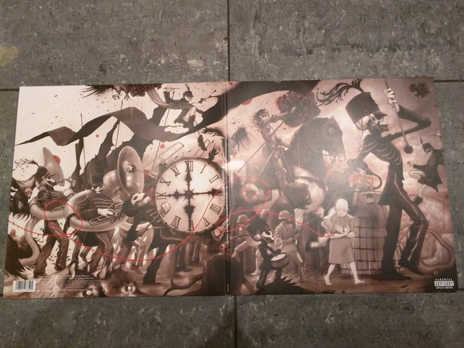
When you open the cover, notice how the interesting-looking fellows tell a bit of a story from the front to the back? That’s exactly how you’d use Continuation on a landing page.
Your landing page should tell the story of the product or service that you’re selling. That story should be visually interesting and should say things in the right order.
Your visitors should be left with no doubt as to the order in which they should consume your content.
18. Size: The Allman Brothers – Eat a Peach
After the death of Duane Allman just halfway through the recording of this album, the Allman Brothers pulled it together to create one of the greatest “jam band” albums of all time.
With several tracks clocking in at almost 10 minutes long, they created a soundscape as impressive as the giant peach on the album cover.

There’s no way around it — the bigger something sounds, the more we’ll pay attention to it, as evidenced by this popular record. And the bigger an image is when contrasted with those around it, the more you are going to notice it.
The peach is, obviously, the most important thing on the cover, and its Size demonstrates that.
The same principle applies to landing pages. If you have something that you want to stand out from the rest, blow it up, make it giant, and it’ll get noticed.
19. Perspective: Do Make Say Think – Self-Titled
Do Make Say Think are a Canadian post-rock band (read: indie rock that is not as accessible as the rest). They take their time revving up each song, with clear but labored journeys from one place to the next.
It’s not for everyone, but if you enjoy post-rock of any kind, this is a band to check out.
The cover art for their self-titled album is a great example of the design principle of Perspective:

See how the image on this album cover carries your gaze from front to back? This sort of visual trick can be used to direct attention to one of the elements on your landing page.
In the ebook, Oli provides the example of this landing page:

The background image creates a sense of Perspective on this landing page, and the form area really pops because the depth of field pushes it to the foreground.
20. Grouping – Various
As it turns out, Grouping was not an easy principle to find in my collection. So in order to demonstrate it, Oli and I pulled out a bunch of records.

Placing these albums in groups with similar visual elements creates the impression that each album in that group is somehow related. You also get the sense that they’re separated from the other items in other groups. You may also get the sense from this image that Doug Kershaw is about as 70s as they come.
That’s what the Attention-Driven Design principle of Grouping does: it helps to define boundaries and gives you a means of more clearly defining your message. By placing similar elements together, you create visual simplicity and reduce cognitive load.
21. Encapsulation: Fleetwood Mac – Tusk
This album, to some, perfectly encapsulates rock star excess. Both the music and the packaging (with sleeves designed by a sleep-deprived Lindsey Buckingham who was becoming obsessed with… whatever was near enough) are examples of ego run rampant.
Don’t get me wrong, it’s a great album. It’s just got a certain je ne sais quoi.

On the Tusk album cover, a dog biting into some unlucky fellow’s pants is neatly encapsulated by an abstract and somewhat sparse background.
Encapsulation on landing pages gives visitors the idea that something is important by enclosing it within a container. In the example below, the form and CTA button area are encapsulated to become a focal element on the page.

In the image on the right, Encapsulation helps draw visitors to the most important area of the landing page — the area where they’re going to give you their information!
22. Contact: John Lennon & Yoko Ono – Double Fantasy
Double Fantasy was released just three weeks after John Lennon was shot outside his apartment building. On the album, John and Yoko hold a kind of conversation between husband and wife, with every second track by Yoko. (This is why I prefer to listen to it on CD — it’s much easier to skip every second track.)
The cover conveys the sense of intimacy and earnestness behind the music:

That it’s John and Yoko is clear, but what we are really drawn to is the Contact being made between them. The kiss is front and center, drawing the eye towards it with more impact than the yellow text in either corner.
In design, we use points of Contact to attract attention, just like the kiss between John and Yoko. This image below shows what Contact might look like on a landing page.

Your eye is immediately drawn to the Contact point between the two phones, and then to the similarly colored headline.
It’s one more weapon in your design arsenal to help you show your customers where to look!
23. Nesting: It’s up to you!
Sometimes your pages will have long lists of benefits and features. This is when Nesting can be employed to reduce the cognitive load required on the part of your visitors. As Oli says in the ebook:
You can add some clarity, reduce comprehension time and apply emphasis through interruption by adding some hierarchy by way of indentation.
Most commonly, Nesting takes the form of bulleted lists, which are easy to scan.
There’s just one thing: we actually weren’t able to find an example of this on a record cover! If you can find an example of nesting on an album cover, show us in the comments below. If we think it fits, we’ll send you an Unbounce t-shirt!
Applying the 23 principles
The principles of Attention-Driven Design can be found everywhere — they’re so ubiquitous that you may not even notice them. They can be found in nature, architecture, urban planning, art, video games, movies, paintings and, as we’ve just learned, on album covers.
They appear everywhere because they are effective visual tools — and learning how they work brings you one step closer to guiding your visitors toward that all-important conversion.
Psst. Who better to teach you than Oli Gardner, the guy who’s seen more landing pages than anyone on the planet? Check out his latest ebook, Attention-Driven Design: 23 Principles for Designing More Persuasive Landing Pages.
