
It’s an all too familiar battle: Marketing vs. Sales.
The sales team is saying that we’re not providing good enough leads, and the marketing team is saying that the sales team isn’t following up correctly. This can lead to a divided culture that pits your marketing team against the sales team.
But no one wins.
Truth is, there shouldn’t be a battle at all. When the sales funnel is working well, everything is in sync. That’s the goal.
But what can we do as digital marketers to make sure that our landing pages are bringing in the highest quality leads possible?
Here are 8 lead gen landing page examples that are trying to generate more than just an email list. They’re going the distance, getting the digits, and generating sales leads. But let’s look at how they might improve their landing pages and win the day.
1. CBeyond – VOIP Phone Services
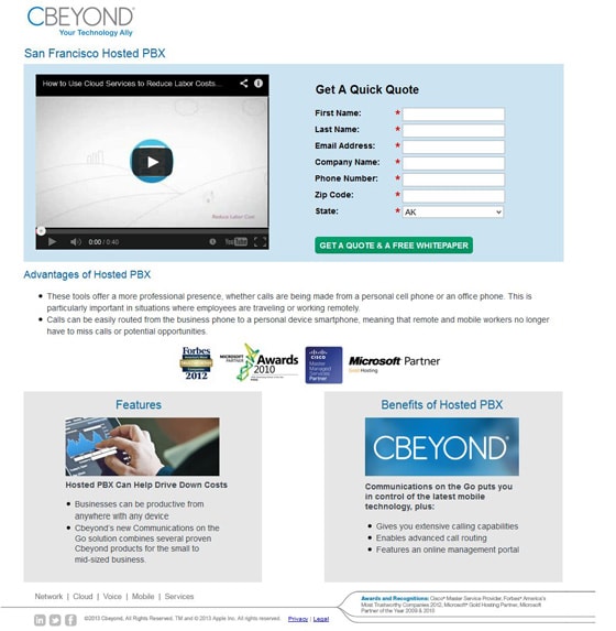
This page really does leave a lot to be desired. Here are a few ideas on how to increase conversion rates, and maintain high quality leads.
Where is the value proposition?
The text that stands out the most on this page simply says “Get a Quick Quote.” There’s not much value in that, and it’s going to cause a lot of traffic to bounce right away. Instead, CBeyond needs to have a strong headline with some value for the visitor built in. A headline like this:
Find out how CBeyond can help your business communicate for less
What the hell is a hosted PBX?
The trouble with jargon is that it isn’t universally accessible. Maybe a portion of your visitors will know what a hosted PBX is, but why take the chance? After all, a hosted PBX is just an industry term for an internet phone service that is managed for you.
Sure, list your jargon somewhere on the page so that you can connect with people in the know, but always make important elements on your pages accessible to everyone.
Everyone hates long lines
You know that feeling when you hit your favorite coffee shop in the morning only to find a lineup of 12 people who have the same idea? Yeah, it sucks. And you know what? So do long lines on a landing page.
The copy under “Advantages of hosted PBX” is too long to read comfortably. Some studies show that the optimal line length for any block of text on a page is 50-75 characters. This page uses a width of over 100 characters.
Can’t trust an outdated logo
Unfortunately these trust logos are not evergreen. They have the year they were given right on them, which can make your page, and your product or service, look out of date. Everyone knows that anything tech goes obsolete quickly, so showing awards from 4 years ago can actually hurt your social proof.
Out of focus
The lists of “features” and “benefits” seem like an afterthought and are really out of context on the page. On top of that, the form call to action refers to a mysterious “white paper” that isn’t mentioned anywhere else on the page.
Keep your pages focused and on point to maximize conversions and ensure the highest quality leads. If your visitor is confused, even if you get the conversion, you surely will have a low quality lead.
2. Concord Law School
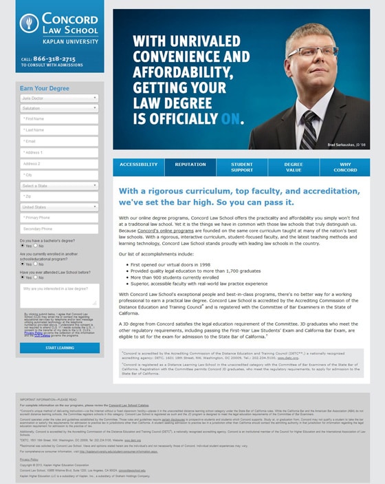
Wait. Is there a form on this page?
This form blends right into the entire page and is easy to miss. Make it stand out and lose most of the fields. Do you really need two phone numbers? Do you need a state/city if you’re collecting a zip code? Do you need their address right now?
Every single field on your landing page can have a big impact on your conversion rates so make sure that you absolutely need each one for your sales team to get in contact.
What’s the value of signing up?
Will I “Earn my degree” by filling out this form? That’s pretty darn easy – I guess anyone can be a lawyer these days! You need to make sure that it’s extremely clear to your visitor why they are signing up, and why they should care. Make it irresistible to them by focusing on the emotional triggers that are linked to your product or service. In this case, starting a fulfilling and prestigious career.
There’s an interesting test opportunity on this page
There are multiple content headings on this page (Accessibility, Reputation, etc.), and I would suspect that there doesn’t need to be that much content to get good quality conversions. I would test each content section as the default until I found which page connects with visitors the most. Then I would get rid of the other content sections and see if I can help focus the visitor. Sometimes adding too much information can turn off a visitor.
3. Fico – Predictive Analytics
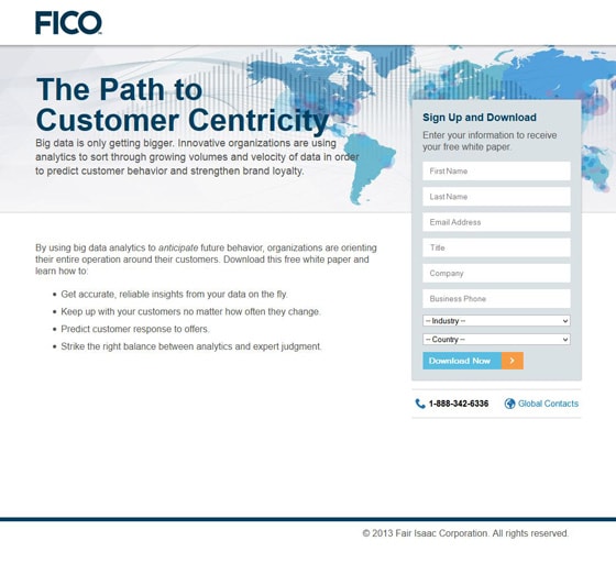
There’s those fancy words again…
Jargon may delight the hell out of your boss during a presentation, but your traffic probably isn’t impressed. Change the headline to something that makes sense to everyone. Something like this:
The data you need to understand your customers
Signup and download what?
The form and the bullet points on this page talk about a white paper, so why is there no mention of it in the sub-headline?
With our new jargon-free headline, a sub-headline that explains to visitors that this whitepaper is an essential key to understanding their customers would tie everything together. The key here is to make sure that every bit of copy on the page pushes the visitor towards becoming a lead. Here’s an example:
Download our free white paper and discover how you can start predicting customer behavior, build brand loyalty, and increase customer lifetime value.
Benefit-free bullets
Where are the benefits of this whitepaper? Why do I care about getting accurate, reliable insights from my data on the fly? What does “on the fly” even mean in this context?
Here is a better way to reword these bullets with a direct benefit to the visitor that is crystal clear:
- Find insights in your data that let you take action
- Change with your customers and give them exactly what they need
- Predict customer responses and build more profitable campaigns
- Make informed decisions based on real data
4. Fluid – Search Engine Marketing
Which headline is important?
The trouble here is that there are essentially two headlines. The problem with having two headlines is that visitors don’t know which one to read first, or which one is more important. In this case, the second headline shouldn’t be so large because you actually want visitors to read the copy before calling.
Otherwise you might end up generating unqualified leads that don’t know what you’re offering because they never read your copy.
Lose the silly stock photo
It adds no value, and you’re not fooling anyone into thinking that you have a team of models who are also marketing professionals.
Time of day?
Are you asking me what time of day it is right now, or are you asking when I would like you to contact me? Make things clear. And test whether this field is driving conversions down. I’d be willing to bet that it is turning people off.
Yay, a fancy “Submit” button!
I appreciate that the designer went through the trouble to fancy up the submit button, but they should have saved their time. Using “submit” for your call to action is the same as using a button that says “enter,” or “forward.” It’s just a word that doesn’t mean much, and doesn’t promote any action. Instead, use something like this:
“Request a call back”
Try a different angle
This page isn’t nearly good enough to inspire any trust in the company. Instead of jumping to a sales call (which everyone hates) why not promote an exchange of information (like a demo, or a webinar) were you can present your expert knowledge of the visitor’s problem and how you’re going to fix it. By taking this angle, you can generate more educated and higher quality leads.
5. Fonality – Business Phone Services
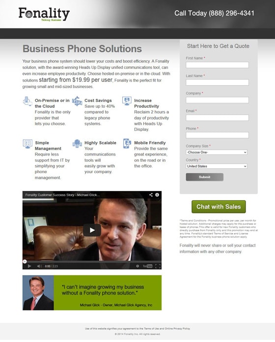
Use more testimonials
Why are you only using Michael Glick as a testimonial? I get that he likes your business, but by using him twice it makes things look like he’s the only one who’s ever used the service… and liked it.
Business phone solutions is a headline, but…
It’s a terrible one. It states what you provide, I’ll give it that much, but telephone service is very much a commodity. That means that most phone service providers are the same, so most visitors will just choose the cheapest one.
Unless you want to race to the bottom and eat up all of your margins, why not give visitors something to care about? Something to sign up for. Something that makes you stand out.
What’s the biggest issue that people have with phone companies? The mediocre customer service. Focus on that, and ye too shall prosper.
Where do I click?
Why are there two calls to action? The “Chat with sales” button stands out more than anything else, but it has nothing to do with the lead form. The actual button for the lead form is garbage. Not only is it a submit button, but it’s gray and boring. Fonality needs to choose whether they want their traffic to chat with sales, or sign up for a quote, and then focus on that one goal.
6. Goldmine – Customer Relationship Management Software
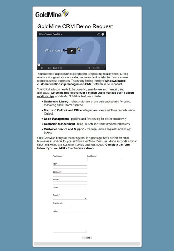
Don’t get fresh with me!
What kind of headline is that? Would you walk up to someone on the street and say to them “Fill out this form to demo my product”. Of course not. You would first introduce your product, build trust through showing them the benefits, and at least tell them why they should care about seeing a demo. Here’s a better headline…
Easily Manage Your Sales Relationships
Why is the video just floating there?
There’s no reason why I would choose to watch this video, since the only information I’ve read so far is a poor headline about a demo request. If your traffic hasn’t bounced at this point, they are frantically searching for the back button.
Clean up the form
Why are there notes on this form? What the hell is someone going to write in this field? I hope they’re writing “Please don’t use submit as your call to action.” Too late… I already did that.
7. Results Driven Marketing – Digital Marketing Services
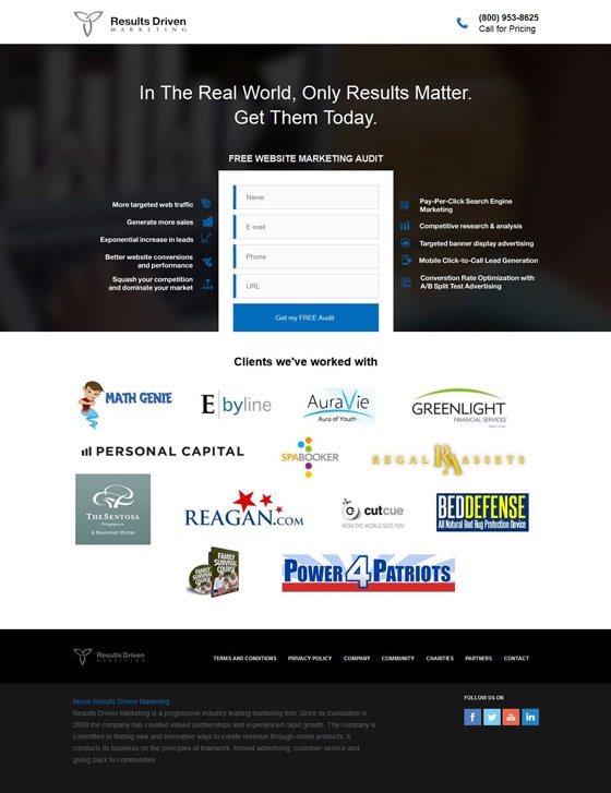
Can you be more specific?
What type of results are you going to get me? How are you going to get them for me today? The headline of this page could be rewritten to be more specific.
Try something like this:
Strategic Digital Marketing That Will Grow Your Business
Our results driven approach focuses on getting you more traffic and leads
Don’t just list services, sell them
There is a list of services next to the form. The problem is that these types of services are a commodity. Even the worst marketing companies on the web will tell you they can do PPC and SEO. Tell me why you’re better. How have you helped others? What angle are you going to bring to helping me “get results?”
The only decent bullet point is the one about “squashing your competition.” Now that I can get behind.
Don’t make me feel dirty
Why do I want an audit? An audit sound awful! Do you mean there’s a guy that’s going to come and go through my receipts and tell me all of the things I’ve done wrong? Why not turn it into something fun, like a “website tune-up” or a “website opportunity report”? Your products should be fun, interesting, and helpful.
They should definitely not remind me of anything as painful as an audit.
8. Ricoh – Cloud Storage
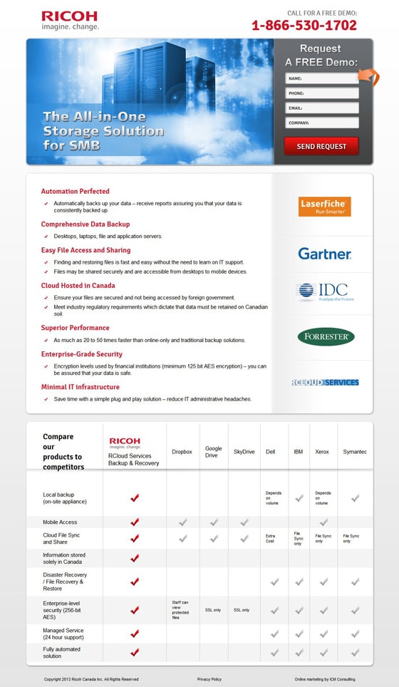
Watch out for too much symmetry
Your designer will love the fact that everything lines up, but if your page is too symmetrical, important elements can blend in. The form at the top of this page is the same width as the sidebar so it tends to blend in to the other elements and get lost. I would move it down to be next to the body copy. This would help it to stand out and make sure that every visitor sees the goal of the page.
TL;DR
Do you need this many bullets? Seriously, some testing is required here to determine exactly what problem your traffic is looking to solve so that you can focus. Right now it just seems like a mash of bullets that are a lot of work to read through. I’m willing to bet that just a few bullets are what really stand out for Ricoh’s traffic.
What do these logos mean to the average visitor?
There needs to be some explanation for why there are logos on this page. I can’t tell if these are companies you work with, companies who endorse you, or companies that manufacture products that you use. In either case, a small headline above them would clear this up and make sure that they are adding value to every visitor.
Where Do We Go From Here?
Slapping a web form on a page and removing the navigation from your template does not make a successful landing page. If you want to generate high quality leads that will keep your sales department happy and also increase conversions, you need to put some serious thought into each landing page.
Most of these landing pages fall flat because they aren’t focused enough on pushing the visitor towards the conversion goal. Go back and take a look at your own landing pages to see if they are focused on a single goal. Remove the waste, and as always, test test test.
Have a question? Leave a comment below!

