
Creating a mobile-friendly landing page is no simple feat.
For starters, you need to cram all of the essential landing page elements into half the space.
But the real tricky part is understanding – and adapting to – the way your users’ behavior changes when they’re browsing from the palm of their hand. How do their motivations differ from desktop users? What anxieties do they have when they land on your page?
Understanding which questions to ask is the only way to get the answers you need to create high-converting mobile landing pages.
In our recent Unwebinar, Bryan Eisenberg (author of Call to Action who boasts over 20 years of CRO experience) helped demystify the mind and motivations of mobile users, and provided a clear breakdown of the anatomy of a high-converting mobile landing page.
You can watch the full recording of the webinar here, or keep reading for three questions you must ask to create smoother, more delightful landing page experiences for your mobile users.
Question #1: How much information do your mobile users really need?
Bryan explained that the behavior of your mobile users is fundamentally different from your desktop users – especially when it comes to gathering information.
He likened the behavior of desktop users in the research phase to sitting down to have a complete meal. They pour a glass of water, get out their napkin and set the table. They’re in a mindset that makes them more likely to deep dive into topics and finish what they start.
But on mobile, Bryan explained, it’s a whole different ballgame:
The behavior is much more snack-like. We won’t take a deep dive – we want bits of information.
What does this mean for your mobile landing pages?
Mobile users are more likely to be in a top-of-the-funnel research phase, so you need to make the information you provide digestible or they’ll give up and look elsewhere.
To illustrate this, Bryan compared the mobile landing pages of Intuit and PayPal.
PayPal’s landing page spans for 11 screens, which Bryan explained was way too long for a mobile user:
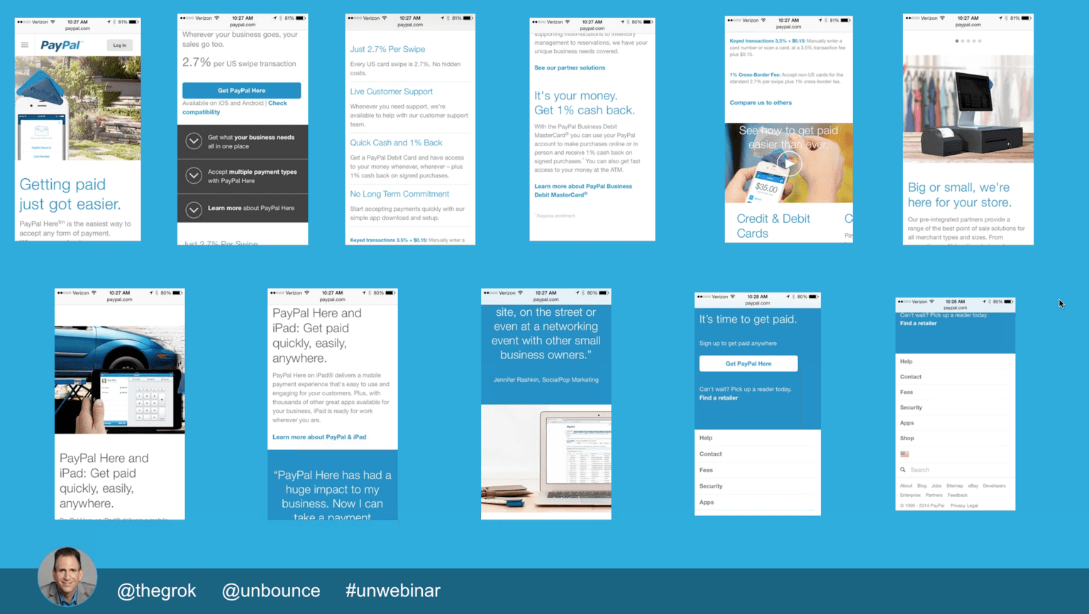
Because they’re in a “snacking” mindset, having to scroll frantically is likely to give them indigestion – and cause them to bounce.

On the other hand, Intuit’s landing page is much more aligned with the “snacking” tendencies of mobile users:

The information on Intuit’s mobile landing page is chunked out in a very digestible way and contains juuust enough information to keep snacking mobile users engaged.

Though mobile browsers are more likely to be in research mode, Bryan cautioned that you still need to validate this assumption with your users. Depending on your offer and the level of commitment required, mobile users may be at a different stage in the buying cycle – and you need to conduct research to figure it out.
A good place to start is to determine which keywords mobile users are searching for. Determining this will allow you to peer into their minds and get a better idea of their stage in the buying cycle.
Once you’re clear on their intent, you can then strip down your page so that it only contains the information they need to take action.
When designing a mobile landing page, change the content to be “snack-sized”, don’t just resize the desktop version. #Unwebinar
— Corey Dilley (@CoreyDilley) December 9, 2014
Question #2: Can prospects understand your offer regardless of where they’re coming from?
Whether your prospect clicks through to your landing page from an email, PPC ad, social media or any other marketing channel, your offer needs to be crystal clear.
That should go without saying – but landing pages that don’t provide context for the offer (regardless of where traffic is coming from) are all too common. This is problematic because, as Bryan has learned from years of usability studies, people literally forget about the offer in question from click to click.
Bryan provided Bla Bla Car’s mobile landing page as an example of this common mistake:

While the mobile landing page contains many essential elements such as the logo, testimonials and a clear CTA button, it lacked two important elements to provide context for the mobile user: A headline and a clear description of the offer.
Bryan found that many important questions were left unanswered:
What are we trying to get people to accomplish? What is the pain point that you solve? What is the offer?
As Bryan explained, you can’t assume that your visitor will remember the full details of your offer from your marketing email or PPC ad. Make sure that your landing page clearly communicates the value of your offer – even without the context of what came before it.
#unwebinar @theGrok. People forget from click to click. Remind them of your info, CTA, links, offer, value, credibility
— Denise Sonnenberg (@DniseSonnenberg) December 9, 2014
Question #3: Have you closed any loopholes that make your CTA less compelling?
Having a powerful call to action isn’t just about having optimized button copy – it’s about creating a sound argument across your entire landing page (without any conversion leaks).
As Bryan put it, you need to be asking yourself:
Have I closed all the loopholes? Have I done everything I can so that people feel comfortable taking the next step?
For example, Bryan felt that Laserfiche’s landing page clearly explained the offer but lacked what he referred to as “confidence building” elements:
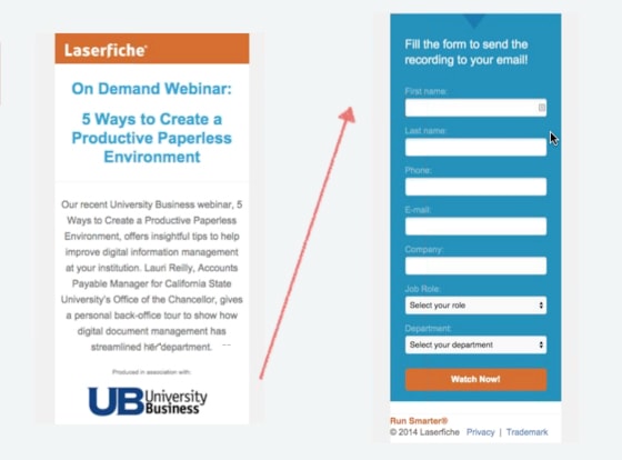
They did an awesome job of making the landing page laser-focused on the offer, and topped it all off with a big, contrasting CTA button. However, the page fails to give people a sense of why they are a trusted source.
And a lack of social proof makes prospects slam on the breaks and ask questions like, “Who are you, and why do I want to do business with you?”
To inject some authority, Bryan suggested the following:
- Incorporating the feedback of people who attended previous iterations of the webinar.
- Including the logos of recognizable companies who have attended.
No matter what the social proof, Bryan recommended including it right above the form to propel people forward and encourage them to fill out the form.
Bonus tip:
If you’re collecting leads on a page, make the form short and sweet. If you need more details from prospects, you can always follow up via email later to ask for them.
Gut-check with the Conversion Trinity
There’s no other way to spin it; mobile landing pages are challenging to create. It’s not easy to be concise without accidentally omitting any essential landing page elements.
When in doubt, cut back your mobile landing page to be as succinct as possible, and then gut-check your work with the Conversion Trinity model that Bryan shared on the webinar:

Look at every one of your landing pages and ask yourself:
- Is your landing page relevant to the unique needs of your prospects?
- Is the value you provide explained clearly (with plenty of context)?
- Is your CTA compelling and click-worthy (without any loopholes)?
Whether your landing page is mobile or not, answering these three questions can help you do some serious damage control before you even publish your page.
Over to you – are your mobile landing pages guilty of neglecting any of the three elements of the “Conversion Trinity”?


