“If you want results, you need to start by setting goals. When your goals are set, you need to find out how to best achieve them.”
I think we can all agree to the logic behind this statement. And exactly the same logic can be applied to landing page optimization.
If you want to create a high-converting landing page, you need to start by defining the goal of your landing page. After that, you need to build the best possible landing page to achieve that goal.
A beautiful landing page is a means to an end – but not an end in itself
A beautiful landing page can help you achieve your goal, but it should not be the goal in itself.
For this reason it’s important that you can leave the “artist” on the shelf for a while so you can assume an analytical approach and focus on giving your potential customers what they need in order to make the right decision.
From a strictly esthetic or artistic point of view, the resulting landing page may not be the most creative solution. But essentially that doesn’t matter. What matters is that the landing page gets as many potential customers as possible to make the right decision.
The goal of LPO is to get conversions – not creative awards
If the landing page itself is the main goal, you can easily end up designing a page that looks great but doesn’t have any effect on the decisions of your potential customers. That may get you a nomination for a creative award, but it won’t get you more conversions.
I’ve been in several situations where we designed an awesome landing page that impressed the client – only to set up a split test and find out that it had little or no positive impact on conversions.
Let me give you an example from the real world:
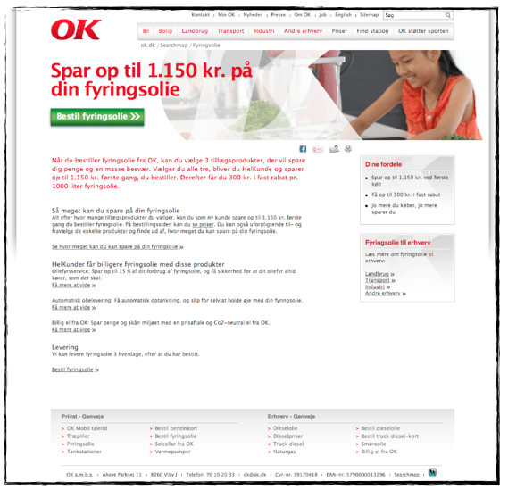
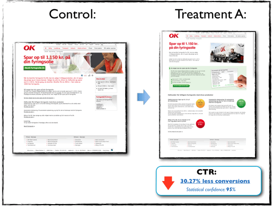
Here’s an example from a case study where my business partner and I “optimized” and redesigned a landing page for a client. The control page was pretty boring and very heavy on plain copy.

In previous tests, I had achieved significant lifts exclusively by optimizing the copy and stating the overall value proposition more clearly.
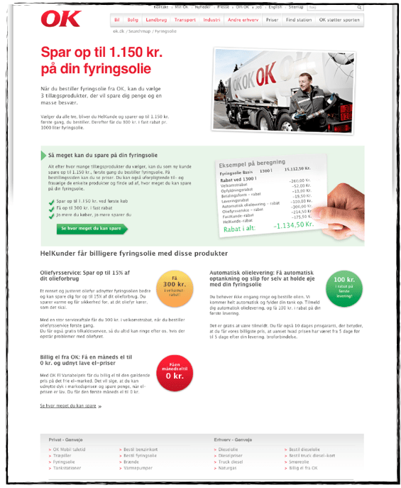
So for the new treatment, our main focus was optimizing the design and creating a more esthetically pleasing variant.

We were very pleased with our new beautiful landing page design, and hopes were high for the lift it was bound to generate. The test results stared rolling in, and from the beginning they were unmistakable – our variant performed significantly worse than the control page. In fact, our treatment decreased conversion by 30.27%.

We were taken aback by these results. How could our new variant that looked so much better perform so much worse? Moreover, how could a radical redesign fail so miserably, when minor copy changes could generate substantial lifts?
The copy changes were laser-focused on conveying the value of the offer and giving potential customers what they needed in order to accept the offer. In other words, I focused on optimizing the decisions of the potential customers and not so much the page itself.
With the redesign however, it was the other way around. We overlooked the goal of the page and made the mistake of assuming that optimizing the page itself would automatically results in more conversions.
Eventually we did come up with a redesign that worked, and we ended up with a variant the generated a lift of 48.69%, read the entire case study here.
A ridiculously simple tip to avoid the pitfalls of landing page design
Designing a high-converting landing page takes time, effort, research, and rigorous testing. If you want long-term success, there are very few short cuts. But I do have one ridiculously simple trick that I find very effective.
Whenever I’m involved in designing a landing page, I go over all the different design elements one at a time and ask myself “How will this element help potential customers make the right decision?”
If the answer is “Uhhhh” or “Hmm, I’m not sure – but it looks cool!” I reconsider whether that element actually has a role to play and whether it really deserves to be on the page.

