Much like peanut butter and jelly, copywriting and design are key elements in crafting the perfect marketing campaign. One without the other just isn’t quite the same — you’ve either got a sad sandwich on your hands or a boring campaign. I’ll have neither, thank you very much.
As a professional marketer, you likely have the copywriting part on lockdown.
And while you may have some design fundamentals under your belt, amping up your knowledge will not only help your campaigns, it will also help you to communicate with your team of designers in order to achieve the results you want.
Now, we know you’re busy and may not be able to carve out the time to teach yourself design, let alone take a course (ugh, school), so we’ve curated our top nine design resources from our fave blogs. Read them all at once, or bookmark them for later.
Have we forgotten one of your favorite posts or resources? Tell us in the comments — the more the merrier!
1. 7 Rules of Content Marketing Design [SlideShare] via Uberflip
You may be able to woo your visitors with compelling content, but if your page isn’t visually optimized for conversion, you may be missing out on leads. Uberflip does a bang-up job of identifying seven rules for effective content marketing design — all wrapped up in a beautifully designed SlideShare.
Two such rules include keeping the design consistent throughout (a.k.a. visual message match) and showing more (i.e., using videos and images to demonstrate the product rather than using wordy descriptions).
2. Stock Photos That Don’t Suck by Dustin Senos via Medium
It’s not a stretch to say you can spot a stock photo from a mile away. Often they’re cheesy, posed and make you wonder, WTF? Thankfully, Dustin Senos, former head of design at Medium, put together an invaluable list of stock photo hubs brimming with beautiful, candid, modern shots that don’t suck — like, not even a little.

3. 23 Principles of Attention-Driven Design as Demonstrated by Album Covers by Mark John Hiemstra via Unbounce
Getting your visitor’s attention in today’s crazed digital age is about as easy as getting your toddler to put down the iPad and come to dinner.
If you can’t even get your visitor’s attention, how will you ever get them to convert? Well, Oli Gardner of Unbounce has shared 23 principles of attention-driven design to help remedy this modern problem.
You can read about the 23 attention-grabbing principles in the 68-page book — or you can read the abbreviated version in the post above by Mark John Hiemstra, which uses record covers to highlight key attention-driven design principles.
")
4. How to Design Graphics that Convert via HubSpot + Canva
Not all marketers have the privilege of working closely with a designer. There are times when you need to pull up your sleeves and open up that intimidating image-editing software.
If you’re worried about creating something that looks right (let alone converts), Canva and HubSpot have teamed up to bring you an ultimate guide on creating assets for a variety of channels: from email to social and paid advertising. It’s filled to the brim with advice on information hierarchy, typography, color, grids, landing pages, CTAs and so, so much more.
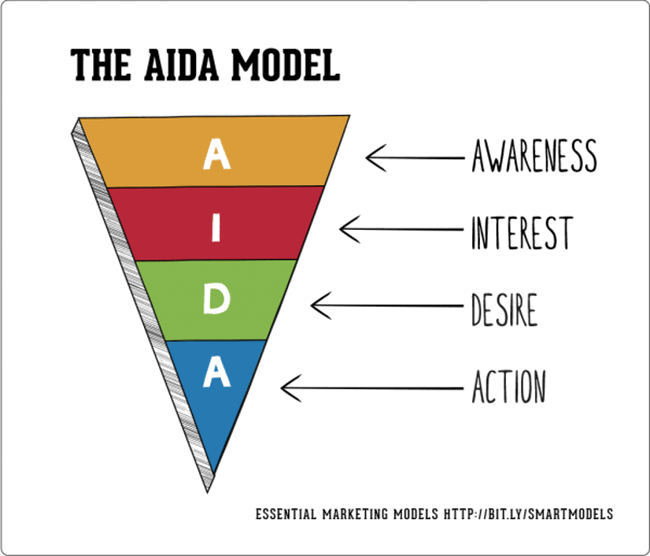
5. Designing Your Website Flow To Meet Your Conversion Needs by Marie Polli via ConversionXL
Good landing page and website design isn’t just about choosing palettes and pretty pictures. This post by Marie Polli for ConversionXL explains that it’s also about information hierarchy. ‘Cause if your page doesn’t flow then neither will those dollar bills.
Marie explains how the good ol’ AIDA model (image below) can help you order your page elements in a way that feels natural (and pushes prospects toward the goal).
6. The Psychology Behind Successful Web Design by Ivana McConnell via The Next Web
Design can be super subjective. Some people like what you’re throwing down — others maybe not so much. But like and dislike are difficult things to measure.
What can be measured, though (through research and thorough usability testing) is what happens in the brain when a customer interacts with either a good or bad web experience.
Ivana McConnell has taken these insights and translated them into a thoughtful piece on pattern recognition, and how to leverage it for better web design.
7. 3 Design Best Practices That Web Designers And Conversion Optimizers Can Agree Upon by Jeremy Smith via Marketing Land
Bridging the gap between conversion marketer and designer can seem like a challenge: both have their own ideas about what works and what doesn’t.
Conversion consultant Jeremy Smith discusses how CROs and designers can find common ground by leaning on three key best practices to create beautiful and effective marketing experiences. My fave tip? “Make Your Main Thing As In-Your-Face As Possible.” I mean, how could it not be?
8. Why Ugly Website Design Often Converts (Better) by Dale Cudmore via Crazy Egg
Is beauty only skin deep? This post by Crazy Egg explores whether the cliché is true for website and landing page design. When you give into flashy and trendy web design trends, do you sacrifice delightful user experience? Dale Cudmore attempts to answer that and shares his take on what all high-converting pages have in common (regardless of their looks).
9. Crappy Design thread via Reddit
As much as it’s great to read about design best practices, it’s also beneficial (and probably more fun) to hear about what not to do. If you need a breather from all these design tips, check out the subreddit /r/CrappyDesign — it’s filled with user-submitted examples of hilariously bad design choices.

At the very least, it’ll provide some comic relief… and general relief that you weren’t the one who came up with these stinky designs.
