
Marketers, how do you solve a problem like Maria?
In our profession, the hills are very much alive with the sound of conversion opportunities, but at the end of the day, how do you catch a cloud and pin it down?
With new trends and channels emerging every day—at this point we’re just waiting for Excel to release a Stories feature—it can be tough to keep your efforts fresh and effective.
Just look at your landing pages. Putting out campaign after campaign after campaign can easily feel like you’re spinning in a neverending circle on a mountaintop.

Moving away from Sound of Music—and all the Von Trapp puns that coulda been—optimization fatigue is a real thing.
You know it, we know it. No matter how many blogs on best practices you read, sometimes it’s just so gosh-darn hard to bring optimizations to life. More likely than not, you end up staring at the screen for three hours deciding whether or not to move your CTA button three pixels to the left.
But what if you had an optimization specialist on call? What opportunities would they see on your landing pages?
We were so intrigued by the question we decided to ask the pros and run a lil experiment in the process …

The Experiment
The first step was to find a landing page—a good one, so that we can find opportunities instead of just focusing on the basics. Also, we needed a real page—no hypothetical what-ifs would do.
So we opened the challenge to the Unbounce Community. And Visar Murati, marketing head-honcho at Moona—a sleep science ecomm company—put his hand up.
I was looking for some insights on how to improve my conversion rate from other users on the Unbounce Community forum [when I saw the call for volunteers] … I thought to myself ‘well, I really need this, let’s try maybe I’ll be lucky’.
— Visar Murati, Marketing and Growth Manager, Moona
(In Morgan Freeman’s smooth narration voice): Visar was lucky indeed.
The next step was getting a couple of pros involved to create their own variants of Moona’s landing page. Kyle Carline and Jonathan Naccache, both Unbounce Community Leaders and bonafide optimization experts, stepped up to the plate.
From there it was simple. Jonathan and Kyle met with Visar—client-pitch style—and had about a week to build their own landing page variants. Although there were a few basic guidelines Kyle and Jonathan had to follow, the pros were given free rein with the sole goal to increase conversions—whatever those conversions might be.
Once the Moona team approved the pages, both variants were published and ran head-to-head for a month. Yep, the experiment ran with real visitors and prospects.
The Goal
“So there’s an original version, plus two new variants from the pros—we’re trying to see who wins with the most conversions, right?”
Eh, no. Not quite.
You can’t compare apples with donkeys, right? It’s the same with landing pages. There’s a very good reason A/B testing is a long and arduous process—because it’s a controlled test environment that looks for winning elements on pages that are virtually similar.
We’re not trying to see if a blue or pink button works better, but rather different perspectives that could lead to an overall increased conversion rate.
That doesn’t mean we’d randomly send landing pages into the wild. We’re marketers after all, and we like our campaigns orderly. Here’s where Smart Traffic steps in. This AI-powered tool actively learns about visitors’ preferences to send the right person to the right landing page where they’re most likely to convert.
Just like that—TADA!—we can have three wildly different landing pages (Visar’s original, plus the ones created by Jonathan and Kyle) that appeal to wildly different audiences, all tied neatly together in the same campaign.
One winning variant is so last season. When the conversion rate spikes up across the board because you’re speaking to the right people in the right way—everyone wins.
1. Vis’ OG Variant
Meet Visar Murati—friends call him Vis. Vis heads up the growth and marketing team at Moona.
Working with a small team of three, Vis’ core goals revolve around convincing, converting, and retaining customers. Working in a startup, his role covers a wide scope of work, which makes his successes all the more impressive.
Since joining Moona a year and a half ago, he has overseen the company’s first product launch, implemented high-quality customer support, managed insights to continually improve the product, and generated good customer reviews. We’re not even mentioning growing monthly sales targets, all with a limited budget and human resources.
The small but mighty team at Moona aren’t lightweights. So what do they look for when it comes to their landing pages?
When building a landing page, I always think about value. People give us their ‘time’ by spending time on our landing page so we need to provide value in exchange.
— Visar Murati, Marketing and Growth Manager, Moona
To Vis, this value is seen through brand value (the overall look-and-feel), educational value (impactful and meaningful content that extends beyond the product), and product value (how Moona can benefit customers).
Here we have the original “OG” landing page that kick-started the experiment:
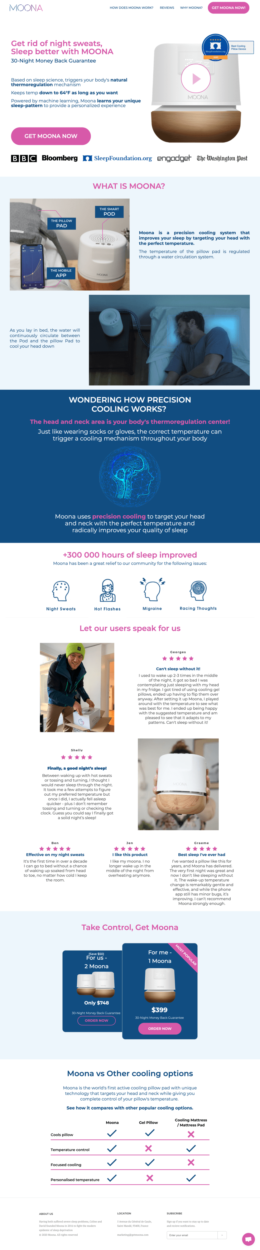
Click on the image to see Vis’ full landing page.
Looking at the five essential elements of a winning landing page, Vis’ version has it all. So it’s no surprise that the page was performing steadily with a conversion rate of 3.5%—well above the overall landing page median of 3.2%.
But Vis wanted more.
Although Moona’s state-of-the-art sleep technology—a cooling pillow that uses AI to find your body’s ideal sleep temperature—has helped more than a thousand people get their sleep back, it’s not an easy product to sell. Retailing at $399, it’s a pricey purchase when compared to your average, off-the-rack, non-temperature-controlled pillows.
The price point is high so in order to convince someone that it is worth the investment, we need a long conversion funnel with key education messages all along the road.
So, how will the pros overcome these hurdles and convince visitors that Moona is for them? Will their approaches lead to a higher conversion rate?
Grab some popcorn and find out …
2. Jonathan’s Variant: Optimized for Sales
In the one corner, we have Jonathan Naccache. Jonathan is the president and co-founder of Webistry, a marketing agency specializing in sales-centered campaigns. In his day-to-day, Jonathan leads a team of marketers that include paid media specialists, designers, and developers.
Webistry started as a two-person startup focused on event marketing. Early on the team realized that the full-service marketing agency model was highly flawed. One agency to rule them all? Very risky. So they decided to go the other direction by only offering Google Search Ads.
This led to Webistry quickly becoming one of the go-to agencies for Google services. From there, Webistry grew to include social media ads and today they specialize in optimizing online customer journeys, starting with paid traffic.
How do landing pages fit into Websitry’s portfolio?

When used correctly, landing pages are your best chance at converting traffic. Since your website is static, it can’t possibly adapt its messaging and content to every single user. Traffic means nothing if you can’t create an environment tailored to your customers’ needs.
— Jonathan Naccache, President and Co-Founder, Webistry
The team at Webistry is well-versed in what makes a great landing page—you can see some of their handiwork here—but for the purposes of the experiment Jonathan stepped up as a lone-wolf marketer.
I have to say, taking on this challenge, I knew I had to walk the talk. By ‘walk the talk’, I’m referring to the countless times I told our customers what worked in a design and what didn’t without being a designer myself. Even worse, I’m referring to all the times I gave our own (amazing) designers tips about their landing page designs!
Jonathan’s approach to Moona’s optimization challenge
Taking an optimization-first mindset, Jonathan analyzed Moona’s landing page, section by section, looking for ways to improve the page to lead to a smoother viewing experience, to bump the conversion rate.
Keep the page’s conversion goal focused on click-throughs, here’s what he created:
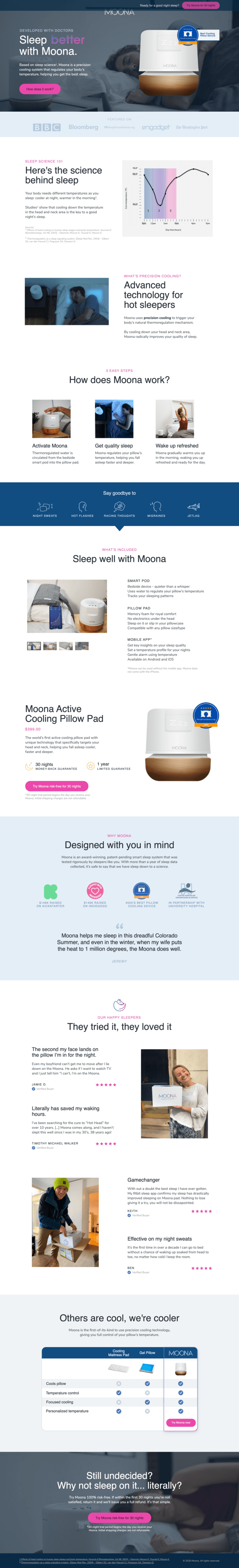
Click on the image to see Jonathan’s full landing page.
Jonathan’s first step was scanning Moona’s original landing page and reframing sections to reflect a problem-solving mindset. For example, he changed the headline from “Get rid of night sweats”—which spoke to a specific pain point—to “Sleep better with Moona”—an overall benefit of the product.
He also went one step further to reinforce this value proposition with evocative imagery, by overlaying the product on a visual of someone sleeping soundly.
Going into the educational aspect of the page, Jonathan prioritized the “why” behind the device, followed by the “how”, leaving the “what” till last. Here’s what that thought process looked like broken down into his landing page’s sections:
- Why: Giving the product credibility by explaining sleep science, and the source of sleep-related problems.


- How: Showcasing how easy to use the product is to drive interest.


- What: Highlighting what’s included in the purchase, and explaining the technology in simple terms. Let’s be real, what’s the one thing all potential customers want to know? What’s in the boooox?!


Going through the rest of the landing page, Jonathan focused on clarity—both in the content and design. For example, he changed the main call to action from “ORDER NOW” to “Try Moona risk-free for 30 days”. This simple change highlighted a key benefit to clicking. Also, by directing the visitor directly to the checkout page instead of the product page, it created a smoother customer experience—not to mention a little more urgency in purchasing.
Jonathan’s quick-fire tips to landing page optimization:
- Understand the product well enough that you’d feel comfortable selling it door-to-door.
- Audit the traffic source, such as Google or Facebook ad accounts, to gain insights into the user journey to your landing page.
- Audit any analytics you might have, preferably on-page analytics such as heat maps, to better understand visitor behaviors.
- Put together a hypothesis document that summarizes potential tests and the reasoning behind each test.
- Roll out one to two tests at a time, depending on how much traffic and how many conversions are being driven.
- Gather your learnings, implement, and optimize!
3. Kyle’s Variant: Going for Leads
In the other corner of the experiment is Kyle Carline, a digital marketing specialist. Unique skills Kyle brings to the table include graphic and web design, as well as an entrepreneurial spirit. He works full-time for an NGO, OneHope—while maintaining a suite of freelance clients.
While he has a toolbox of custom landing page templates he regularly refers to, he doesn’t consider landing pages to make the majority of his professional repertoire—although auditing and providing page feedback is one of his favorite things to do. “Landing pages sometimes feel more like a hobby and less like work”, Kyle explains.
When it comes to the value of landing pages, however, Kyle is in full-on marketer mode:

Having dedicated landing pages for marketing campaigns allows for specificity. The words ‘optimize’ and ‘specificity’ could be synonyms for a digital marketer. We always need to make sure we are giving the audience what they need. If we’re only using a general home page, then we can’t get to the specific needs of our audience.
— Kyle Carline, Digital Marketing Specialist
Though his web and design background is something that’ll make most marketers green with envy, he sees his ability to understand and string together information as the most important skill in his job. To Kyle, language and user experience go hand-in-hand.
The first thing I ask is, how well does the page “speak” to the audience? We have to know what our audience needs and similarly, we have to know how we can give them what they need.
Kyle’s approach to Moona’s optimization challenge
Instead of optimizing Moona’s current landing page, Kyle decided to pursue a persuasion angle in the form of a lead-gen campaign.
A word that stood out for me was ‘education’. The product price was described as a point of friction, but marketers don’t get to decide what the price point is. We can, however, influence the attitude of users before seeing the price. I thought the users only need to know a little more about the product in order to convert.
Kyle kicked off the process by doing a competitive analysis of websites, ads, and landing pages to see what kind of voice other companies use in their marketing language. He wanted to get familiar with what users are exposed to, and better understand the needs of his audience.
He then went into learning-mode by reviewing just about every Moona webpage and resource available to him. In his research, he found an extensive archive of resources about the product and helpful guides that are beneficial to the brand even beyond the campaign.
Finally, Kyle pooled together his research into an ebook to act as an instant solution to the complicated problem of sleep. He packaged everything a prospect would need to know about sleep science and how Moona assures a better night’s rest—all before they see the hefty price tag.
Here’s the landing page Kyle created:
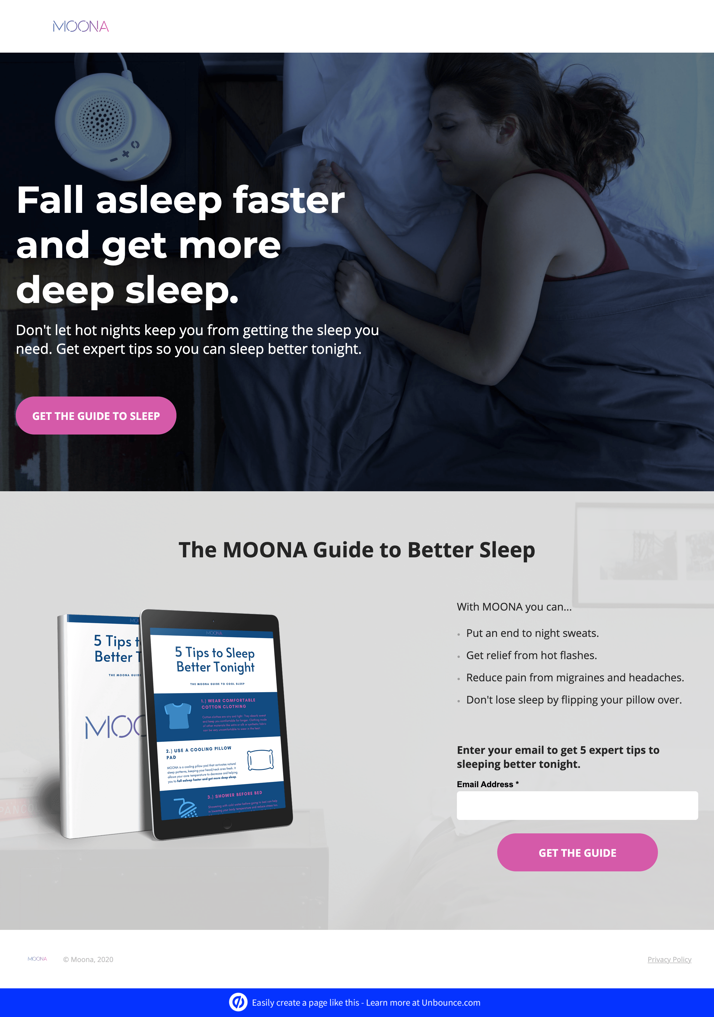
Click on the image to see Kyle’s full landing page.
Channeling his inner designer, Kyle created article content from his research as a PDF and added it as a perk on the landing page. The result was a simple and beautiful two-page site built around the ebook download.
In addition to sales, Kyle saw an added value for Moona through lead generation. If the user wasn’t convinced to buy from the ebook, and they didn’t click the CTA to the product page, the MOONA team could reach out with an email campaign to further convince the user that their product is worth trying. A campaign within a campaign—brilliant!
Kyle’s quick-fire tips to landing page optimization:
- Review the existing data available. What is on the page (text, images, actions), and how does the page perform technically?
- Get to know the audience. Make sure you’re not causing more problems with your page than they already have in their lives. The users have come to the page for a reason, let’s make sure we know what that reason is and fulfill our promise to meet it.
- Audit the page based on the information you’ve gathered so far. Creating a pro/con list and define some areas that need improvement.
- Mock up a draft with new content such as images, copy, buttons, or colors.
- Test, test, test!
Don’t have a couple of pros on hand? Don’t get stuck mindlessly toggling between blue and red buttons. Here are five clever ideas to create winning variants.
Two Variants, One Winner?
Let’s say it louder for the people in the back: When the conversion rate lifts, everyone wins.
So the question isn’t who won the challenge with most conversions, but rather, did conversions increase? After running the experiment for a month, here’s how Kyle and Jonathan’s variants stacked up:

While Jonathan’s variant had a higher conversion rate, Kyle’s variant received quite a bit more traffic. Both variants more than doubled the original conversion rate of 3.5%—score!
I am still surprised by how well the two different approaches performed! Although the two landing pages were totally different, Smart Traffic managed to generate high conversion rates on both. They did much better than any of my previous landing pages.
— Visar Murati, Marketing and Growth Manager, Moona
Lessons from the experiment
What makes this experiment so incredibly interesting, is that the two variants had completely different conversion goals, yet both saw a spike in conversion rate.
Why? Because different strokes for different folks.
Regardless of how you segment your audience, delivering the right content to the right person, at the right time, is much harder than it sounds. The magic of Smart Traffic is that it sends visitors to the landing page variant where they’re most likely to convert. This means your campaign can have landing pages with different layouts, designs, AND conversion goals, all the while appealing to different audiences with a much higher conversion rate.
What does this mean for marketers going forward?
Smart Traffic should change the way marketers put together landing page campaigns. It has helped me put aside my assumptions and to feel comfortable testing more types of landing pages. I wouldn’t feel too comfortable testing dramatically different page types without Smart Traffic.
— Kyle Carline, Digital Marketing Specialist
The Golden Rule to Optimizing Landing Pages
At the end of the day, every marketer has their own recipe for optimizing their campaigns and landing pages. Just as every business is unique, so are audiences and their browsing needs.
So, how would the pros optimize your landing page? In short, they’ll test variants—and then keep testing.
Only by experimenting with different variants in your campaign can you learn about what works and what doesn’t quite match up to par for your unique audience. Smart Traffic allows you to do just that all the while seeing a conversion spike across the board.
Now go forth and experiment to make those optimizations stick!

