
Here are a couple of interesting—terrifying?—statistics for ecommerce marketers:
The average click-through rate (CTR) for an ecommerce search ad on Google is just 2.69%. Facebook isn’t any better, with a 0.09% CTR across all industries.
But wait—it gets worse. Only 2.81% of people who click your Google ad will take an action (like buying something) when they land on your website.
That’s… not awesome. Just a handful of people who see your paid ad will click it, and only a tiny fraction of them will actually convert to a sale. There are some things you can do to optimize your ad clicks—write attention-grabbing copy, pack your slug with keywords—but you’re always gonna be at the mercy of Google and Facebook. (Algorithms!) As it becomes harder and harder to stand out against your online competition, it’ll be the ecommerce companies that make the most of each and every paid click that are most successful.
The good news is there’s one thing you have total control over: the destination URL of your ads. We want to talk about how you can get more sales outta those clicks you do get by sending your paid traffic to pre-cart landing pages.

What Are Pre-Cart Landing Pages (and Why Do I Need Them?)
Let’s pretend you own a brick-and-mortar sporting goods store and you’re running a promotion on commuter bikes. You put up a sign in your window advertising your two-wheeler discount, maybe send out some flyers, then wait for the roadies to show up.
And they do. But when a customer enters your store, here’s what happens:
- The first thing they see is a bunch of stuff they don’t care about: helmets, bells, baskets. Oof.
- They spend a few minutes wandering around, searching for the bikes, before they finally find them at the back of your store. Not good.
- It’s kind of an expensive purchase (even with the discount), and they’ve got some questions—but there’s nobody around to ask. Uh oh.
And so, frustrated, they leave.
We’ve all had this experience in the offline world, but it’s also a huge problem in ecommerce. People are interested in buying a product, click an ad that seems to fit, then wind up somewhere that doesn’t deliver what they’re looking for—so they bounce.
Pre-cart landing pages are designed to help move prospects from your advertisement through to your checkout. They expand on the unique value proposition of your product. And unlike your homepage or your product pages, they’re customized to deliver on the promise of your ad and maintain the momentum of that initial click. That makes them an important first touchpoint that can totally shape your prospects’ purchasing experience.
Here’s how our earlier brick-and-mortar scenario plays out online:

In the example above, you’ve got a Google ad that promises a 15% discount on commuter bikes. But when a prospect clicks through, they end up on your homepage. Sure, there are some indications that you sell bikes, but where are the commuter bikes specifically? How does someone claim the discount that you promised?
Compare that with this example below, where you decide to use a pre-cart landing page. (Clever marketer, you.) The prospect sees exactly what they expect when they click your ad: a commuter bike. There are more details about what makes this particular bike great, and the sticky bar highlights how prospects can claim your offer. This page delivers on your original promise and it’s far more likely to close the sale.

Pre-cart landing pages can be especially helpful for complicated products, or products with multiple use cases. Maybe instead of a bike meant for commuters, you’ve got the most impossibly awesome bike that’s great at everything: road biking, mountain biking, sky biking. You can create specific ads and pre-cart landing pages for each product use case—that way, prospects will see what makes your bike a good choice for whatever they’re doing. (Or learn exactly how a three-speed can let them soar like Icarus.)
Getting super granular with your ads and landing pages like this can also save you money. A component of Google’s Quality Score is landing page experience and relevance—so, the more you can match ads with very specific pre-cart landing pages, the higher your Quality Score and the lower your cost-per-click. (Facebook factors in relevance for its ads, too.)
All of this is to say: if your ecommerce brand is running paid search and social ads, you really, really oughta be using pre-cart landing pages. But maybe the best way to understand pre-cart pages is to see them in action. And so, without further ado:
4 Ecommerce Pre-Cart Landing Pages Built with Unbounce
#1. Perfect Keto
The Context:
Perfect Keto sells snacks and supplements geared towards the keto crowd—that is, people on a ketogenic diet who don’t eat certain types of food, particularly carbs. This pre-cart landing page for Perfect Keto’s protein bars was built by CRO and PPC management agency Webistry, who here uses a combination of Google and Facebook ads to drive traffic. Search ads target terms like “low carb protein bars” and “things that taste like foods I miss”:

Meanwhile, Perfect Keto’s social ads (which include a ton of video content) talk about the benefits of their product in an engaging, lighthearted way. Here’s a screenshot from a recent Facebook ad for a new bar flavor, chocolate chip cookie dough:

The Page:
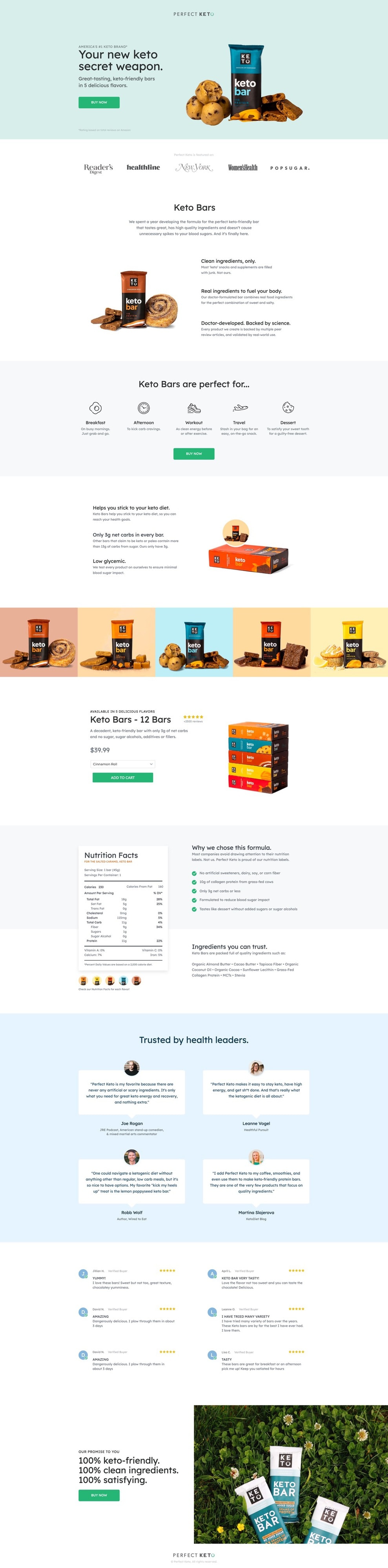
From the matching imagery and copy to the defined call to action, check out how Perfect Keto’s pre-cart landing page provides a consistent and accelerated path to purchase:

When someone clicks one of these ads, they wind up on the Perfect Keto protein bar pre-cart landing page. The header copy tells you why this product is worth your attention—it’s “your new keto secret weapon”—and the hero image shows you exactly what you’re getting, mirroring the chocolate chip flavor featured in many of the social ads. Clicking the “Buy Now” call to action bumps you down the page, where you can add the product directly to your cart.

Jonathan Naccache, President of Webistry, explains how this helps drive more ecommerce conversions:

On-page checkout streamlines the customer’s journey. We let them choose their flavor and quantity, then they can check out right from the page. That way, we can avoid overloading them with too much information and keep them focused on the purchase.
Since ketoers—ketoites?—tend to be a savvy bunch, this page gets into the nitty-gritty, listing the ingredients and nutritional value of each bar. Perfect Keto describes how the product can improve your lifestyle, helping you stick to your diet while still satisfying your sweet tooth. It’s these kinds of details that really help prospects understand the value and make them much more likely to buy.
Now that we’ve talked about the pre-cart landing page, take a look at Perfect Keto’s homepage:

It looks awesome, sure, and the imagery currently matches the chocolate chip flavor our visitors were after—but you can see why this wouldn’t be a great spot to send someone who clicked one of those earlier ads. The other products, the educational content, and the limited-time promotions are only distractions for a visitor who’s already demonstrated buyer intent for protein bars. In contrast, the pre-cart landing page speaks directly to that product, provides all the information a visitor could need, and simplifies the buying process.
#2. Mizzen+Main
The Context:
Here’s an example from Mizzen+Main, a performance menswear retailer that does a ton of its business online. The brand has a monster social following across Facebook and Instagram, where it runs targeted ads like the one below:

When a prospect clicks through this Facebook ad for dress shirts, they find themselves on a pre-cart landing page (built by WITHIN) specifically for that collection.
The Page:

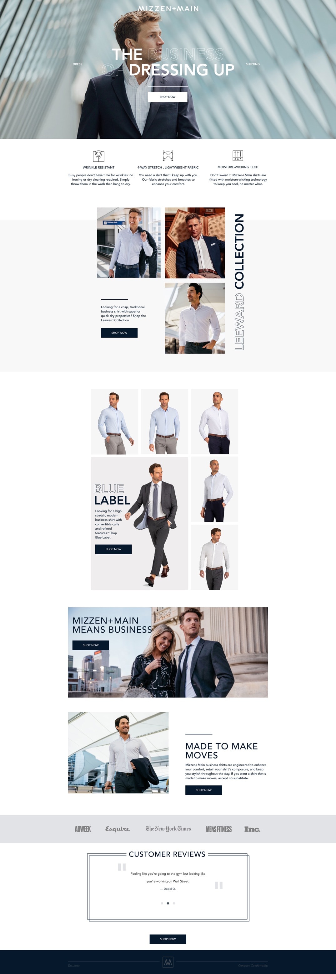
This Mizzen+Main pre-cart landing page uses a hero shot of a sharp-dressed guy with a crisp shirt on his way to do something important. (Lower, we see the same guy from the Facebook ad—nice message match.) The headline tells us we’re in the right place while cleverly speaking to the main product use case: “The business of dressing up.”
And, if we’re ready to buy right now, we can click the “Shop Now” call to action and immediately see Mizzen+Main’s full selection of dress shirts.

But most people still need some convincing before they make a purchase, and that’s when the rest of this pre-cart landing page goes to work.
Mizzen+Main knows that their clothing is all about the visual, so they don’t commit much space to copy. Instead, they highlight just their top three value points—wrinkle resistance, moisture-wicking, stretch fabric—then they get right to what visitors want to see: the shirts in action.
Instead of flat, folded dress shirts, Mizzen+Main uses this space to show off their product in the context of use. Each image is hyperlinked, so visitors who are interested in a particular shirt can click right through to the product page. Add a logo bar featuring authoritative brands like AdWeek and Esquire, and Mizzen+Main closes out with XL social proof that’s sure to help their sales.
Langston McCullough, Digital Marketing Manager at WITHIN, elaborates on the importance of pre-cart landing pages:
By building a cohesive experience between our ads and this landing page, we were able to effectively reinforce our messaging while differentiating Mizzen+Main from competitors.
Something that might make this pre-cart landing page even more effective? Using a popup or sticky bar to reiterate the offer made in the ad and incentivize the purchase each step of the way. Another idea could be to create a variant of the landing page so the headline can match the Facebook ad copy exactly—for example, the “wrinkle resistant” message could replace “the business of dressing up.”

#3. Samuraw
The Context:
Samuraw is a nutritional supplement with two main audiences: one option for adults, one for kids and teens. The brand runs some ads on Google, but unless someone is already searching for something like this product, they’re not likely to see it. Social media, on the other hand, lets Samuraw reach out to their core demographics with messages that resonate.
Check out this ad they’re running on Facebook:

Samuraw explicitly appeals to one of its key audiences—the “supermoms”—and describes the key benefits of Samuraw for children, differentiating itself from competitors that might “cause more harm than good.” Throw in a picture of cute kids enjoying the product and you’ve got yourself an attention-grabbing ad for a nutritional supplement.
The Page:
So, where do people end up when they click one of these ads?

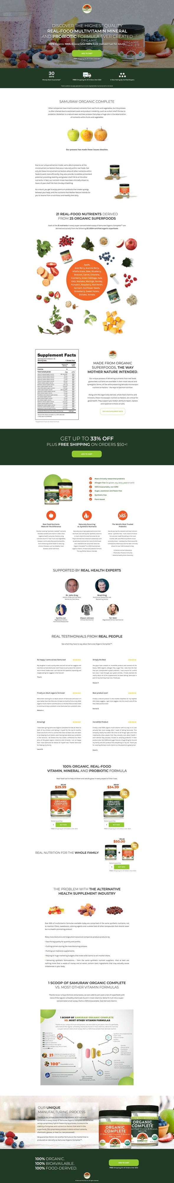
Samuraw’s pre-cart landing page (another built by Webistry) looks a lot like what you’d expect to see. The headline uses language from the ads word-for-word—like “the highest quality multivitamin mineral and probiotic formula ever created”—and the hero image shows the product from the ads alongside a bunch fruit, signaling its nutritional content.
There’s a call to action above the fold prompting visitors to add Samuraw to their cart (and it’ll follow us as a sticky bar as we scroll the page), plus free shipping on orders over $50 as an extra incentive to make the purchase. Like with the Perfect Keto example, this pre-cart landing page accelerates Samuraw’s customer journey from ad to purchase by letting people add products right to their cart.
Moving lower, a series of sections tell us everything we need to know about the product: the main differences from other supplements, the ingredients and nutritional value, the customers and health experts who swear by it. It’s a long page, no doubt. But nutrition is a complex industry, and transparency is essential in establishing trust with potential customers.
This isn’t your conventional landing page. It’s much longer than what we’re used to building, but we wanted to focus on educating the visitor and validating our core differentiators. Our hunch was that our target market is well-read and educated, and they’re wary of false promises. They value being informed.
This was actually our variant page, which we tested against a much shorter counterpart. This version won by a landslide.
Samuraw’s homepage, which is comparatively light on copy, doesn’t as convincingly convey the product value to people who are on the fence.

With added complex nutritional information and added navigation, pointing Samuraw’s Facebook ads here would just as likely distract a prospect as result in a sale.
#4. Cramp Defense

The Context:
Cramp Defense is a magnesium-based supplement that helps people—you guessed it—defend against cramps. As you might imagine, it’s an ecomm product that absolutely benefits from further explanation. Here’s one of the ads you might see if you search “stop leg cramps” on Google:

As with any health-related product, one of Cramp Defense’s main challenges is convincing people that it works. That means the company spends a lot of online real estate providing evidence from medical studies and answering frequently asked questions. The result is a website that’s really informative, but not exactly optimized for sales.

The Page:
Unlike other ecommerce examples, Cramp Defense’s pre-cart landing page isn’t about providing additional product information. It’s about distilling the information that already exists (like from that product overview page) into something more manageable. It’s also about establishing trust with the company’s potential customers.

This page does a lot of work above the fold. The headline introduces the product through a question people probably haven’t asked themselves: “Do your cramps need magnesium?” (Spoiler, yes.) Bullet points quickly highlight some of the key benefits, like “fast results.” There are also a bunch of indicators of legitimacy: “Made in the USA,” “Over 500k Sold,” and the Amazon review score. That’s all followed by a logo bar that features brands like WebMD, BBC, and the Chicago Tribune.
The rest of the pre-cart page explains the science behind the product, but it makes clever use of footnotes (plus an expanding “Read the Full FAQ” button) to lighten the copy and keep people focused on converting. There’s also a sticky bar, which ensures that purchase incentives like free shipping and a money-back guarantee stay top-of-mind.
When someone clicks the “Buy Now” call to action, they’re taken to a page that presents another incentive: discounted prices for buying in bulk. Having already demonstrated their intent to buy, the visitor is a lot more likely to take Cramp Defense up on the offer.

Top-Selling Ecommerce Brands Use Pre-Cart Landing Pages
Let’s close out with a few more ecomm marketing statistics, shall we?
The average cost per click (CPC) for Google search ads is currently around $2. (Same with Facebook ads.) And that number has been rising for years.
Competition for people’s attention online is already fierce, and it’s only getting worse. Successful ecommerce brands are the ones that make the most of every paid click they get. Often, that means using pre-cart landing pages to reflect visitor intent, expand on product value, and streamline the path to purchase.
If your ecommerce brand isn’t already pairing search and social ads with pre-cart landing pages, it’s a great time to start. And with Unbounce’s 100+ high-converting templates, it’s a lot easier than you think.

