
Copy is the lifeblood of your landing page.
You can pour your heart and soul into the design of a page, but if your headline is boring or your body copy is irrelevant, it’ll all be in vain.
Copy is so important that even minor changes (like changes to to a single word) can make a big difference when it comes to your conversion rates…
Not to mention your bottom line.
Yet with tight deadlines and disjointed teams, the left hand doesn’t always know what the right hand is doing. And very often landing landing page copy isn’t succinct.
Let’s take a look at 9 landing pages that suffer from a case of bad copy. Then, lets see what could be done to tighten up the pages… and hopefully convert more traffic.
1. Bizness Apps
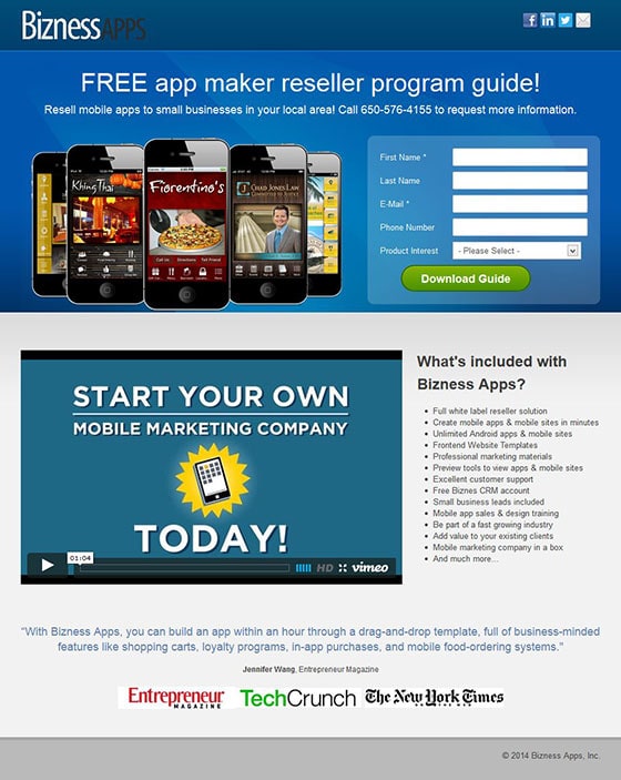
This headline actually hurts my brain
I can see that it’s free, but I’m not entirely sure what “it” is. This headline tells me nothing about the problem that the offer will solve – not to mention the awkward grammar.
On top of that, the sub-headline has call information in it. Make up your mind and choose whether you want the visitor to call or if you’d like them to fill out the form, then focus on that.
Here’s a headline that focuses on the offer and orients the visitor quickly:
How to Build a Business Selling Mobile Apps
This free guide shows you how you can build your own local business selling apps
The body copy doesn’t add value
The body copy talks about what is included in Bizness’ main product rather than focusing on selling the offer on the page. Instead of a list of bullets far too long to read anyway, why not cement the offer with some social proof and a few short bullets about what visitors are going to learn from the guide?
2. Friesenpress Publishing
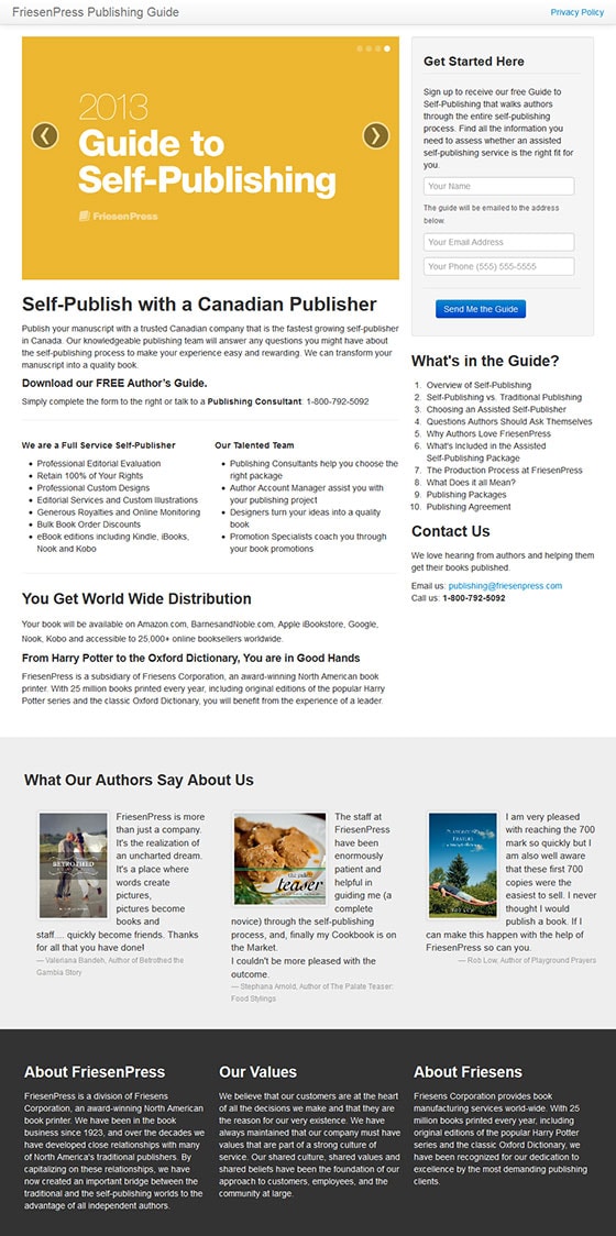
Here’s a new one… a rotating headline
If the point of a landing page is to focus the visitor on one goal, then this one accomplishes the exact opposite with its rotating headline. The sad thing is not one of the headlines in rotation is very good.
Here’s the thing: The headline and copy need to tell the visitor what is being offered on the page. Quickly.
Ask yourself what the real goal of the guide is. It’s to teach the visitor how to self-publish in Canada without hassle, right? The other thing to take into account is that authors interested in this type of service are probably trying to realize a dream – one they’ve likely had for a long time.
With this in mind, let’s try a more customer-centric approach to this headline:
Realize Your Dreams: Learn to Self-Publish in Canada the Right Way
Simple but effective.
3. Gorilla Conferencing
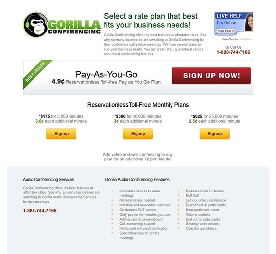
Buy me a drink before you try to close the deal
The very top piece of copy on this page is telling me to select a rate plan. Care to buy me a drink first before trying to close the deal?
This page needs to focus on introducing me to the product and selling me on its merits before telling me that I need to sign up.
Something like this:
Advanced Audio Conferencing With Pay-As-You-Go Pricing
Oh, and exclamation points don’t make your argument more convincing. Use them sparingly… or better yet, not at all.
Consistency in copy goes a long way
Always make sure that you’re consistent in the way you spell words throughout your landing page. If you say “Pay-As-You-Go” in one place, then don’t spell it “Pay As You Go” (without the hyphens) elsewhere.
Consistency will help drive your point home through repetition. Being inconsistent works against you.
The large block of text at the top of the page is useless
I’m willing to bet that only a tiny percentage of visitors actually read the paragraph at the top of the page. Aside from being repetitive, the paragraph is too long and reading it feels like a chore.
Break up your paragraphs to make copy easy to scan. It will help you get your point across.
4. LinkedIn Sales Solutions
Finally, a benefit-driven headline! But…
…the sub-headlines are useless.
Why put in all that work grabbing my attention, just to squander it with a floating sentence like, “Request free demo?”
You need to tell me why I need to see the demo in the first place. To do that, LinkedIn needs to tie the benefits from the headline (higher quality sales leads and more pipeline) back to the offer.
Here’s an example:
Find Higher Quality Sales Leads and Generate More Pipeline
Watch a 5 minute demo and learn how LinkedIn can deliver better leads to you
Next, hammer the point home
Don’t stop there. In point form, tell me exactly what I’m going to learn in the demo. Like this:
In this quick demo you’ll learn:
- How LinkedIn helps you find the right people in less time
- Key insights and information about your leads not found in traditional lead gen
- Easy ways to eliminate cold calling and pre-qualify leads
Pretty straightforward, right?
Seal the deal
This should go without saying, but can we please stop using “submit” for calls to action? That phrasing doesn’t exactly inspire any action from the visitor. How about something like this:
“Watch the Demo”
5. Minneapolis Media Institute
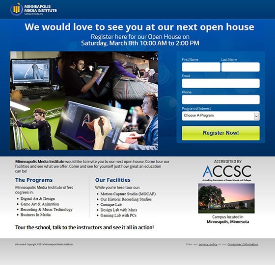
Wait… are you selling houses?
How about some context? What is the open house that you’re holding, and why should I care about it?
The only reason I’d want to go to an open house is if I was interested in attending the school. So first sell me on the school, then sell me on the open house.
Here’s an example:
Get access to all the tools you need to launch your career
More inspiring, right?
The cart is pulling the horse
All of the body copy on this page is found below the form and the main image. The problem with this is that the body copy explains what I will get at the open house. In order for the page to flow logically, the copy should be moved up to the top of the page, under the headline.
Oh, and it would be nice to have at least one testimonial from a student who not only attended the school, but is also working in their chosen career.
6. Online Trading Academy
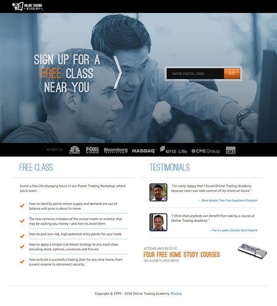
Am I signing up or am I searching for a class?
There is a disconnect between the headline and the form on the right. If I’m signing up for a class, why do I need to fill in my postal code? Am I signing up or searching for a class? Something feels off.
A better approach would be to first sell me on the class and then tell me that I can search for the nearest one. Which brings me to my next point…
Why do I want a free class?
You haven’t even told me yet what the class is about or how I will benefit from it. The leading headline should be something like this:
Learn the Art of Power Trading
Find a free workshop near you and discover how to build a successful trading plan that fits your life
Use testimonials that matter
These testimonials fall flat on their face because they are not specific. Powerful testimonials are examples of exactly how someone else benefitted from the class, not vague claims that “anybody can benefit.”
7. Savo Group
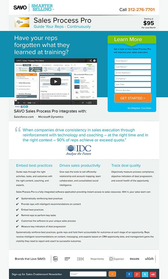
You build me up just to shoot me down
Why yes, my reps have forgotten what they learned in training. Now what do I do?
If you use a question as a headline, you need to answer that question with an action for the visitor to take if they say yes.
Here’s an example:
Have Your Reps Forgotten What They Learned At Training?
Watch this 1 minute video to discover how SAVO can help your sales team drive more sales through continued online coaching
This technique will get your visitors moving in the right direction… if of course your question hits home with their needs.
8. Soffront
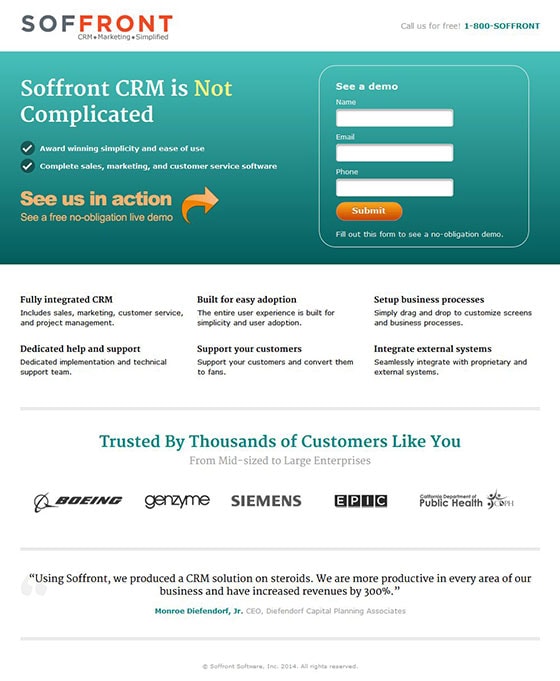
I think this headline takes the cake for worst of the bunch.
Which would you rather have: a piece of software that is “not complicated,” or a piece of software that is easy-to-use and time-saving?
Consider this instead:
Easy-To-Use Contact Management Tools
Build relationships. Save time. Make more sales.
The headline above is much more likely to resonate with leads who have experienced the chronic pain that the service solves.
Be clear, not clever
Statements like “See us in action” don’t add value to the page. What does that even mean? Even something more specific like “See Soffront in action” would be terrible.
The whole reason why a visitor would want to “see it in action” is to gain some sort of benefit. So why not lay out that benefit in plain terms:
Watch our free demo and see just how easy your workflow can be
Are you selling a demo, or a solution?
The title of the opt-in form box is, “See a demo.” You sure sold me there!
Instead of completely wasting this space, try a title that ties in a benefit while dispelling any objections (like a long demo done by an annoying sales rep). How’s this:
View the 5 minute demo instantly and see how Soffront works
Submit?
… ‘nuff said.
9. Sungard
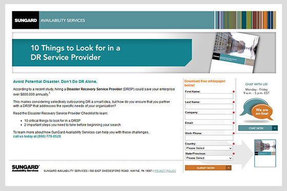
Don’t use acronyms in your headline copy
Don’t take for granted that all visitors will know your jargon. Instead, spell everything out as if you were explaining it to someone at a party.
Also, the way this headline is written is pretty dull. Try to use direct words that have a deciding action associated with them. Instead of “look for” we can use “choose.”
Here’s an example of what I mean:
10 Ways to Choose the Right Disaster Recovery Provider
It’s your turn
I hope that you’ve seen a recurring thread in these examples.
Clarity and focus are key to having a successful landing page. Keep your copy focused on the offer and its benefits. ALL of the copy – your headlines, your testimonials, your body copy and bullets.
Do this and you too shall prosper.
See you in the comments!
