
You’re probably used to reading posts that run through a number of A/B test examples. But how often do you get the chance to read an article that gives you an in-depth look at a single case study?
Today I’m going give you a detailed look at a simple A/B test that increased sign-ups on a betting forum by 31.54%. The point is to give a deeper understanding of what goes into conducting a valuable split test that provides you with both insights and lifts.
Background information
Client: Bettingexpert.com – a free betting community where tipsters from all over the world can share betting tips, tools, data, and much more
Page: Home Page Bettingexpert.com
Optimization goal: Increase number of signups/new members

Page Diagnosis
From experience, I know that it’s not always the biggest changes on the page that result in the biggest lifts. Making strategic changes to mission critical elements will often result in dramatic improvements. Instead of focusing on how much the change impacts the page itself, I’ve learned to focus on how much the change will impact the decisions of potential customers.
So when BettingExpert.com approached me and asked if I could help them increase the number of sign-ups via their home page, I immediately honed in on the most mission critical and prominent page element – the sign-up form itself.
Both the design and placement of the form work well. So at first, I didn’t see any particular need to make any changes here. The form copy however is another story, and I saw a lot of potential for improvement.
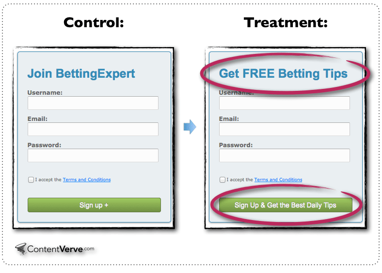
At first glance, the original from copy is pretty decent and does an okay job of clarifying the purpose of the form. The header says: “Join BettingExpert” and the button copy says: “Sign Up+”
However, the form copy doesn’t convey any value whatsoever and does nothing to answer the question: “Why should I fill out this form and give you my email?”
In other words, the form copy lacks both relevance and value – two of the main things to focus on if you want to write web copy that converts.

A/B Test Hypothesis and Treatment A
When I created the treatment, I focused on increasing the relevance and value communicated by the header and button copy. In other words – I focused on answering the question “Why should I fill out this form?”
The main – and most tangible – benefit of becoming a member of BettingExpert.com is that you can get free betting tips from top tipsters on a daily basis.
Based on experience from similar tests, I hypothesized that I could accelerate the decision-making process of the prospects and increase signups by focusing the form copy on the main benefit.
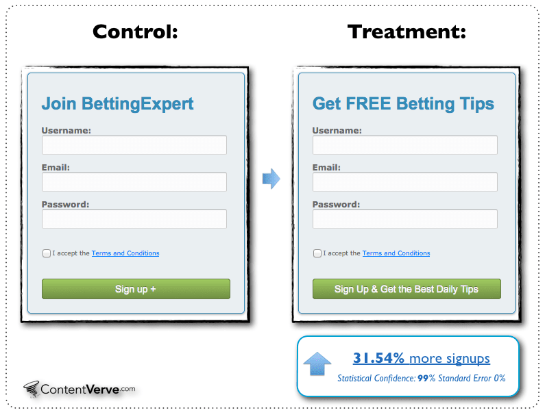
In my treatment the header says: “Get FREE Betting Tips” and the button copy says: “Sign Up & Get the Best Daily Tips”
A clear A/B test hypothesis is absolutely essential if you want to conduct clean and valuable A/B tests that provide you with both insights and lifts. To learn more about how to create a clear test hypothesis read this article.
A/B Test Setup
In order to find out whether my hypothesis would hold water and increase conversions, I set up a simple A/B test with the Control Variant (A) and my Treatment (B).
There are dozens of different tools you can use to conduct split tests, but in my opinion there is no reason to make your test setup more complicated than absolutely necessary. For experiments such as this I prefer to use tools that allow me to create variations and set up tests easily without having to mess around with code.
Check out this video to see how to set up a split test in 3 minutes with no knowledge of code.
Test Results and Validation
I ran the test for 9 days and reached a sample size of 13.560 visitors, and 291 conversions. The standard error was 0%, and the statistical confidence was 99%. From the beginning to the end, the treatment outperformed the control variant – at no point did the control take the lead. The Treatment increased signups by 31.54%.
Test validation and statistics are some of the less sexy aspects of testing – nevertheless, they are extremely important because there really is no point in testing, if you can’t rely on your tests results.
When validating your test results there are 3 basic factors that you NEED to look at:
- Confidence Level
- Conversion range
- Sample size
The big problem for most marketers is that they either pay no attention to these three factors, or focus only on one of them.
But you really need to be aware of all three factors in order to perform valid experiments that provide true and lasting value to your online business.
Check out this 10-minute video and get a basic introduction to test validation and determining the statistical significance of a split test:
What I learned
This test did more along the lines of confirming what I’d learned from previous experiments than actually opening my eyes to something new. But here’s a rundown of the main takeaways of the test:
The copy you use in your signup form has direct and measurable effect on your conversion rate. The tweaks described in this article may seem insignificant from a usability or design stance, nonetheless, they directly influenced the decisions of the prospects and generated a serious lift in conversions.
When you ask prospects to do something online, you will automatically start an internal dialogue in their heads. They need to assess whether the potential benefits of what you’re offering them outweigh what they have to do – or part with – in order to get it.
In connection with mission critical elements like sign-up forms, it’s important to clarify the value of your proposition so you can give your prospects a good reason to carry out the conversion goal.
Follow-up Experiments
Just because you’ve conducted one successful experiment doesn’t mean that you’ve found the best solution or that you should stop experimenting. In fact, I usually use the first test as a sort of “warm-up,” setting the scene for more experiments. Moreover, the first test will give you some initial insight and an idea of how much it takes to influence the actions of your prospects.
In this case, I followed up with an experiment where I tweaked both the headline and the form copy – as opposed to just the form copy. This simple exercise in clarifying value and adding relevance resulted in an additional 3.65% increase in sign-ups.
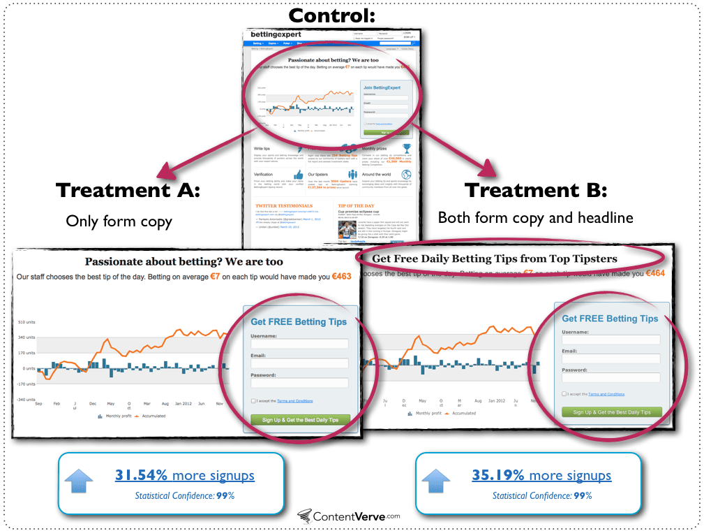
I’m by no means done experimenting with this page, and I’ve conducted several other follow-up experiments that include button size, button color, and a different value prop.
All right, so this was a closer look at some of the formalities that go into conducting a valuable and clean A/B test. Now all you have to do is get started on your own website – 1, 2, 3- GO!