
Back in 2015, Unbounce launched its first ever exit popup on this very blog.
Did it send our signup rate skyrocketing 4,000%? Nope.
Did it turn our blog into a conversion factory for new leads? Not even close — our initial conversion rate was barely over 1.25%.
But what it did do was start us down the path of exploring the best ways to use this technology; of furthering our goals by finding ways to offer visitors relevant, valuable content through popups.
In this post, we’ll break down all the wins, losses and “holy smokes!” moments from our first 2,345,864 exit popup viewers.
Goals, tools and testing conditions
Our goal for this project was simple: Get more people to consume more Unbounce content — whether it be blog posts, ebooks, videos, you name it.
We invest a lot in our content, and we want it read by as many marketers as possible. All our research — everything we know about that elusive thing called conversion, exists in our content.
Our content also allows readers to find out whether Unbounce is a tool that can help them. We want more customers, but only if they can truly benefit from our product. Those who experience ‘lightbulb’ moments when reading our content definitely fit the bill.
Testing conditions were as follows:
- All popups were triggered on exit; meaning they launched only when abandoning visitors were detected.
- For the first three experiments, we compared sequential periods to measure results. For the final two, we ran makeshift A/B tests.
- When comparing sequential periods, testing conditions were isolated by excluding new blog posts from showing any popups.
- A “conversion” was defined as either a completed form (lead gen popup) or a click (clickthrough popup).
- All experiments were conducted between January 2015 and November 2016.
Experiment #1: Content Offer vs. Generic Signup
Our first exit popup had a simple goal: Get more blog subscribers. It looked like this.
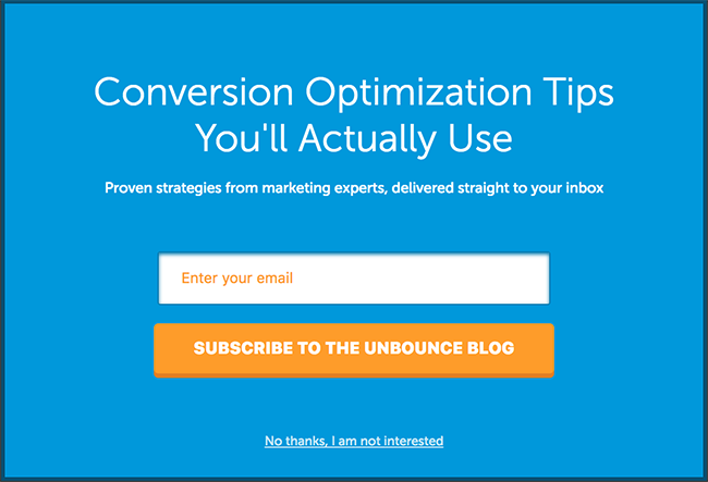
It was viewed by 558,488 unique visitors over 170 days, 1.27% of which converted to new blog subscribers. Decent start, but not good enough.
To improve the conversion rate, we posed the following.
HYPOTHESIS
Because online marketing offers typically convert better when a specific, tangible offer is made (versus a generic signup), we expect that by offering a free ebook to abandoning visitors, we will improve our conversion rate beyond the current 1.27% baseline.
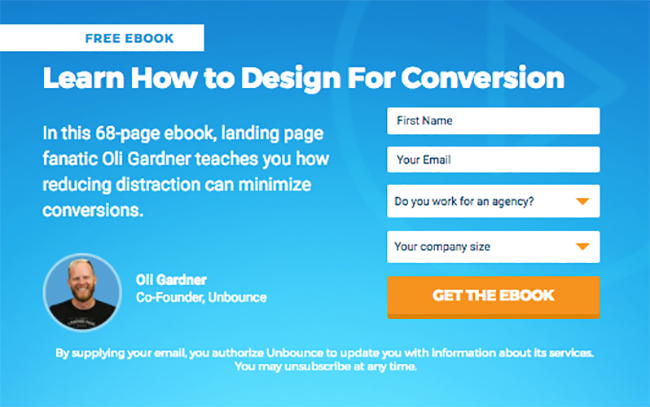
Whereas the original popup asked visitors to subscribe to the blog for “tips”, the challenger popup offered visitors The 23 Principles of Attention-Driven Design.
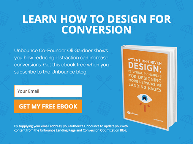
After 96 days and over 260,000 visitors, we had enough conversions to call this experiment a success. The popup converted at 2.65%, and captured 7,126 new blog subscribers.
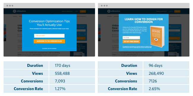
Since we didn’t A/B test these popups, our results were merely observations. Seasonality is one of many factors that can sway the numbers.
We couldn’t take it as gospel, but we were seeing double the subscribers we had previously.
Observations
- Offering tangible resources (versus non-specific promises, like a blog signup) can positively affect conversion rates.
Stay in the loop and get all the juicy test results from our upcoming overlay experiments
Experiment #2: Four-field vs. Single-field Popups
Data people always spoil the party.
The early success of our first experiment caught the attention of Judi, our resident marketing automation whiz, who wisely reminded us that collecting only an email address on a large-scale campaign was a missed opportunity.
For us to fully leverage this campaign, we needed to find out more about the individuals (and organizations) who were consuming our content.
Translation: We needed to add three more form fields to the popup.
Since filling out forms is a universal bummer, we safely assumed our conversion rate would take a dive.
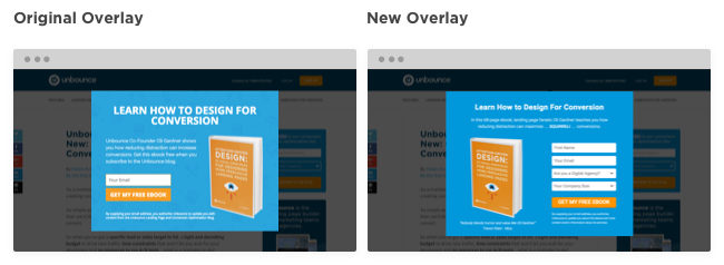
But something else happened that we didn’t predict. Notice a difference (besides the form fields) between the two popups above? Yup, the new version was larger: 900x700px vs. 750x450px.
Adding three form fields made our original 750x450px design feel too cramped, so we arbitrarily increased the size — never thinking there may be consequences. More on that later.
Anyways, we launched the new version, and as expected the results sucked.
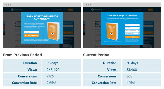
For business reasons, we decided to end the test after 30 days, even though we didn’t run the challenger popup for an equal time period (96 days).
Overall, the conversion rate for the 30-day period was 48% lower than the previous 96-day period. I knew it was for good reason: Building our data warehouse is important. Still, a small part of me died that day.
Then it got worse.
It occurred to us that for a 30-day period, that sample size of viewers for the new popup (53,460) looked awfully small.
A closer inspection revealed that our previous popup averaged 2,792 views per day, while this new version was averaging 1,782. So basically our 48% conversion drop was served a la carte with a 36% plunge in overall views. Fun!
But why?
It turns out increasing the size of the popup wasn’t so harmless. The size was too large for many people’s browser windows, so the popup only fired two out of every three visits, even when targeting rules matched.
We conceded, and redesigned the popup in 800x500px format.
Daily views rose back to their normal numbers, and our new baseline conversion rate of 1.25% remained basically unchanged.
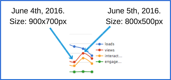
Large gap between “loads” and “views” on June 4th; narrower gap on June 5th.
Observations
- Increasing the number of form fields in popups can cause friction that reduces conversion rates.
- Popup sizes exceeding 800×500 can be too large for some browsers and reduce load:view ratio (and overall impressions).
Experiment #3: One Popup vs. 10 Popups
It seemed like such a great idea at the time…
Why not get hyper relevant and build a different exit popup to each of our blog categories?
With our new baseline conversion rate reduced to 1.25%, we needed an improvement that would help us overcome “form friction” and get us back to that healthy 2%+ range we enjoyed before.
So with little supporting data, we hypothesized that increasing “relevance” was the magic bullet we needed. It works on landing pages — why not popups?
HYPOTHESIS
Since “relevance” is key to driving conversions, we expect that by running a unique exit popup on each of our blog categories — whereby the free resource is specific to the category — we will improve our conversion rate beyond the current 1.25% baseline.
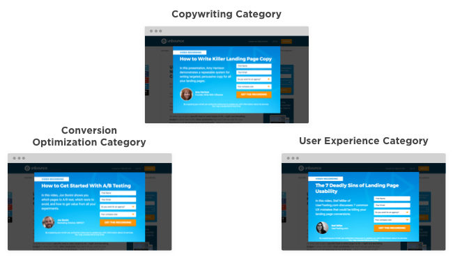
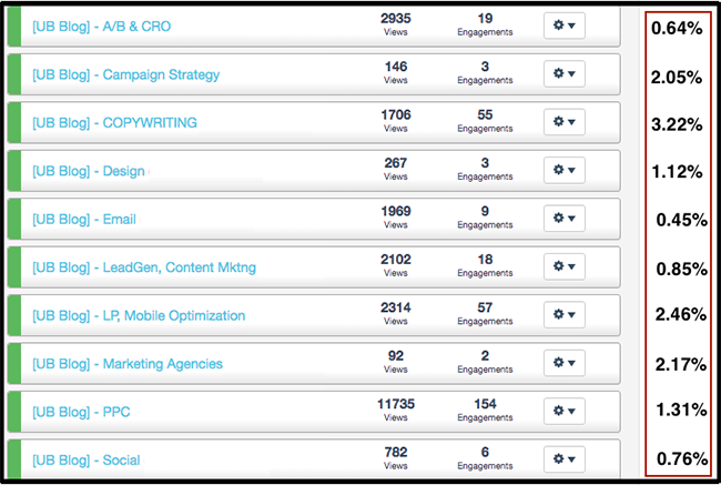
We divide our blog into categories according to the marketing topic they cover (e.g., landing pages, copywriting, design, UX, conversion optimization). Each post is tagged by category.
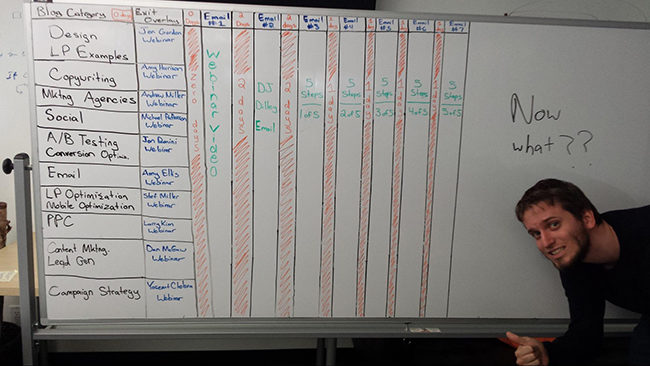
So to increase relevance, we created a total of 10 exit popups (each offering a different resource) and assigned each popup to one or two categories, like this:
Creating all the new popups would take around three hours, but since we already had a deep backlog of resources on all things online marketing, finding a relevant ebook, course or video to offer in each category wasn’t difficult.
And since our URLs contain category tags (e.g., all posts on “design” start with root domain unbounce.com/design), making sure the right popup ran on the right post was easy.
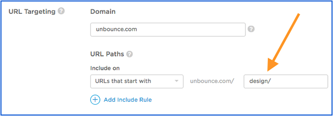
URL Targeting rule for our Design category; the “include” rule automatically excludes the popup from running in other categories.
But there was a problem: We’d established a strict rule that our readers would only ever see one exit popup… no matter how many blog categories they browsed. It’s part of our philosophy on using popups in a way that respects the user experience.
When we were just using one popup, that was easy — a simple “Frequency” setting was all we needed.
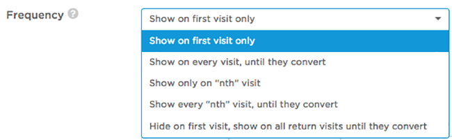
…but not so easy with 10 popups running on the same blog.
We needed a way to exclude anyone who saw one popup from seeing any of the other nine.
Cookies were the obvious answer, so we asked our developers to build a temporary solution that could:
- Pass a cookie from an popup to the visitor’s browser
- Exclude that cookie in our targeting settings
They obliged.
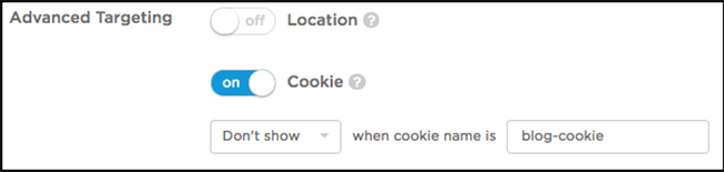
We used “incognito mode” to repeatedly test the functionality, and after that we were go for launch.
Then this happened.
After 10 days of data, our conversion rate was a combined 1.36%, 8.8% higher than the baseline. It eventually crept its way to 1.42% after an additional 250,000 views. Still nowhere near what we’d hoped.
So what went wrong?
We surmised that just because an offer is “relevant” doesn’t mean it’s compelling. Admittedly, not all of the 10 resources were on par with The 23 Principles of Attention-Driven Design, the ebook we originally offered in all categories.
That said, this experiment provided an unexpected benefit: we could now see our conversion rates by category instead of just one big number for the whole blog. This would serve us well on future tests.
Observations
- Just because an offer is relevant doesn’t mean it’s good.
- Conversion rates vary considerably between categories.
Experiment #4: Resource vs. Resource
“Just because it’s relevant doesn’t mean it’s good.”
This lesson inspired a simple objective for our next task: Improve the offers in our underperforming categories.
We decided to test new offers across five categories that had low conversion rates and high traffic volume:
- A/B Testing and CRO (0.57%)
- Email (1.24%)
- Lead Gen and Content Marketing (0.55%)
Hypothesis
Since we believe the resources we’re offering in the categories of A/B testing, CRO, Email, Lead Gen and Content Marketing are less compelling than resources we offer in other categories, we expect to see increased conversion rates when we test new resources in these categories.
With previous studies mentioned in this post, we compared sequential periods. For this one, we took things a step further and jury-rigged an A/B testing system together using Visual Website Optimizer and two Unbounce accounts.
And after finding what we believed to be more compelling resources to offer, the new test was launched.
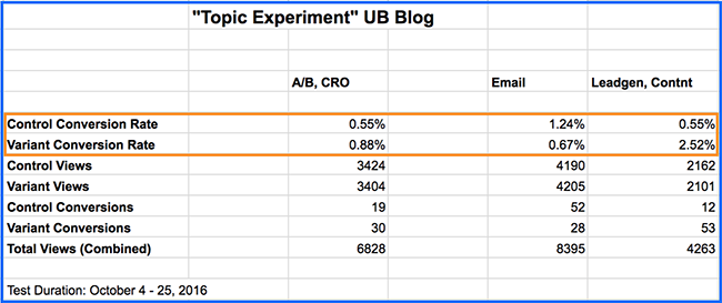
We saw slightly improved results in the A/B Testing and CRO categories, although not significant. For the Email category, we saw a large drop-off.
In the Lead Gen and Content Marketing categories however, there was a dramatic uptick in conversions and the results were statistically significant. Progress!
Observations
- Not all content is created equal; some resources are more desirable to our audience.
Experiment #5: Clickthrough vs. Lead Gen Popups
Although progress was made in our previous test, we still hadn’t solved the problem from our second experiment.
While having the four fields made each conversion more valuable to us, it still reduced our conversion rate a relative 48% (from 2.65% to 1.25% back in experiment #2).
We’d now worked our way up to a baseline of 1.75%, but still needed a strategy for reducing form friction.
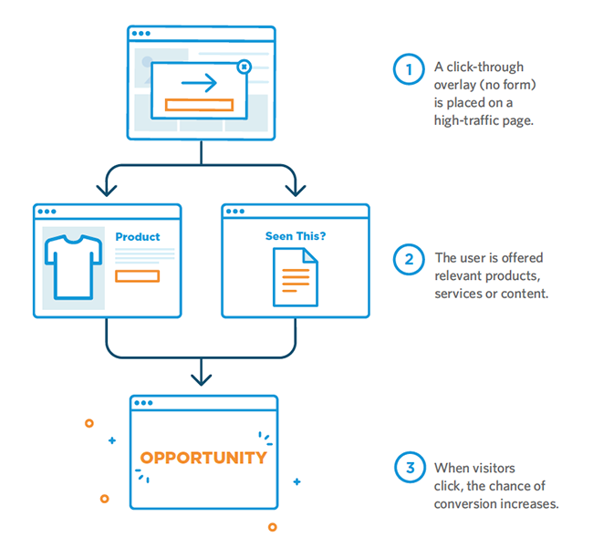
The answer lay in a new tactic for using popups that we dubbed traffic shaping.
Here’s a quick illustration:
Converting to this format would require us to:
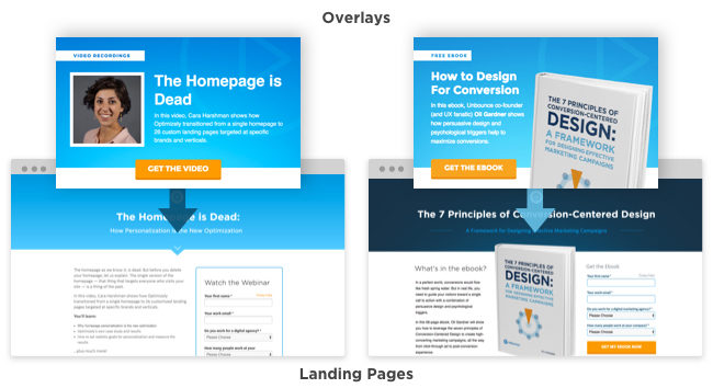
- Redesign our exit popups
- Build a dedicated landing page for each popup
- Collect leads via the landing pages
Basically, we’d be using the popups as a bridge to move readers from “ungated” content (a blog post) to “gated” content (a free video that required a form submission to view). Kinda like playing ‘form field hot potato’ in a modern day version of Pipe Dream.
Hypothesis
Because “form friction” reduces conversions, we expect that removing form fields from our popups will increase engagement (enough to offset the drop off we expect from adding an extra step). To do this, we will redesign our popups to clickthrough (no fields), create a dedicated landing page for each popup and add the four-field form to the landing page. We’ll measure results in Unbounce.
By this point, we were using the Unbounce Builder to create the entire campaign: the clickthrough popups were built in Unbounce using drag and drop, and the landing pages were copied over (and updated) from existing campaigns (that already offered the resources)
We decided to test this out in our A/B Testing and CRO as well as Lead Gen and Content Marketing categories.
After filling out the form, visitors would either be given a secure link for download (PDF) or taken to a resource page where their video would play.
Again, for this to be successful the conversion rate on the popups would need to increase enough to offset the drop off we expected by adding the extra landing page step.
These were our results after 21 days.
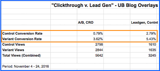
Not surprisingly, engagement with the popups increased significantly. I stress the word “engagement” and not “conversion,” because our goal had changed from a form submission to a clickthrough.
In order to see a conversion increase, we needed to factor in the percentage of visitors who would drop off once they reached the landing page.
A quick check in Unbounce showed us landing page drop-off rates of 57.7% (A/B Testing/CRO) and 25.33% (Lead Gen/Content Marketing). Time for some grade 6 math…
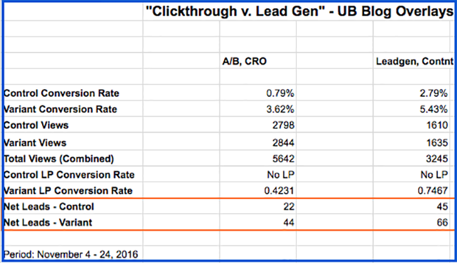
Even with significant drop-off in the landing page step, overall net leads still increased.
Our next step would be applying the same format to all blog categories, and then measuring overall results.
Onward!
All observations
- Offering specific, tangible resources (vs. non-specific promises) can positively affect conversion rates.
- Increasing the number of form fields in popups can cause friction that reduces conversion rates.
- Popup sizes exceeding 800×500 can be too large for some browsers and reduce load:view ratio (and overall impressions).
- Just because an offer is relevant doesn’t mean it’s good
- Conversion rates vary considerably between blog categories
- Not all content is created equal; some resources are more desirable to our audience.
- “Form friction” can vary significantly depending on where your form fields appear.
Stay tuned…
We’re continuing to test new triggers and targeting options for popups, and we want to tell you all about it.
So what’s in store for next time?
- The Trigger Test — What happens when we test our “on exit” trigger against a 15-second time delay?
- The Referral Test — What happens when we show different popups to users from different traffic sources (e.g., social vs. organic)?
- New v.s. Returning Visitors — Do returning blog visitors convert better than first-time visitors?
