The examples presented in the infographic below should be used to inspire thought, but more importantly to remind you of the importance of testing, and that you should employ a process for conversion rate optimization.
A word of caution: don’t think that because one test shows success, that the same change will work for you. Each business has different visitors and customers and each requires a different approach to the creation of a testing hypothesis.
As an example; one of the Performable tests highlighted in the graphic showed a conversion lift of 21% by changing the button color from green to red. Sometimes, micro changes can cause big improvements – but more often than not they cause micro improvements (or no improvement at all). This is where it becomes important to understand the process of Conversion Rate Optimization (CRO).
What we can learn from the Infographic
Here are a few of the important data and case study highlights from the infographic and what they can mean for your conversion rates:

- Trust badges work: Read How To Use Trust Symbols to Increase Conversions and 15 Ways to Increase Trust in Your Landing Pages for more examples.
- Place trust symbols and price discounts close to your call to action buttons for increased conversions.
- If you have a free version of your product (or what you are giving away on a particular page is free) – using the word “Free” can increase conversions.
- Use clear and direct language in your sales messaging (i.e. describe exactly what people will be getting by investing time, effort and money in your site and products).
- Remember ABT: Always be testing…
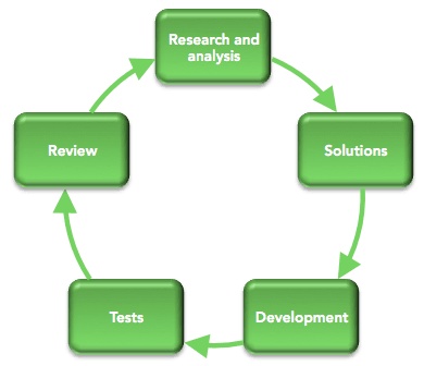
The Importance of Process in CRO
Stephen Pavlovitch from Conversion Factory name gave a great presentation about the conversion rate optimization process on Day 2 of MOZcon, where he reminded the audience about the importance of using a thoughtful process for optimization.

For better results from your A/B testing, form your hypothesis based on research and feedback from your visitors and customers. Then make larger changes based on this insight.
For more detail on this concept, read “What are Your Visitors Thinking When They Should be Clicking?“.
Stephen also (very transparently) pointed out that it’s likely that many of your tests won’t be successful – perhaps only 1 in 3 will result in improved results – but that this is okay.
And as one of my first bosses (London 1998) used to tell me every time I hit a brick wall:
“If it was easy, everyone would be doing it…”

