
Some people hate forms. In fact, nearly everybody hates forms. Fill this in, give me your details, do not pass go until you’ve told me your mothers maiden name. How rude. Personally I love forms. Why? Because I get to write about how annoying they are and how to make them less so.
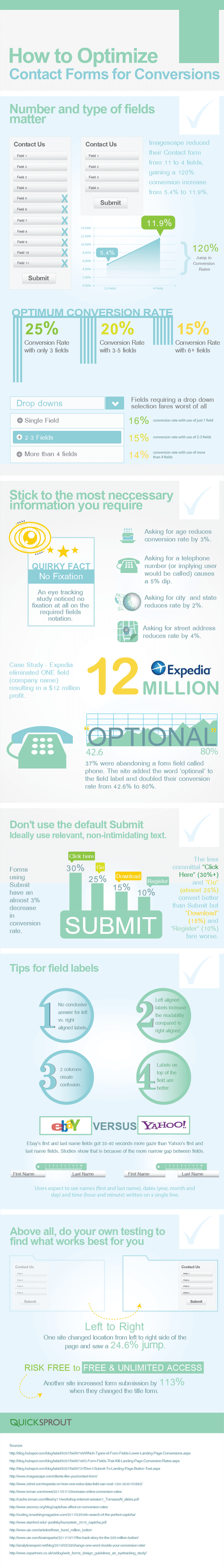
My biggest pet peeve (pet? let’s say “form” peeve), is when people don’t express what the button will do when it’s clicked, but thanks to some studies done from the infographic below, we can see that using the dreaded word “Submit” as your form CTA copy, reduces conversion rates by around 3% . For that reason I’m bringing back the image, a quote written by Unbounce’s Ryan Engley. Never Submit.
What can you do to optimize your lead gen forms?
Every marketer wants to optimize their forms to get more leads, but how do you do it? Let’s look at a few ways before you dig into the infographic:
- Test the button copy: Apparently “Click Here” and “Go” are the most successful. Personally, I’d like to test this against a very specific CTA – such as “Click here to download your ebook,” using the power words of “Click Here” with a more descriptive element.
- Form length really does matter: If you want to increase form conversions, you must consider reducing the number of fields. An example presented in the infographic highlights one company that increased conversions by 120% by reducing their form from 11 fields down to 4. Clearly it’s worth sacrificing that extra information to get such a high conversion rate. If you really need extra info, consider doing an a/b/c test where you compare all of your fields with the absolute minimum and a half-way version to determine which converts best – and then weigh it against the value of the extra data collected, and see how it will impact your post-click marketing.
- Don’t call me: An average 5% dip in conversion rate by including a phone number field. Unless your business is based on post-click sales calls, avoid this field at all cost. Not many people like to have someone call them (unless it’s critical to their personal success).
My advice, test your forms constantly – and use the advice from the infographic below as a starting point. You might also want to tweet about some of these cool stats with the Tweetables at the bottom of the post.
Tweetable Tips
You can change what gets tweeted before it goes out, so don’t be afraid to click.
- Forms using Submit have an almost 3% decrease in conversion rate
- Expedia eliminated ONE field (company name) resulting in a $12 million profit
- Asking for a phone number causes a 5% dip in conversion rate
- Imagescape reduced their contact form from 11 to 4 fields, gaining a 120% conversion increase
- Left aligned labels increase the readability compared to right aligned


Comments:
Google Caves on Ad Group–Level Mobile Bids + MORE
[…] How To Optimize Contact Forms For Conversions [Infographic] […]
wpveteran.com
Great info.
Learned 3 things from it. Specifics CTA, Less Field Forms, Don’t ask to much, Try to put your forms on right sidebar.
Thanks Oli
Chase
Interestingly enough, I tested two versions of my landing pages: one with a form in the right sidebar, and one with a big CTA that took visitors to a second page with a form. The pages with the CTA had double the conversion rate. It’s a high value product so that obviously affects things, but it was definitely interesting.
How To Optimize Contact Forms For Conversions [Infographic] – Unbounce « The Marketing Automation Alert
[…] See the article at unbounce.com […]
The Top 12 Marketing Automation Articles Curated Today, Monday, 4/15/13 « The Marketing Automation Alert
[…] How To Optimize Contact Forms For Conversions [Infographic] – Unbounce […]
Fresh Pressed: 4/18/2013 | CopyPressed
[…] How To Optimize Contact Forms For Conversions [Infographic] […]
Ashley F
Fantastic summary in visual form- Infographic!! I recently wrote about choosing the right plugin for wordpress, so I think linking to this will really help my readers even further!
Great job Oli
Adding a Wordpress Contact Form - The Easy Way - Mad Lemmings
[…] One week after writing this I stumbled upon this great infographic on optimizing contact forms which can take your above choice to the next […]
Chase
Do you know what I want to know: what ELSE to put on your contact page to optimize it. I can’t touch the fields on our forms or the Sales team will kill me, so that option is out the window. However, I have control over all other elements on the page, especially sidebar items.
Funny thing is, I can’t find a single article online about how to optimize this space, or what other kinds of things you can put on the page with your contact form to increase conversions.
We have about 15 different contact forms in 15 different languages. All of them look the same and yet conversion rates range from 7% to 40%. There must be ways I can optimize the page around the form to increase conversions.
Raul
I never thought that the word “submit” could reduce conversion in contact forms, but it really makes sense, I think that people prefer words that they associate better with sending a contact form
Tyinternety.cz | Facebook od A do Z. Lekce sedmá: Aplikace za hranicemi Facebooku
[…] konverzního poměru při průchodu registračním formulářem je věda, která může přinášet větší výkon než kampaně za statisíce. Na co se ptát, kdy, ve které fázi a jak? Modrobílá tlačítka, […]
How To Optimize Contact Forms For Conversions
[…] Other sources, Contact Form Optimization infographic: http://unbounce.com/conversion-rate-optimization/how-to-optimize-contact-forms/ […]
17 Examples of Lead Gen Forms Optimized for Conversion | Ross Bloomfield.com
[…] post was inspired by a previous Unbounce post, How To Optimize Contact Forms For Conversions [Infographic]. Further down, I’ll give you 17 live form examples, each with a short critique, but for now, […]
Better Contact Form
Oli, I agree with you. An user friendly contact form will help to increase the conversions.
That is the reason we made our contact form simple, easy to use and responsive. http://bettercontactform.com
Also, we don’t use CAPTCHA as it is hard for users and may put them off. We use real SPAM patterns and user behavior to verify and stop spam. Eg:
– Users can not enter and submit form less than 10 seconds.
– Users can not submit form without click on Send button or type “Enter”
– And many other spam patterns…
20 Marketing Insights That Inspired Us In 2013 «Internet Marketing Reviews
[…] lounge emblazoned with this quote from our customer support director Ryan Engley. Remember, your call-to-action button should never, ever say “Submit,” which doesn’t tell potential customers anything […]
6 Ways To Hack Conversions By Building Better Calls To Action | Spinnakr Blog
[…] and email address? Do you need to know the customer’s company? Their position at the company? Unbounce notes that one company saw a 120% increase in conversions by reducing their form fields from 4 to 11. It […]
20 Marketing Insights That Inspired Us In 2013 - Marketing News | Marketing News
[…] lounge emblazoned with this quote from our customer support director Ryan Engley. Remember, your call-to-action button should never, ever say “Submit,” which doesn’t tell potential customers anything […]
20 Marketing Insights That Inspired Us In 2013
[…] lounge emblazoned with this quote from our customer support director Ryan Engley. Remember, your call-to-action button should never, ever say “Submit,” which doesn’t tell potential customers anything […]
Top 5 Tips for PPC Landing Page Conversion
[…] If you don’t need their phone number or their company, don’t ask for it. One company managed to increase their form conversions by 120% just by taking their form fields down from 11 to […]
Want More Conversions? Offer Less Options! - Vici Media Inc
[…] like the “submit” button can increase your conversions. “Submit” was found in another study to decrease conversions by 3%. What works better? “Click here,” “Go,” […]
Conversion Rate Optimization for Shopping Carts
[…] of little changes you can make on this page to increase your conversion rate. Generally speaking, form length and conversion rate are inversely correlated, so the fewer fields you have customers fill out, the better your offer will […]
QPT 005 - Marketing Your Website? Forget Yourself. - Grainhappy
[…] Optimize your contact form! (http://unbounce.com/conversion-rate-optimization/how-to-optimize-contact-forms/) […]
7 Web Form UX Tips to Design with Words
[…] and it’s less overwhelming. After cutting form fields and going from 11 to 4 questions total, one company increased conversions by 120%! So keep your words lean and take away anything that’s not […]
5 Ways to Increase Conversions With Forms | Blog
[…] clear of invasive questions like asking for their age, if possible (reduces conversion rate by 3%) or phone number (reduces conversion rate by […]
Your lead-gen form sucks | Dave Holsinger: not the composer
[…] who were guilty of overloading forms with up to 13 fields. Seriously, 13. Any more than 3 and you risk losing conversions. That’s far from the only crime against would-be customers out there, though. There is plenty […]
Nassir Khodesh
Oli Gardner cannot be trusted.
I repeat: Oli Gardner cannot be trusted.
His optimization techniques are unproven.
Run for your lives. Women and children first.
Quickly, everyone. Quickly.
Cómo eliminar opciones para mejorar la Conversión (CRO)
[…] ellos y su optimización. Por ponerte un ejemplo, esta infografía del blog de Unbounce acerca de Cómo Optimizar los Formularios de Contacto (en inglés) deja claros algunos principios […]
Should You Really Reduce Form Fields?
[…] “If you want to increase form conversions, you must consider reducing the number of fields. If you really need extra info, consider doing an a/b/c test where you compare all of your fields with the absolute minimum and a half-way version to determine which converts best – and then weigh it against the value of the extra data collected, and see how it will impact your post-click marketing.” (via Unbounce) […]
Should You Really Reduce Form Fields? | Profit Maxim Tips&Tricks
[…] “If you want to increase form conversions, you must consider reducing the number of fields. If you really need extra info, consider doing an a/b/c test where you compare all of your fields with the absolute minimum and a half-way version to determine which converts best – and then weigh it against the value of the extra data collected, and see how it will impact your post-click marketing.” (via Unbounce) […]
Ish
Great tips on how we can optimise forms. I still feel it is very difficult to fill forms on mobile and that has got nothing to do with how the forms are designed. It is a basic interface problem and part of a larger problem of input data collection.
ps : we are trying to think of a new interface for mobile forms – hellotars.com
Are You Asking the Right Questions? Your Conversion Rate Could Be Suffering
[…] you using the word “submit” on your contact forms? If you are, stop! This can decrease your form’s conversion rate. Instead of the default “submit” option, use something like “send email” or […]
How to Master Lead Gen Form Optimization
[…] Always remove the phone number field because it will always decrease conversions by 5%. […]
How to Master Lead Gen Form Optimization | Profit Maxim Tips&Tricks
[…] Always remove the phone number field because it will always decrease conversions by 5%. […]
Start Here. Your Roadmap To Success. • Lab41
[…] (Image Source: Unbounce) […]
How Shorter Lead Forms Improve Conversion Rates | ZoomInfo Blog
[…] Longer lead forms lead to greater segmentation, but increases the risk of receiving junk flowing through to your sales team. According to Unbounce: […]
5 Secrets of an Effective Lead Generation Strategy | Rise to the Top Blog
[…] been many studies showing the huge increase in conversions when a contact form has fewer fields. A published infographic from Unbounce featured a 120% increase in form conversions when they went from 11 fields to 4 […]
Amphil Solutions
If you are interested we want to increase the number of “online customers for your business”.
We strictly work on Performance basis and can assure you of getting quality links with a proper reporting format for your site as well.
Please do let me know if you have any questions, If interested please reply with your skype id, you can also add me on your skype, my skype id is “amphilsolutions”.
We are looking forward to a long and healthy business relationship with you and your company. If you have any questions, we will be more than happy to provide you quick assistance.
Your Roadmap To Success. • Lab41
[…] (Image Source: Unbounce) […]
Vtiger Blogs » 3 Simple Ways to Generate Sales Ready Leads and Improve Conversion Rate
[…] when you are not shipping anything to that address right away. Asking for phone numbers causes 5% dip in conversion rate; instead provide a number for them to contact […]
Ultimate Guide: 11 Sign-Up Strategies for Building Your Email List
[…] fields means greater conversion power. On average, asking visitors to complete three fields results in a 25% conversion rate, compared to six or more fields, which see a 15% conversion […]
14 Steps to Building Sign-up Forms That Convert
[…] In one study an 11-field version of a contact form was replaced with a 4-field version, resulting in a 160% increase in the number of forms submitted and a 120% increase in conversion while the quality of submissions stayed the same. […]
Do You Make These 8 Conversion Mistakes? - Conversion Optimization Blog
[…] to an infographic used by Oli Gardner from Unbounce, the optimum conversion rate […]