
I was sitting in my local coffee shop the other day (okay fine, it was a bar), and Pearl Jam’s version of “Last Kiss” started playing. Being the metaphorical addict that I am, I started trying to insert marketing words into the first verse of the song, using CTA as an awkward rhyming partner for “baby”. Call it ridiculous, or call it inspiration, but what came out of it was a post idea based on where you should place your landing page CTA, and why.
First, let’s read the start of the song to see if I can lodge it in your head, the way annoying songs like Tiffany’s “I think we’re alone now” do. (If you’re singing that now, sorry).
Original version:
Oh where, oh where, can my baby be?
The Lord took her away from me
She’s gone to heaven, so I’ve got to be good
So I can see my baby when I leave this world
My version:
Oh where, oh where should my CTA be?
Your website hid it away from me
I’ll use a landing page, they’re known to be good
So I can see my CTA the way that I should
I should seriously consider a career in marketing music right? No? Fine.
In this post, I’ll cover the following ideas for where to place your landing page CTA:
- Above the fold
- At the bottom of the page – AIDA
- Below the fold using directional cues
- In a minefield of clutter
- A case study on CTA positioning
Where you place your CTA on your landing page can have a big impact on conversion, which I’ll explore with some case studies.
I can already hear the chants of “Above the fold, above the fold!” – Yawn
The web has evolved, behavior has evolved, and marketing needs to evolve too. Not only is the “fold” bigger now than it was, but the way people read your story has changed (if you know how to tell a story on a web page).
History lesson: since MySpace (sorry), Facebook, and other long websites, and the invention of the mouse scroll wheel, scrolling has become second nature.
To add to this, placing your CTA in someone’s face before they’ve had a chance to become engaged with your message is like running in a straight line to second base.
Not to say that placing your CTA above the fold is wrong, most of the time it’s a good idea. But you shouldn’t be afraid of experimenting based on how your marketing story needs to be told.
Consider the example heat map below – from a recent post – that shows by placing less content above the fold, people are actually more likely to scroll down the page.

Now that I’ve set the scene for CTA placement, take a look at the five tactics below. Hopefully they’ll inspire your next CTA test.
1. Landing Page CTA Above the Fold
I’d be remiss not to talk about placing your CTA above the fold, as it is still the most common placement choice. As I mentioned above though, this can be expecting too much of someone right off the bat (there’s that baseball reference again – I’m so clever).
What I’d suggest is what I call the 5-point punch, which works like this:

- A powerful and descriptive headline: The type that stops you in your tracks when you see it in a newspaper dispenser on the street.
- A complimentary supporting sub header: This is designed to to give you both the ability to keep your headline short and sweet, and to provide the extra information that would make your headline a bloated mess if it was included.
- A brief benefit statement: This should succinctly describe the core benefits of your product or service.
- An urgency or special offer statement: Entice people to click by adding urgency to the experience. Examples include a time limit or a limited quantity available (Expedia does this really well by saying there are only 2 seats available for this flight). A special offer like a discount can also entice the click.

- A CTA that describes exactly what you’ll get: This should be really closely tied to the title to reinforce your page’s purpose.

Using these 5 steps you can create a mini experience above the fold that can improve your potential for an above-the-fold conversion.
2. Landing Page CTA Below the Fold – AIDA
Let’s go old school for a second. You remember the marketing concept called AIDA?
It stands for Attention, Interest, Desire, Action, and is based on the idea that a visitor progresses through a series of linear steps on their way to making a decision to take action. The template below illustrates this flow, and is a good example of placing the CTA at the bottom of the page once the visitor has followed the progression of your marketing story.

Let’s break down the template to illustrate how it follows the AIDA principles:
- ATTENTION: You capture the attention of your visitor with a highly relevant and punchy headline.
- INTEREST: Through the use of the video, you gain the interest of your visitor.
- DESIRE: Desire is created through the use of features and benefits that appeal to the needs of your visitor.
- ACTION: And finally, a strong call-to-action completes the story at the point where your visitor has been convinced that your solution is appropriate for their needs. In this case, it uses contrast, color and defines what you’ll get when you click the button, with a little extra nudge in the copy beside the button.
If you can turn your page’s message into a story, then the AIDA approach can be a very effective way to build a landing page.
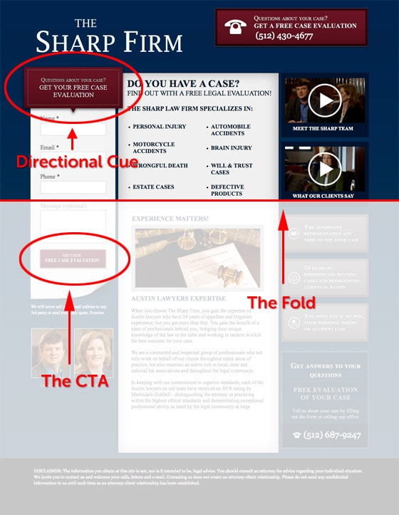
3. Landing Page CTA Below the Fold Using Directional Cues
Sometimes you can’t help but have the CTA below the fold, the best example being a long form on a lead capture page. In order to entice your visitors down where you need them, use a directional cue to drive their subconscious. A good place to add this is the header of the form itself, pointing directly down at your form (which is your desired conversion goal). You need to lead the eye to let people know there is more below.
Here’s a good example:
Another great example is this animated homepage by sidigital, where they pull you down the page stage by stage in a really interesting way.

4. The Cluttered Landing Page CTA Placement

Here’s an example of having too many CTAs slapped all over your proverbial page. Trying to figure out what you’re supposed to do on this page is like trying to find a needle in a pile of needles.
5. A Case Study on Landing Page CTA Positioning
In this A/B test, we experimented with an Unbounce landing page with traffic driven via pay-per-click (AdWords). You’ll note that the CTA’s are below the fold. To mitigate this, there is a secondary navigational CTA at the top of the page that says, “Pick your plan below”, and uses a smooth scroll effect to move down the page to the pricing grid. The smooth scrolling effect allows the visitor to see how much content there is on the page as it scrolls. Also, by indicating that you are going to pick your plan “below”, the visitor knows that there is more below the fold and the button won’t take them away from the page.

The hypothesis – created by our Director of Marketing, Gia – was that by moving the CTA above the pricing grid, we’d see a lift in the number of click-throughs. The hypothesis was designed to keep the CTAs above the fold of the bottom of the page (after the smooth scroll created by the button at the top of the page). Previously after scrolling down, there was the chance that the CTAs were still hidden.
The outcome: The B variant (the treatment page) produced a conversion lift of 41% over the control page.
Recap
I hope you learned something about CTA placement from this post. To cap things off, here are a few Do’s and Don’ts to remind you of some core points:
Do
- A/B test where you place your CTA
- Use multiple CTAs on a long page to chunk it up into mini sections
- Use directional cues (visual or copy based) when the CTA is below the fold
- Develop a story to guide people to your CTA wherever you place it
- Use design to make it stand out (contrast, whitespace)
Don’t
- Don’t be afraid to go below the fold
- Don’t place your CTA in a busy or cluttered area
- Don’t have multiple CTAs unless they all have the same core purpose
Got an opinion about where your CTA should be? I’ll see you in the comments.

