
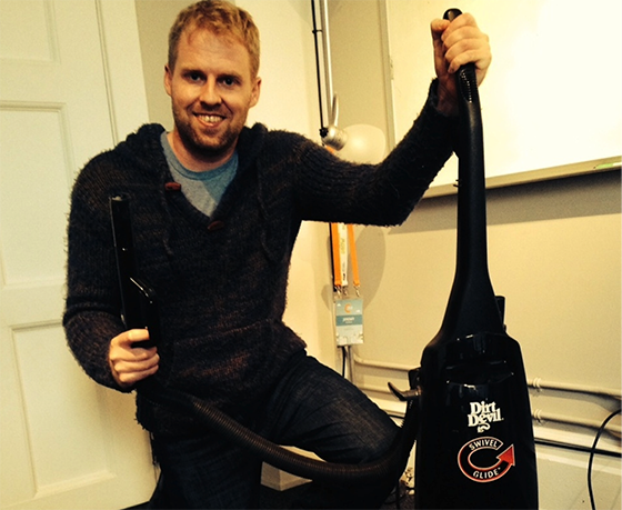
A few weeks ago I came clean to my co-workers: in college, I was a vacuum cleaner salesman.
In exchange for a set of shitty steak knives, people would allow me into their homes to demonstrate vacuum cleaners and air purifiers. I was yelled at, threatened and insulted on a daily basis. Even grandmothers flipped me off.
But you know what? Lots of people bought machines from me, and I became loyal to the game. There’s just something about hawking a $2000 vacuum to a perfect stranger that makes you feel like a cowboy. And I’m not a cowboy; I work at a computer and like cats.
The funny thing is, being a vacuum salesman taught me more about people than any other job. Now that I work in conversion rate optimization, I see parallels everywhere.
In CRO, complicated analytics and competing opinions can get in the way of common sense. Sometimes, a simple dose of reality is all we need to increase conversions.
So if your conversion optimization hypotheses need a dose of street smarts, here are three lessons (with case studies) straight from the greasy world of a vacuum cleaner salesman.
Lesson #1: Buy me a drink before you ask for my number
Conversions don’t just happen – they’re generated through a series of steps. Online, these are called “micro-conversions.” In a live sales demo, we call this “get ’em saying yes.”
Online or offline, you don’t ask for all the marbles – or overly burdensome questions – right off the top. First, you need to get prospects agreeing with you by asking questions that are easy to answer in the affirmative.
During a vacuum demo, I would ask a prospect all kinds of questions, ranging from the innocent:
Does anyone in the home have allergies?
… to the mildly invasive:
Would you consider this product a worthwhile investment in your family’s health?
But I would never ask for a large commitment early in the presentation. Likewise, a good landing page never starts with a “Buy Now” CTA; it starts with a series of softball questions like:
- Do you have this problem?
- Can you picture yourself with this problem solved?
- Would you like a free resource that addresses this problem?
- May we have your email address to stay in contact?
The key is asking your questions in the right sequence and framing each “ask” in a way that reduces the perceived burden on the user.
Any questions that don’t follow a logical order create friction that works against completing the sale or conversion.
A real world example
To illustrate, here’s an example from a recent conversion optimization project for Bankruptcy Canada.
The company was experiencing a high rate of drop-offs within their signup flow, which asked a series of somewhat difficult questions. Here’s the original first step:
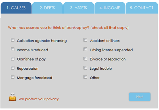
The first two steps ask questions about “causes” and “debts.” Besides being a bit cold and unfriendly, these questions are too invasive to ask right off the top before rapport has been established.
On top of this, the five blue tabs at the top of the form scream “this is gonna take forever,” furthering the burden on the user. If I told people that my full vacuum demonstration actually took two hours, I never would have gotten through the door.
Bankruptcy Canada’s analytics backed up this hunch, as half the leads who completed the first page of the multiple-step form failed to complete the whole thing.
Our conversion team hypothesized that since bankruptcy protection is a difficult thing to seek out – and that users may feel somewhat ashamed of their situation – that a connection needed to be established before any difficult questions were asked.
Starting with a smaller ask
After developing a hypothesis, three variations of the page were created. Challenger A – which began with a very small ask (the user’s name and contact information) – immediately showed the most promise. Here’s how the form started:
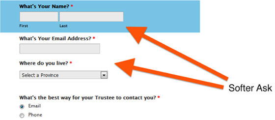
Gone are the imposing blue tabs, and the entire form is on one page. Lower on the form, the friendly, positive language and smaller “asks” continue:
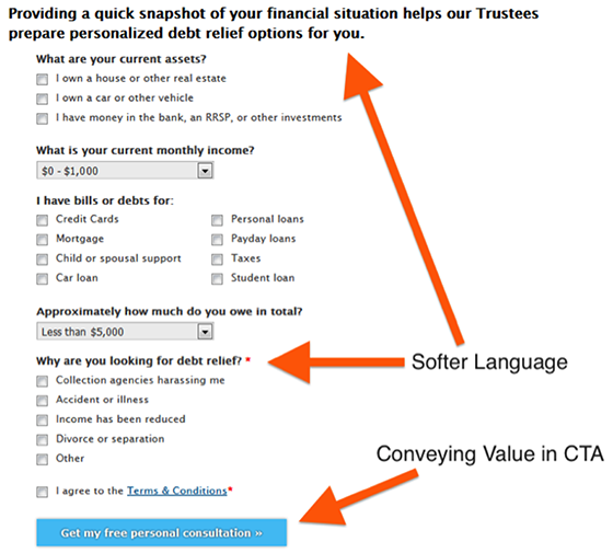
Most notably, the question “What has caused you to think of bankruptcy?” was replaced with “Why are you looking for debt relief?”
This is an important point of difference:
- “What has caused you to think of bankruptcy?” focuses on the problem, and all the negative feelings that surround bankruptcy protection.
- “Why are you looking for debt relief?” focuses on the solution, and uses language with a more positive connotation (e.g. “debt relief” instead of “bankruptcy”).
Finally, the CTA copy was adjusted to take the focus off the function of submitting the form (“Next”), and onto the value of submitting the form (“Get my free personal consultation”).
Results
Though all three challengers outperformed the control, Challenger A emerged as the winner:
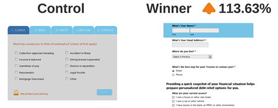
The winning variation increased conversions from 14.57% to 31.13% – a whopping 113.63% lift in completed form submissions.
From the results, our team concluded that:
- Asking easier, less burdensome questions early in a form flow is a legitimate tactic for generating micro-conversions, and increases the chances a form will be completed
- Single-page forms outperform multi-page forms for this type of industry, likely because visitors in high-stress situations have decreased ability to cope with complexity
- Leading with friendlier language that focuses on the solution rather than the problem increases the odds of a form being completed
Lesson #2: The more you know about prospects, the more you can optimize your pitch
What do all effective salespeople have in common? They’re great listeners and strong judges of character. And they use these skills to adjust on the fly.
As a vacuum salesman, I learned to scour for clues when walking into a prospect’s home:
- Neat freaks? Demonstrate how much less dirt the Filter Queen leaves behind in comparison to their machine.
- Parents? Bust out a flashlight and show how much harmful dust the prospect’s vacuum blasts into the air (into their children’s waiting lungs).
- Gearheads? Tie the neoprene (scuba gear) hose in three tight knots, then suck a lead bullet through the hose to demonstrate durability (makes for great sound effects).
But on the web, much of this adaptability is stripped away. The web is one-way interaction, not a two-way street like a live sales demo.
So how can we make sure we’re appealing to the core motivations of our audience in a digital environment?
By relying on audience demographics.
Uncommon Knowledge proves the value of audience demographics
This case study by VWO shows just how impactful audience demographics can be.
Uncommon Knowledge (UK) offers online training resources to mental health practitioners.
With a new product launch imminent, UK created a lead gen campaign with a dedicated landing page. The campaign would offer a series of videos in exchange for the prospect’s name and email address.
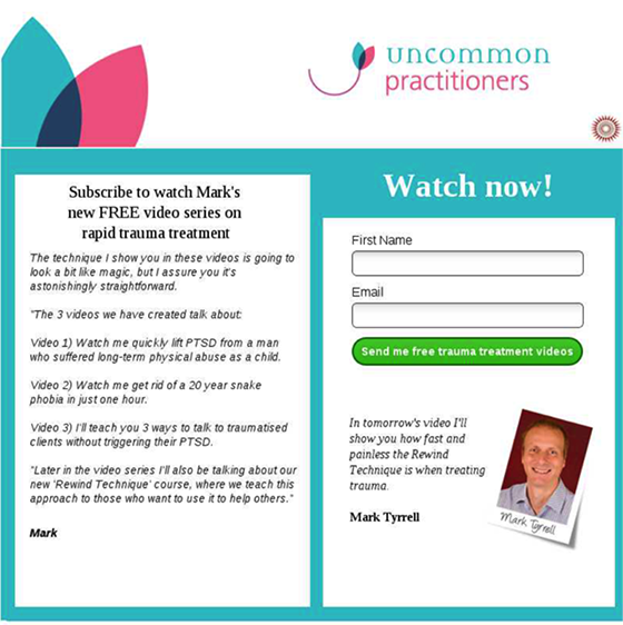
To improve conversion rates, UK decided its website needed a makeover — something a bit more trendy. Here’s what they came up with:
If you’re like me, this trendy design puts you in the mood to buy some overpriced coffee. Gone is the dated magazine-style layout, and in its place is something VWO describes as “simplistic and urban.”
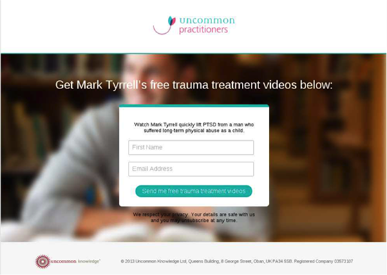
Unfortunately, the metrics didn’t agree. The old page outperformed the new design by 19.55% with 99.99% statistical confidence.
But why?
VWO hypothesized that the answer lay in UK’s audience profile, which was older than the team expected:
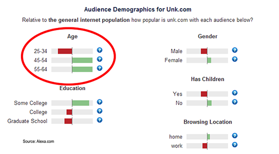
Most users were 45 and older, a demographic less likely to be impressed by swaggy design trends. Additionally, since the original page offered much more information than the challenger, the trendier design could have lost its appeal to more methodical buyers.
All told, this case study teaches us an important lesson: the more you know about your audience, the more successful your conversion optimization hypotheses will be.
Lesson #3: In crunch time, put the product in their hands
As most salespeople will tell you, the more prospects can touch, sample or try the product during your pitch, the better.
My crusty vacuum boss taught me to always put the vacuum in a prospect’s hands while the tough questions were being asked.
Granted, this is easier with physical products, but we’re seeing it more and more online – especially with free trials.
Letting customers try your product without any commitment increases trust by showing you have confidence in your product — enough confidence that you’re open to any pre-purchase scrutiny that comes your way.
A real-world example
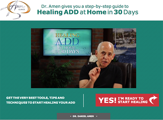
Here’s an example from Amen Clinics, which operates six clinics throughout the United States with the goal of helping people have “better brains and better lives.”
To promote its “Healing ADD at Home in 30 Days” program, Amen sends organic and paid search traffic to a dedicated landing page — here it is below.
To give users a chance to try without commitment, Amen equipped the landing page with exit-intent technology, which would offer abandoning users the chance to try part of the program for free before making a commitment. Screenshot below:
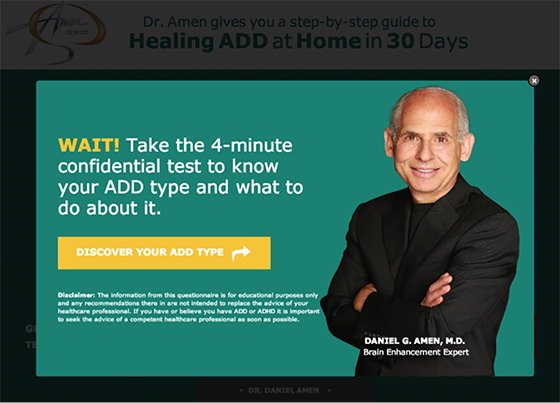
In this example, Amen Clinics convinced 19.44% of otherwise abandoning users to try the product before they left the site.
Further, Amen avoided cannibalizing average order value from paying customers by only offering the free trial to users who were about to abandon the site without purchasing the program.
Take it from this salesman: putting the product in prospects’ hands during those critical decision moments can make all the difference.
Takeaways from a vacuum salesman
As conversion-focused marketers, we can learn many things from the world of traditional sales.
If you’re a marketer and you find yourself on a car lot, in a presentation centre – or heaven forbid – being pitched by a slippery vacuum cleaner salesman, watch closely. There are many sales techniques that translate to online marketing.
The three lessons I learned in sales that improved my work in conversion optimization are:
- Establish a connection with prospects before asking difficult questions
- The more you know about prospects, the more you can optimize your pitch
- During the prospect’s critical decision moments, put the product in their hands
Have you noticed any parallels between traditional sales and conversion optimization? Drop me a comment!

