The call to action (CTA) is the most important part of a landing page, designed to convince visitors to take the next step or complete a specified action. That could mean signing up for an email list, purchasing a product or service, downloading a white paper, or completing any request aligned with furthering your business goals.
In this post we’ll dissect, congratulate and insult a bunch of CTA’s – because let’s face it most of them *really* do suck…
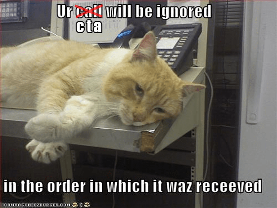
The problem is that most calls to action are totally lame, and thus ineffective. Here, we take a look at what can turn a loser of a CTA into a conversion rockstar (Oli likes rockstar type things).
FAIL Time: What’s in a bad CTA?
The most common CTA blunder is a lack of detail. There are a plethora of pathetic CTAs on the web, some built from stock art or uninspired text. Here are a few CTA no-nos, and why they don’t work.
- Buy now. Buy what now? It might as well read, “Bye now,” because that’s what’s going to happen.
- Submit. What exactly am I submitting to? Is this an MMA class or are you phishing for my personal info? And if I do submit, what do I get in return?
- Click here. #VAGUE – Click here and… get an awesomely fantastic virus that will destroy my system 32 files? No thanks. (Oli: I’m guessing the author has a PC – shame on you ;)
Part 1: Design Elements for CTA Conversion Success
The text on a CTA button is just one element of a true conversion-generator. Smashing Magazine points out some good rules of thumb for making CTAs stand out from the rest of the page using design features.
You should also consult this post on Conversion Design Techniques.
So let’s get started with some examples!
Each will draw upon design and conversion principles to illustrate why it’s a good example of the way to go… and cos I’m (Oli speaking) editing this I’ll throw in a few extra arguments or pointers here and there about where they #FAIL or #RULE. Fun right!?
1. Size matters
Really? Okay, fine… pfft
The CTA should be larger than other elements on the page, and if there are two CTAs (if you must), the more important of the two should be very dominant.
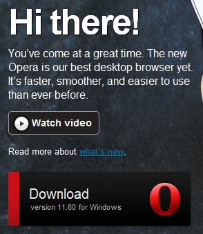
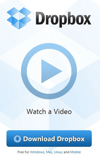
Oli: The main CTA (download) could use a little more contrast and a maybe a downward pointing arrow for the “dumb obviousness download” factor. As it stands, the “Watch Video” CTA stands out more for me which is wrong.
One plus is the inclusion of operating system requirements which clarifies what you’re getting.
DESIGN: Also I’d suggest turning the red stripe on the left into an arrow pointing to the word “Download”.
Also… “Hi there!” Come one!!! What’s that supposed to mean. Give an indication of the purpose of the most important area of the page. Describe exactly what’s going on and what you’ll get if you participate. i.e. “Why do I care?”
2. Obviousness
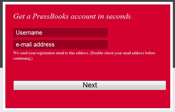
This example makes it very clear what they want, and what you’ll get (an account), by having a clear title and inset descriptors of the form fields.
Oli: This CTA does have some components that make it kinda lame – the word “Next” implies there’s more to come, which can put doubt and “click fear” in the mind of the user, wondering how big the bait and switch form will be on the next page.
3. Whitespace
Non-designers are afraid of whitespace. But whitespace can help readers make visual connections between page elements, and it can also differentiate a CTA as a stand-alone, important element.
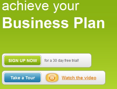
Oli: Whitespace actually has nothing to do with the color white – the key element is space. Which this design shows fairly well. I would say though, that they have chosen the absolute worse color for the CTA to stand out (which it should). Green on green is just plain stupid. We’ll get into color in the next example.
4. Color & Contrast
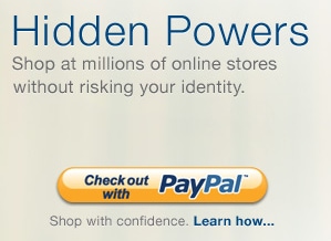
Perhaps one of the simplest ways to make a CTA stand out is to make it a color that’s in sharp contrast to the page background or to the page as a whole. Using a color, such as bright orange, not used elsewhere on the page will make a CTA glaringly obvious.
Oli: Personally I hate the “Learn how…” secondary CTA. Don’t make people click away out of sheer curiosity! Use a boring phrase like “Terms & Conditions” or “Privacy Policy” (and load it in a lightbox) which does double duty to add trust and make Google AdWords like you if you’re doing lead gen on your landing pages. If you do want them to learn more – add a video to your page – video has been shown to be very effective in lifting conversions.

Part 2: Text elements for Rockstar CTAs
What about the text? Copy is the most often and most overlooked aspect of conversion optimization. Using text you can build trust, create urgency and eliminate anxiety – to improve conversion rates. Avoid dull and simplistic copy and instead offer visitors a real reason to follow through. HubSpot provides a few tips for doing just that.
If you want to have fun with this part – run an A/B test and see if it makes much difference for you.
5. Communicate Value
Visitors want to know what they’re getting in return for their money or handing over their contact info. Will they get a free ebook, white paper or a product or service that will solve a problem?
Oli: Remember, the size of the prize must equal or exceed that of the barrier to get it.
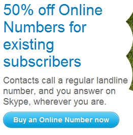
Here, Skype are clearly stating a “sale” style benefit (50% off – the real benefit here is that it’s real and numerical, unlike a clothes store where a pretty sales person tells you how wonderful you look in whatever sh*t you’re wearing.)
btw. I Love how Google Hangouts video chat doesn’t add 10lbs to your weight :)
6. Reduce Anxiety
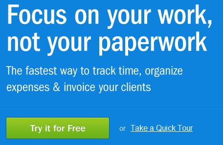
This is from Freshbooks (who Unbounce hearts). Here they employ a quality secondary CTA that lets you take a tour first (critical to communicate your concept if it’s more than an elevator pitch or mile high club’s worth of conversation).
What they should do: If a CTA involves a purchase, reduce customer anxiety through a money-back guarantee or free trial offer.
7. Create Urgency
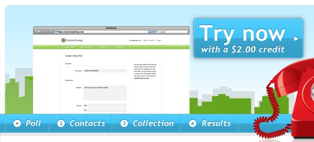
Few things delay the buying cycle more than hesitation or IT departments (Oli: #HighFive). Creating a sense of urgency through the CTA, such as a limited-time offering or a special discount for an immediate purchase, can overcome buyer hesitation.
8. Use Directional Cues & Simplicity
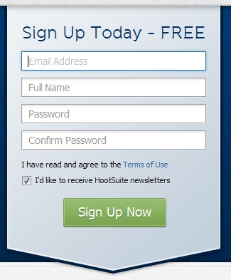
I like this one. It tells you that you are signing up and that it’s FREE. They also include a newsletter signup and an opt-in for newsletters (the opt-in is not only necessary according to CAN-SPAM, but let’s people choose who they want to communicate with on the form).
It also uses a directional cue (the arrow pointing down) to entice you into completing the form – or at least look down (which was the point).
CTAs should make it easy for visitors to complete the action. Ask for the minimum information required.
Rockstar CTAs convey that taking an action is simple and won’t require much time. Web users have come to expect immediate gratification. Give it to them.
DonorTools is a good example of both a secondary and tertiary call to action – “it takes less than 20 seconds” makes it sound very easy- and “browse our user guide” puts trust front and center.

9. Be Clear and Concise
The best CTAs leave little to the imagination. (i.e. they’re obvious as f***). They’re brief and to the point. What do visitors need to know? Will they be required to complete another step (let ’em know up front – if they are going to be a real customer they will value your honestly and integrity, which drives word of mouth marketing WOMM and retention.)
Oli: This is awesome because the CTA describes what will happen and the title just BEGS you to watch the video.

Oli: Here, I love the horizontal flow. It’s different and takes up very little space in a design.
10. Set a Visual or Architectural Hierarchy
Largest to smallest, top to bottom, left to right. If using more than one CTA, the most important (and preferred action) should be the most prominent. Some landing pages offer a CTA for a purchase but also a secondary action (such as signing up for a newsletter). This tactic is sometimes used to convert more visitors; those who fail to convert at the purchase stage may sign up for a mailing list or follow you on a social network (extending you sphere of influence).
Seen some good or bad examples of CTA’s? Share them in the comments below…
