What do Game of Thrones and the vast majority of landing pages have in common?
Without seeing a “Previously on Game of Thrones” recap (complete with beheadings, baby-stealing white-bearded giant folk, fashionable incest, and the word Stark), you’d have absolutely no clue what’s going on.
Similarly, if someone lands on a page and the scannable headlines, imagery and subheads don’t communicate effectively – in a succinct and clear manner – you’ll be left wondering why you clicked on the link that brought you there, and again, you’ll have absolutely no clue what’s going on.
That’s a problem.
We should NOT be designing experiences that confuse potential customers. And yet, virtually everyone does.
What’s the solution?
Clarity.
To be clear… Pause for effect. #ChucklesToSelf
There’s an invisible un-clarity counter that sits in everyone’s brain, ticking quietly upward whenever we see a word or phrase that makes us reflect on its meaning.
Every time you disrespect your visitors with a page highlight (something that stands out visually to the scanning eye), that’s confusing or unclear, you increase the count.
And every increase in that count reduces the likelihood that the visitor will convert.
Today, I’m basing my commentary of these landing pages around the Conversion Centered Design principle of Clarity, or lack thereof.
Let the judgement begin!
Sidenote: The 29 landing page examples shown below were submitted to Unbounce for the Page Fights series, but didn’t make it on the show.
Sidenote 2: Click the images for the full page (some were so long I cropped the thumbnails).
Sidenote 3: You should know this by now. If one of these pages is yours, all of my commentary is delivered with love, no matter how harsh. Every page can be better and brutal honesty is the fastest route.
1. The Weekly Sticky

Ding. Elevator doors open! Out we go…
- Be clear, not clever. “Put Your Patient Education on Automa-TIC”? Wordplay, great. Now I have to figure out your inside joke. It’s okay for the folks in my office to deal with my incomprehensible three-step jokes, but it’s not acceptable to put your visitors through the same. The fact that you put it in quotes is both a mystery and a misfortune.
- What is your CTA talking about? “Start Getting Stickies For Your Practice.” This is a gross context misassumption. Not only do I not know what stickies are – aside from the universally branded post-it notes that everyone calls stickies – but you’re asking me to want them before I know what your version of them is.
- The hero shot is wasted. Your hero shot is a visual opportunity to showcase your product or service in action. But what you’ve chosen to do here is show what only looks like a web page talking about mechanical lubricant in a lame, editorial manner.
- Watch your language please: Go ahead and read the copy beneath “What the Heck is a Sticky?”:
“It’s an New Principled tool…”
That’s not English. And why are “New” and “Principled” capitalized? Poor grammar and spelling are trust and conversion killers.
- Icky Sticky: The middle testimonial is creepy. Read this out loud:
“I’ve enjoyed MANY complements on these Stickies.”
#deepbreath, continuing…
“Just last week I had a patient who works in marketing share how much she enjoys them.”
There is so much inappropriately sexually charged innuendo in that testimonial. You need to get rid of it. Or find a new testimonial writer – preferably real customers…
- The headlines are confusing on their own. Try to make each headline work regardless of context. “How Do They Work?” should read, “How Do Stickies Work?”
- It only gets worse from here. I’m tapping out.
Footnote: Apparently, if you look really closely, this had something to do with chiropractors. I wouldn’t let any of them touch me.
2. GreenPal

Love the playful design of this landing page.
- The headlines and subheads are clear. If you do a quick scan test, reading through the copy that stands out the most you get:
“Lawn mowing made easy, get my lawn mowed today, how does Greenpal work? tell us when and where, they bid, you save, choose with confidence, schedule and pay online, get free access to 100s of pre-screened lawn care professionals, with no obligation.”
That’s pretty good – an exception to the upcoming examples I’m afraid. One thing I would say is that the phrase “pre-screened lawn care professionals” feels like it should come earlier on, perhaps mentioned in the four benefit blocks.
- How does it work? To find out, you can read the four benefits or you can watch the video later on. Both of these achieve the same goal so they might work better positioned together. Either way, I’d test placing the video section directly beneath the top section because its headline is much more benefit-driven than “How does GreenPal work?”
- The footer dilutes the focus of the page. Remember that every landing page should have a single campaign goal, which is to get someone to click the orange button(s). By adding site nav links and social follow icons, you’re diluting the focus and increasing the attention ratio. If someone leaves and goes to your website, they may still convert but you’d be clouding your analytics. Your campaign will register as a failure and your website will gain a conversion – which can result in you making an incorrect deduction about your marketing.
- There’s no device targeting. There are app CTAs at the end of the page. If this page is being viewed on a mobile device this is probably okay (and would even be a better CTA than the primary one here). But on a desktop computer, they are an unwanted distraction.
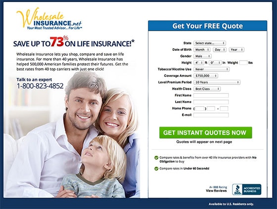
3. Wholesale Insurance

Arrrrgggggg! It’s so crowded. Here’s what I’d do on this page:
- Add some space around the form area. The form is complicated so you want to make that region appear a little more user-friendly.
- Move the logos down the page. They’re adding too much noise right off the bat. Also, add a label so I know what they are. Are they customers, partners, places that you retrieve quotes from?
- Emphasize the word “instant.” The sentence, “Quotes are instant and will appear on the next page.” is great. Don’t bury this – it’s extra urgency incentive for me to fill in the form immediately. Place this as subtext beneath the button.
- Don’t overwhelm with legal details. Move the paragraph of terms from the form area to the footer so you’re not overwhelming people.
- Pick only one intended action. Do you want me to call you or to fill out the form? Pick one. Or at least make the phone number a secondary consideration instead of one of the first things I read.
- It’s 2014. Time to update the date in the footer. Unless you give two-year-old quotes. ;)
Here’s a very quick Photoshop makeover with some of those ideas applied. Notice how much more relaxed your eyes are with the clutter removed. Yes, you still need to add the logos and terms, but they can appear below this area.
4. Trumpia

- The headline is generic. The headline could use a lot of work to make it communicate the value of your software. “Powerful” and “Trusted by Fortune 500s” says absolutely nothing about what you offer or why it’s unique. I’d consider moving the trusted part into a subhead and making the main headline focus on your core benefit.
- The CTAs send mixed messages. The two CTAs suggest a different purpose. “Contact Us” doesn’t say what will happen when I click the button. It’s confusing – most of the page is designed to get you to contact me, but your CTA suggests I can contact you.
- The copy in the screenshot is spammy and confusing. You are wasting a great opportunity to communicate value in the screenshot. Why is there a text message that just says your name? That’s not communication. Then you say that you’re going to send me alerts and deals. Who am I in this situation? Am I your customer, my customer or my customer’s customer?
5. Insight Pest Solutions

- The value proposition is vague. Simplified pest control doesn’t really speak to the prospect’s pain, which is the bugs bothering them. It makes it sound like they’ve been controlling their pests in a complex way. “Simple” can’t be the biggest benefit of using Insight Pest Solutions.
- There’s a lack of urgency. A more urgent headline would probably work better – words like “now” and “today” speak more to the urgency I’m feeling.
- Callback? If you’re going to call me back, make the form header and CTA copy reflect this: “Call me back.”
6. YouVisit

- The header image is messy. With so much going on in the background, it’s very hard to read the headline. Your logo is also virtually (see what I did there?) impossible to see.
- Who cares about your mobile app? Why are you talking about a mobile app when I don’t even know if you are any good? App for what? Can I create virtual tours on the app? And why are you wasting the subhead on a supplementary offer? You need to use that valuable space to talk about your product.
- The testimonials are vague. The Syracuse University quote is vague and could use some relatable numerical impact. In what way has it enhanced their presence?
- What do the trust logos mean? Are NBC and the NYT customers? I’m guessing they’re media mentions, so you might want to add a heading that speaks to that, or better yet, use fewer logos and add in what was said about you.
- The bottom CTA is incomplete. You’re missing a word. “Your FREE Consultation” isn’t a call to action.
7. Website Toolbox

This is actually a website, so that’s problem #1. Don’t send marketing campaign traffic to your homepage! Remove the navigation and you’d have a beautifully focused experience.
- How do I watch a demo? Clearly a demo of this type of thing is important, but navigation aside, the only way to see it is to click on the laptop. Easy enough, except the fact that you don’t show me that I can. Stick a (+) sign on it so I know it’s clickable.
- Don’t take me away from the page. The forum site actually scales nicely into a smaller browser window, so you could pop up a lightbox with the forum in an iFrame (or just embed it on the page). This would let people view the “demo” without leaving the site.
- What am I demoing? You show an example forum, but you don’t show your actual forum software.
- Don’t use hyperboles. “Industry leading support.” Okay, well show me some numbers to back that up.
- Ranked #1 in what? How is this ranking determined? Some extra detail might make this more believable. #1 amongst who/what?
8. Testive

- Where’s the headline? Your headline is your first opportunity to communicate your unique campaign proposition and this page completely misses the boat here. There should be a big headline introducing the page and what it’s going to do for me. The closest thing it has is a small statement that’s trying to be clever. The 21st century angle is meaningless to me, as is the parent reference. It’s delivering cleverness instead of clarity, which almost always loses the conversion battle.
- What’s the CTA? “Learn more” is very relevant CTA copy as I’ve not learned anything yet and I could use some help.
- Don’t use the word “gimmick.” Don’t use words like “gimmick” (beside the $0 free plan). I’ve proven in an A/B test that this exact word caused a drop in conversions
- For clicks sake! You are asking me to “Sign up now and get a free 30 min session” but it’s not a button. Then at the bottom of the page you have a button-shaped green thing that isn’t clickable either! Make them both scroll you back to the top of the page. And if it’s a sign-up form, say that on the button. Right now, “Learn more” isn’t a sign up action.
9. Examine

This is a super confusing above-the-fold experience.
- The headline could use some work. Make my supplement routine more effective how? It’s like you’re telling me to as opposed to showing me how.
- What’s the offer? Is it something that students read on their tablets? Because that’s what the photo shows. Or is it a physical book? Because that’s what the images show. “Get it now.” I don’t know what “it” is.
- Get to the point. I had to read through so much content to even find out what you’re offering.
10. Sedation Dentistry

- The headlines are too hard to read. “H squiggle creating S squiggle”? If you spent some time squinting at the screenshot figuring out the typography, you wouldn’t be alone. The first two headlines are very difficult to read and are not scannable. Don’t make your visitors work so hard to understand your primary purpose.
- The opt-in form uses stop words. The subtext beneath the CTA uses the phrase, “We will never sell your personal information.” I wasn’t imagining you would but now, as I am about to click, you make me think of something bad. I’d remove this or reword to “100% privacy guaranteed.”
- What’s the unique value proposition? The messaging is so generic that it could be applied to any dentist. If you are doing pay-per-click campaigns and are targeting particular services such as “sedation dentistry” then you should focus on that – the benefits of coming to you for that specific service.
- The testimonials aren’t about the service. The testimonials should speak directly to the experience of receiving one of your services, such as sedation dentistry.
11. Kwik Mortgage

- The CTA is hidden. The color contrast of the call to action is so poor that it’s completely hidden amongst the background. Choose a complementary color that makes the button clearly stand out.
- The visual hierarchy doesn’t work. The page is all about the meaningless photo rather than describing the offer and why you are unique. The headline should be more dominant in the visual hierarchy. Right now, the headline copy reads more like a call to action rather than a statement of why I should care about your company and your offer.
- The subheads don’t stand on their own. You could increase the clarity of this label by qualifying it: “Today’s Mortgage Interest Rates.” It might seem overly simple, but that’s the point. Make each scannable subhead crystal clear so the page reads like a progressive story.
- The testimonial is buried. There is a testimonial right at the end of the page but it doesn’t look like a testimonial. At a glance it looks more like legalese.
- Back to the future: It’s 2014. #footerupdate
12. Inquisitek

- Borrrrrring. Could this page look any less appealing?
- Is it a webinar or seminar? My gut reaction to this page was that it was to register for a webinar. This is in part because of the subject matter, but also because the location (and the fact that it’s offline) is completely buried in a big wall of text.
- The readability sucks. The copy is really small which makes it hard to read, and the perceived friction of having to read so much is a big barrier to conversion.
- In a post-apocalyptic world… There is too much faux drama in the copy (“chaos,” “order” and “in a world” to name a few). Makes it sound like fluff.
- The testimonial is misleading. The first testimonial is terrible. It starts like this:
“This is a great class for a broad overview, but…”
But? I immediately think the class has a downside and that it has no focus. It makes it sound like there is a class AND a workshop. I’m confused.
- What are these bonus sessions? Okay, so there is a workshop first, followed by a free “hands-on” workshop. So confusing.
- How do I pay? Will I be paying for the session on the next page after I complete the form?
- Outbound links to website/Facebook/Twitter: Don’t. Do. This.
13. Heimdal Security

- The navigation works. This is an example of acceptable navigation. Instead of linking to other site pages, it links internally within the page and scrolls down slowly enough that you understand the mechanics of how it works.
- What are you protecting? What type of infrastructure are you protecting? Is it for someone who uses online banking? I wasn’t clear on how it would help me specifically.
- Don’t make me click away. Noooooo. The “more features” link takes you to a “Why Heimdal?” page on the website without a call to action. If you want to show more features, throw them into a lightbox popup or have an expandable section on the page that opens to show the extra details.
- There’s no urgency. You can choose to start a free trial or pay for it now. The price is discounted, but there’s no urgency. Make the offer time-limited to increase the desire to act now on the paid version. Use subtext below the CTA for this – it would get too busy inside the button.
- Make your testimonials clear. Introduce them with a subhead. As it stands, I have to read them to figure out that they are customers as opposed to information about your team.
14. BrandBlasting

- The network photo is cheesy. The hero shot looks like the type of cheesy stock photo you get for some type of network or I.T. solution. If it’s about social media and storytelling, I’d want to show a much more humanistic visual.
- You do or don’t offer social media marketing? In the intro paragraph, it says,
“We don’t offer elements of social media marketing.”
Huh? I see that you’re trying to say that you provide the whole thing, not just bits and pieces, but it’s unclear and confusing to read. If you want to keep that copy, I’d add emphasis to the word “elements.”
- More chaos: Seems like order and chaos are a common theme today. Instead of painting this type of picture, why not talk about a specific problem that brands have with social media marketing? Chaos is too broad and doesn’t speak to my pain.
- The CTA is vague. “Contact us” is a very vague CTA. What will happen when I contact you? Surely it should be about you contacting me.
- Fields not required: As you have two fields that aren’t required, you might want to test not including them. You’ll probably get a bit of a conversion lift, but you will want to balance the benefit of more leads with the quality. If the quality of your leads drops with fewer fields, I’d try all five fields as required to add a bit of friction – as counterintuitive as that sounds.
- Weak testimonial: The quote is really generic and doesn’t speak directly to any quantitative benefit, which is essentially what people want to know.
15. Farm Bureau Insurance

- Kissing before sex: If you missed the “Personalize your auto experience” line at the top (positioned where you’d expect a logo), the main opening statement here is “Request your quote,” which is way too aggressive as an opener.
- How is it personalized? Justin (that’s the name I have for the guy with his hands clenched) looks friendly enough, but is he the personalized aspect? Is it “personalized” because I’ll set this up with a person? Or will you be tailoring my car insurance quote to me personally?
- Where’s the benefit? We all know and love/hate Geiko for their brilliant advertising and one of the best value propositions in the history of advertising (“A 15-minute call could save you 15% or more on car insurance”), so what’s the equivalent here? It’s just Justin and a form. Give me something to want.
- Speaking of benefits: “In addition to solid benefits…” Really? That’s lazy copywriting. It’s like saying, “In addition to some good stuff that I’ve not yet pointed out, you’ll get…”.
- The testimonials aren’t credible. Linda, I don’t believe you. “Thanks for a wonderful product.” Bullshit. Nobody says that about car insurance.
16. Patriot Software

- Simplify what? Is it simplifying the payroll itself? Or is it simplifying the process of paying your employees? Add some extra benefit to the headline to make me care a little more.
- What’s it called? If you have an online product, you should introduce it by name. Right now all I have to identify you by is “Patriot Software,” which could be a service provider. You only get to the actual product – “Patriot PAY” – at the end of the page.
- Meaningless subhead: “Use our easy and affordable payroll software” is a bit self-serving. You need to address your customer’s biggest pain point.
- Automatic updates? What’s getting updated automatically? The software version? I don’t see much value in saying this. The first bullet point should always drive home the #1 benefit of using the software – which should be something that speaks to the simplification you’re promising.
- The “3 easy steps” section is great. This section exhibits excellent clarity. Consider bringing it further up the page to connect with the first CTA.
17. Simple

- Banking should be… confusing: It’s supposed to be simple, but my immediate takeaway from the header area is that banking should involve a credit card that’s hard to read.
- Is Simple a bank? Am I getting on an invite list for a new bank? Or a new credit card company? Or is it a software solution? It’s really not communicated as simply as it’s suggesting.
- The tiny type is hard to read. The design is delightfully simple and the whitespace really helps with visual clarity, but the type is too small to be easily read.
- Oh, it is a bank. Or is it? Right at the end it says “Ready to replace your bank?” Replace it with another bank or with a new concept entirely? “Switch banks” would be clearer.
18. Next Level Purchasing

- The headline is bland. The headline here is horribly vague and wastes a prime opportunity. Am I purchasing certification? Is this an ecommerce page to buy certificates? The subhead does a better job of clearly pointing out the purpose of the page.
- The bullets in the header are generic. The first bullet point is okay, but the other two are terrible. As standalone benefit statements, they are super generic. Right below, they are repeated with details that are actually useful. For this reason, you could probably remove the top three and focus entirely on the headline and subhead.
- Study or get certified? The subhead makes me think I’m going to register to get certified online from this page but when I get to the form, I’m told I’m going to get a guide. Feels like an unintentional bait and switch. If the goal of the page is to provide help with getting certified, talk more about the guide and its purpose.
- The trust logos are misleading. The company logos have a subhead to introduce them. It’s a good start, but what are they using you (the company) for? Have they used the guide? If not, and they are just customers, you’re sending a mixed message. The purpose of the page is getting someone to download the guide, not believe in your company’s ability to service big companies (in what way I don’t have a clue). Splitting the purpose makes the logos incongruent with the campaign goal, and thus confusing. Remember that your content marketing strategy is to get the email for the guide, and *then* start pushing people further down the funnel towards your actual business.
19. The Pink Bride

- Start with your headline. The first thing you want people to do on your landing page is read the headline. On this page, the headline states what the event is called. This works well as an identifier beside the logo, but I’d actually treat the subhead as the “real” page title and make it much more prominent – it does a good job of explaining what and why you should attend. The problem design-wise is that the photo of Nashville is so dominant, you can easily gloss over the subhead and go straight to the CTA.
- Show the event: A good test would be to try the video at the top instead of the photo, as it shows the event rather than a generic destination shot.
- The CTA subtext is wordy. There is an entire sentence below the button that could be replaced with a simple, “Save $2 off tickets when you buy online now.”
- Unclear CTA copy: “Take me to the bridal show!” Am I going to be your guest? Are you actually going to take me? Is it a prize? What will happen after I click isn’t clear unless you read the subtext. For clarity, you could try something simple like “Buy Tickets Now.”
20. Milk It Digital
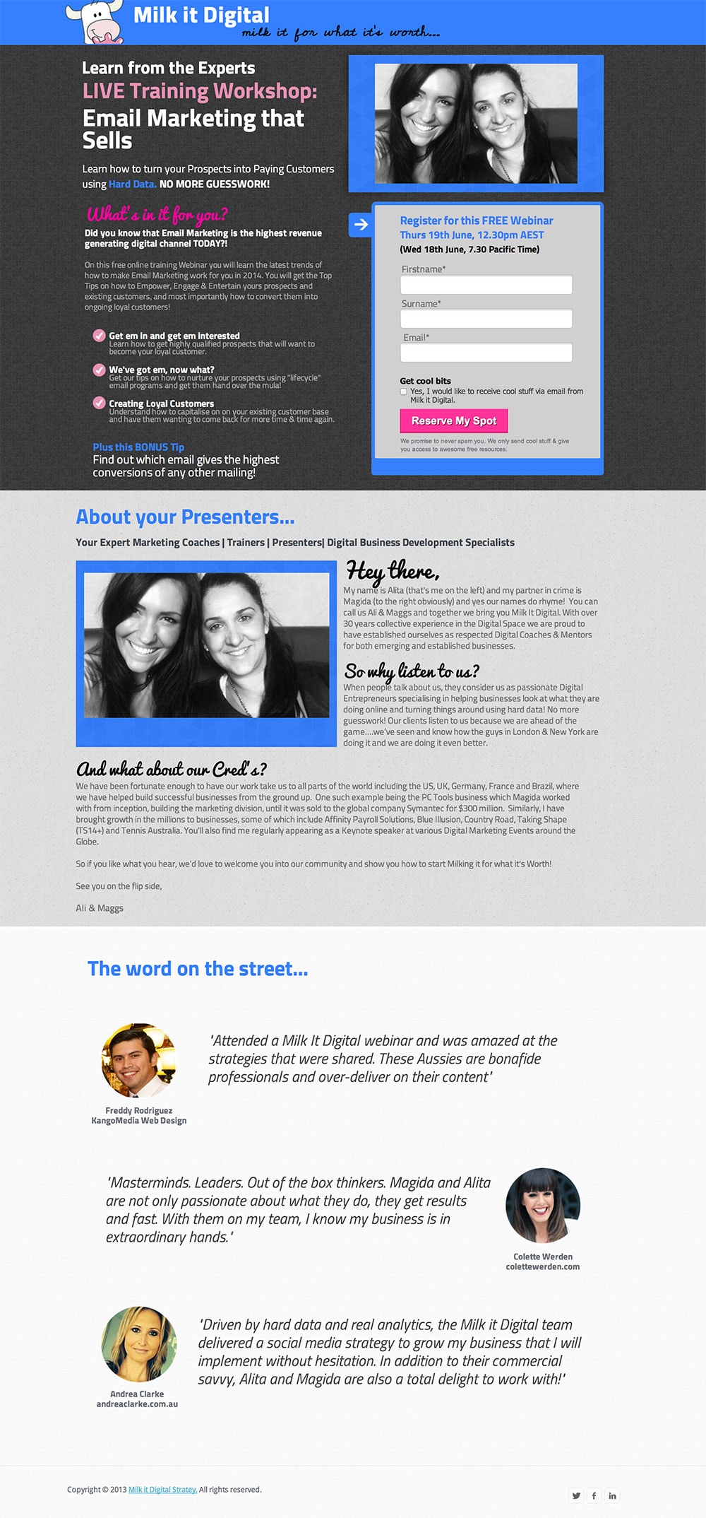
- The headline is messy and fragmented. The headline is broken down into three sections, each with its own communication goal. “Learn From the Experts” is fluff and doesn’t help me understand what the page is about. I’d remove it and then flip the order of the remaining parts: “Email Marketing That Sells – A Live Online Training Workshop.” To make it even better, you could remove the workshop line and add a subhead that adds extra benefit to the subject matter.
- There’s too much text. In my experience, you don’t need much information to convince someone to register for a webinar. Take a look at this landing page – it follows a WWWH format: what, why, when and how. And it does so in a simple and linear manner. It converts at 70% which is slightly more than our standard (and more meaty) version. There is so much small copy on your page that it can be hard to really find the answers to those WWWH questions that people have.
- Stop words: I’ve mentioned it often: remove the word spam from beneath the CTA, it can turn people off. Focus on the positive only.
- Who are you? I’d remove the top photo. It only serves to beg the question “Who are you?” and you answer that further down the page. I’d leave it down there and focus the top on the event itself, so people don’t have to jump around to find answers.
- Add more whitespace. The visual clarity could be improved dramatically by adding some spacing throughout the content. Here’s a quick Photoshop hack job to show what I mean (also removing the top photo):

21. McCarthy Law

- Slow down. The copywriting comes across as very disjointed and staccato. For a page that’s about getting in touch for a consultation, I’d suggest getting a bit more conversational. If you read the copy out loud, you’ll notice that you don’t actually communicate anything of real value or explain how your service is better than the competition.
- The subhead is confusing. “Pick a plan” is an action-oriented request, but I don’t actually get to pick anything at this point. Without more context, it’s a bit misleading and confusing at this stage of communications. You should have more value in a subheader.
- What do I actually get from you? Free review, consultation or evaluation? What do I actually get from you? Is it an evaluation of the amount of debt I say I have on the form? Is it a free evaluation on the phone to see if I qualify for a free consultation in your office? And the headline says review. For a legal website, the ability for confusion and misconstrued intent is very high.
- The expandable FAQ works. This is the right way to do this. Keep people on the page and don’t take up too much space for those who may not have questions.
- Stay – no wait, go! You keep visitors on the page with expandable FAQs and then try to send them away to your blog and social profiles. Don’t ask people to leave your landing page.
22. Einstein Medical

- How do you help doctors grow? The headline is very ambiguous. It doesn’t mention that you’re offering internet marketing strategy services. A descriptive headline that talks about what you actually offer would add a lot of clarity. People will be more willing to say yes to a website review if you introduce it properly. Plus, the headline is very me me me. The current headline is more appropriate as a lead in to the social proof area after you’ve told me what you do.
- Who’s speaking to me? When you combine the “We’ve been” phrasing in the headline and the photo of the doctor, my first reaction is that he’s talking to me, when in fact it’s a testimonial.
- Ditch the social! I’m getting exhausted bringing this point up. Don’t put five social share/follow buttons right in my face. I might go check out your Twitter following, see that you only have 20 followers and decide that you’re lame.
23. Air Concierge

This is not a landing page. But I’m going to look at it because it’s such a terribly unfocused landing experience. I really hope people aren’t being sent here from paid advertising.
Seriously, what’s the point of this page? The design is horrible at helping someone understand what they should be doing. Close your eyes and pick a starting point.
If I were to go with convention, I’d look top center to find the headline (the defining purpose of the page). So this page is about “Provide Promo.”
There are so many action items fighting for my attention it’s just overwhelming.
- So many CTAs. “Call my concierge,” “Provide Promo 47-21-62-0,” “Like, Tweet, Pin!” Pin? Are you kidding me? Who is going to Pin this to Pinterest?
- Epic and un-believable testimonial: “Hello, thank you so much for the good service that I had with Delta Airlines”? Really? Not only does it sound fake, lame, unimportant and not at all helpful to my purchasing decision, it’s about Delta. You’re not Delta!.
- Then there are the three price points below… “Fly upper class without paying for it.” Oh wait, the price is 3x the economy price? I guess you are paying for it.
- This page could be soooooo much better.
- If the page owner is out there, I’d love to know the source of the click that would bring someone to this page.
24. Enterhost

I must confess I know diddly about Lync. So to be fair I’m going to go Google it and come back.
Sigh. Wikipedia just made my life way less happy than I’d thought it would. Microsoft’s branding is so poor that it took 43 words for me to kinda understand Lync. Let’s run with, “It’s an enterprise level replacement for Windows Messenger.” Gross. No offense.
- The headline sucks. Are you talking to sys admins? Otherwise why would I want you anywhere near my messaging software?
- Why hosted Lync? That’s a darling question, Enterhost. You hadn’t even mentioned hosted services, so that’s a pretty abrupt leap from the headline. Oh wait, I can get a free quote over on the right. Man this page is confusing.
- Microperbole! (See what I did there?) “With just an internet connection, your computer is transformed into your phone system on-the-go.” Kill me now. I know we’re talking about Microsoft, but this isn’t the 80s. You should speak to people with a little more respect for their intellect.
- “Get a free quote on Lync.” I don’t understand this page at all.
Here’s a free quote: “When it takes me 30 minutes to critique a landing page and I leave more confused than when I arrived, you have a problem with clarity.” — Oli Gardner
25. Easy Insights

Sidenote: Ignore the repeating nav bar in the screenshot, that’s not actually how it looks. The screenshot software couldn’t render the persistent nav that moves when you scroll down.
- The headline is condescending. Try reading the header experience in isolation:
“Easy insights: stop guessing and start using data to grow your business.”
“Easy insights” is arguably the most generic headline in this list of 29 landing pages. Fix that. The start of a public speaking gig is the only time that you have 100% of the crowd’s attention. It’s the same with your landing page headline. Grab me with something unique and very specific. The subhead is a little condescending – don’t tell me I’m guessing. Appeal to my pain and help me, don’t put me down.
- Then there’s a wall of text. I can’t read all of that. And I bet most of your visitors won’t either. If you’re writing a long form sales letter, you need to get personal. There are two ways to do that:
- Make your landing page look like crap.
- Include a personal video from you.
This looks like a shelf-bought site from Squarespace. As such, I find it hard to make a personal connection.
#ThoseWerentEasyInsights
26. Do Inbound

- The headline is confusing. Seriously, read the headline three times fast. I hope this is a landing page for branded search, otherwise it’s pretty confusing. It’s not a useful headline either way, it’s just a statement.
- A little foreplay please? “On-demand,” “Instant Access” and “Plus a special offer!” That’s a lot of desperation in the first three seconds of our relationship. Slow. It. Down. A little!
- The tone is cold. The copywriting on this page reads like a blog post. A conversational style can be amazingly effective, but it feels like the conversation hasn’t been started elsewhere. You start with a cold, “We recently” which implies some history, but not a direct connection to copy in an email or whatever pre-click experience existed.
- The subhead is disconnected from the body copy. Everyone should do this for every landing page they design: Just stand up and read it out loud. If you do that here, you’ll recognize that the subhead (“Get instant access”) doesn’t lead into the body copy in any way. It reads like a blog post on a landing page.
- My advice? Stop trying so hard. Focus one a few really awesome things that you do and describe why they help someone. Instant access to a walkthrough of anything doesn’t sound that great.
27. Digital Tangible Trust

The blockchain? I’m so out of touch. I think the blockchain is a transactional Bitcoin database.
- So what is this page about? Out of context, pretty much nothing. However, I had the pleasure of perseverance when looking over this page, and found my way alllllll the way to the bottom where I stumbled upon a video and this headline:
“WANTED: Senior node.js Engineer to Pave A New Path in Cryptocurrency.”
Now that’s some direct copy. I care about that even if I don’t know what’s going on specifically with the technology. If you need to say “build on the blockchain,” make sure you couple it with the passion of your actual requirement. The lower half of the page is humanized, the top is soulless.
28. SJVC College

- There are trust issues. This is a branding issue but I have to draw attention to it. This is an educational institute, but it’s called SJVC without an explanation of the acronym. I have no idea what a “Private Junior College” is, so that doesn’t help me figure you out.
- The headline is weak. “Become a medical assistant”. Okay. Where, what, why and how? Give me something to grab onto.
- “Are you looking for a medical assistant college?” I hope so. That’s why you created this page right? Read the next paragraph, it reads like a bored answering machine, gah. “Detail-oriented”. What a drag.
- The CTA is stressful. There are multiple schools of thought on the progression of multi-step forms, and one rule is to never make it obvious that there is a second step. Saying “Next >” implies more effort for me. Make it more enticing like, “Let’s find out if you’re really detail-oriented!” I jest, but you get my point I hope.
29. ADHD Crusher

- Looks like you forgot the header. You should put the name “ADHD Crusher” beside the logo. Right now, with the black stripe at the top, it feels like the page hasn’t finished loading.
- The CTA is weak. “Try Now” is generic button copy that only works when it’s part of a group (10 options, each with a “Try Now” button). Tap into the needs of your visitors with something like “Get focused, get organized.”
- The trust seal isn’t trustworthy. Zero risk? There is always risk when you’re buying something online. This page isn’t trustworthy enough for me to believe your claim that if I email you, you’ll refund my money. Don’t suggest a method of refund that sounds bootstrapped. I don’t want to think of you in your basement.
- Why did the page end? It actually felt like the page ended unexpectedly, like there was something still to come.
Clarity always trumps cleverness
I think it’s pretty clear from these examples that clarity is the most important aspect of your landing page copywriting. Your grandmother doesn’t necessarily need to be able to understand your business, but she should be able to tell you what the page is about.
Remember (and tweet) this:
Cheers,
P.S. If you’d like to see some brutally honest landing page critiques LIVE, you should come to the first ever Unbounce Call To Action Conference in Vancouver on September 12th, 2014, where myself and two other conversion rockstars will be looking at landing pages from the attendees.


