Love ’em or hate ’em, read ’em now or download for later, ebooks are a great incentive for your lead gen landing pages. When framed attractively, they can help your company educate potential customers, fill your pipeline with qualified leads and position your business as an authority in your industry.
But before you can make your ebook into an effective lead generation tool, you need to get your prospects to download it from a landing page.
If your landing page fails to convince prospects that they need your ebook, then you can’t deliver value and you won’t collect leads.
And all the time you spent putting the ebook together will have been in vain.
Let’s take a step back and learn from the mistakes of others. Here are eight ebook landing pages and how they could be tweaked for a bigger impact – and more leads.
1. Beretta
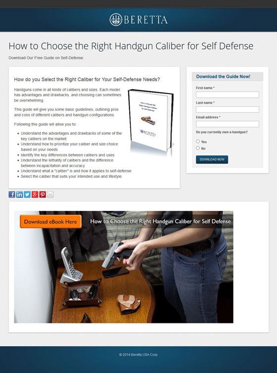
The headline is descriptive but doesn’t inspire action
Okay, so you get an idea of what this page is about right away – but the headline doesn’t inspire action. There’s a barely-legible subhead with a call to action, but because of the tiny font, it’s easy to gloss over.
Here’s an example of a headline that Beretta could use to inspire more leads to take action:
The Wrong Caliber Could Leave You Defenseless
Download Our Free Guide to Choosing the Right Caliber for Self-Defense
This headline triggers the fear of making the wrong choice in caliber (thereby leaving you defenseless). The sub-headline then provides the solution: download the free guide.
The lower half of the page takes up valuable real estate
It’s hard to tell from the screenshot alone, but the entire bottom section is useless. It’s just a photo with what looks like a button… but clicking on it does nothing.
It looks more like an advertisement that was just thrown onto the bottom of this landing page. Beretta would be much better served to use this space for testimonials to cement the benefits of the ebook.
No one wants to share your landing page
The social media tiles on your ebook landing page may help to make your boss happy, but they only serve to distract your prospects from the goal.
Toss ’em and let visitors focus on the task at hand: opting in.
2. Coach Lisle
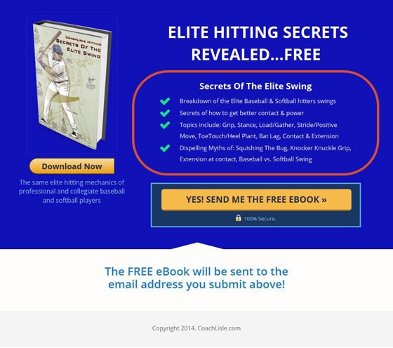
The headline doesn’t speak to benefits
What is really being sold here? Is the site selling “Elite Hitting Secrets”? Or are they selling the ability to crush a baseball so hard that you become a hitting legend yourself?
I think you know the answer.
And this is the difference between selling features and selling benefits.
Yes, they are selling the feature of teaching the user how to hit better, but the ultimate goal is different. What they’re really selling is the benefits: the feeling you get when you crush the ball and are better able to contribute to your team.
So let’s try to sell what people are really buying, shall we?
How about this:
Awaken the Baseball Hitting Legend Inside You
Learn the Hitting Secrets Baseball’s Elite Hitters Use to Crush It out of the Park
The lightbox increases the number of clicks
When you click on the call to action, a lightbox with the opt-in form pops up.
Why make the visitor click, and then type and then click again?
It’s worth testing against a simple opt-in form right on the page. Type. Click “Go.”
3. Fight Media
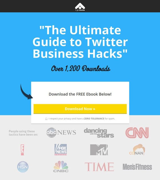
Really? The ULTIMATE guide?
Okay. I’ll give you the benefit of the doubt and accept that this ebook might just be the ultimate guide to Twitter hacks… though there’s nothing on the page that would back up that statement.
Even if there was, it’s still not a very good headline. Because it’s just a name.
It doesn’t tell me what the content is going to teach me. It doesn’t tell me why I should be downloading the ebook in the first place.
There’s nothing inherently wrong with calling your ebook the ultimate guide, but use a headline that sells that ultimate guide so well that people can’t resist downloading it. Speak to the benefits.
Here’s an example:
Turn your Business into a Twitter Superstar
Learn the Little-Known Hacks Big Brands Use to Promote Themselves to Millions of Followers on Twitter
Editor’s note: You may have noticed our CTA for the “Ultimate Guide to Landing Page Optimization” below – however, we challenge you to find a more comprehensive ebook on LPO! ;)
The social proof feels generic
Showing that your ebook has been downloaded over 1,200 times is a great step towards social proof, but the rounded number could turn certain prospects off.
Visitors respond much better to real numbers because, well, they look real.
Find out just how many downloads you’ve received and use that number instead. Or better yet, set up a script to automatically update the number as your ebook is downloaded.
Imagine how convincing this social proof element could be if the number was increasing while someone was reading the page!
4. Grossman Group
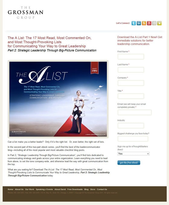
The headline lacks clarity
The headline is convoluted and unclear complete rubbish.
There’s too much going on here. There’s no clear indication that this is a downloadable product, and no mention of the benefit that I’ll receive by reading it.
In fact, the way that this headline is structured, it makes me think that it’s going to be page after page of fluff.
Here’s how I would fix it:
Learn How to Inspire your Employees Through Communication
Read the 17 Most Thought-Provoking Lists Designed to Make you a Better Leader
The offer is also unclear
This page is full of jargon and 10-dollar words. Look at this one:
Strategic Leadership through Big-Picture Communication
Say what?
Why not break this down for people instead of talking like a lawyer who is trying to learn marketing?
And what’s with the “Part 2” in the sub-headline? Unless it’s clearly explained, I would remove any reference to Part 1 or Part 2.
Being clear will help each visitor understand exactly what they’re signing up for – and I’m willing to bet it’ll increase conversions, too.
5. Impact
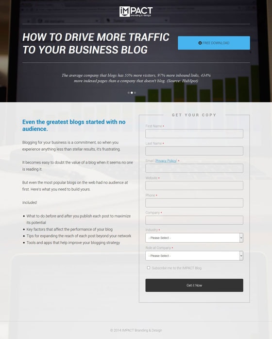
The headline could be more specific
This headline cuts to the heart of what a lot of businesses need from their content marketing efforts: more traffic. Why not go a step further and talk about what traffic will really mean for a business?
Here’s an example:
How to Build Your Business Blog’s Traffic, Leads and Sales: Step by Step
The form is too long and blends in with the rest of the page
Do you really need all of these fields? If the goal of your page is to send leads to your sales team, then you can probably cut down on the number of fields.
For example, if you are asking for a visitor’s website, you don’t need to ask for the company name or industry. The information can likely be found on the website and your sales team can add it to your CRM software themselves.
Also, this form needs a bit of design work to make it stand out.
Why ask for the blog subscription up front?
Adding a checkbox to subscribe to the blog is just another step for the visitor to take when filling out the form.
Why not simply add it to the thank you page and let the visitor focus on one conversion goal at a time?
6. Maximize Social Business
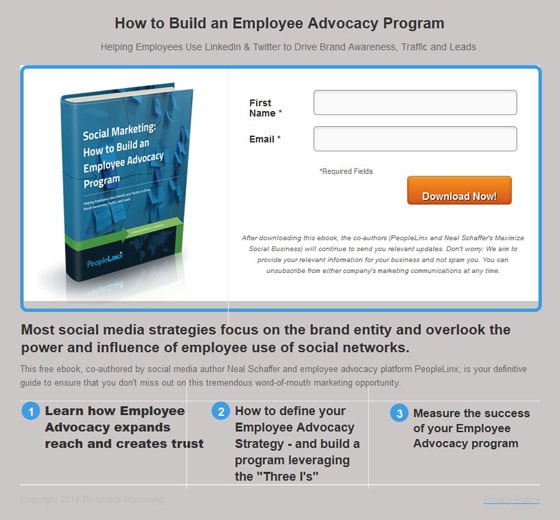
This page needs to be brought into the 21st century
The design on this page is dated, and any internet user can tell that the spacing is off. Is this really the first impression that you want to send to your future clients?
Clean up the design elements, boost the headline size and don’t hide your footer links with super light font. This will make the page seem way more professional.
This headline is too specific
The headline “How to Build an Employee Advocacy Program” only works if you’re selling this ebook to visitors who are looking specifically for an employee advocacy program… talk about niche.
Why not cut to the core of the solution like this:
Teach your Employees to Promote your Brand
Learn How to Leverage the Power of Your Existing Employees to Build Brand Trust
Something seems fishy here
If the intention of the long paragraph of privacy text is to set me at ease, the fact that the privacy policy link is almost hidden is acting against you.
If you want to seem transparent, act like it. Make your privacy policy visible. Very few visitors will leak from your privacy policy link if the rest of your page is enticing enough.
7. Simply Measured
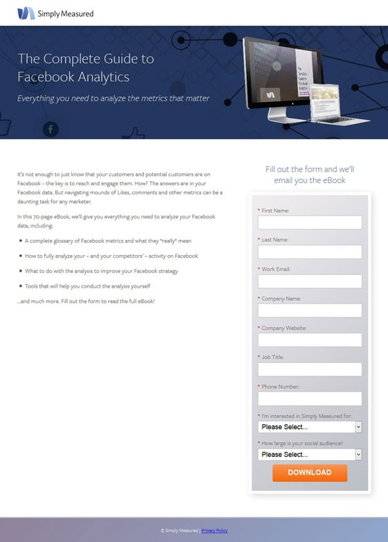
Don’t use the name of the ebook as your headline
Instead of just telling me the name of the download in the headline, tell me explicitly what I’m going to get out of this ebook.
Here’s what I mean:
Make your Facebook Page More Effective by Understanding Facebook Analytics
Download Our Free Guide and Use Your Facebook Page More Effectively
Reconsider your choice of form fields
This landing page is all about improving Facebook pages right?
Then why aren’t you asking me for my Facebook page? Sure, some of your visitors may not have one set up quite yet, but you can fix that issue by labelling the field “Website/Facebook page.”
Also, you might as well lose the company field, because their Facebook page will tell you that information.
One last thing: this landing page hasn’t sold me on Simply Measured, nor has it told me anything about the company. Why would you have a form field asking me why I am interested in Simply Measured?
At this stage, I’m interested in the information in the ebook, not doing business with the company.
Lose that form field.
8. Social Media Today
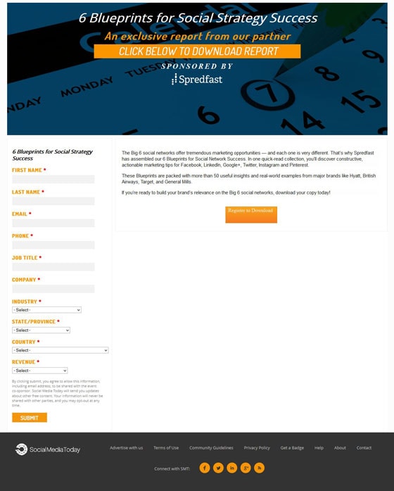
The header is confusing as hell
There is so much wrong with this header that I am going to put it into a bullet list so it’s easier to read.
- The headline doesn’t touch on any of the benefits of the ebook. Focus on what this ebook will do for me, not what it’s called.
- No one cares if this is an exclusive report from your partner, and no one cares about your sponsor. Include this information somewhere else on the page – not in the area where people look first.
- The “Click below to download the report” section looks like a button, but it’s not. It’s also misleading; I don’t just have to click, I have to fill in a form and then click “Submit.”
- The background image doesn’t seem to have anything to do with “social strategy success.” Maybe calendars are a part of that “success,” but that’s not clear.
The copy feels like an afterthought
My eyes glaze over when I try to read the copy on this page. Why not throw the benefits of this ebook into a bullet list so that visitors can easily scan through what they’re getting?
What’s with all the fake calls to action?
The header has a line that looks like a button.
The copy also has what looks like a button.
Both are bigger than the only real call to action. This is almost too much to take!
Lose the confusing orange rectangles and use call to action copy that tells the user what they’re clicking on. Something like this:
Download the Blueprints Now!
You think I’m going to tell you my revenue for an ebook?
Come on.
I get that you want to give your sales team the information they need to make smart qualifying decisions. I also understand that with revenue data in your list, you can segment the type of marketing emails that you send. But do you really think that I have enough trust in your company at this stage in the game to be telling you my revenue?
Get real.
This is what your sales team is for: qualifying. If you would like all of your marketing to be automated, then simply build these questions into your sales funnel.
The bottom line is this:
Only ask for what you really need up front. You can always get more information at a later time.
What’s the verdict?
Did you see a running theme with these landing pages?
I did – a lack of focus on benefits.
It’s a mistake I see a lot, which is a shame because it could mean the difference between a successful ebook promotion and one that flops.
Ask yourself: what’s in it for the visitor? How is this ebook going to help make their life better?
And then keep your landing pages laser-focused on the benefits.
Do you have any impressive ebook landing page examples? Share them in the comments.
If you wanna get started building your own ebook landing page, check out the ebook landing page templates available in Unbounce.


