Sometimes I respond to marketing campaigns just to see how they’re put together. Perhaps there’s something in the subject line that makes me sit up and take notice. Perhaps it’s an unusual offer.
But whatever it is, it builds enough curiosity to get me to click all the way through.
Recently, a campaign by Easypurl got me clicking, and I wanted to evaluate why. So I went back and reviewed the entire campaign, from the first touch to the last. What I found was a good reminder for all of us: how one mistake can undermine an otherwise outstanding campaign.
So here it is: the good, the bad, and the lessons learned.
Touch 1: The Email
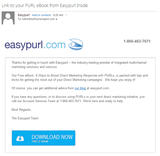
The campaign starts in the prospect’s inbox with this email.
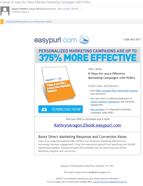
As first touches go, this is a win.
The subject line is good. It’s descriptive and includes the keyword, PURLs (personalized URLs). It also promises more effective marketing, which could capture the attention of people who don’t have PURLs on their radar now.
The format is also good. It’s colorful, easy to understand at a glance, and has an outstanding headline. Any time you can put specific numbers in your headline — especially if they’re as impressive as 375% — do it. My only caveat is that 375 sounds like it may have been rounded. A number is more believable if it’s precise, like 374% or 377%.
All this — the subject line, headline and format — are enough to make this email work. But it’s the call to action that especially caught my attention.
This email doesn’t just talk about PURLs. It uses one. Notice the link: it has my name in it.
As a marketer, I know this URL doesn’t magically make the ebook more relevant to me. And to be honest, I probably would have deleted this email if I hadn’t seen my name in it. But that PURL was so effective at making me look at the email, I wanted to see what else Easypurl does right.
I clicked on the link and landed here…
Touch 2: The Landing Page
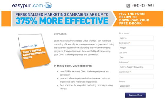
The first thing you’ll notice is that this landing page has the same look and feel as the email. This tells me without a doubt that I’m in the right place: The colors and design are the same, and the headline echoes the one that originally caught my eye.
Clear instructions tell me what to do next, so there’s no struggle to understand the page: Fill the form below to download your free e-book.
Notice that “free” is underlined in those instructions. Easypurl makes it clear that there’s no obligation. That builds my confidence and removes a barrier to my response.
I also like the layout of this page. The picture of the ebook helps me know what to expect. The personalized note details what I’ll get in the ebook. Best of all, the form is already filled out for me.
Easy. All I have to do is click “Download Now.”
Notice also that the call-to-action is an accent color in the brand. Blue tends to recede, but since the banner is orange, an orange button might get overlooked. The blue stands out and is easy to find.
Touch 3: The Verification Page
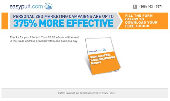
My preference is to be able to download the ebook immediately. So I’m a little disappointed that I have to wait for an email. Still, this page does the job.
Once again, the look and feel of this campaign is carried through. I see the picture of the ebook, so I’m confident I’m going to get the information I seek.
The thank-you message is clear and appropriate. I know to watch my email for the download link.
Touch 4: The final email
While the colors are stripped down in this email, the overall impression resembles the original campaign. As a result, it’s easy to identify this email in my inbox and complete the transaction.
The subject line does a good job of letting me know that this is the email I’m expecting. In particular, I like how they call it “your PURL ebook.” This signals ownership and creates a subconscious desire to collect what’s mine. So I’m predisposed to click “Download.”
As I mentioned above, my inbox is full, so I’d rather have the option to download the ebook from the verification page, with this email as a follow-up, but this oversight isn’t a deal-breaker.
I clicked the download button and here’s what I got…
Touch 5: The ebook
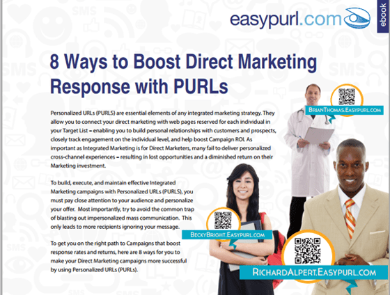
Here’s where the campaign fell apart for me.
This isn’t an ebook.
Maybe that’s just semantics, but if you’re going to call it an ebook, I want to see a cover page, a table of contents, and some in-depth information. I’d also like to see more than eight pages.
Furthermore, this doesn’t look like the picture in the email and landing pages. I feel disappointment, not satisfaction. After a stellar marketing campaign, this ebook was a let-down.
My response? I glanced through the ebook and immediately forgot it. I wasn’t impressed. And I wasn’t inclined to contact Easypurl. Sadly, by under-delivering on the ebook, Easypurl lost me as a prospect.
Touch 6: The follow-up phone call
A few days after the download, I received a phone call from Joe, an account executive at Easypurl. This was a touch I didn’t expect, and it definitely improved my perception of this campaign.
Joe asked me what I thought of the ebook, so I told him. He was gracious enough to thank me for my evaluation, then set up a phone call where he could fill in the gaps left by the ebook.
Nice job, Joe.
Lessons learned
In multi-channel, multi-touch campaigns, it’s easy to let one or two of the pieces fall through the cracks. It takes a lot of planning and oversight to get every detail right.
In this campaign, the only real fail is the ebook. Coming on the heels of such a great email and landing page, though, the ebook should have been much higher quality. Here’s what I’d recommend to fix it:
- The ebook should have a cover that has a similar look as the email and landing page. It doesn’t have to be exact, but the same color scheme and style would be nice.
- The image in the email and landing page should show the actual cover of the ebook.
- Either the ebook needs to be called an “information guide” or “special report,” or it needs to be beefed up and formatted as an ebook.
Overall, I give this campaign high marks. It was well planned, with high attention to detail. In particular, I like:
- The first call to action was a PURL, my name in the link. That’s unique enough to get me clicking. And as you know, once people start clicking, they’re inclined to keep clicking.
- There was a consistent color and design scheme through most of the campaign. That made it easy for me to recognize all the different touches as part of a bigger message.
- Each piece of the campaign was clear and easy to navigate. I always knew what was happening, what I needed to do, and what to expect.
- The final piece was an unscripted human connection. Joe didn’t just read a marketing message when he talked to me. He engaged me in a real conversation, which gave him far more information about my needs than he would have gathered otherwise.
One thing I would have liked to have seen: This campaign is about PURLs. The final email should have used a PURL to stay consistent with the first email.
How you can do it
Getting all the pieces right in a multi-touch campaign can be a challenge. The fact that Easypurl lost me with a low-quality ebook doesn’t mean they didn’t do a good job.
It does make you realize how important it is to get the details right.
So how do you ensure you can do that? Focus on these four things and you’ll have a good head-start:
- Structure your campaign from a high level first, designing the flow and overall message first. Once you can see the big picture, you can drill down to the details.
- Create a design that will apply to every piece in the campaign. Then stick with it. By branding the entire campaign, you help people see at a glance how everything fits together. (As a bonus, it tends to generate higher trust too.)
- Provide clear instructions that tell people how to respond and what to expect at every stage of the campaign.
- Make sure you deliver on your promises.
What would you add? Do you find it difficult to keep all the pieces together in large campaigns? What tips would you offer?
![]()
