There are plenty of ways to screw up a form.
Put your form above the fold, you’re a pushy salesman. Put it below the fold, you’re a pushover. And what’s good CTA copy? Three fields or two? There’s never a firm answer.
But since forms are the apex of lead gen campaigns, these are very important questions for every digital marketer. Everything you say — everything you design — should build towards persuading users to complete your form.
The problem is, that “apex” is a moving target. People arrive at purchasing decisions at all different times. So how can we appeal to different buyer types without placing nasty, unsightly forms all over our landing pages?
To solve this, we’ve uncovered a tactic for allowing users to tell you when and where they’re ready to fill out your form; something that allows you to place the same form in multiple sections of your landing page without taking up real estate.
The tactic: placing forms within a user-triggered lightbox, a.k.a. a lightbox form, and distributing CTAs to the same form throughout your landing page.
The form conundrum
Form placement wouldn’t be an issue if users all had the same buying habits, but we know that’s not the case.
In their 2006 book Waiting For Your Cat to Bark, Bryan and Jeffrey Eisenberg assert that customers can be segmented into four fundamental buyer modalities, (i.e., profiles that describe the behavior of different buyers):
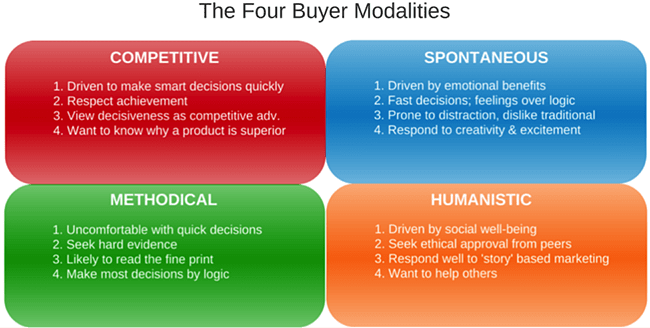
Without going into too much detail (but here’s more if you need it), they break down like this:
- Competitive buyers like making quick decisions based on logic; they view speed and decisiveness as an advantage.
- Spontaneous buyers also make quick decisions, but these decisions are driven more by emotion than logic.
- Methodical buyers take their time to make the most informed decision possible — they read the fine print before making a choice.
- Humanistic buyers want to ensure their values align with a company before becoming a customer; ethical approval from peers is important.
These four buyer modalities tell us different people arrive at purchasing decisions at different times. But with only one form per page, how can marketers appeal to everyone?
If you bury your form below the fold, buyers who make decisions on a whim (competitive and spontaneous) may decide to bounce before they scroll down and see it.
If you put your form above the fold, methodical and humanistic buyers (who are busy devouring your copy three screens down) may forget where it is. Same result: they’ll bounce.
But in all this madness, there’s one thing common to every buyer type: they all have questions that need to be answered before they arrive at a purchasing decision.
And by answering these questions, marketers build momentum towards successfully converting visitors to leads and sales.
Conversion momentum
Every landing page tells a story. It’s not enough to just say the right words and have the right design. To convert prospects, you must address their questions in the right order.
Most landing pages follow a story similar to what’s known as Monroe’s motivated sequence — developed in the 1930s by Professor Alan Monroe — as a way to structure persuasive speeches.
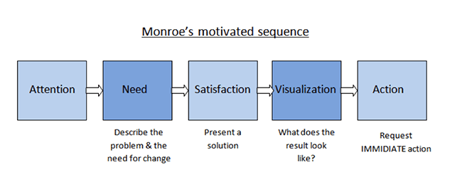
Monroe’s sequence lends itself to the concept of building conversion momentum, (i.e., the forward movement your landing page creates when you address a prospect’s questions in logical order). You need conversion momentum in order to build and motivate prospects towards performing your desired action.
On a landing page, that normally means either clicking a call to action or filling out a form. But with the concept of lightbox forms, it means clicking a CTA to activate a form.
And when your landing page copy tells the story in the right order — the correct hierarchy of persuasion — a lightbox form will help you appeal to different buyer types at different stages of your funnel, all on the same landing page.
So what are lightbox forms?
A lightbox is a modal window that opens over a page, filling the screen and dimming what’s behind. It allows us to prominently display content requested by the user.
Click on any Facebook picture, and it displays in a lightbox:
Lightboxes are normally used to display media or extra copy, but lightbox forms are used to display, well, forms.
Here’s an example from Autopilot — a marketing automation platform — who uses lightbox forms on its webinar landing pages.

So unlike inline forms, which display on the page itself, lightbox forms only display once they’ve been consciously triggered by a user clicking your CTA.
The concept takes advantage of what’s called the Zeigarnik effect, developed by Russian psychologist Bluma Zeigarnik, which suggests people are much more likely to finish processes they’ve already started. It states that people have trouble focusing on new goals when they’ve left previous tasks incomplete.
In this context, the Zergarnik effect suggests users who click a CTA are more likely to complete your form, since they’ve already taken the first step.
And remember those buyer modalities? With lightbox forms, we can distribute multiple CTAs throughout the page — all linking to the same form — allowing us to appeal to competitive, spontaneous, methodical and humanistic buyers.
Spontaneous and competitive buyers can be captured with CTAs earlier in the story, while methodical and humanistic buyers can click your CTA after getting more information.
Of course, there’s no such thing as a guaranteed conversion lift. Lightbox forms are a great testing opportunity, not a sure thing. So if you’re interested in giving it a shot, follow the step-by-step tutorial below.
Putting your form in a box
If you use Unbounce, you can follow this process to set up your first lightbox forms. If you don’t use Unbounce, you can grab a free account and follow along.
If neither option works for you, check out this handy tutorial on setting up lightboxes with CSS and jQuery.
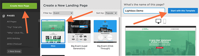
Step 1 of 4: Create a page (or use an existing page)
Open up the Unbounce App. If you have an existing lead gen page you want to test, click Start with a Copy of Your Existing Page.
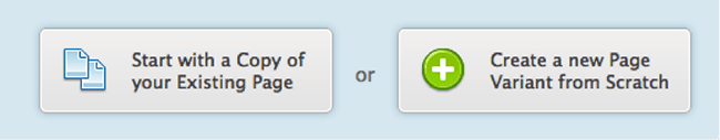
If you don’t have an existing page, click Create New Page, give it a name and click Start with this Template.
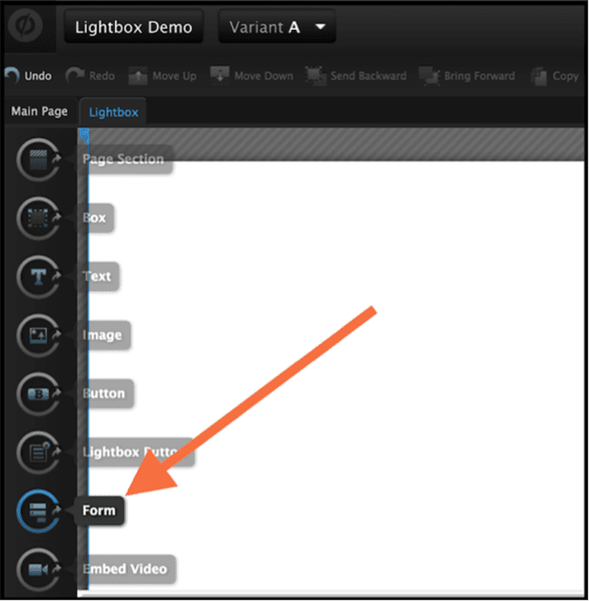
Step 2 of 4: Create a lightbox
From the tool panel on your left, select Lightbox Button, and drag and drop it onto your page.
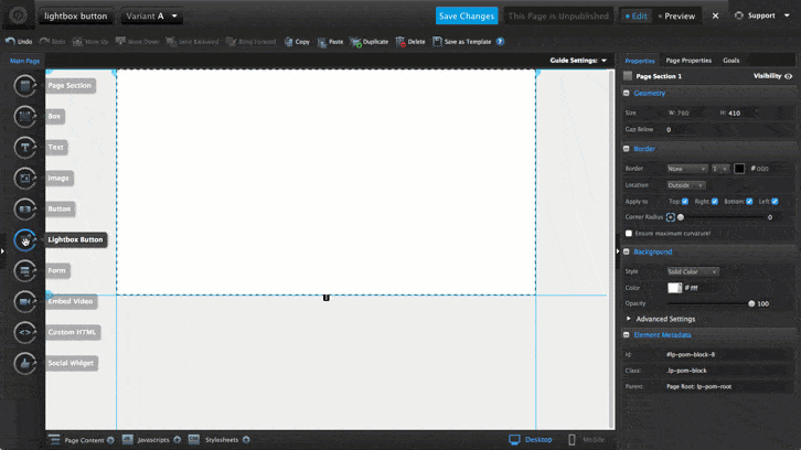
After dropping your button and typing your CTA copy, a menu called Lightbox will appear just above your page preview window. Click this menu.
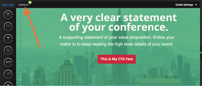
Step 3 of 4: Put your form in that box!
Your page should turn blank, and the tool panel will reappear. Select Form and drag it onto your page.
You’ll now be prompted to select your form fields, just as if you were setting up a normal form. Select your fields and click Done.
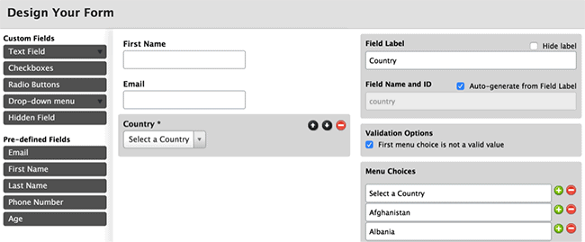
Crop your form, click Save Changes. The entire sequence is demonstrated in the GIF below.
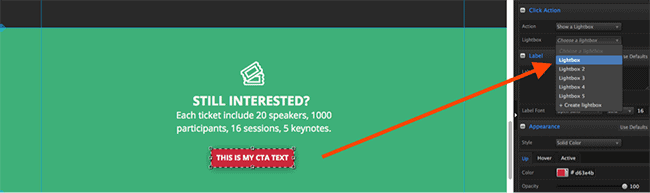
Step 4 of 4: Make ’em open the box (distribute more CTAs)
As discussed earlier, one of the advantages of lightbox forms is you can link multiple CTAs throughout your landing page to the same form. This helps us appeal to multiple buyer types.
Scroll down, and when you find somewhere to place an additional CTA, drag and drop another Lightbox Button (the same as you did in Step 2). Highlight the button, and in the Properties menu on your right, options for “Click Action” will appear, as per the screenshot below.
Selecting Lightbox will link to your original form. Rinse and repeat for every additional CTA you wish to add to your landing page.
Setting up your A/B test
Now for the fun part! Setting up your A/B test is pretty simple, so you can follow the step-by-step instructions below, OR just watch this 60-second tutorial :)
Step 1 of 3: Duplicate your page
If you started this tutorial by copying an existing page, skip this step.
If you started by creating a new page, open that page by clicking it in your Admin Toolbar.
Next, click Start with a Copy of Your Existing Page.

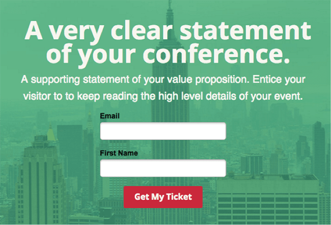
After duplicating your page, you will need to work backwards and create a variant that has an inline form, instead of a lightbox form.
In your new variant, delete the lightbox CTA.
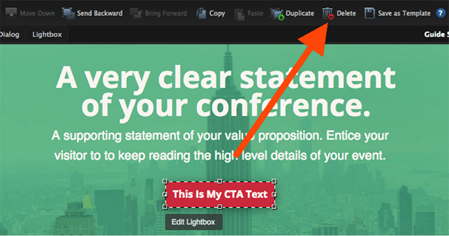
Next, go to the same Lightbox menu above the tool panel. Click the actual form to highlight it, and then click delete. (Note: If this isn’t completed properly, you won’t be able to add a new form in the next step.)
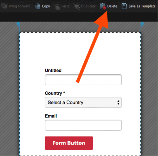
Next, drag and drop the “Form” widget from the tool panel, select your fields and click Done. You’ll be left with an inline form like this:
Since any other CTAs you’ve linked to the form (in the lightbox version) will no longer work, you’ll need to remove these from your page as well.
Step 2 of 3: Assign traffic
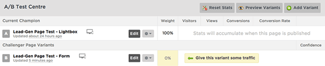
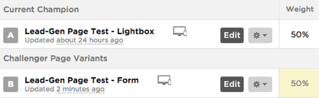
Now that both variants are set up, your dashboard should look something like this.
Next, it’s time to assign traffic to your “Challenger” variant. Simply click the “0%” and assign a traffic value of “50.” Your dashboard should now look like this.
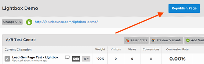
Step 3 of 3: Publish (or re-publish)
From your dashboard, click the blue Publish button towards the top of your screen. If you copied an existing page way back at the beginning, this button will say Republish.
Mazel tov! Your test is ready :)
So what can you expect?
When you test lightbox forms, a blessing of unicorns won’t carry you to a 300% lift, nor will your landing page will be imbued with the strength of 10 fallen kings.
But like any form-based A/B test, you will see a change in the way users interact with your offer. Whether that change is positive depends on your aforementioned hierarchy of persuasion, which you can learn more about in this episode of the Landing Page Sessions.
In essence, lightbox forms are a nuts-and-bolts, throw-on-your-hard-hat type of A/B testing opportunity you can implement without too much pain and agony (e.g. endless hypothesizing).
♭And that’s the way you do it!♮
")
