If you’re here, you know that without conversion rate optimization, all the traffic in the world won’t guarantee a profit. You probably also recognize the need to test your assumptions with experiments and split tests, that you need to overcome objections, and, well, convince them to convert. But if you’re like almost every marketer in this field, you’re missing one big, important piece of the puzzle: a unified framework.
Most of us are forced to start with hunches or guesswork when best practices aren’t making the cut. Sure, that eventually turns into tests, data, and a road forward. But it’s usually a long and winding road, and there’s a reason for that.
Most of us have no idea what our users are thinking about.

Wouldn’t it be great if we had some unified model to turn to, something that would tell us what consumers were thinking about during each stage of interaction with your site?
It turns out, we’ve got one.
The model comes from a peer-reviewed paper called Developing a New Model for Conversion Rate Optimization: A Case Study. It’s built on three case studies, a detailed analysis of the literature, and examination of one highly successful CRO agency.
And it means that most of us are, at best, making decisions based on a half-finished model.
The Trouble with Conversions
Let’s be honest: conversion rates on the web suck.
Sure, over half of US consumers with net access are regularly shopping online. But most sites have conversion rates under 5 percent, and unoptimized sites are lucky to capture value from more than 2 or 3 percent of their visitors. Compare that with physical retailers, and it starts to look absolutely horrendous.
There are several reasons for this:
- It costs no money and very little time for users to shop around online. Compare that with the financial and temporal cost of driving and it’s easy to see why users are more willing to hit the back button than to walk out of the grocery store empty-handed.
- Most prefer to do their research online and then make the purchase in a physical store, so they don’t have to wait.
- The needs and behavior of online consumers are very different, and most online retailers know little or nothing about them.
That last point is a big problem. We can’t treat online consumers like people walking through the front door. They’re a different animal entirely. And that’s why the model most of us are using is only half-baked for a digital marketplace.
The Buying Funnel: Only Half the Story
If you’re not familiar with the buying funnel, it goes something like this:
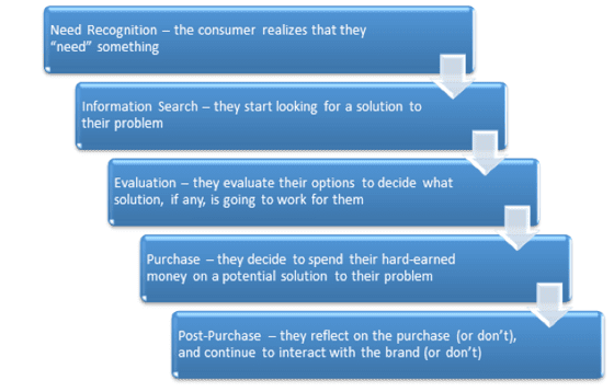
This isn’t the only version of the buying funnel. Some of them talk about awareness, interest, desire, then action, or use different terminology. But they all take the same basic framework: consumers realize they need something, then go through a series of steps until they buy something, and then perhaps do something else.
Do these steps leave you feeling uninformed? Unsure how you could possibly use them to your benefit? Bored?
That’s the trouble with this model, and others like it. The steps just sit there. It tells us that consumers need to pass through a series of steps, but it doesn’t tell us how or why they do.
Don’t get me wrong, the buying funnel isn’t without merits. It’s useful to know that there are stages in the process, and that the consumer needs to advance through all of them if you want to run a successful business. You can’t sell a solution to somebody who doesn’t even recognize a need for one.
But how do we advance them through those stages, instead of sending them running for the back button?
Most versions of the buying funnel don’t even give us an idea of how to do that. The general advice is to just test whatever random impulse comes to mind if best practices aren’t working. We don’t have a model that tells us why best practices might not be working.
At least, most of us don’t.
Experiences – The Missing Half
After analyzing academic papers on CRO from 2004 to 2012, the researchers concluded that the buying funnel model was missing one thing: web experiences.
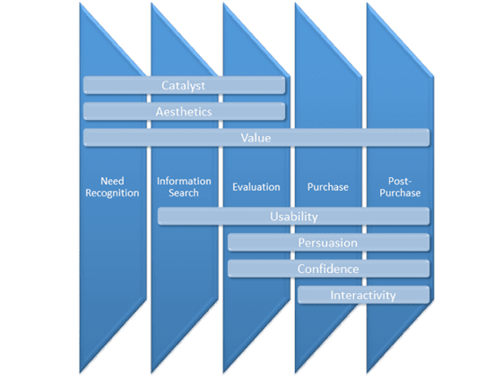
Here’s the thing. The online marketplace just can’t be compared with physical retail. People experience the web differently than they experience “the real world.” After interviewing a CRO agency called Clixo, who’s worked with companies like Nissan, Samsung, and Hasbro, they uncovered five elements of web experience that play a crucial role in conversions:
- Catalyst: What is the user’s motivation and traffic source?
- Value – How unique, specific, and relevant is the solution for the user?
- Usability: How intuitive is the user experience?
- Persuasion: How clear is the value proposition, and what is the incentive to act on it?
- Confidence: How much anxiety does the user have, and can they trust the brand?
And the peer-reviewed literature had two more elements to add to the mix:
- Aesthetics: How does the appearance of the site impact their decisions?
- Interactivity: How much does the site and the company respond to the user’s actions and individual needs?
So, what’s the point of adding these seven experiences to the mix? Are we just trading in one arbitrary set of “steps” for a different set of “web experiences?”
Not quite.
First off, in the three case studies, applying just 5 of these web experiences was enough to double conversion rates 2 out of 3 times (and make some serious cash in the third).
But the breakthrough comes from combining these two ways of looking at user behavior into one unified framework. At each stage in the buying funnel, the user is experiencing one or more of these elements. This helps us pinpoint which kinds of changes are worth testing during each phase in the buying funnel. Here’s how they fit together:
Write this down or print it out now. Tape it to your computer monitor. Seriously.
Now, at each step in the buying funnel, we know which elements are most important to test. We don’t need to address interactivity during the need, information, and evaluation phases. We can ignore the catalyst when the user is making the actual purchase, and afterward.
By combining these models, we have a framework for deciding what to test, why, and when.
Now let’s go ahead and dive into these elements:
1. Catalyst
This is all about the intersection between the user’s motivation and the traffic source. When you understand what motivates the user to visit the page, you can design accordingly. This is why user targeting is so important. Take a look at:
- The traffic source itself (organic search, paid search, social, display ad, existing customer, subscriber, etc.)
- User intent. The title of the page, or the text that brought them to it, plays a huge part here. The promise of the title or ad copy is what motivates the visit.
- Market research through surveys and tools can also play an important part in identifying what motivates users to visit your site, and how you can respond to those motivations.
2. Aesthetics
This is what people tend to think of when they talk CRO: button sizes and colors, layout, images, text size, etc. An understanding of visual psychology and design principles can pay dividends here. Unbounce has covered this tons of times so it’s probably best if you just take a look at How to Use Design Principles to Increase Conversions and some Unbounce landing page critiques.
Value
This one is huge. Did you notice it’s present during every single phase of the buying funnel? To establish value, you need to accomplish three things:
- You are unique
- Your value is specific (you’re not just “the best”)
- Your solution is relevant to the visitor
Visitors also measure value on two different levels:
- The company/brand
- The product/service
It’s important to demonstrate value on both of those levels.
3. Usability
This is closely related to aesthetics, but it’s not the same thing. Put simply, the user isn’t going to buy anything if the interface makes them do any work at all (and that’s only a slight exaggeration).
Keep in mind that usability testing is a very different beast from split testing. It’s about observing a small number of users (5 or so) and identifying common obstacles that make it difficult for them to move forward. Once you fix those obstacles, you iterate. Each iteration has a small sample size, but over time this sample size should get fairly large.
This is another topic that’s covered in depth all over the place, so we won’t delve too far into it here. Unbounce has a post on the complicated relationship between usability testers and split testers, and Smashing Magazine also has a helpful guide to improve your usability testing.
4. Persuasion
This one gets missed a lot. You can adjust button colors and directional cues all year long and get nowhere if your core approach to persuasion is flawed. Persuasion is based on two fundamentals:
- Clarity: Your visitors should have close to zero ambiguity about what they’re getting themselves into, and that means using text, images, layout, and design to convey a very clear message.
- Incentive: What are you doing to encourage the visitor to take action now instead of shopping around more or taking their transaction offline?
Persuasion also occurs in 3 phases:
- Attraction: This is about grabbing the user’s attention with your ads and/or headlines.
- Engagement: This is about keeping the user’s attention while overcoming their objections. Being brief, bold, and having personality play a big part here.
- Action: Ah yes, the call to action. Unbounce has an awesome guide on this one, packed with case studies. But if you focus on nothing else, recognize that your CTA must offer value (“free consultation” beats “contact us”) and alleviate anxiety (“add to cart” feels safer than “buy now”).
5. Confidence
When you compare online and offline shopping, there is a serious confidence gap. This is one of the absolute biggest gaps between the two worlds of retail. Your visitors really need to trust you, and the value of your product, before they’ll even consider spending a dime on you.
This is made up of 2 key elements:
- Reducing Anxiety: Symbols play a big part here, things like “VeriSign Secured,” or other security seals and lock pad icons. Things like free trials also leave people feeling anxious about what might be hiding in the fine print (like auto-enrollment), so it’s important to be as upfront and clear about this as possible.
- Credibility and Trust: Badges from authoritative sources, including “featured in…” badges, play a huge part here, as do testimonials, or endorsements. The best possible testimonials come from an unfiltered user review section, much like Amazon’s review system, and these can be made even more useful if you respond directly and helpfully to any negative comments.
6. Interactivity
Online stores are both more and less interactive than physical stores. When you physically drive to a store, you can directly ask questions and get help without an awkward interface. At the same time, the store can’t physically change shape or teleport you exactly where you need to be based on your needs, while an online store can.
There are several ways you can enhance interactivity:
- A personalized interface that responds to the consumers’ needs, preferences, and previous buying decisions. (Alternatively, segmented subscription lists.)
- Chat sessions (help desks)
- Interaction in the comments section
- User communities, like forums, that allow consumers to interact with one another in the context of your brand
Put it All Together
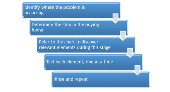
Okay, this is a lot of information, and it’s easy to get lost in it. So, how can we approach this actionably? It actually all boils down to a fairly simple process:
Case Study: 1
As an example of how this works, let’s take a look at one of the case studies from the paper: an SAAS software company.
- The problem was on a form page that was keeping users from signing up for a free trial.
- They recognized these problems as happening during the information search and evaluation phases of the buying cycle.
- They responded by testing associated page elements, and discovered that usability and persuasion issues played a big part, and confidence was interfering as well.
- To reduce confusion, they moved the form page to the home page. The page was then rewritten to improve persuasion and to clarify the value. To reduce anxieties, they got rid of several form fields.
- These changes boosted the conversion rate from 4.89% to 9.55%, nearly doubling results.
Case Study 2
In the second case study, a B2B business was struggling with attracting phone consultations:
- The problem seemed to be ubiquitous on the site.
- The stage of the buying cycle didn’t seem to matter.
- After conducting interviews with customers, they recognized that they were dealing with a value problem.
- They recognized that the main issue with value was relevance. The copy was attempting to sell a product when the goal was to elicit a phone call. They adjusted the copy to fit the CTA on a new microsite.
- The new site nearly tripled conversions.
Case Study 3
The final case study involved a skin care company:
- Reorders were high, so the issue was occurring early on in the buying cycle.
- The problems seemed to center around the evaluation phase.
- They identified problems with confidence, since the products they were selling were usually only available at doctors’ offices. They also had value problems that made it difficult to succeed in a price-competitive market.
- They addressed anxiety, trust, and value issues simultaneously by using less ambiguous language and clarifying their unique value in the process.
- Revenue increased by 18%.
Feel Smarter Yet?
I’m a fan of theory, but I don’t think it’s worth investing a ton of time into unless the result is a model you can use. That’s what I love about this new approach. It gives you principles to base your decisions off of, instead of just throwing things at the wall to see what sticks.
It’s not enough to know where the user is in the buying funnel. We need to address what is going through their minds during each stage, and why. Once we recognize which level of experience matters and when, we can eliminate objections before they happen, keep users on the site, and even keep them coming back for more.
Have you ever addressed the wrong thing at the wrong time? Does this model clarify what went wrong? We’d love to hear anything you have to add to this conversation.
![]()
![]()
