
It’s landing page examples time again, and this time I’m going to focus on critiquing the pages from an A/B testing perspective.
Each example will examine the thought process you’d go through when analyzing a page (or the reaction a visitor might have when arriving for the first time), a testing hypothesis for how the page might perform better, and some examples of what you could test to prove your hypothesis.
This should give you and the page creators some inspiration for further testing, and show what you should consider when you run your own landing page A/B tests.
Note: Each landing page was built by customers using Unbounce, and permission was kindly provided by the page creators.
Let the critiques and A/B testing tips begin!
*PAUSE*
Actually before we start, let’s take a moment to reflect on a mistake from the past.
Do you remember those old grey Windows buttons that said “Submit”? We all do. And it’s about time we stopped copying bad habits and started creating relevant calls to action (CTAs). CTAs should be instructive. They should inform your visitor what will happen once they’ve clicked. And for the love of all things clickable, your CTA should never, ever say “Submit.”
Be warned, I’ll call out anyone (nicely) who uses that foul button language in the critiques below.
Want even more landing page design inspiration?
And remember – every page can be better, and the best way to get better is by testing. Let’s begin…
1. Right Signature
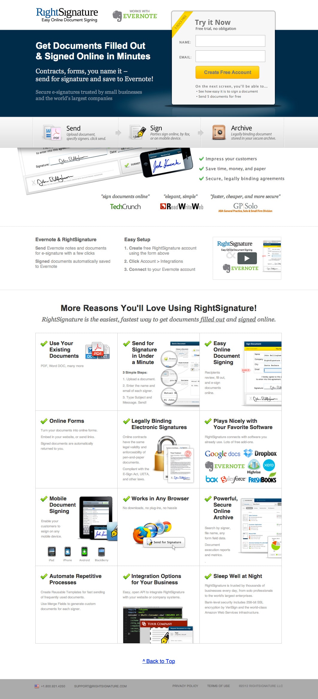
Thoughts
The length of this page makes it feels like there is a natural split between the top section of the page and the “More Reasons” section. It would make sense to somehow shorten the page, yet still provide access to the features in an on-demand manner.
Hypothesis for A/B Testing
By reducing the length of the page by removing the features section, and making it available as needed, the page will communicate its main message more succinctly, and keep the form top of mind – increasing the number of signups.
A/B Testing Advice
Suggestions on what to test to prove the hypothesis:
- Shorter page: By changing the “More Features You’ll Love” title into a link that opens a lightbox with the extra features, you remove the clutter, providing the extra information only as required to convince a fence sitter who needs more detailed information.

Site: Right Signature
2. Macquarie University
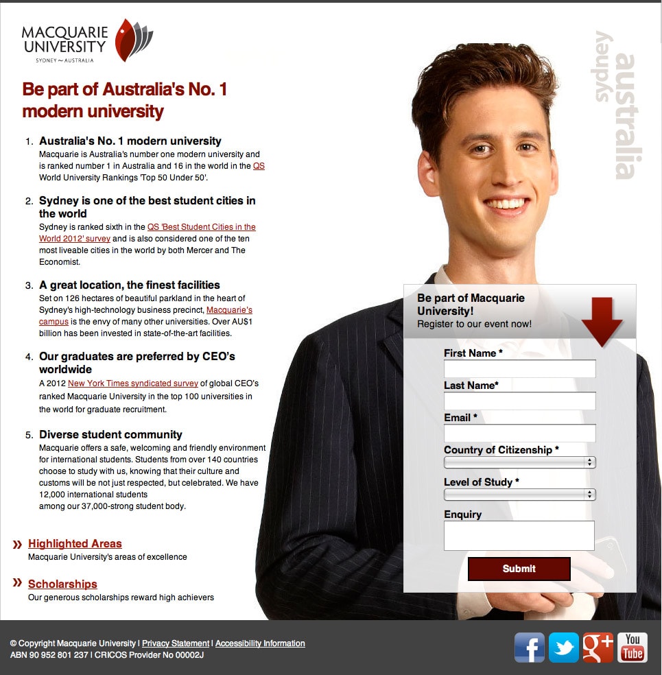
Thoughts
This one’s hard to critique. It’s a really good landing page. Oh, but there is the dreaded Submit button again! Tsk Tsk. There are a few things I’d suggest to keep the landing page experience intact. Firstly, I know people are afraid to remove links (or “leaks” as I call them), but you really don’t need to cite every claim you make at this point. It’s not a whitepaper, it’s a marketing device. Secondly, the form area needs a little work. I’ll describe a hypothesis for each.
Hypothesis for A/B Testing
The form area:
By enhancing the messaging of the form area to explain, and focus on, the purpose of the page, the clarity of communication will improve and encourage more people to complete a form they know will benefit them. This will also increase the number of relevant and qualified leads.
Page leaks:
Distractions remove people from the reason *you* have paid them to be here. Removing all links on the page so there is only one action, will increase the engagement with the page’s conversion goal, increasing form completions and reducing the bounce rate.
A/B Testing Advice
Suggestions on what to test to prove the hypothesis:
- Clarify the form’s purpose: The form header is your one chance to describe the reason why you’re asking for personal data. Here the wording suggests that you complete the form to “Register to their event”. Yet, having skimmed (that’s all people will do) the page copy, I see no mention of an event. And the dreaded Submit button does nothing to clear it up. Will you receive information about the university based on your level of study (Current? Desired?) or a prospectus for available courses? So my test advice is to say exactly what you will receive in the header, and reinforce that in the CTA.
- Never submit: You were warned.
- Leaky page: Take away all of the links on the page (except for the privacy statement). If you really need to link to something, do it in a lightbox to keep prospective students on the page.
- Add a FAQ: You can remove the need for so many questions by opening a FAQ page in a lightbox that addresses all of the questions you are currently answering via external links. This will reduce your total points of interaction to three: The CTA, privacy policy and the FAQ.
Site: Macquarie University
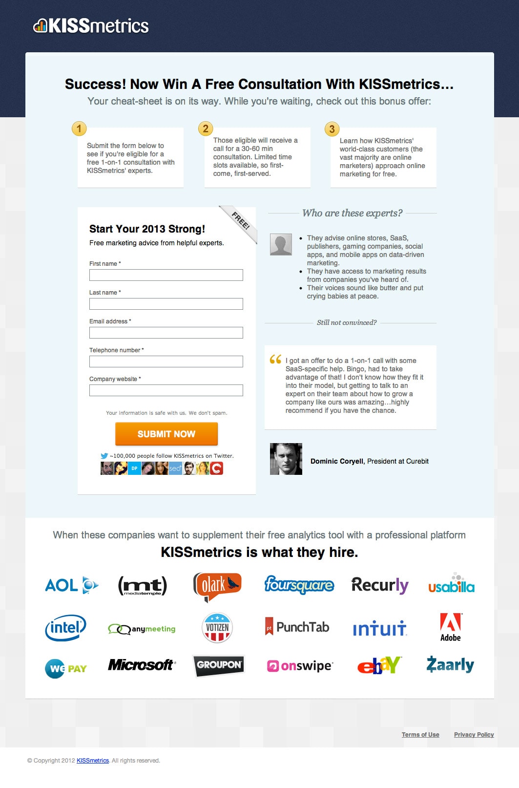
3. KISSmetrics
Thoughts
At first glance, I thought this was an ebook download, but after a bit of reading figured out it was for a bundle of something. Seems like it’s actually a report listing 6 must-have marketing tools. A better description of what’s inside and a list of the tools would add incentive to download. I’d also like to know how long the document is to gauge how much detail they will go into for each tool.
There are also a few mixed messages on the page. The first indicates it is a cheat-sheet (perhaps only one page), but then it becomes a bundle (which is a bit confusing), and then it changes back to a cheat-sheet in the form header.
Finally, the social proof at the bottom is all about KISSmetrics, which is very dominant and doesn’t really seem congruent with the purpose of the page.
Hypothesis for A/B Testing
By listing the companies included in the bundle and providing a clearer sense of what the cheat-sheet actually is, the download rate will increase.
A/B Testing Advice
Suggestions on what to test to prove the hypothesis:
- Use logos of the tools included in the cheat-sheet: Test placing the logos in the actual cheat-sheet image to let people know what’s included.
- Remove distractions: Use 1/3 of the customer logos to make it a less dominant part of the page – establishing the cheat-sheet as the most important element, and not clashing with the logos added in the first suggestion. Also consider greying them out for even less distraction.
Confirmation Page
KISSmetrics have such a beautifully crafted value proposition that is being wasted on the first landing page. It should be placed in a prominent place on the confirmation page to reinforce the brand as the purpose of the page is to get a free consultation.
Add a tagline: To accomplish this, I’d add the value prop as a tagline for the logo. There is a lot of wasted space next to the logo, so my suggestion would be: Enlarge the logo, so that it’s height can support 2 lines of smaller text right next to it. Then insert the tagline:
Line 1: “Google Analytics Tells You What Happened.”
Line 2: “KISSmetrics Tells You Who Did It.”
Site: KISSmetrics
4. Bryan Eisenberg Ebook

Thoughts
Well this is scary! Despite knowing Bryan (a bit) I’m still critiquing a page made for the man who literally wrote the book on the “Call To Action”. #NoPressure.
My first reaction is that the headline is an incomplete sentence until you read the sub-header. I prefer to use the sub-header as a supporting element for the headline – rather than a continuation of a sentence.
I like that the form uses the principle of encapsulation to separate it visually from the rest of the page, highlighting this as the area of interaction.
The design elements at the top and bottom feel like a distraction to me, and the top image essentially bumps the ebook image and form down for no real reason.
Hypothesis for A/B Testing
By removing the top-right design elements, the page layout will have more flexibility to raise the dominance of the form area, increasing downloads.
A/B Testing Advice
Suggestions on what to test to prove the hypothesis:
- Lifting the form: I’d try testing removing the top-right shapes, and encapsulating the ebook inside the form area, so that the form placement is above the fold, where you’ll get a stronger sense that completing the form is in direct correlation with getting the ebook.
- Clearer headline: Try removing the shapes and run the headline right across the top, including a supporting sub-header for clarity. My suggestion would be:1st line “The Website Testing & Optimization Buyers Guide”
2nd line “Let Bryan Eisenberg make your vendor selection easy”
Site: Bryan Eisenberg
5. Pear Analytics
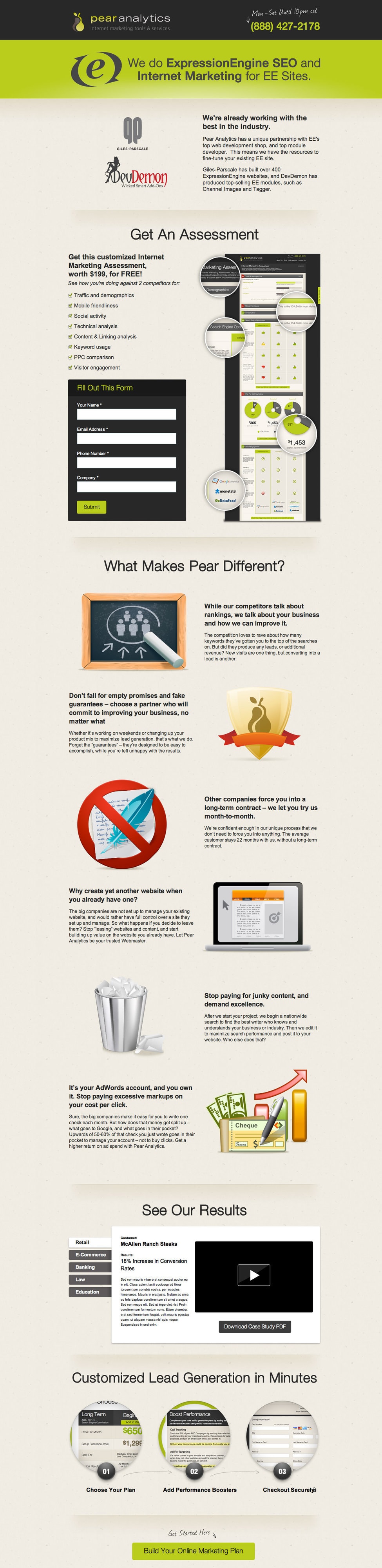
Thoughts
This is a really really long landing page, which can be great for warming up your visitors so that they are making an informed decision. The conversion goal of this page is to get people to get a free assessment and become a highly qualified lead. The CTA at the end that directs people to a different page – breaking the rule of one page, one goal. In my mind, the page should be entirely focused on trying to get people to fill out the assessment form.
Hypothesis for A/B Testing
By focusing the whole page on getting a free assessment, there will be more form submissions, resulting in more qualified leads and potential business.
A/B Testing Advice
Suggestions on what to test to prove the hypothesis
- Refocus: I’m tempted here, to go for a big-bang approach, by changing a few things at the same time to shorten the page and keep it focused on the assessment form. These would be:
- Removing the lead generation section at the bottom of the page.
- Changing the bottom CTA to “Get My Free Internet Marketing Assessment” and have it jump them back up to the form. Notice the change from “Your” to “My”, which was shown to increase conversions in a test we ran recently.
- Changing the form header to say something like “Get a Free Internet Marketing Assessment”.
- Changing the button CTA from “Submit” (Grrrrrr) to “Get My Assessment”.
- Lightbox Benefits: Reduce the length of the page by listing the 6 benefits as bullets, then opening the full details on demand.
Site: Pear Analytics
6. Super Stock Jockey
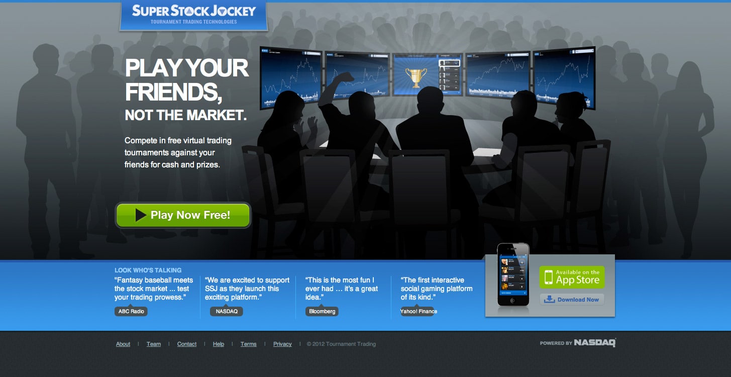
Thoughts
I’m not entirely sure what platform this virtual trading game works on. The “Play now free!” CTA indicates that there is an online version (or potentially a download).
It also doesn’t explain any of the features that make it such a great virtual game.
Hypothesis for A/B Testing
By clarifying the platform and adding feature descriptions, the click-through-rate will increase.
A/B Testing Advice
Suggestions on what to test to prove the hypothesis:
- Change the main CTA: Make a simple change to the button copy saying “Play free online now!” (if it’s indeed an online game).
- Add some feature/benefit statements: These could be in the form of bullet points for easy scanning, or a lightbox popup with more detailed descriptions complete with screenshots.
- Social proof: Mention how many people are already playing the tournaments to give a sense of its popularity.
Site: Super Stock Jockey
7. American Bullion
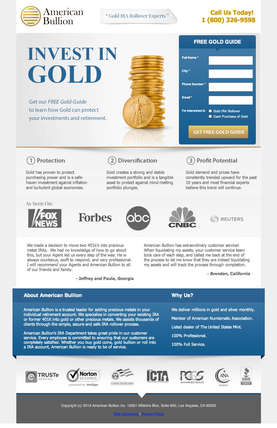
Thoughts
Oh dear. What am I supposed to do with this one? It’s a great page. So I’m going to do a 180 here and talk about what I like about it.
What I like
- Descriptive headline: The headline tells you what the page is about in three words.
- Simple intro paragraph: Describes what you’ll get for completing the form.
- Perfect form header and CTA: A descriptive form header and button copy.
- Supporting information: Everything you need to know is pretty much above the fold, but if you’re not convinced then you can check out a large amount of social proof below including: testimonials, media mentions and trust symbols.
The only thing I would add to this page would be a sub-header above the 3 steps to say what they are about: such as “About Gold Investing”.
Site: American Bullion
8. Brokers for Life

Thoughts
Another good page here. The do a good job of focusing on the form by having a CTA at the bottom jump you back up to the top. However, the most important area of the page, containing the headline, form and trust symbols, is difficult to read. The text is small and it all tends to blend into the background image.
Hypothesis for A/B Testing
By using the design principle of encapsulation the form area will stand out more making it clarify what the goal of the page is resulting in more form completions.
A/B Testing Advice
Suggestions on what to test to prove the hypothesis
- Encapsulation: Test placing a box behind the entire content section in the header photo to make it pop against the background.
Site: Broker For Life
9. Mines Press Pens
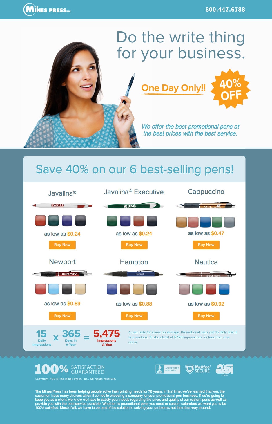
Thoughts
The headline is cute, but it doesn’t really explain what the page is about. Further down it get’s into what they are selling – promotional pens. What’s a promotional pen? There’s also a calculation about yearly impressions which makes it sound like a banner ad. Super confusing.
Hypothesis for A/B Testing
By explaining more clearly what a promotional pen is and why they are beneficial, the CTA click-through-rate will increase.
A/B Testing Advice
Suggestions on what to test to prove the hypothesis:
- What is a promotional pen?: In the headline describe clearly what a promotional pen is and why it’s beneficial. I’d try doing this with a two-layer headline. An example would be:Main headline: “Promotional pens help your business by _____”
Sub-header: “They allow you to _____”. - Details: Add a detailed description beneath the “Save 40% on our 6 best-selling pens” that describes exactly what a promotional pen is and lists bullet style, some benefits of “using one?” and how they are used.
Site: Mines Press Pens
10. Social Safe
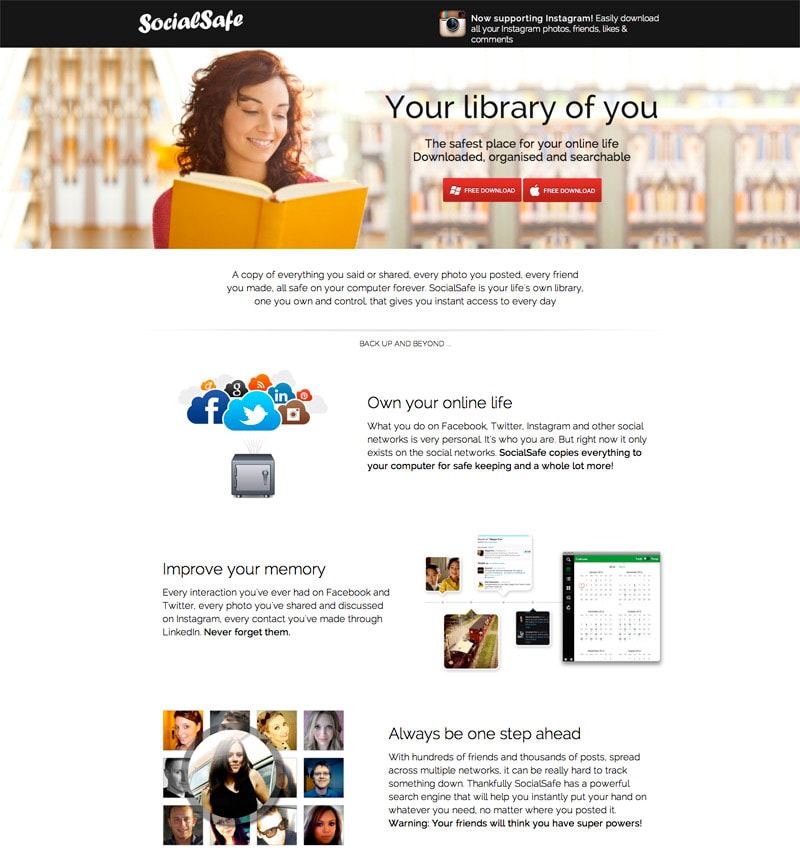
Thoughts
Pretending I was arriving on this page from a paid search ad, my first introduction to the product was “Your library of you” which didn’t make me think of a digital social media product (which Social Safe is). Especially with the brick and mortar library photo in the background. The features below do a much better job of outlining what it is all about – but I may not get that far having seen the headline.
Hypotheses for A/B Testing
By changing the header to have a social media image coupled with a headline that talks about your social media life, there will be less page defections and more downloads.
By bringing social proof elements to the top of the page, more people will believe in the quality of the product, increasing downloads.
A/B Testing Advice
Suggestions on what to test to prove the hypothesis
- Header image: Consider using the cloud-to-safe image as the main image to illustrate more immediately what the product is for.
- Flow diagram: At the bottom the very last thing you see is a descriptive visual flow diagram. This would be much better served at the top of the page. It could even be in the main header if the headline was full width above it.
- Headline: Include a mention of social media in the headline to back up the image choice and make it clearer that it’s all about social media profiles. Profiles would be a good choice of wording for the headline of a supporting sub-header.
- Social proof: Bring the social proof indicators from the bottom to the top. This includes the “millions of posts have already been saved” statement, pointing at the download buttons. Make pace to include this with the download buttons at the top.
Site: Social Safe
11. Ganxy Ebook Sales
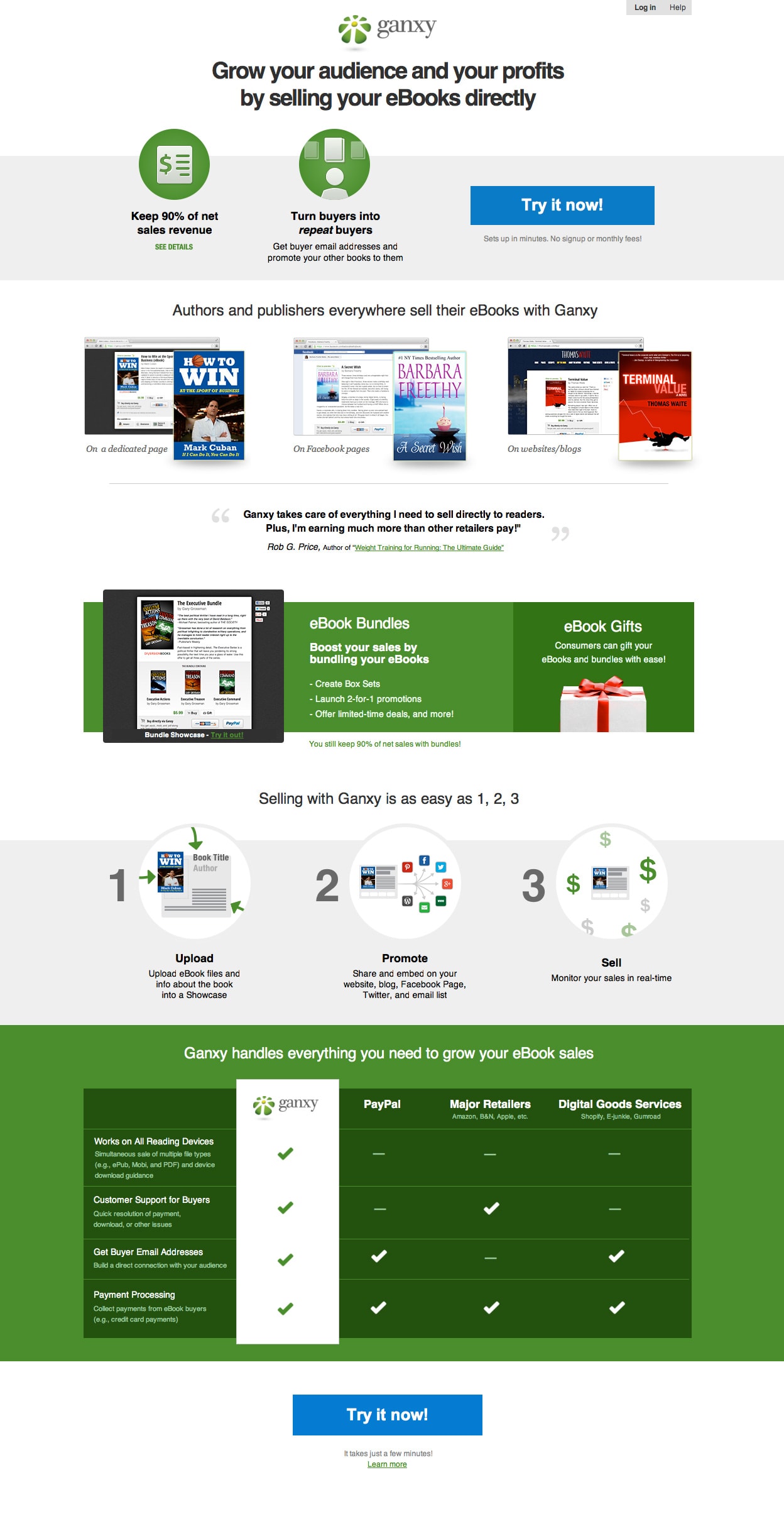
Thoughts
This page is begging for a CTA test. “Try it now” doesn’t say anything about what you are trying.
Hypothesis for A/B Testing
By including a sense of the service benefit in the CTA, click-through conversions will improve.
A/B Testing Advice
Suggestions on what to test to prove the hypothesis
- CTA copy: Test alternative CTA copy that explains what you are going to sign up for. This will support the headline by explaining how you will achieve the promise outlined. An example replacement could be “Start selling your ebooks online now”.
Site: Ganxy
12. Florida Hospital – TAVR
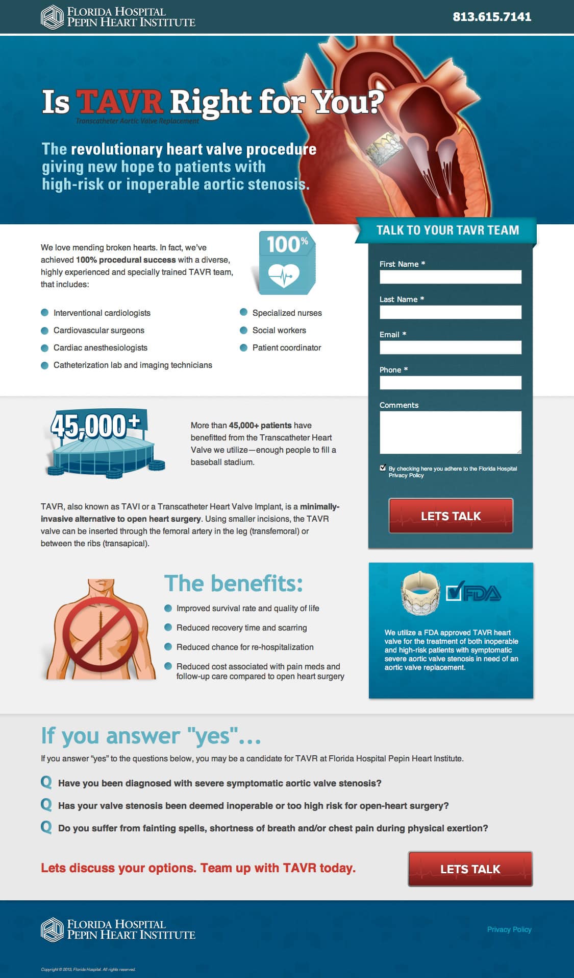
Another excellent landing page. Although I don’t get a clear sense of what TAVR is right away (the tiny description of the acronym is hard to see). If you have highly targeted ads, then you need to make sure the headline is a clear match with them.
Hypothesis for A/B Testing
By being more explicit in the headline about what TAVR is, more people will be able to relate, staying on the page and completing the form as a result.
A/B Testing Advice
Suggestions on what to test to prove the hypothesis
- Headline change: I would test using the full name of the procedure, placing the acronym as a second element.”Is Valve Replacement (TAVR) Right for You?” followed by an explanation of what the acronym and procedure are in the first intro paragraph.Note: I can’t say if this enough information for people to understand it.
- Optimize for Pay-Per-Click: If there are any paid ads (AdWords etc.) driving traffic to this page, I would change the header to be text with a graphical background, compared to having one giant image. This would increase the Quality Score and the test would compare the change in Quality Score by making the header bot-readable.
Site: TAVR
13. TakeLessons
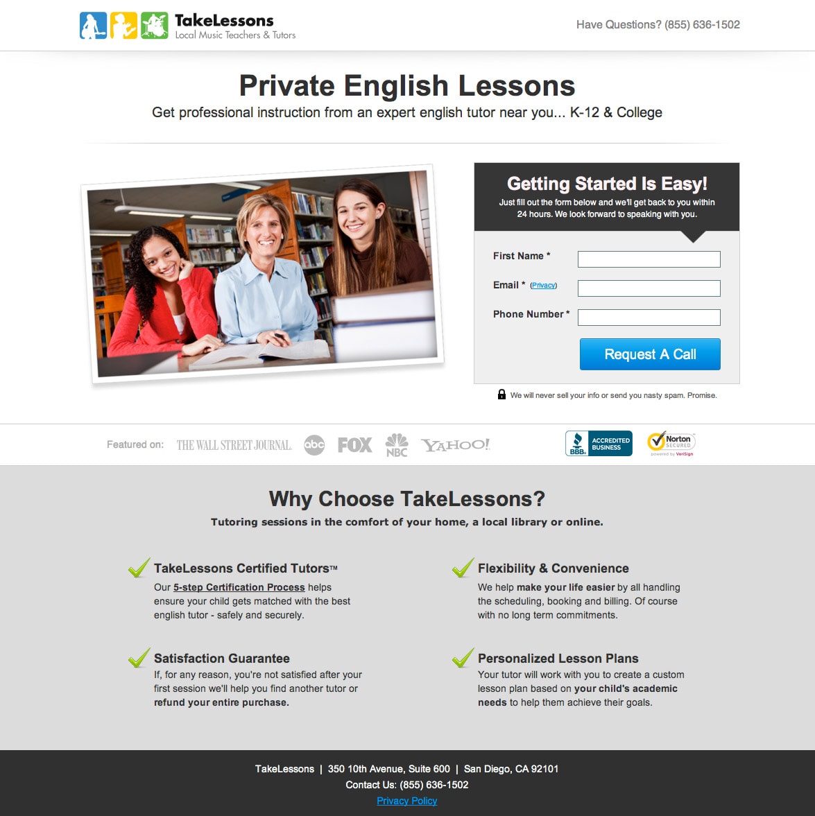
Thoughts
Being a location based service, it would be helpful to know the level of nationwide or state coverage.
Hypothesis for A/B Testing
By listing the range of coverage the service provides, there will be a greater confidence and relevance to a visitor, and as a result, form completions will increase.
A/B Testing Advice
Suggestions on what to test to prove the hypothesis
- Where: Mention where the service is available and perhaps add a map that shows precise locations.
Site: TakeLessons
14. Grab a Coffee with the Brendans
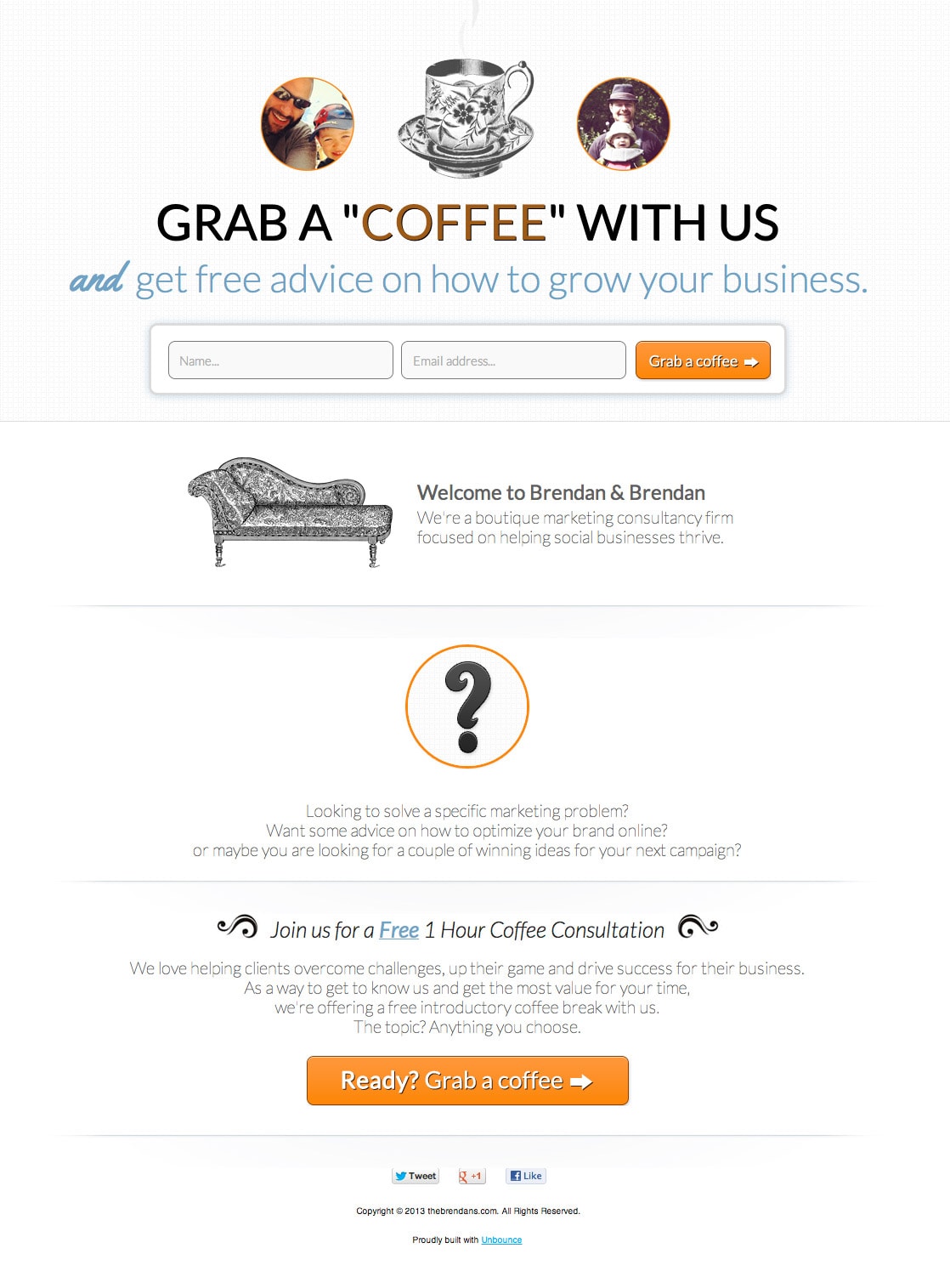
Thoughts
At first glance, I’m not sure why I would “grab a coffee with us”. Who is us? Where are you based? Is it a virtual coffee, or an actual sit down?
I also find “grow your business” to be to general and vague. I would think they’d have more success by using some of the copy used further down the page in the supporting headline, while clarifying where the coffee will happen.
Hypothesis for A/B Testing
If we explain that we are offering an online marketing consultation, we’ll get more targeted companies filling out the consultation request form.
A/B Testing Advice
Suggestions on what to test to prove the hypothesis
- Headline: Test “arrange a free 1hr marketing consultation” vs. “grab a coffee” so that people know what they are signing up for. Use the sub-header to clarify how far the geographical net spreads (local or online). Then include the grab a coffee as a secondary element so the brand personality is maintained.
Site: The Brendans
15. SweetIQ Whitepaper Download
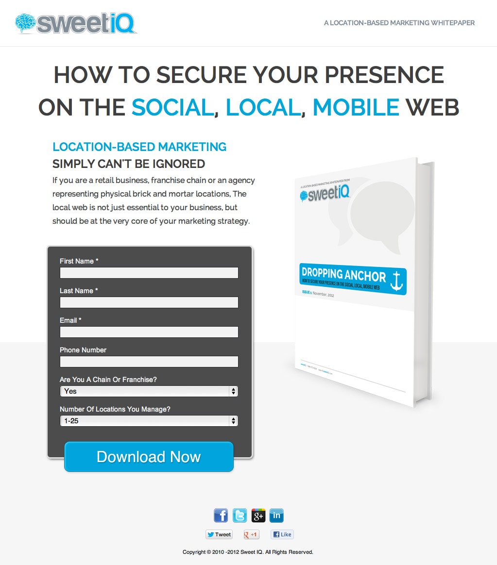
Thoughts
This is a fairly standard whitepaper/ebook download page, however the underlying design doesn’t support the aesthetic you’d expect from a brick and mortar targeted page. As an electronic document delivered online, it’s important to make it obvious that it’s for local businesses.
There are a couple of ways to do this. Use imagery to show physical businesses, either on the ebook or the background of the page or make the CTA very explicit about the ‘local’ aspect.
Hypothesis for A/B Testing
By focusing on the local business aspect in the CTA, there will be a better understanding of the local brick and mortar business relevance and more targeted downloads (creating better qualified leads).
A/B Testing Advice
Suggestions on what to test to prove the hypothesis
- CTA copy: I would test the current CTA copy against something more explicit like “Download your location based whitepaper now”, with a short supporting line beneath the button that says “For brick and mortar retail businesses”.
Site: By The Brendans
16. Do You Have Asthma?

Thoughts
I can’t find much at fault on this page, so I’ll revert back to what it does well.
Why This Landing Page is Good
- Clear headline and sub-header
- Directional cue: There is an arrow pointing from the sub-header to the form, helping to guide the visitor to the conversion goal.
- Encapsulation: This is a great example of how to use encapsulation to highlight a form, which is exactly what I was talking about for #8.
- Details: All of the main details needed are covered in simple terms – study criteria, length of trial and the cost. This is a great example of layman’s terms based writing.
- Questioned based CTA: Having a question for the CTA encourages engagement by making it more personal (and yay, no “Submit” copy).
Site: IMMUNOeResearch
17. Bounding Box Boxing
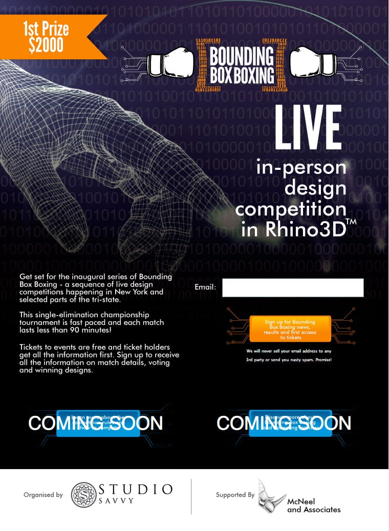
Thoughts
The visual design of this page is intriguing, but I don’t get a solid sense of what Bounding Box Boxing is right off the bat and would therefor have a hard time staying on the page.
Is Rhino 3D a viewing experience or a 3D modeling tool?
The prize money makes me confused. Can I win the money as a spectator? If I can’t, consider removing this, as you want to draw in spectators not competitors. Remember what is important to your audience.
Moreover, the CTA is so crowded with text that it doesn’t look like a button anymore, and requires some squinting to know why you would want to provide an email. Additionally, the “Coming Soon” buttons that are impossible to read below the Coming Soon text.
Hypothesis for A/B Testing
By adding a clear headline about how a ticket holder can experience the design competition and removing any misunderstanding about who is participating and who the prize money, will increase the chance of a form completion.
A/B Testing Advice
Suggestions on what to test to prove the hypothesis
- Headline test: Test a new headline like “Get free tickets to a 3D design competition in New York” – and relegate the prize money to the copy below (unless it’s somehow a prize for ticket holders).
- Add a FAQ: If I had this many questions, it’s likely that visitors will have a similar experience. Consider adding a short FAQ with answers to a few questions.
Site: Bounding Box Boxing
18. Benchmark
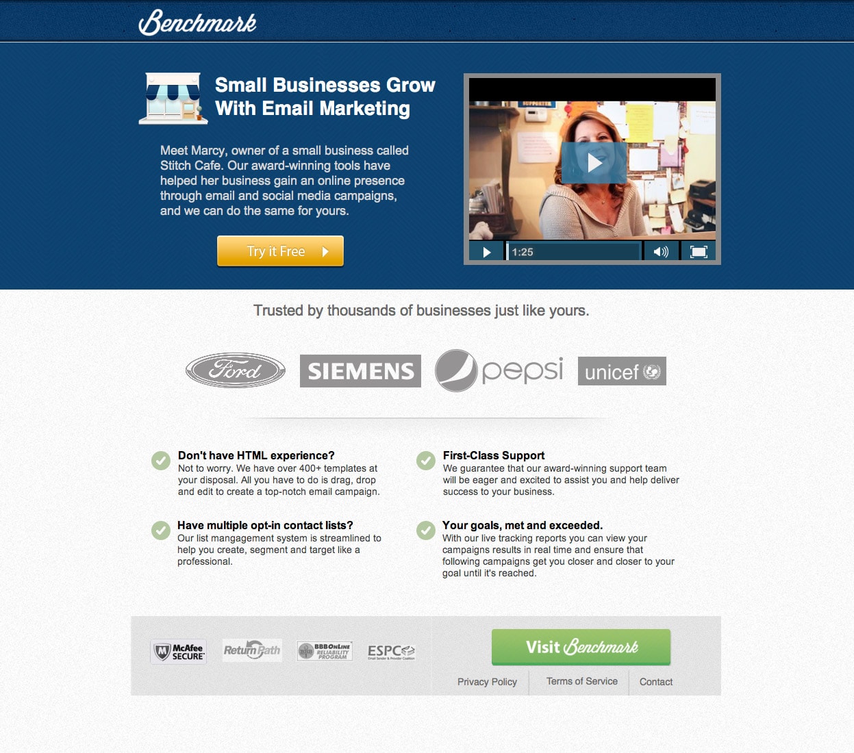
Thoughts
The page talks about small business, and then features giant companies. There seems to be a mismatch of company size that could make people perceive their offering targeted toward the enterprise market.
There are two different CTA’s on the page, both in color and copy. These could use more consistency, and represent what the next step will reveal (assuming the homepage).
No clear value proposition. I don’t know how the company differentiates from the 100 other email service providers out there.
Hypothesis for A/B Testing
By including a strong value proposition that illustrates why they are unique, people will be more willing to click through to the next step.
A/B Testing Advice
Suggestions on what to test to prove the hypothesis:
- Tagline: There could be a tagline right next to the logo (to use some of the wasted space up there) that helps define the company right away. After all, Benchmark doesn’t say email to me.
- The primary headline: This could be stronger, again, differentiation is key here. Why should I care about Benchmark? What’s the main difference? I’d suggest a 2-level headline where the main header explains the core benefit, and the secondary headline backs it up with supporting information (stats, number of customers etc.) Then I’d move it over the top of the first paragraph and video.
- Image or video of the software in use: Instead of focusing on a testimonial at the first level, I’d include some bullet points that support the headline again – and a video or screenshot of the software. (Then move the testimonial further down).
Test it and see…
Site: Benchmark Email
19. Zoho Lead Generation
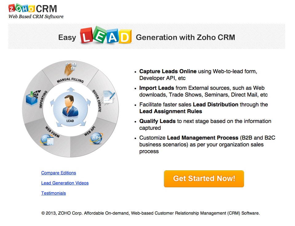
Thoughts
You’d expect this to be a nice simple page given its short concise length. But I find myself literally going in circles – like the diagram – to decipher what the product and page is all about. The headline seems clear enough, generating leads. I’m also a bit confused by the focus on the diagram being about manual entry, as that seems like the most work of all the methods of lead entry.
The CTA is nice and big, which makes it dominant on the page. This is a great opportunity to solidify the purpose of the page, almost acting as a supporting headline. Sadly the CTA copy is “Get Started Now!” which doesn’t convey what you would be getting started on. I’d like to see the main purpose/benefit of the product included here.
Hypotheses for A/B Testing
CTA test:
By including explanatory copy in the CTA the purpose and main benefit of the product will be more apparent, raising the click-through-rate of the CTA.
Diagram test:
By replacing the diagram with a short video describing the solution the clarity and purpose of the page/product will encourage more clicks on the CTA.
A/B Testing Advice
Suggestions on what to test to prove the hypothesis
- CTA: Test new CTA copy such as “Capture & Manage More Leads” with “Get Started Now” as a supporting message directly below the button.
- Video: Test the diagram against a video to see which provides more clarity. The video could be as simple as a simple voiceover as the circle revolves, explaining each method of adding leads.
Site: Zoho
20. Spousal Immigration to Canada
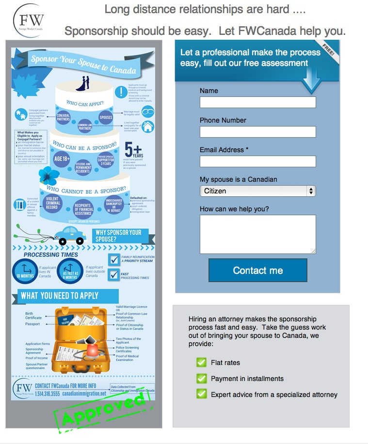
Thoughts
Well this is a first! An infographic on a landing page. Very cool. Although time consuming to read.
The opening headline is too situational, rather than descriptive. It would be stronger if it were simplified, rather than ‘cute.’ The infographic has it right: “Sponsor your spouse to Canada”.
Hypothesis for A/B Testing
By changing the page title to directly describe the purpose of the page, the bounce rate will be lowered, and conversions lifted.
Replacing the infographic with key facts in written form will improve the clarity and time spent reading, resulting in more people completing the form, as they will have a better idea of what the benefits of using FWCanada are.
A/B Testing Advice
Suggestions on what to test to prove the hypothesis
- Page title: Change the page title to “Sponsor your spouse to come to Canada” and use a sub-header that says something like “Let FWCanada make your sponsorship easy”.
- Replace the infographic: Take the key points out of the infographic to inform readers who can apply, who can be a sponsor, and how to apply. Probably in the form of an intro paragraph and sectioned sets of bullet points.
Site: Spousal Immigration to Canada
21. AT&T Authorized Dealer

Thoughts
What seems to be missing on this page is a description of the full package/plan (which may be buried in the fine print – but I wouldn’t read that unless I saw the high level details first).
It also doesn’t say whether you will qualify as soon as you click the button, or whether you will be contacted via email to take the next step.
BUT it says “Submit” on the button… #notahappycamper
Hypothesis for A/B Testing
By clarifying the form purpose to explain why you are completing it, people’s expectations will be set in advance and they’ll be less hesitant to provide their email.
A/B Testing Advice
Suggestions on what to test to prove the hypothesis
- Form fields: If you find out if you qualify immediately upon form submission (via an online check), then consider removing the email address to decrease friction. If you will be contacted via email, explain this in the form header or on the CTA.
Site: AT&T Offer
22. Furniture Realm

Thoughts
So, what’s the conversion goal? Took me quite a bit of reading to get people to download a restaurant furniture buyer’s guide. For this reason I would suggest a headline test.
Hypothesis for A/B Testing
By changing the headline to focus on the conversion goal, more people will proceed to the form to download the guide (and produce more leads).
A/B Testing Advice
Suggestions on what to test to prove the hypothesis
- Headline: The most important thing to test here is the headline. I would suggest testing the current one against a two-line header. Something like this:Line 1 “Download a free restaurant furniture buyers guide”
Line 2 “From the UK’s #1 supplier”.
Site: Furniture Realm
23. Falcon Social
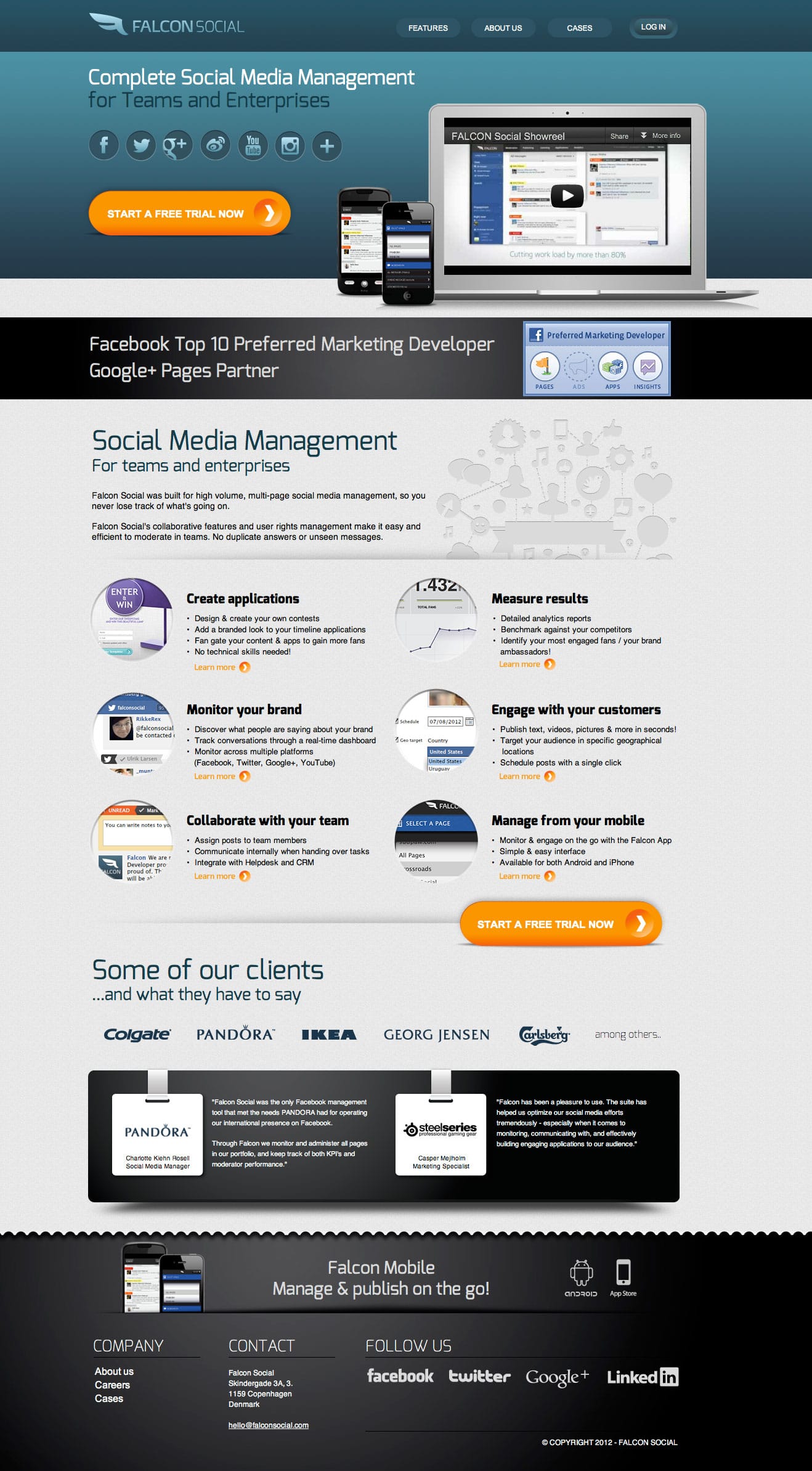
Thoughts
This page is actually a microsite, so I would first suggest ripping out the header and footer navigation to increase the on-page engagement and turn it into a promotion specific landing page.
What Falcon Social does really well is something that I’ve been preaching for a long time, namely the use of lightboxes to show extended content without leaving the page. This happens if you click any of the ‘learn more’ links.
However, the page lacks explanation of what the solution provides prior to asking someone to start a free trial. This could include having an introductory paragraph beside the video that mentions how long the trial is along and include a benefit statement.
Hypothesis for A/B Testing
By changing the CTA copy to a benefit driven statement and telling the customer what they would be when they sign up, more people will start a trial.
A/B Testing Advice
Suggestions on what to test to prove the hypothesis:
- CTA copy: To test different CTA’s, I’d run the original against a core benefit CTA such as “Grow Your Brand Socially” and a 3rd CTA that says “Grow Your Brand Socially” with a smaller supporting “x-day free trial” directly beneath the button.
Site: Falcon Social
24. Orion Space Burial
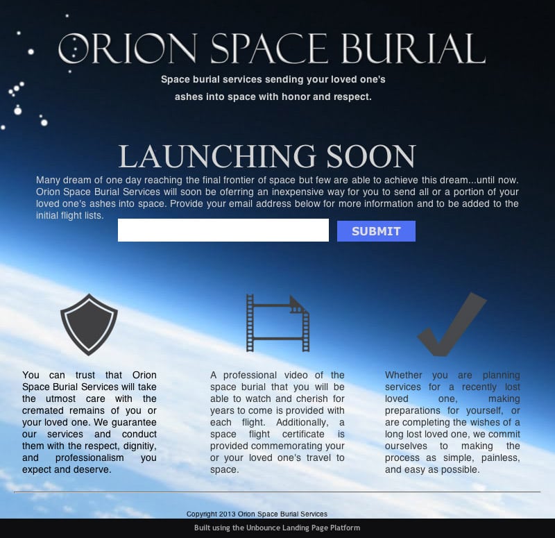
Thoughts
My first thought was “Wow!” – getting your ashes shot up into space. Well not your own, but you know what I mean. Pretty cool concept, but I think I’ll wait a little before committing.
Having said that, the title “Launching Soon” is the cleverest coming soon title I’ve seen (and I’ve seen about 20,000 landing pages).
As promised, I’m calling out any “Submit” buttons. A form button should never say submit on it. In this case, something like “Send me more information” would be appropriate.
Hypothesis for A/B Testing
By describing how the ashes are transported into space and providing or alluding to information on costs, more qualified will be generated.
A/B Testing Advice
Suggestions on what to test to prove the hypothesis
- Logistics: Change the CTA to something like: ‘enter your email to find out how it works and how much it costs.’ This would be a good enticement to fill out the form.
Site: Orion Space Burial
25. Dodo Power & Gas

Thoughts
One confusing part of this otherwise simple landing page, is that there is a dropdown box to choose your location, yet there is a “Victoria Only” designation on the page. The required fields asterisk also clashes with the headline asterisk. For the headline one I’d use a different symbol to connect to the fine print.
And I’d just ask very politely that the button copy be changed from “Submit” to something more relevant.
Aside from that, I’ll reiterate the importance of having the headline in text rather an image. This will penalize you severely in the landing page quality quotient of your Adwords Quality Score.
Hypothesis for A/B Testing
By removing the required field for email address, more leads will be captured to receive an agent callback via the phone.
A/B Testing Advice
Suggestions on what to test to prove the hypothesis
- Form changes: Make the email field to be not required and change the CTA copy to reflect that an agent will contact you over the phone.
- Callback method: To get even more form submissions I’d suggest allowing the visitor to choose their preferred method of contact.
Site: Dodo Power & Gas
26. Tap for Tap
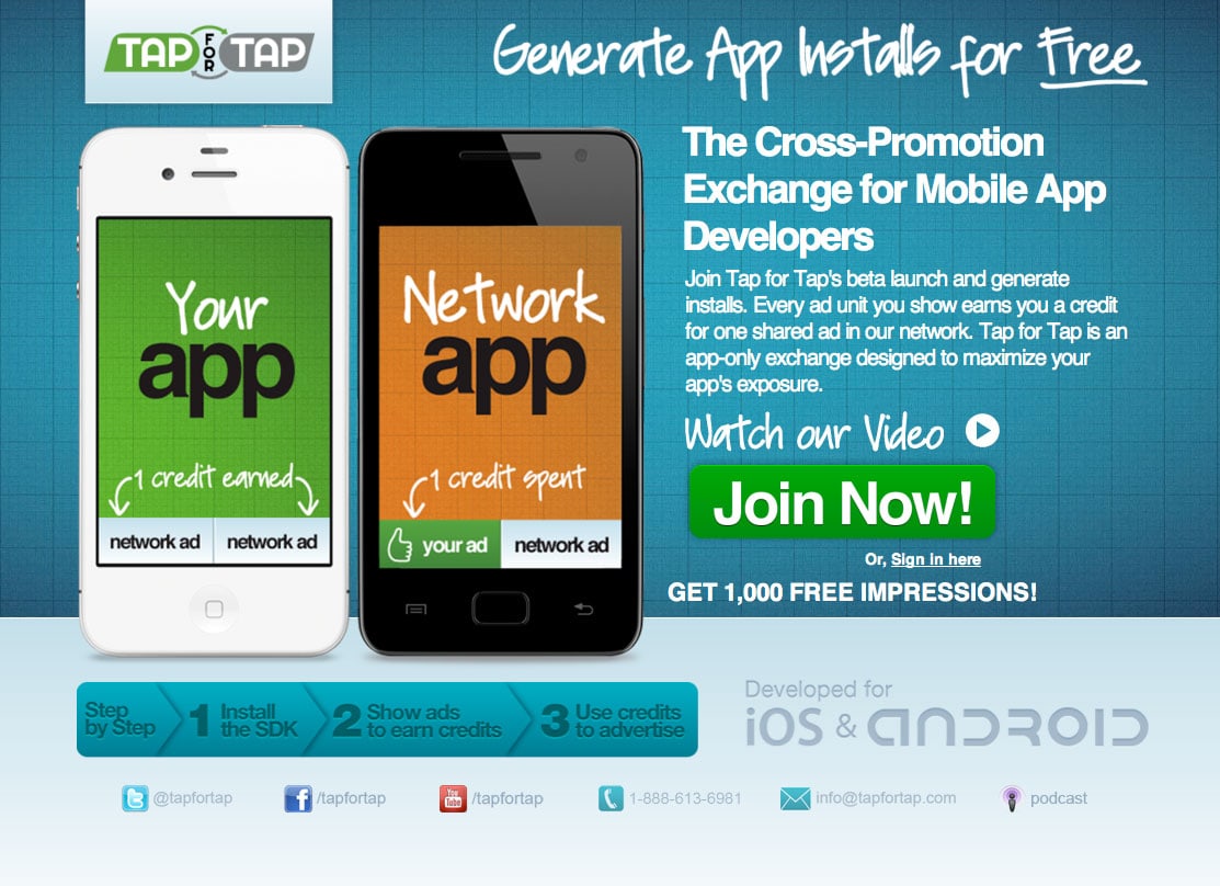
Thoughts
Sounds like a cool concept, apart from the fact that I had to read every word on the page to really understand the mechanism it’s based on.
They do have a video, but it’s on another page. The video on the other page uses a lightbox, which would be perfect for the landing page as a mechanism to educate without leaving the page. Another solution would be to have the video play right inside the phone image. Better yet would be two videos – to explain the two sides of the concept.
Hypothesis for A/B Testing
By including two embedded videos inside the phone images, the two-sided concept will clarify the concept. Removing the large “Watch Our Video” CTA will result in a single CTA with additional whitespace for clarity. These changes will result in higher engagement, and a higher click-through-rate.
A/B Testing Advice
Suggestions on what to test to prove the hypothesis
- Video: Test the current (A) page, against a B page with a lightbox video on the “Watch Our Video” link, and a C page that has the two videos embedded in the phone images.
Site: Tap For Tap
So there we have it, 26 landing pages critiqued for conversion and A/B testing. What do you think? Have your own testing hypotheses? Share them in the comments.
And what’s the biggest takeaway from this roundup of fabulous landing page examples?
