
Design rules. Design RULES! A subtle difference, but which would you pay more attention to? My guess is the second, as it’s been crafted (albeit not very subtly) to be more persuasive. Designed.
The image above is all about design, you just need to know what to look for:
- A directional cue: shows the motion of the butterfly, by way of the trail of stars and bubbles.
- Whitespace: is shown by the lack of clutter around the subject.
- Color & contrast: are used to make the butterfly stand out from the dominant hue of the photo.
- And finally the golden spiral is utilized, where the inferred location of interaction between the subject, and it’s destination, is positioned directly on a dynamic focal point.
With that in mind, I’m taking this post old-school, to show you how fundamental design principles can be used to increase conversions on your landing pages, breaking it down into two important aspects of conversion centered design:
- Persuasive design for lead gen forms
- Persuasive design for calls-to-action (CTAs)
Part 1. Persuasive Design For Lead Gen Forms
In the first segment we’ll explore the progressive design of a lead gen form, applying the design principles of encapsulation, color & contrast and directional cues to take your form from zero to hero in three simple steps.
If you have a form on your page, it’s likely to be your conversion goal 99% of the time (if not, it shouldn’t be there), so why bury it? Your form should stand out from the rest of the page, and be designed in a way that draws your eye directly to it – in the same way the intro photo drew your attention to the butterfly. Step one of our lead gen form’s evolution is the use of encapsulation:
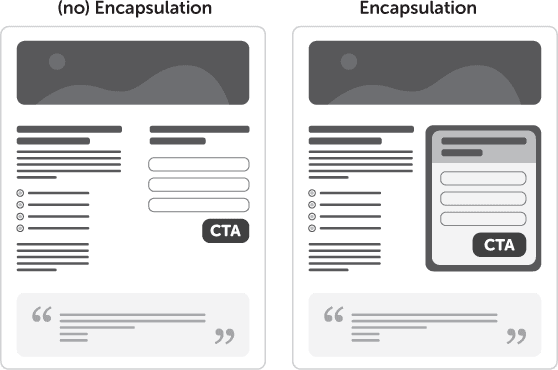
Step 1: Using Encapsulation to Increase Conversions

Encapsulation refers to the use of a container to highlight what’s inside. It’s a classic technique used to hijack your visitor’s eye and create a tunnel-vision effect. Think of it like creating a window on your landing page where your CTA is the view. In the example opposite, a circular arch creates a frame for the feature in the distance, preventing your eye from wandering elsewhere in the photo.
Landing page tip: Use strong dynamic shapes to constrain your point of interest. This can be seen in the progression below, where the form goes from being lost in the page, to becoming a focal element by virtue of the encapsulated area.
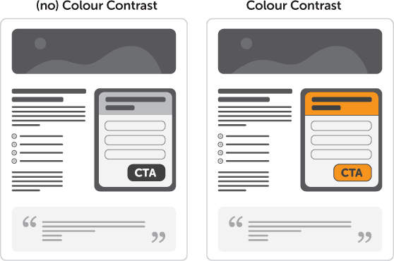
Step 2: Using Color & Contrast to Increase Conversions

Color can be used to create an emotional response from your visitors. Orange, for example, is known to generate positive feelings and as such is a great choice for the color of your CTA. (You can also consider the positive affect of Green for go, or Blue, as the classic ‘click-me’ link colour).
The idea of using color & contrast is founded on the concept of “isolation via difference”. An “in your face” approach if you will.
Some say that button color is irrelevant, but this a falsehood. Color contrast is the real problem. Yes, red might not perform better than green under normal circumstances, but if the page is dominantly green, then a red button will naturally attract more attention than a green one.
Landing page tip: Use a single color (with a variety of tones) for your entire landing page – except for the CTA. Make it jump off the page.
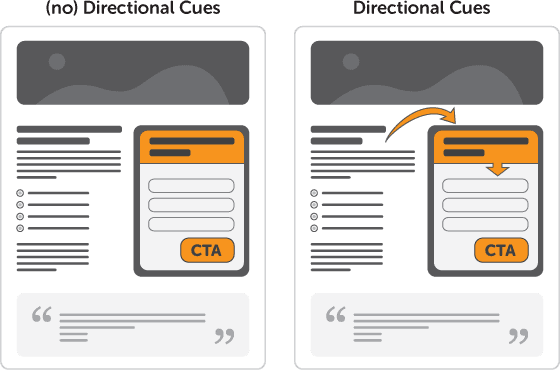
Step 3: Using Directional Cues to Increase Conversions

As directional cues, arrows are about as subtle as a punch in the face – which is why they work so well. With so little time on your page, guiding the user to the checkout is a smart move.
Arrows let you say, “ignore everything else and pay attention to this please.”
The example opposite shows 3 cues all at once. The arrow is a directional pointer, the man opposite is then firing you right back to the guy with the arrow using his eyes, and finally the upside-down text acts as an interruption that make you stop and stare (and most likely rotate your head to figure out what it says).
Landing page tip: Call attention to your most important page elements by using strangely placed and angled arrows. Tie a sequence of arrows together to define a path for the visitor to follow, ending at your CTA.
» So there we have it. A more effective lead gen form created using the principles of design.
See how I used arrows there?
Part 2. Persuasive Design for CTAs
Your CTA is the second most important element of your landing page – after the headline. After all, nobody will consider clicking your CTA if they weren’t coerced into sticking around to convert by a persuasive headline. Here, as in the form design section above, I like to use what I call the M.I.R.B.O principle – Make It Really Bloody Obivous.
In this second segment I’ll get more specific and focus just on two steps: your CTA design using whitespace, and your CTA copy placement.
Step 1: Using Whitespace to Increase Conversions

Whitespace (or more correctly termed blank space) is an area of more or less nothing surrounding an area of importance. The reason I say blank space is that the color of the space isn’t important.
The purpose is to use simple spacial positioning to allow your Call To Action (CTA) to stand out from it’s surroundings and give your eye one (and only one) thing to focus on.
Landing page tip: Give your CTA some breathing room to make it stand out from the rest of your design.
Step 2: Using CTA Copy Design & Placement to Increase Conversions
Finally, I want to touch on a technique that utilizes different approaches to CTA copy placement and layout to create a more powerful and descriptive button. You really want your CTA to encompass two concepts. 1) To be short and sweet and 2) to describe exactly what will happen when clicked. Let’s look at some examples:
In the first example you can see that if you need a longer description in the CTA copy, you would have to use a large button to accommodate the long button text. Not a bad thing, but not always possible depending on your overall design.
The ideal technique here is to break up the copy into primary and secondary statements, with the secondary copy supporting the primary. Examples two and three show different approaches to this: one inside the button and one outside. The choice is up to you, but they are both more effective than the first example at communicating without breaking your design.
Comments:
Shell
There are design principles I instinctively use which I know work, but it’s great to having a visual guide to refer back to and I agree with everything you’ve highlighted.
Great article Oli!
Oli Gardner
Thanks Shell – appreciate the comment. The fundamentals of design are often overlooked and replaced with subjective visual design (I’m as guilty as anyone) – but when you take the time to understand why something works the way it does, it can change the way you work. Repetition of smart behaviour in time results in smart design.
Deyson
Thank you, thank you and thank you for such a well written article! :)
Great advice. I now have some things to keep my busy on my online store! :)
Andy Kuiper
Nice tutorial – thanks :-)
Gerben
Thanks for this nice read! Always try to work with these principles but from time to time an article like this is needed to persuade some team-members.
Oli Gardner
Well I hope it helps Gerben. It can be tough to convince people sometimes – that’s the value that testing brings. Or even just a new topic presented in a familiar way.
Rob Kingston
Great list, Oli.
I almost couldn’t tell when the post had stopped – you’re obviously practicing what you preach under each and every article you post. ;)
Oli Gardner
Thanks Rob! Hope you enjoyed it and got something useful from it. I know I often notice something in our own work that needs updating after I write something – a long forgotten landing page or CTA – but yeah, try to eat my own dog food as much as possible :)
Shane Powers
You had me at “golden spiral…dynamic focal point.”
Ravi
Great post Oli, I especially liked the arrows under directional cues. The flow got me anticipating how it would be applied on the landing page example at each point.
Oli Gardner
Glad you liked it Ravi. It’s really interesting how you can lead someone around a page using the directional cues – keeps people on the path towards your conversion goal.
I Love these Brands
I think the biggest turnoff for a lot of people visiting landing pages or lead gen sites is their spamming feeling. If the website is not trying to spam or scam anyone, they NEED good design. Good design reassures the person that everything is alright and the business cares enough to invest time and money in their own site, so you can trust them.
Nathan Bullock
I’m a big fan of simplistic design… great article on better design principles. gives me something to take into account with my upcoming projects.
Nathan
Veronika
Unfortunately, the corporate design pronciples and furious designers are often the biggest conversion killers :(
Patrick Tasner
I think I have to absorb this tips and put to implementation soon. Thanks.
Kelly Fisher
…I feel like I am last…wait, I am last writing here. I just started this blogging thing, and I appreciate all you have posted…I am following…or trying to follow your articles.
Thank you for helping me to get going here!
K
the hurricane marketing
I really like the tips, time to implement it in my website. Thanks Oil!
Leo
CTA’s are the life-blood of my business, but we’ve found it is really important to focus on how the user views our site when creating the CTA. Our revenue model is affiliate marketing, so if people don’t click through and purchase things from our partners sites, then we can’t keep the lights on. That said, people value our sites, because they provide trustworthy, objective information. If we try to hard to say “click here” with our design and language, we wind up turning off our users. For our content, sometimes a well placed text-link outperforms a well-spaced, colorful button. As always, you must consider the customer when applying these design rules.
All that said, I think it’s a great, well thought out article. Appreciate the information.
David Chris
I have read a lot of your articles and once again, nicely written. Thanks for sharing Oli
John
You’re right, I SHOULD follow Oli on Twitter! (and so I will ;)
Harper
Wow, so much going on in one image. Incredible. I’ve found encapsulation to be an incredibly effective method for improving conversions
18 datos increíbles sobre la psicología del color para aumentar clicks
[…] Principales: http://unbounce.com/conversion-rate-optimization/design-principles-increase-conversions/ http://visualwebsiteoptimizer.com/split-testing-blog/copywriting-examples-for-high-conversions/ […]
18 datos sobre increibles sobre la psicología del color que te hará vender más | Colombianos en Argentina
[…] Principales: http://unbounce.com/conversion-rate-optimization/design-principles-increase-conversions/ http://visualwebsiteoptimizer.com/split-testing-blog/copywriting-examples-for-high-conversions/ […]
5 DICAS DE OURO PARA CRIAR UMA LANDING PAGE ALTAMENTE EFICIENTE |
[…] (crédito da imagem: unbounce) […]
7 Conversion-Optimising Principles of Website Design, Hotel Edition | Net Affinity BlogNet Affinity Blog
[…] source: Unbounce […]
23 Principles of Attention-Driven Design as Demonstrated by Album Covers | Profit Maxim Tips&Tricks
[…] Source […]
23 Principles of Attention-Driven Design as Demonstrated by Album Covers | Bertha's WordPress Blog
[…] Source […]
23 Principles of Attention-Driven Design as Demonstrated by Album Covers | ejoni S.A. - Small Business Solutions
[…] Source […]
23 Principles of Attention-Driven Design as Demonstrated by Album Covers | A Blog For Entrepreneurs | Podcasters | Internet Marketers
[…] Source […]
23 Principles of Attention-Driven Design as Demonstrated by Album Covers | stem1390
[…] Source […]
23 Principles of Attention-Driven Design as Demonstrated by Album Covers | seanmorrisonn
[…] Source […]
23 Principles of Attention-Driven Design as Demonstrated by Album Covers | paulbarletta
[…] Source […]
23 Principles of Attention-Driven Design as Demonstrated by Album Covers | Anthony Lewis
[…] Source […]
23 Principles of Attention-Driven Design on Album Covers
[…] Source […]
De vormgeving van een succesvolle call-to-action
[…] maximaal effect moet de call-to-action een logisch onderdeel van de flow zijn. Staat een knop onder of naast de belangrijkste informatie dan kan een gebruiker hem bijna […]
Cómo aumentar clics y conversiones con la psicología de los colores. | Colocos Marketing Digital & Social Media
[…] Principales: http://unbounce.com/conversion-rate-optimization/design-principles-increase-conversions/ http://visualwebsiteoptimizer.com/split-testing-blog/copywriting-examples-for-high-conversions/ […]
26 Beautiful Landing Page Designs With A/B Testing Tips | StartupBoard
[…] using the design principle of encapsulation the form area will stand out more making it clarify what the goal of the page is resulting in more […]
5 web design principles that doubled a client's conversion rate. - Sunday Grind
[…] If you put a border around a website element, it ends up looking more important. This is a classic technique to draw focus and create a tunnel vision effect. So put a border around the element you want to draw attention to. For Sogro, I used this technique on the checkout page. The bounce rate on this page went from 16% to 0%. […]
7 Inspiring Ecommerce Call to Action Examples and Why They Work | Zokam Expert
[…] they utilize the idea of encapsulating the call to action button by surrounding the “Shop Now” text with a rectangular border. It stands out from the […]
The Anatomy of a Mobile Landing Page That Converts
[…] The CTA button needs a contrasting color scheme with the page […]
The Anatomy of a Mobile Landing Page That Converts – theme wordpress
[…] The CTA button needs a contrasting color scheme with the page […]
7 Fundamentals of Hotel Web Design - Net Affinity Blog - Give Your Hotel Superpowers - Net Affinity Blog - Give Your Hotel Superpowers
[…] source: Unbounce […]
100 Epic Resources To Become an Expert Online Seller
[…] “I’m taking this post old-school, to show you how fundamental design principles can be used to increase conversions on your landing pages, breaking it down into two important aspects of conversion centered design.” – Read on Unbounce. […]
7 Inspiring Ecommerce Call to Action Examples and Why They Work – WunderkindPR
[…] they utilize the idea of encapsulating the call to action button by surrounding the “Shop Now” text with a rectangular border. It stands out from the […]
7 Inspiring Ecommerce Call to Action Examples and Why They Work | Shopify News, Tips & Tricks
[…] and saw that, you’d be more inclined to complete a purchase. Secondly, they utilize the idea of encapsulating the call to action button by surrounding the “Shop Now” text with a rectangular border. It stands out from the […]
7 Inspiring Ecommerce Call to Action Examples and Why They Work - Shopify News, Tips & Tricks
[…] they utilize the idea of encapsulating the call to action button by surrounding the “Shop Now” text with a rectangular border. It stands out from the […]
The Anatomy of a Mobile Landing Page That Converts - Sajad Ghanizada
[…] The CTA button needs a contrasting color scheme with the page […]
5 dicas de ouro para criar uma landing page altamente eficiente -
[…] (crédito da imagem: unbounce) […]
Layart Agência Digital | 5 dicas de ouro para criar uma landing page altamente eficiente
[…] (crédito da imagem: unbounce) […]
5 dicas de ouro para criar uma landing page altamente eficiente | Italotec Máquinas
[…] (crédito da imagem: unbounce) […]
Mobile E-Commerce Website design factors affect mobile e-
[…] Use encapsulation to draw the visitor’s attention to an element, such as an “Add to cart” button. Create a container for the button with a contrasting background color. Unbounce does a great job of explaining encapsulation. […]
Vineet Gupta
I was reading about Landing page optimization on adespresso website and they had linked to thins page to help us learn more about effective Landing page optimization. I am glad that I landed on this page.
You have explained everything so well about the landing page. It’s really important to have proper color contrast, proper CTAs. These things I knew somehow, but having Whitespace around CTAs is really cool stuff I learned. Will try to implement it for my landing page. Thanks :D
La Anatomía de una Landing Page Móvil Que Logre Conversiones
[…] El botón de llamada a la acción necesita una combinación de colores que contraste con el entorno de la […]
Jump in... (Good Website Design - Call to Actions) - Creative Curiosity
[…] they utilize the idea of encapsulating the call to action button by surrounding the “Shop Now” text with a rectangular border. It stands out from the […]
Jasmin Otto
In current market there are very tough competition regarding web design and the main thing is client satisfaction. Thanks for the great info , we are design firm this article helps us to improve over designing skills.
Thanks
Maximizing Conversions: The Best Design & Psychology Tricks | WP Blogging Nerd
[…] Using Design Principles To Increase Conversions, Unbounce, https://unbounce.com/conversion-rate-optimization/design-principles-increase-conversions/ […]
JTorres
I really like your articles and how easily you can explain the goals of the landing pages.
Devin Hayes
I’ve bookmarked it! Thanks Oli Gardner for the nice post!