CTA’s (Calls to action) are everywhere. They attack (see how I made the headline relevant?) our senses, and play trickery & mind games with our emotions. Which is one of the reasons that most people have a hate/hate relationship with marketing and advertising.
Next time you go for a walk, try to spend a little time in your customers shoes. Really read the messages you are confronted with, and see if you can learn a marketing lesson from that flashing neon sign you’d usually see as a giant pink pain in the a**.
This is exactly what I did. I took my camera and went walkabout on a random mission to find CTA’s in the real world. Trying to find a connection between the clutter we see every day and the work we do as online marketers.
Here’s what I found…
1. The Blatantly Obvious Directional Cue

What it teaches us
Despite the stupidity of wanting to be punched in the head, you can’t argue with the effectiveness of this call to action. Using shaving design, the fighter has used a blatantly obvious directional cue (the arrow) to get what he wants.
Verdict: WIN
2. Guerrilla Chalk Marketing
What it teaches us
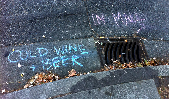
Don’t forget the basics of matching supply with demand. In this case, a hot Sunday when liquor stores were closed created the demand. And some free – and very clever – guerrilla marketing, using just a couple of pieces of chalk, created a constant flow of new customers to a new supply of cold beer. To investigate further, I spent a few minutes in the store casually eavesdropping as I heard customer after customer delightedly explain how they “never knew this place even existed”.
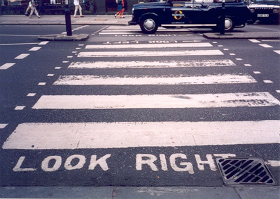
The position of the message was equally important. People have been trained to stop and look down at instructions before they cross the street (as shown in the example below), so this chalk message was perfectly placed to garner attention.
Verdict: WIN
3. Sensory Overload
What it teaches us
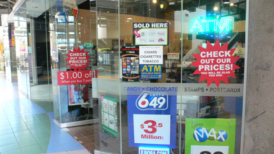
Too many CTAs is a bad thing. The overwhelming clutter just makes you want walk on by. This is the real-world equivalent of how banner blindness came about.
Verdict: FAIL
4. The Segmentation CTA

What it teaches us
Clear directional cues don’t even need writing. Powerful iconography or imagery is all that’s needed to segment incoming traffic to this area. It’s important to note that segmentation at the point of arrival isn’t enough for a great conversion experience. You still need to design the environment for each segment as shown in the photo below – taken near the same spot as the signs above.

Verdict: WIN
5. Door Handle CTA
What it teaches us
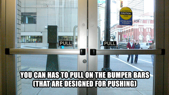
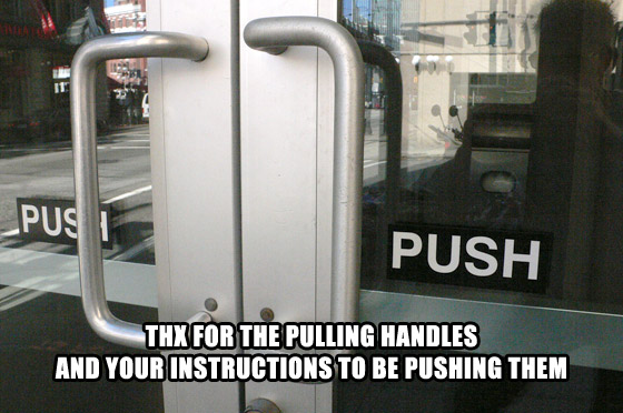
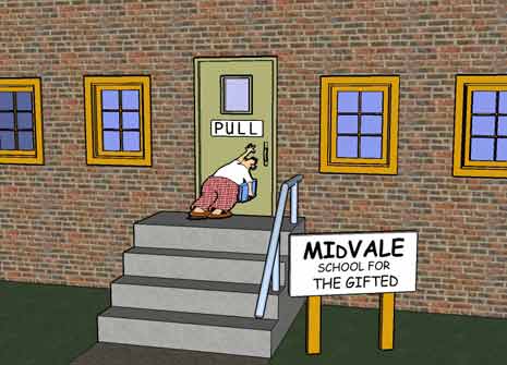
This example highlights the importance of following established design standards, and making interactive devices behave as expected. In the online world, an example would be having text that’s underlined act as a link. It also teaches us that if you happen to make a construction error (like putting the doors on backwards), you should undo that error and start again, rather than just applying a band-aid solution (in this case – the conflicting written instructions).
Verdict: EPIC FAIL
6. The Double-Team Aerosmith Style Graffiti
What it teaches us
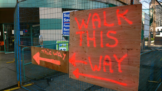
People sometimes miss things, through banner blindness or impatience or because they are on a long page and your CTA was “correctly” above the fold. The point to learn here is that you often need to repeat your call to action – especially on a long page – to make sure people see it and know what to do next.
Verdict: WIN
7. Parking Directions

What it teaches us
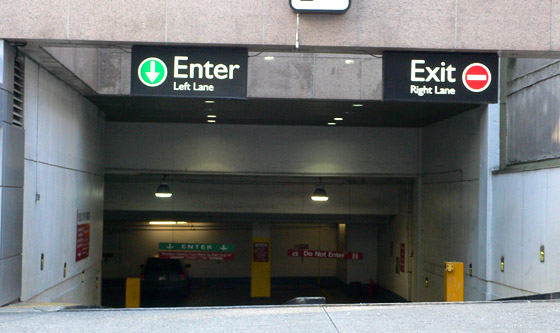
People can get lost of wander off without proper guidance. An online analogy would be comparing a homepage (which has many different points of interaction – leading to many user paths) to a landing page focused on a single purpose with a single clear call to action. To learn more about this concept, read “Can You Catch 4 Ping Pong Balls? – How Too Many Messages Can Kill Your Conversion Rate“.
Verdict: WIN
8. The Inferred-by-Design CTA
What it teaches us
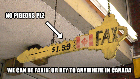
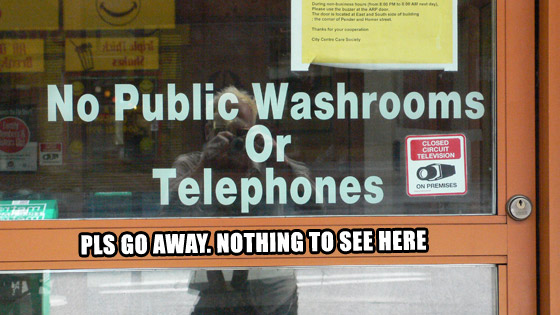
This example teaches us two key (get it?) lessons. Firstly, design matters. Secondly, if you know who your product or service isn’t for, then making this obvious can help your bottom line by stopping people from clicking your ad (which costs you money). The photo below is an excellent example of this…
Verdict: WIN
9. The Just-In-Time Contextual CTA
What it teaches us
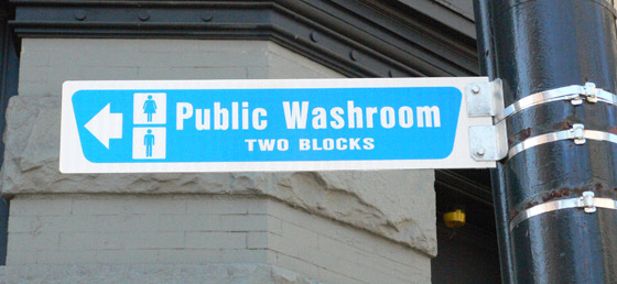
There is usually a very small window within which to capture your visitors’ attention, which makes it critical that you have the right message (and call to action) in the right place at the right time. Online this is analogous to placing ads where people have a need for your product or service (context). Going back to the photo, the just-in-time aspect is very obvious – if you need to pee in a hurry and don’t know where to go, you’ll do one of two things: pee in the alley, or go into the nearest open store to ask if you can use their facilities.
There’s also a trust factor to be explored here. In the context of the location described above, a tourist not knowing the area could feel intimidated to the point where they ignore the sign (and head for the nearest shiny mall). The sign below is a great example of how you can add a trust statement to encourage action.
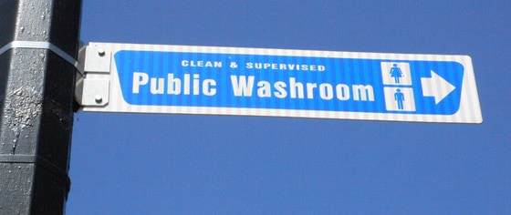
Verdict: HALF-WIN
10. The Wasted CTA

What it teaches us
Never waste your ad space with a useless CTA. Online, you have the opportunity to test and refine your ads until they perform – don’t just set it and forget it.
Verdict: FAIL
Share Your CTA
Add a comment below with a call to action to your website, your business, or your idea… I dare you. (You’ll get free public hug on Twitter!)
