Back in the 1990’s we thought having an animated gif on our web page was the greatest thing since sliced bread, but nowadays using an animated gif is considered a huge FAIL. However, by using video on our websites we are able to still capture the “wowness” of an animated gif with much better bottom line results.
Now that video production is affordable to all business sizes, we’re beginning to see companies use video on landing pages and not just their homepages.
Spinning off of Oli’s Your Landing Page Sucks! Here are 10 Examples That Don’t… I wanted to take a look at some great landing pages that incorporate video. Great landing pages explain exactly what you do in a brief amount of time, and video is a great asset for accomplishing such a task.
Here are 10 examples of pages that are crushing it with video.
1. Intuit
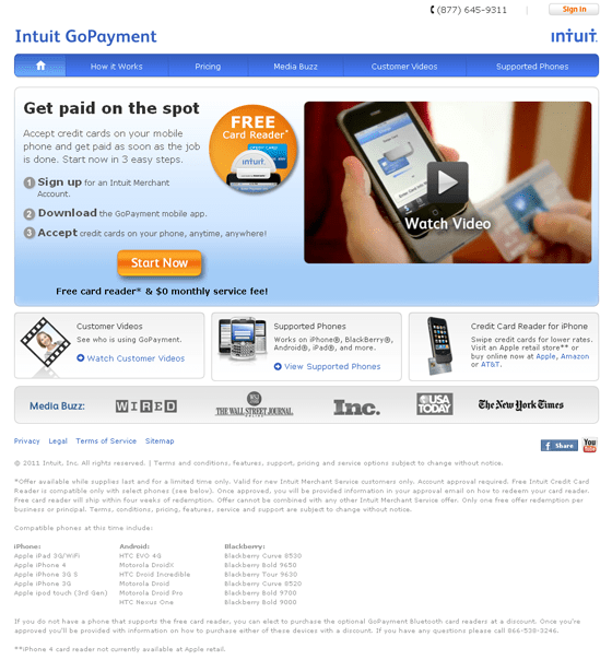
What better way to sell a product than to show it in action? The Intuit video itself does a great job of relating to potential customers, showcasing its benefits and explaining how easy it is to use.
What I like
- They include customer testimonial videos allowing visitors to see what others are saying about the product.
- Easy to read. The top section tells me everything I need to know about the product and how I can get started.
Things I’d change or test
- Remove all navigation at the top.
- From a design perspective, I’d have the “Start Now” section span the width of the page to add some depth to the page. See Zopim.com for an example.
2. Google
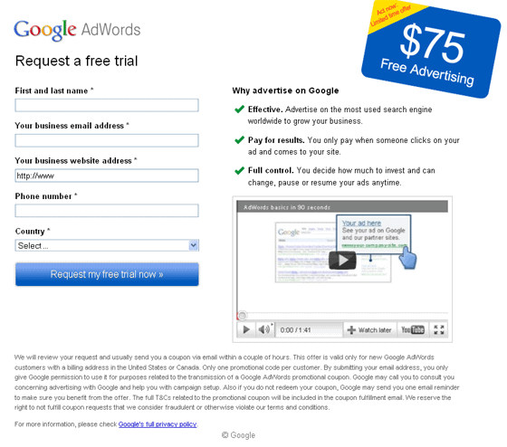
I like Google’s approach here. Give the user two main colors and keep the rest plain and simple. Immediately, the coupon and CTA button jump out at the page.
What I like
- The use of a coupon. Give something away for free to get your users into the door. We all can’t do it, but if you can it can really help conversions.
- Noncommittal copy. Users fear long-term contracts more than death and public speaking. Google’s copy includes “Request a free trial” instead of “Start your free trial”.
Things I’d change or test
- Headline for the video. For those not in online marketing, AdWords can be a complex system, so I’d put more of an emphasis on getting users to watch the video.
3. Path
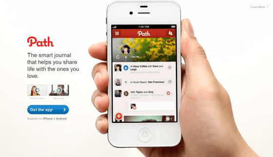
Not only is Path a beautifully designed mobile app, but their homepage incorporates video right upon landing one it.
What I like
- Emotional connections. Rather than showing you the features (ie sharing with close friends), Path uses a more emotional connection by showing a husband and wife actively sharing photos of the family.
- Very little distraction. The copy is focused and there’s not much auxiliary content.
Things I’d change or test
- Add the number of app downloads or the number of captured moments.
4. UPS
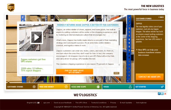
Social Proof is one of the six “weapons of influence” in Robert Cialdini book Yes! 50 Scientifically Proven Ways to be Persuasive. He states that people will do things that they see other people doing. UPS uses Zappos to show the value of their services and how they help Zappos be the consumer friendly brand that we all know and love.
What I like
- Success stories. Using a well-known and well-liked brand such as Zappos will lead to increased conversions.
- Use of repeat shopper statistics. UPS has a hand to helping Zappos achieve 75% repeat customers. The implicit message is well done.
Things I’d change or test
- Minimize the amount of text. There is a lot to read through on the page and would like to see what happens if UPS remove the right side of the page.
- Dim the background. Changing the alpha setting on the warehouse image will make the main section stand out more.
5. Optimizely
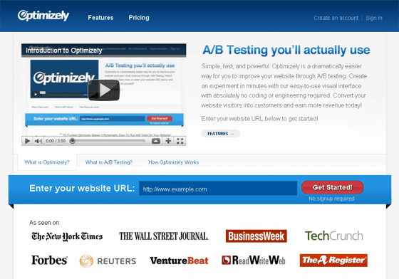
Optimizely uses the video to show the simplicity of the application and lives up to its headline of “A/B Testing you’ll actually use”.
What I like
- No signup required. Allowing users to test drive your service with little or no barriers can lead to increased conversions. Even if a user does not sign up you may end up with a brand evangelist who can speak to the simplicity and value of your application.
Things I’d change or test
- Shorten the video. The video runs close to 4 minutes and gives you the full scope of the application. I’d test a 30-60 second video that gives viewers just a small taste of the functions. I think the product sells itself when you test drive it.
6. Zoho Books
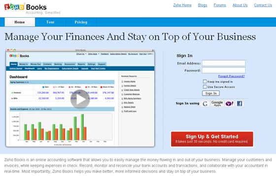
Rather than making users read through all the features, Zoho Books shows you everything you can do in a quick 60 second video.
What I like
- Big video image. According to a recent Kelsey Group study, 21% of video viewers make a purchase. No wonder Zoho Books made the video so big.
Things I’d change or test
- Embed the video. Rather than using a modal, I’d embed the video, so users can sign up while watching the video.
7. Groupon
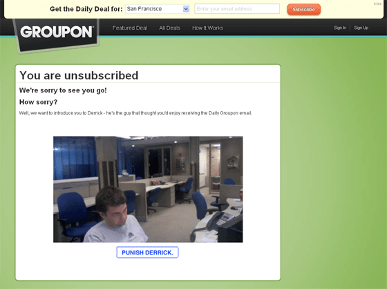
Groupon is known for being a little quirky. Example 1 and example 2. But the use of video to get unsubcribers to re-subscribe is utterly genius.
What I like
- Everything. From using video to having a call to action that says “Punish Derrick”, this is great execution on a page that most marketers ignore.
8. Animoto
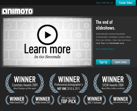
I’m a big fan and a paying customer of Animoto. The design of this page is amazing and uses a unified tone of turning photos into amazing, theatrical movies.
What I like
- Video thumbnail includes a CTA. Most companies use a thumbnail that is a random scene in the video, but Animoto uses a call-to-action as their thumbnail which can dramatically increase views.
- Award design. The awards are very similar to the way awards are presented in motion pictures. Animoto does a great job of sticking with an overall message of the page.
Things I’d change or test
- Change the CTA Text. I would change the “Learn More” button to “See Pricing”. The user is already learning about the product in the video and the link takes the user to the pricing page.
9. VisibleGains
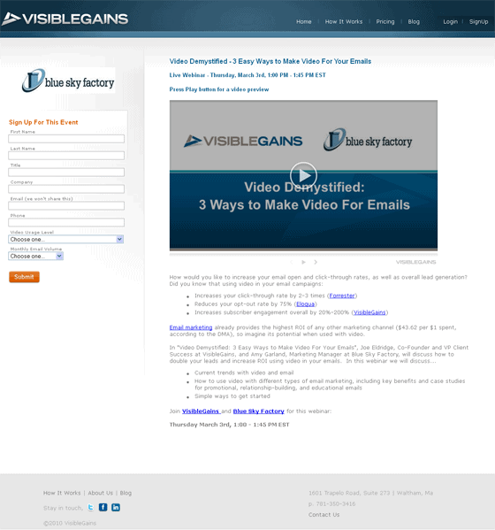
According to VisibleGains, they received a 51% conversion rate on this landing page. That’s pretty impressive and a big part of that success can be attributed to the video preview of the webinar.
What I like
- Huge focus on video. The video occupies a majority of the landing page and gives you a taste of the webinar.
Things I’d change or test
- Move the sign up form. The sign up form is a little far from the video for my tastes. I might try putting it a little bit closer to the video.
- Sign up form on the right. I wonder if having the sign up form on the right would increase conversions even more. My eye immediately goes to the video then my natural response is to look to the right of the video for the form.
10. Dropbox
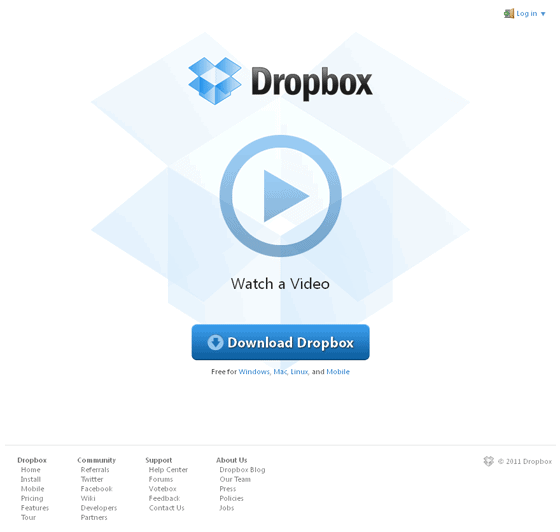
Here’s a company that is fully invested in video. One of my favorite web apps out there, Dropbox has two options on this page – watch a video or download the app.
What I like
- Video thumbnail. The video thumbnail is beautifully designed and is incorporated with the logo itself.
Things I’d change or test
- Add a tag line. It might be interesting to test a tag line in case folks don’t want to watch the video and want to learn more the product. It may even lead to more video views.
Further Reading
Your Turn: What do you think?
Love ’em? Hate ’em? Got examples of how video has helped you to convert better?
