
In this post Carlos and myself (Oli) are going to analyze one of our customers – Vinoetic.com – landing pages (after they opted to allow us to get our opinionated hands on it). Our goal is for it to be an educational exercise that can hopefully help improve the page, but let’s have a little fun too, shall we? We’ll be scoring each point in our discussion with + or – points to arrive at a total score and we’ll be arguing on certain points to show that everyone has a different opinion – which shows the importance of testing.
Warning for the creator of the page: There are going to be some criticisms, but our goal is for this to be useful to you so that you can have a more successful campaign in the future.
Let the battle commence!
1. The Main Headline

Oli: Provides a sense that this product or service can help you to grow your business. #ValuePropositionWin
Score: +1
Carlos: That is clear and to the point. It speaks to a real problem that I might have.
(Oli: What’s your problem?)
(Carlos: my problem is that I keep drinking wine and waking up covered in corks)
Score: +1
2. The Call to Action (CTA)

Oli: The form area and button don’t explain what you are going to get for “joining”. There are also too many other competing links on the page which provide distraction from the main goal.
Score: -1
Carlos: What do I get for joining? Do I have to pay? I’ve only been here a few seconds, and I don’t know what is happening.
Score: -1
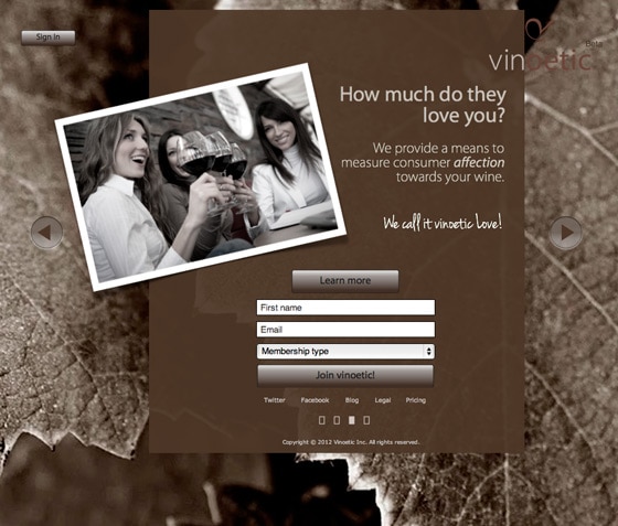
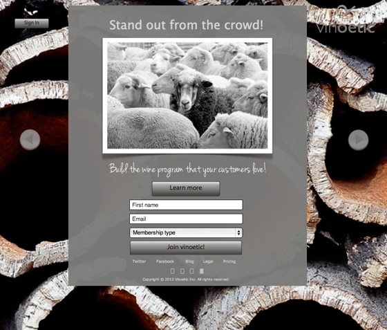
3. Personas (who is this product/service for?)
Oli: It’s not immediately apparent who this page is for. Until you click the drop down menu, you don’t know that it’s applicable to 4 different types of business. It would be better to see a block of information for each type so that they are able to immediately recognize that they are in the right place (maintaining information scent) with a short explanation of how the service benefits them. Each could then have it’s own lightbox “learn more” to give them the information they need without transitioning to another page.
Score: -1
Carlos: If I was your customer which would best describe me:
A winemaker.
A wine distributor.
An alcoholic with obsessive-compulsive issues and a bitchin’ catalog system.Score: -1
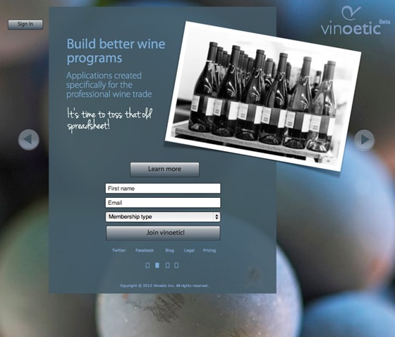
4. Big Background Image
Oli: The background immediately sets the scene, letting you know that it’s a page about wine.
Score: +1
Carlos: Your background is beautiful, but it is distracting and causes some disembodied elements (it’s really hard to see the navigational arrows on either side that lead to the other pages – especially on page 1) and eats your logo (Cookie monster). This a wash for me.
Score: 0
5. What is the purpose of this page?
Carlos: Visually the most important thing to me is the sign-in button, but I haven’t signed up yet so I am lost as to why it’s there. There are also some floating arrows and little boxes at the bottom and a pricing page. I’m going to go have a glass of Pinotage to build up some liquid courage before tackling the rest of this site.
(Oli: Pinotage? Never heard of it, it can’t be good)
(Carlos: it’s a South African red)
Score: -1
Oli: You must be drunk already, the sign-in button seems fairly innocuous to me. The headline and sub-header do an adequate job of describing what the page is about – but I do agree that the *purpose* is a little confusing. Is it a lead capture page, or a full-on website. We’ll get more into that in #10 below.
Score: 0
6. Explain your benefits

Oli: There are 3 benefits listed, but none of them explain how your particular product/service is unique and will address the problem. Given that it’s a software service, I’d like to know how it will benefit me. e.g. “Gain insight into your customers… with x feature that does a,b,c).
Score: -1
Carlos: How do you enhance my traditional sales model? My current model is yelling “Hey, you! Buy my wine!” whenever I see someone new? I guess that could use some help (Extra explanation of how you enhance it).
Score: -1
7. What am signing up for?

Oli: This is where your CTA comes into play. It should be made crystal clear what will happen when the button is clicked. (That you will be added to a beta list, that you will receive further details about the product).
Score: -1
Carlos: You need to say that this is free and that I am signing up for a beta list.
Score: -1
8. Interaction
Oli: I like that the learn more buttons (on the 2nd, 3rd and 4th pages) open up in lightboxes to keep the visitor on the page. Note: this has changed in the latest version. However, they are full pages in their own right and should be distilled into smaller chucks of useful and easily/quickly readable information.
Score: 0
Carlos: I didn’t get this far during my review.
(Oli: cos you were hammered on cheap South African wine?)
(Carlos: Quiet you!!)
Score: 0
9. Privacy Policy
Oli: Lead gen pages, where you’re asking for personal information, should include a privacy policy or statement. This should typically be positioned close to the email or the form button to add a sense of legitimacy and trust. Especially if you are doing paid advertising (e.g. Google AdWords) – not having a privacy policy can risk you being flagged or banned.
Score: -1
Carlos: You have a privacy statement, but it says “Legal,” that is okay, but it’s too far away – it should be right next to the CTA button.
Score: 0
10. Is this a Landing Page or a Microsite?
Oli: The 4 pages don’t seem to be cohesively aligned with the different target audience types (see personas above). Neither has a strong headline that indicates the purpose of the page.
Score: -1
Carlos: Plus 1,000,000,000 points for building a microsite with us! Unfortunately, the internal pages seem disjointed and don’t further the conversion process – so I’ll have to take most of your points away.
Score: +1
Oli’s Final Score: -4 I guess I’m more of a hardass.
Carlos’ Final Score: -3
Sorry! We do genuinely hope that the discussion helps you and others when thinking about your landing pages.
Btw. If any readers think we missed something – it would be awesome if you added it to the comments.
