
40% of web users will leave a page if it takes more than three seconds to load. But they’re not just waiting for a page to load — they’re waiting for you to get to the point. Three seconds to make an impression before they hit “Back”
in their browser.
Of course, it’s not enough for a landing page to load. A landing page has to persuade, and it has to do so immediately. And there’s no better way to do that than to connect with your visitor on an emotional level.
In a recent Unwebinar, Talia Wolf of Conversioner made the case for the value of emotional targeting by examining what is perhaps the most emotional industry of all: dating services. It’s an incredibly crowded field, with each service vying to cut out its own slice of the market by providing unique value.
In the process, she explored how you can emotionally target your audience by helping them envision a better version of themselves (due to your product, of course!).
Read on for Talia’s expert insights on the emotional resonance of three of the world’s biggest dating services, and takeaways from an A/B test of her own.
Dating service #1: match.com
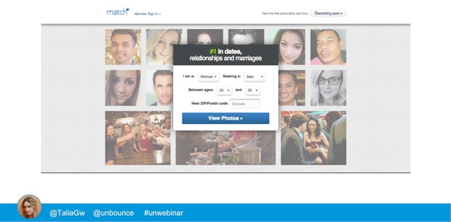
Talia praised Match.com for the combination of already-filled form elements and a call to action that actually promises photos of potential partners. Combined, these two elements are persuasive and make it feel easy to get started.
But the kind words ended there. In particular, Talia slammed Match.com for their poor use of photography. For starters, they miss the opportunity to use the images to actually assist in the conversion.
One of the smart ways you can use photographs of people on your landing pages is as directional cues, with them looking or subtly gesturing in the direction of your call to action. But on Match.com’s page, they serve to distract from the CTA. This could’ve been avoided by heeding Talia’s advice:
60% of our brain is geared towards visual context, so the first thing we see is visual. It’s important to use the images on your page in order to guide user attention.
The other problem is that these photos are stock photos. They look fake, and there are good odds that a visitor could’ve seen the photo elsewhere before. That’s a deal-breaker if you’re trying to seem unique (or even credible).
The images on your page are not mere ornamentation. They are an integral part of your page’s value proposition and its content structure, and Match.com fails that test on both fronts.
Dating service #2: Zoosk
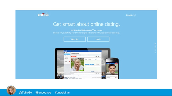
Next, Talia looked at Zoosk’s page, and praised their compelling value proposition — “get smart about online dating” — for connecting with the prospect’s desire to be intelligent:
I like this angle. If you use Zoosk, you will feel smarter than others.
Unlike Match.com’s “#1 in dates, relationships, and marriages” headline, which is all about Match.com and the quality of the service it offers, Zoosk’s headline is actually about the user themselves.
Unfortunately, Zoosk fails in the imagery department in much the same way Match.com does. Pretty much all of the imagery is of software — not something that’s likely to resonate emotionally with someone who is looking for love. And as Talia pointed out, it doesn’t really mesh with their value proposition:
I don’t get the sense that this will make me smarter or give me smarter matchmaking.
Dating service #3: Beautiful People
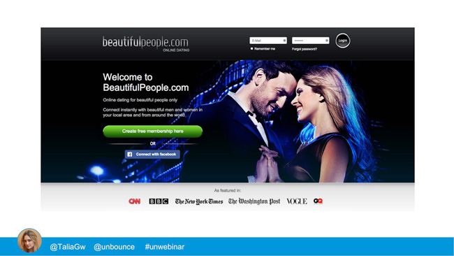
In case the name didn’t make it clear, Beautiful People is “online dating for beautiful people only.”
This is pretty exclusionary, but it’s also a compelling proposition: if you use the service, you must be beautiful, and you’re guaranteed to only meet people who deserve to bask in your radiance. As Talia notes, this value proposition is designed to make you feel better about yourself:
You deserve better. You deserve to find the best looking people.
Physical attraction is definitely the cornerstone of a service like this, and Beautiful People supports this message with their use intimate imagery.
Unfortunately, the copy weakens what could’ve been a very persuasive offer. This page features the dreaded “welcome to domain.com,” a type of fluff message that usability expert Steve Krug refers to as happy talk in his book Don’t Make Me Think:
If you’re not sure whether something is happy talk, there’s one sure-fire test: if you listen very closely while you’re reading it, you can actually hear a tiny voice in the back of your head saying ‘Blah blah blah blah blah….’
Worse, the call to action eschews the sexiness of the rest of the page, opting for the utterly libido-killing “create free membership here.” Yes! That’s why I’m here! I’m ready to embark on a steamy adventure toward membership.
Talia’s A/B testing case study for an unnamed dating service
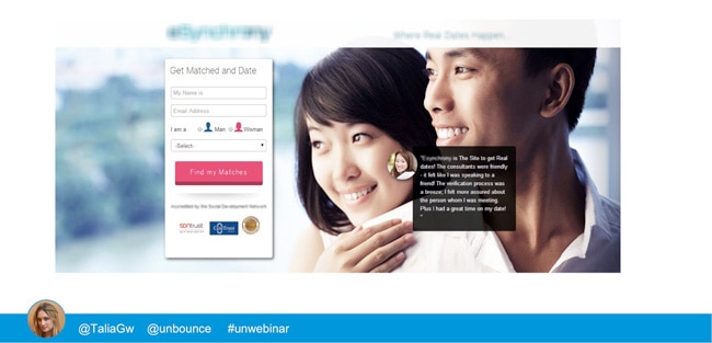
For her final example, Talia shared a case study for one of the dating sites she optimized herself. The initial example has some good elements already: the couple’s gaze draws attention to the call to action, the form is short and a testimonial provides some social proof. But it doesn’t make a compelling offer, nor does it engage the visitor’s emotions.
Talia tested two variations of the page.
Variant 1
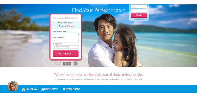
The first variant was similar to the original page, but there were some changes made to connect with the visitor on a more personal level. The addition of a headline — “find your perfect match” — is a small but effective way to let the visitor imagine the positive impact of the service.
This variant keeps directing attention to the call to action using the woman’s gaze, but opts to have the man facing forward, using the power of eye contact to instill a sense of trust and reliability.
The biggest change, though, was the addition of a powerful background image. Adding a locale to the image allows the user to imagine themselves not just in a hypothetical relationship, but in an actual, physical situation. The colors are not coincidental, either; as Talia’s own research on color psychology illustrates, green instills a feeling of freshness and renewal, whereas blue is the quintessential color of trust.
This variant lead to a 24% increase in signups and a 48% increase in paying customers. Certainly a solid win, but could it be improved?
Variant 2
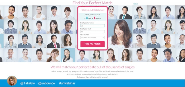
The second variant sacrifices the intimacy of the initial imagery for an increase in variety by opting to show dozens of potential candidates. But there’s something even more interesting at play here.
These headshots have been arranged in such a way as to subtly guide a visitor’s eyes to the form at the center of the page. Look closely; while there are some exceptions, most of the people shown are either tilted slightly towards or glancing directly at the form, even as most of them maintain direct eye contact with the viewer.
What’s perhaps more interesting is that these are all actual members of the service, and each photo has been edited to have a crisp white backdrop and a slightly blue tint, which contrasts against the pink form.
The results speak for themselves: a 38% increase in signups, and a whopping 304% increase in paying customers, proving that this page did its job in attracting the exact right kind of customer.
It’s not about you or your product
Trying to appeal to the emotions of consumers is something that marketers have grappled with understanding pretty much since the advent of marketing. But as Talia notes, the landscape has changed:
Emotion in advertising and marketing has been done for years, but in the offline world.
[…] But they can’t track it. Online, you can combine and track emotion and user experience.
Not only can we now measure the performance of our tactics, we can segment our audiences into smaller groups and create campaigns and landing pages that speak directly to them.
No matter what kind of product you sell, the story that will resonate with your customers is not about your product; it’s about the person your customer wants to be, and how your product can help them realize that dream.
Learn more about emotional targeting by checking out the complete Unwebinar recording here.

