Having a poorly optimized landing page can result in confused leads, poor conversion rates, and lost sales…
…or in the context of Page Fights, public humiliation.
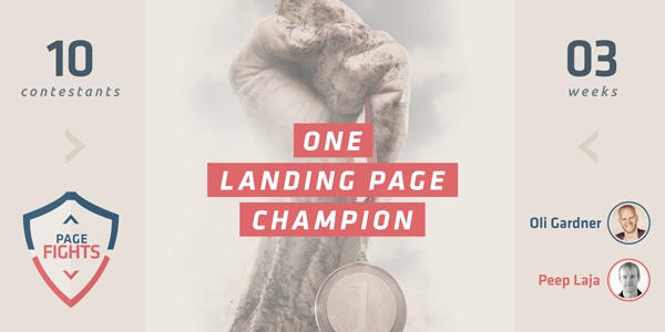
Unbounce recently paired up with ConversionXL to crown the ultimate landing page champion. In a live three-part series, merciless judges Oli Gardner and Peep Laja dished out tough love in the form of brutal (but useful) landing page critiques.
“There’s not going to be a lot of time for niceties. It’s Page Fights – we’re going to be brutal” – Georgiana Laudi, Unbounce Marketing Director and Page Fights Moderator
In the process, Peep and Oli shared conversion rate optimization best practices, broke down the basics of A/B testing and invited viewers to cast their vote to determine who moved on in the competition.
They spared no feelings in the pursuit of the ultimate landing page champion, and lucky for you, our contestants underwent public shaming so you don’t have to.
We’ve compiled some distilled wisdom from the series so you can get to work at removing embarrassing conversion killers from your landing page and making it the high-converting winner it was meant to be.
Who knows? Maybe your landing page has the potential to be crowned the next Page Fights champion…
Episode 1: Landing Pages That Didn’t Cut It
We received over 200 submissions from marketers masochistic enough to want their pages torn apart on a live Google Hangout on Air.
Of these, many just didn’t make the cut. Some had poor design, were painfully slow-loading or had their headlines as images. A handful even had the nerve to submit their homepages as landing pages (if you don’t know the difference, stop right now and watch this one-minute video).
With the pool narrowed down to 33 landing pages, the series kicked off with a flood of rapid-fire critiques as Oli and Peep blurted out first impressions. While this may have seemed rushed, consider this:
In the time Oli or Peep can think of a witty diss, a lead will have passed judgement on your page.
A Page Fights viewer put it best:
The overall theme that I am getting is that when I’m creating a page it needs to be clear within a few seconds what it’s about #PageFights
— Chris Davis (@C_Davis20) May 9, 2014
Poetry.
Here are some recurring weak points we found on our contestants’ pages – and a great starter checklist of things to avoid if you don’t want your visitors to bounce.
Your attention ratio sucks
Page Fights saw many pages without clear purpose, with multiple actions competing for attention.
Take the submission below from Rentify for example:

Presumably, Rentify wants leads to “Get started” by clicking on the orange button on the left – and although the button has a nice contrast against the background, the judges pointed out that it competes with other elements on the page.
Any of the links across the top of the page could distract the lead from converting, and as Oli pointed out, the badge on the right is far more prominent than the actual CTA. With the gentleman in the photo facing away from the copy, the eye jumps around on the page aimlessly.
The attention ratio for this page is 6:1, with six distracting actions and as many obvious areas for improvement. Check out how much better the page looks if you just crop out the nav and the additional CTA:
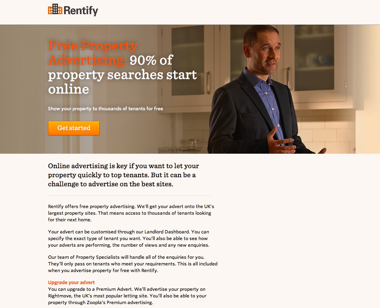
Takeaway: make the intended purpose of your landing page clear and guide your lead toward the click – leave no ambiguity or possibility for distraction.
Your value proposition isn’t clear
Even if your CTA copy is solid, you could still be confusing the hell out of your leads.
All the elements on your page need to work together to quickly and concisely paint a picture of your offer. If any of the elements clash, your lead could become discouraged and bounce.
The landing page submission below is one of the 33 that made the cut – and although it is undoubtedly beautifully designed, the judges pointed out that the headline, sub headline, graphic and CTA copy work against one another:
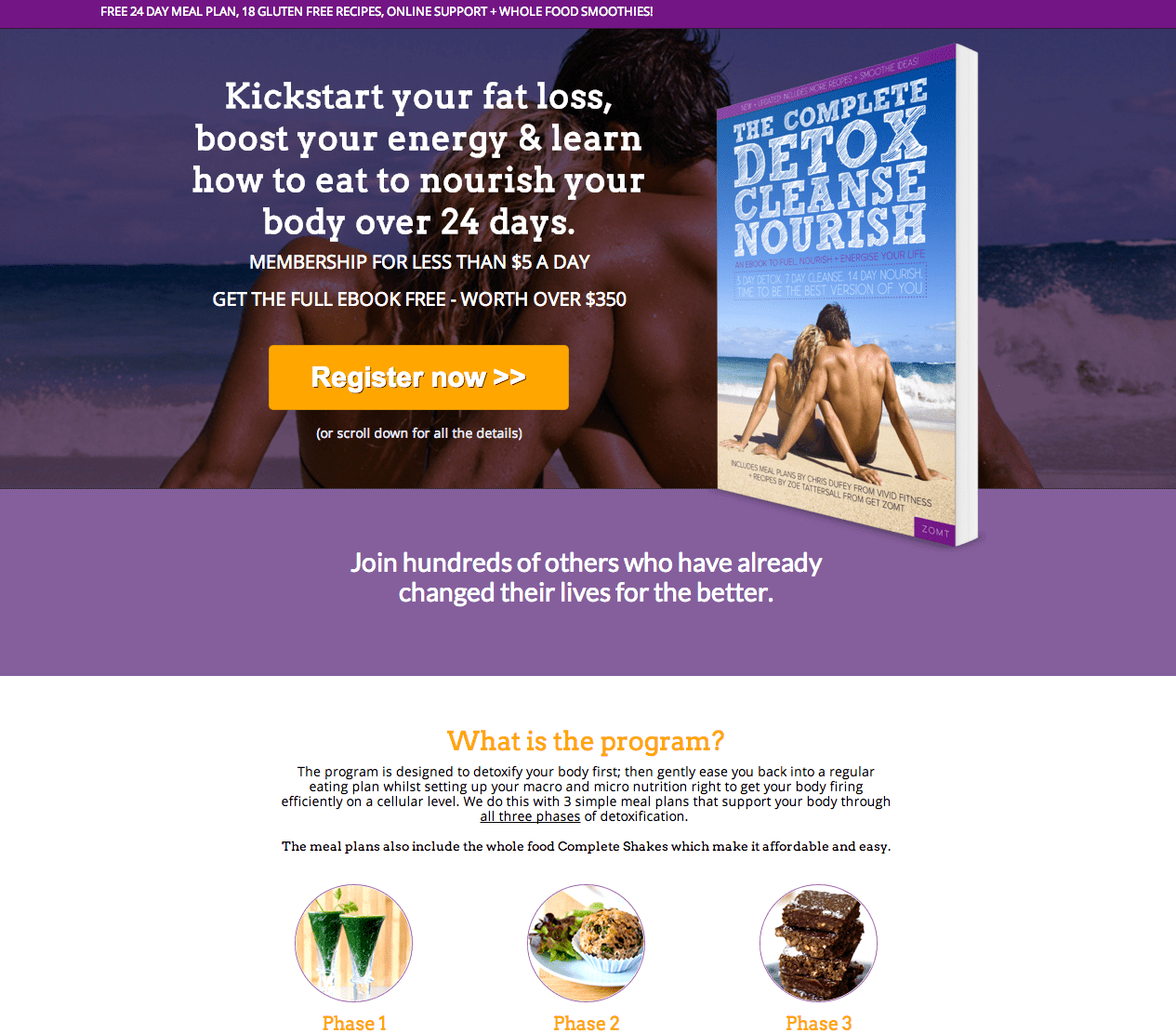
Interchangeably, they refer to a physical book, an ebook and paid membership. With all of these offers on the table, how likely is it that a lead will actually “Register now”, not knowing what they’re getting themselves into?
Peep pointed out that coupled with the buzzwords in the headline, the offer feels unclear (if not sketchy) and so a lead is likely to stray.
Takeaway: Your value proposition should be clear from your headline and CTA copy alone. Any additional elements on the page should exist only to reinforce the persuasiveness of your offer.
The form causes friction
Once your page copy has successfully convinced your prospect that they want to opt in, you want to make the process of opting in as painless as possible.
In other words, if they’re already convinced that they want to sign up, you don’t want your form standing in their way – as is the case in the following submission from DUI Nevada:
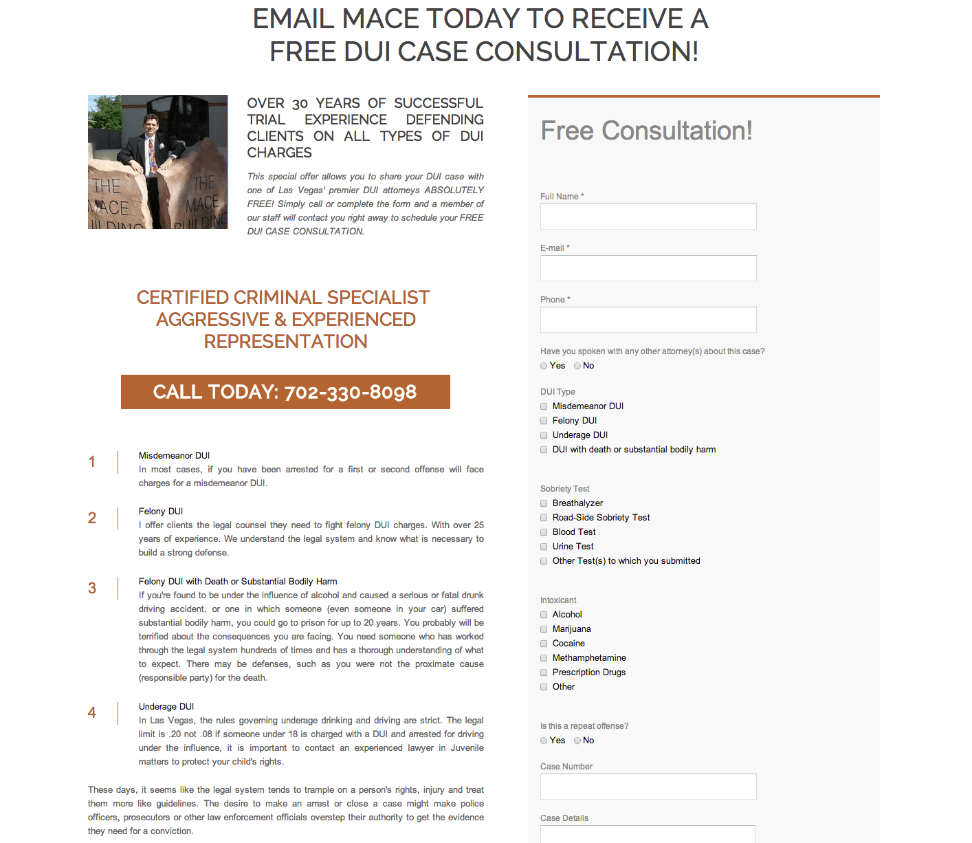
The copy on this page already causes enough friction; as Peep pointed out, the value proposition isn’t clear and the wall of text provides very little motivation to read on.
But even if the copy was masterfully written, the form has so many fields that there is little incentive on the part of the lead to begin filling it out.
DUI Nevada tops it all off with “Submit” as CTA copy. Yikes.
”It looks like this page was designed by a drunk person.” – Oli Gardner
Takeaway: if your opt in form is too lengthy or difficult to fill out, your prospect could become discouraged, even if they believe you have the answer to their problem.
When in doubt, reduce the fields to the bare minimum and ask for the additional information once the lead is in.
Episode 2: The Semi-Finalists Face the Judges
The end of our first episode of Page Fights saw the disqualification of all but five of our brave contestants. Each of the finalists was invited to come face-to-face with the judges and plead their case.
These pages may have strong copy and amazing design, but there is more to CRO than what meets the eye.
1. Paul Jarvis – Creator, Write & Sell Your Damn Book
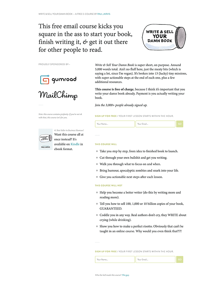
Paul Jarvis is an independently-published author and web designer who wants to help other authors get their book out into the world with his free email course.
Paul explained that with no paid traffic, his course landing page gets over 800 visitors a week, and converts at about 24%.
Oli really responded to the conversational copy on the page, which is relatable and convincing. But as you already know, convincing copy is only one of the many ingredients that go into creating a high-converting page. Peep and Oli mercilessly cracked into the weak points of Paul’s page:
The form isn’t prominent
Although Oli commended Paul for the clean, minimal design of the page, he found that the form got lost in the sea of blank space.
Takeaway: Whitespace is a great technique for focusing your prospect’s eye, but without a contrasting form to stand out against the blank canvas, your page will feel muted and uninspiring.
Similarly, as Peep pointed out, the sponsor logos on Paul’s page dominate, drawing the eye away from his CTA. And although Paul didn’t have control over the size of the sponsor logos, he does have the ability to really make his form pop to effectively push it to the top of the visual hierarchy.
The intended action is unclear
Don’t make it hard for your prospects to determine their ‘next step.’
When Paul adds a purchase link for his book to the bottom left corner of the page, he detracts from the primary goal.
“If your main call to action here is to get people to sign up for your course via email, why would you also try and take them away from the page?” – Oli Gardner
Takeaway: Always choose one intended action for your leads, and don’t distract them from it!
Oli went on to explain that although it’s great to make money, asking a complete stranger to purchase your book is too big of an ask. Start by asking for their email, warm them up in an email sequence and pop the (bigger) question once they know who you are.
The directional cues are lacking
You should always be intentional about how your prospect’s eye should travel across the page. On Paul’s page, the two columns may be aesthetically pleasing, but they cause the eye to move in an unnatural way.
“2 column forms don’t perform as well as 1 column” – interesting first insight from #pagefights
— Krystal Profitt (@Krystal_Faye) May 16, 2014
Test any layout elements that divide the page to ensure that you’re not breaking up the page unnecessarily and blocking off natural gaze pathways.
2. Ryan Walsh – Owner, MindOverPain.org

Ryan Walsh learned about the alleviation of wrist pain after experiencing chronic pain first-hand. Finding that there were others who could benefit from his knowledge, he started a free online course to teach how to obtain relief without stretches or expensive ergonomic gear.
Although the effort he put into designing his landing page is apparent in the length of it, the judges found several areas for improvement.
The copy reads stiff
For starters, the original copy on the page came across as stale, injected with buzzwords. As Peep pointed out, the way Ryan described his story when he was introing his business for Page Fights was way more compelling than the copy on his page.
“Use your own voice and you will be better off” – Peep Laja
The judges suggested that Ryan revise all the copy on the page, including the CTA and the headline, to speak more closely to the pain his prospects are having.
Takeaway: Peep suggested using qualitative research to help uncover the precise language your audience is using, so you can use trigger words to speak to them in terms they understand.
The page feels too salesy
On top of the impersonal copy, Ryan was employing false scarcity, a tactic that Oli suggested could be backfiring.
Scarcity can help convince a prospect that they need to buy immediately, playing on their fear of missing out on the opportunity “while limited supplies last.” However, as Oli explained, the way Ryan used a Hello Bar on this page could backfire; people expect that a free online course won’t have limited seats, and the scarcity feels fake.
Coupled with the baseless guarantee (Peep questioned how Ryan could guarantee results for a free course) and cheesy stock images, the judges agreed that Ryan’s page lacked sincerity.
“It makes my bullshit detector go off.” – Peep Laja
The one redeeming factor? The photo Ryan had included of himself was unpolished and ultimately felt relatable and credible.
The page is unnecessarily long
For a free offer that is relatively simple, you don’t have to do much convincing.
And because Ryan’s value proposition is straightforward, his lengthy page feels like overkill. For a free offer landing page, a shorter page may be better suited.
Takeway: Every element you add to your page has to add value. If it doesn’t, kill it.
The judges strongly suggested that Ryan cut down on sections (especially those that felt insincere) and test a shorter, more concise design.
3. Josh Frank – eCommerce Lead, Chalkfly
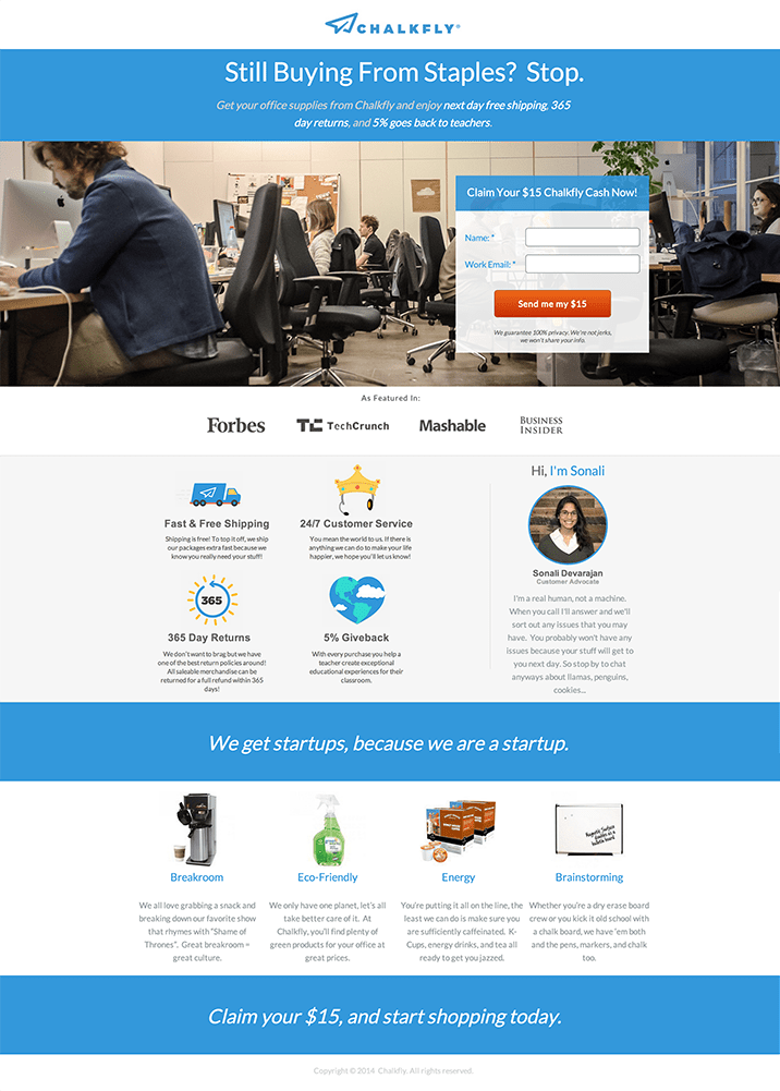
Josh Frank is the eCommerce Lead for Chalkfly, a socially-conscious office supply distributor.
Josh’s landing page, targeted at startup founders and employees, had a 21% conversion rate when he submitted it to Page Fights. It’s worth mentioning that his traffic was primarily coming from a Facebook ad campaign he was running.
As Oli explained, Facebook ads are difficult to work with. Because marketers have no control over the size of the ad’s headline, it’s hard to control which element is most prominent. To remedy this, Oli suggested putting the headline into the ad’s image, so Josh has full control over the prominence of the statement he’s trying to make.
The headline can’t stand on its own
You’ve heard by now that people don’t actually read your landing page – they skim.
And when Oli read the most prominent copy on the page aloud, the value proposition was totally unclear.
“Scan your landing page copy & read the headline and subheads out loud. See if they work on their own w/o body copy.” Great tip! #pagefights
— Krystal Profitt (@Krystal_Faye) May 16, 2014
Josh’s aversion to repeating the term “office supplies” and his vague offer for “15 dollars in Chalkfly cash” ultimately worked against him.
Takeaway: Clarity should trump all other copy decisions.
It doesn’t get straight to the point
This page does a whole lot of beating around the bush.
Josh’s page lacks a story and visual cues; even the most essential elements such as the target customer and value proposition have to be teased out from the copy.
Oli explained that the section above the fold should very quickly communicate what your business is and what it does.
Takeaway: Every other element should contribute to a congruent design, working together to align to a single goal.
4. Mike Svystun – Marketing Manager, Vertalab
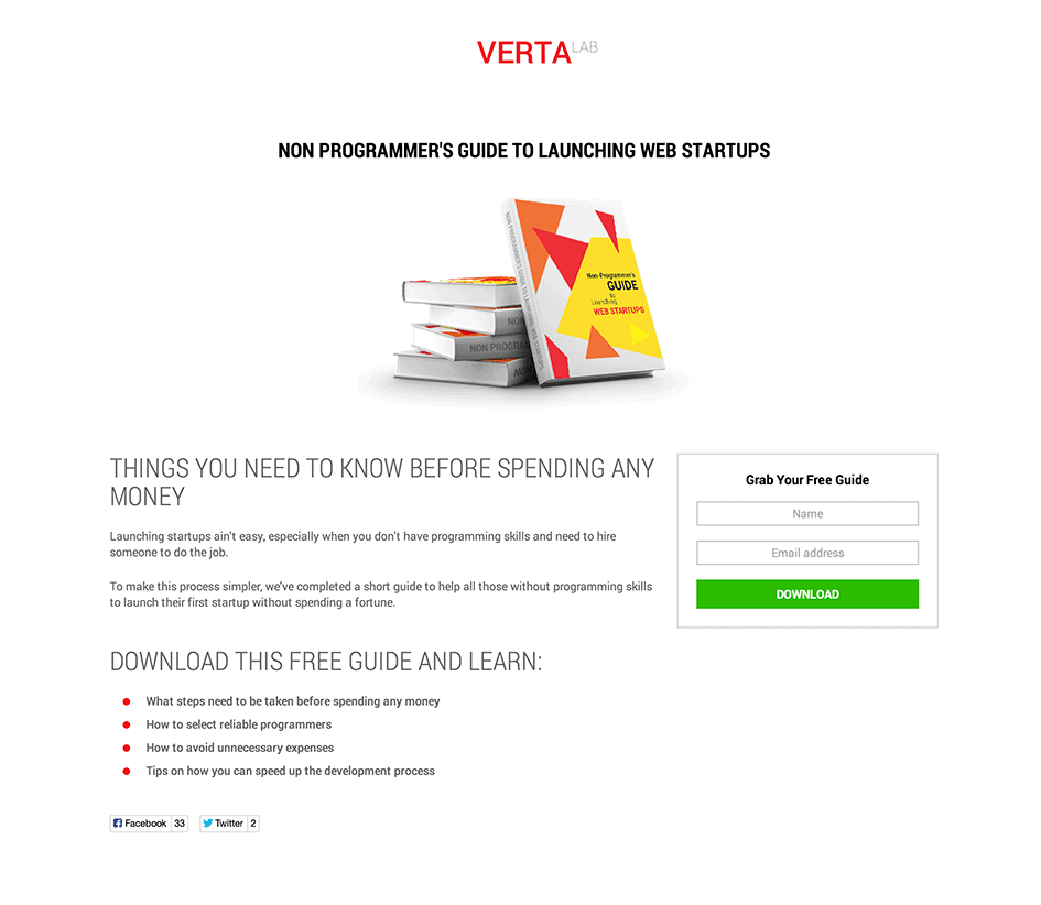
Mike Svystun is the Marketing Manager for Vertalab, a company that helps startups build web apps. The company launched this landing page in the context of a campaign to ultimately help raise brand awareness.
Peep and Oli found some areas that could use improvement:
The offer lacks credibility
The landing page positions Vertalab as an authority on the subject of launching web startups, but there are no elements that add legitimacy to their advice.
There is no mention of certification or past ventures and the low number of social shares create negative social proof for the page.
The judges recommended that Mike remove the social share buttons entirely, placing them instead on the confirmation page. As Oli explained, leads are more likely to return a favor after you’ve already delivered.
In lieu of the pathetic social share counters, Mike could add testimonials or inject other social proof elements that point to the authority of Vertalab in the startup community.
The form is uninspired
With its generic CTA copy and bare bones design, the form on Mike’s page could use a lot of work.
Effectively, the opt in form on the page feels like it’s an afterthought, when it should be the star of the page.
“Design the form as if it’s the only thing on the page.” – Oli Gardner
Taking it a step further, Peep suggested that Mike test putting left-aligned form labels above the form field; having inline form labels can confuse the lead (especially if they disappear after a click).
5. Stuart Harrison – Search Engine Marketer, Hampson Hughes Solicitors
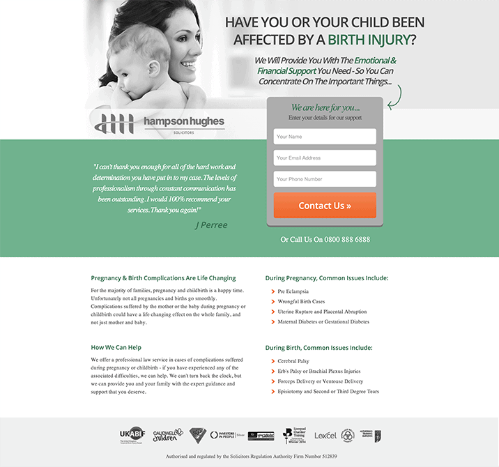
Stuart Harrison, Search Engine Marketer for law firm Hampson Hughes Solicitors, submitted a landing page targeted specifically at birth injury sufferers.
Stuart did a relatively good job on this landing page considering it’s the first he’s ever made, but his 1% conversion rate suggested there was plenty of room for improvement.
Message mismatch
The judges called Stuart out for engaging the prospect in a conversation with his ad and headline and then completely dropping the ball.
The ad, headline and sub headline address very specific pain points, but the call to action feels generic.
Maintaining a coherent conversation from the ad copy to the landing page headline is what Oli has dubbed “conversation momentum.”
“Match the style and context of the conversation you started with your ad on your landing page.” – Oli Gardner
If your messaging starts off by resonating with your prospect, you want to keep that momentum going.
Episode 3: The Finalists Are Given a Second Chance
In the final episode of the series, contestants were given the opportunity to return to the Page Fights stage and redeem themselves for their CRO shortcomings.
Each finalist presented a revamped version of their landing page, showing how simple changes can go a long way when it comes to increasing the conversion rate on your landing page.
1. Paul Jarvis – Owner, Write & Sell Your Damn Book
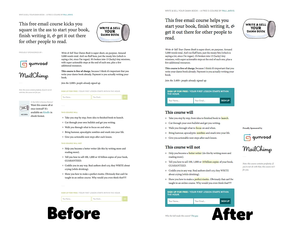
The subtle changes Paul made to his landing page are a huge improvement:
- He tightened the headline copy to be more concise. He also highlighted certain words for emphasis, accommodating leads who skim.
- He left-aligned the headline, page copy and opt in form so that the eye moves naturally from the headline, through the copy, straight to the opt in form.
- He made his signup form more prominent to offset the size of his sponsor logos and to draw attention to the goal of the page.
- He improved the attention ratio on the page by removing the link to his book on Amazon so that the page only has one goal.
Paul’s new and improved page does a better job of guiding the prospect to his opt in form, and his 1:1 attention ratio makes the purpose of the page very clear – at least in theory.
While these suggestions are best practices, the only way to validate that changes to your landing page are worth your while is to A/B test. More on that later…
2. Ryan Walsh – Owner, MindOverPain.org

Ryan’s landing page makeover was the most dramatic:
- He swapped out the explainer video (which our judges suggested are better for tech companies) for a more personal video.
- He removed many sections of the page that didn’t add value or otherwise detracted from a relatively straightforward offer.
- He tweaked his copy to be more personal, as should be the case on a landing page that addresses a health concern.
The judges agreed that omitting unnecessary elements from the page made Ryan’s offer much more legitimate, personal and believable. Overall, the page feels much more trustworthy and to-the-point. That being said, Peep suggested there were other elements that remained to be tested, including the CTA button copy, small font size, and the presence of a crossed out $97 price.
3. Stuart Harrison – Search Engine Marketer, Hampson Hughes Solicitors
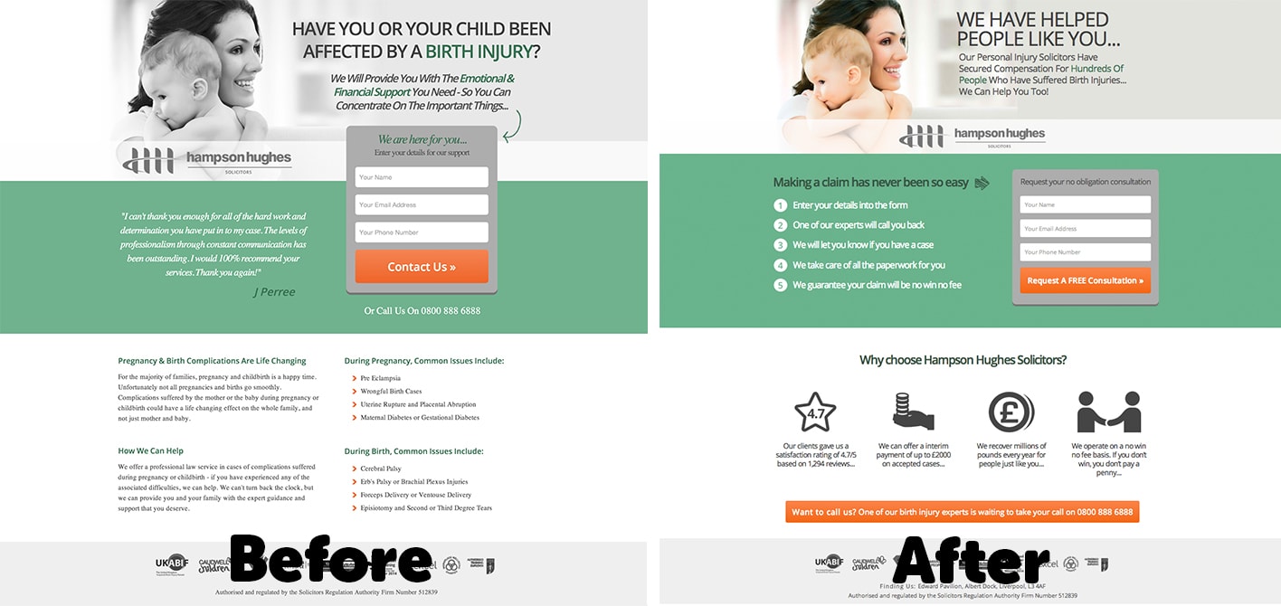
The changes to Stuart’s page are subtle but powerful:
- He condensed his form to make the page more linear.
- He removed the dodgy testimonial and replaced it with steps which lead a prospect toward the goal of the page.
- He removed extraneous copy and instead cited the four main reasons someone should go with his service. The way he did this was masterful; he pulled the data from a survey and treated each bullet point graphically, which makes the overall page easier to digest.
- He added an additional CTA at the bottom of the page to capture any scrolling leads.
- He changed the headline to carry the conversation momentum from his ad to his page.
The verdict? Maintaining conversation momentum from the ad to the landing page and condensing the page’s copy into easy-to-read (and even easier-to-skim) sections reduces friction on the page.
Each of the contestants made impressive changes to their pages, but in the world of CRO, there is always more than can be done, whether another section to condense, or another variable to test.
“If only optimization was as easy as sitting on our asses and just knowing what was going to work” – Peep Laja
Which brings us to the final chapter of the Page Fights saga…
A/B Testing Tips From the CRO Experts
The insight dished out throughout the series is great in theory, but in practice, every change you make on your landing page should be A/B tested and allowed to run until statistical significance is achieved.
In light of this, our judges provided some insight into how to know when a test result is actionable – even with a small sample size.
- Always use a tool such as Unbounce, Optimizely or Visual Website Optimizer.
- Prioritize your testing by figuring out what the biggest problem is. Do quantitative/qualitative research, run surveys and talk to your target market. With their help, find what is broken on your page and start there.
- Only test one thing at a time. Multivariate and sequential testing can be imprecise; motivations change, and if your page starts performing terribly, it can be difficult for you to determine which factor is the culprit. The only time you should be testing multiple elements at once is if you have no traffic for A/B testing and a radical makeover is necessary.
- Only make changes when results are statistically significant. Although there is no universal rule for determining this, Peep shared a good set of guidelines for determining whether your results are ready for you to act on:
-
- Your statistical confidence level is upwards of 90%.
- You have a sample size of at least 100-200 conversions per variation.
- Your test has been running for at least one week (although ideally for two weeks and beyond).
A/B testing can seem overwhelming if you’re not experienced with it, but once you get started, you’ll be amazed at the payout you can get from very little effort. If you don’t know where to start, check out the Ultimate Guide to A/B Testing and start getting your hands dirty. All the cool kids are doing it.
#alwaysbetesting
CRO-wning the Winner
[Warning: Page Fights champion spoiler ahead…]
Page Fights spanned a brutal three weeks, and in that time, much blood, sweat and tears were shed. After many landing pages were improved, viewer questions addressed and brutal disses dished, it was time to crown a Page Fights champion.
The winner was to take home:
- One year free of Unbounce
- A one-on-one consultation with Peep Laja
- Free entry into the ConversionXL Conversion Course
The viewers cast their votes and chose their champion:
Wait for it…
Wait for it…
Wait for it…
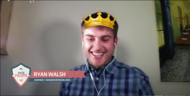
Congratulations to Ryan Walsh of MindOverPain.org!
How does your page measure up to that of our finalists? Does it fall into any of the traps outlined in this post? Or are you primed for battle?
If you missed the chance to surrender your landing page for critique on Page Fights, sign up to be the first to know when you can join the next round.
And in the meantime, learn from our contestants’ mistakes and take your page to the next level.

