
We’ve heard it all before: “Long copy closes the sale!” shout the copywriting gurus. “Shorter landing pages get more leads!” shouts the sales team. Who’s right? Well, as it turns out, they both are. If you’ve ever wondered “what’s the right length?” when it comes to all the things that go into your conversion marketing mix, then you’ll want to keep reading.
Before we go through these examples, I’d like to add the caveat that you should always be testing to see what works best in your particular case – there’s a reason they’re called best practices, after all.
Landing pages
Landing pages are at the heart of any successful marketing campaign. The ideal length of your landing page will depend largely on the goal of the page.
Longer landing pages are ideal for more information-intensive requests, like starting a free trial of a paid product, an online course, or service. Because money is involved (this applies to free trials, too), people what to know precisely what they’re getting – and what they’ll get out of it.
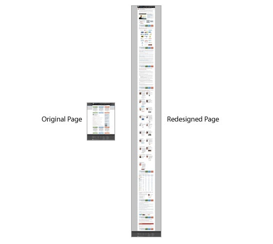
For example, in the famous case study that Conversion Rate Experts used to make $1 million for SEOMoz (now Moz), the goal was to increase subscriptions of the Moz premium program.
The original landing page was more of a one-minute sampler, whereas the redesigned, longer landing page involved tidbits from presentations, customer testimonials and CTAs scattered throughout. They went into great detail by telling the story of what Moz Premium was, how it was used and who could benefit from it.
They surveyed customer service to learn and anticipate customer questions and used the customer’s language in writing the copy. The company even surveyed its users who ultimately canceled their subscriptions to learn why they did so and then addressed those issues on the redesigned page. Taking all these things into consideration resulted in creating a landing page that truly echoed what its customers wanted.
It’s worth noting that the longer page resulted in a 52% increase in sales, with profits enabling Moz to continue to scale as a company.
Shorter landing pages work best when the lead already knows what they’re looking for and your page presents the exact solution without fluff or filler. In an example from ContentVerve, a shorter landing page for a gym increased conversion rates by 11% with 95% statistical confidence.
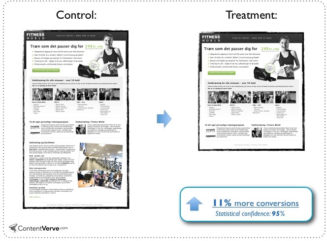
They didn’t need to go into detail about their machines, their programs or their people, as anyone who visits the gym for the first time can see all of those things for themselves. In this case, shorter is better.
The message is simple: join our gym and get fit.
Homepages
Smart marketers know that the difference between a homepage and a landing page boils down to the purpose of the page.
A homepage has multiple elements and links competing for attention. This will compromise your page’s attention ratio and result in fewer conversions.
So, what else can be optimized on a homepage with dozens of links vying for your lead’s attention?
DesignBoost, an online design school, had a homepage that was over 6400 pixels long. They tested a shorter version (just 1200 pixels long) and got a 13% increase in sign-ups with a 25% increase in click-throughs to their courses page.
The finding, therefore, was that if the goal was to get people off of the homepage and actively involved in the content (learning about courses, printing coupons, etc.), a shorter homepage made the action that much easier to take.
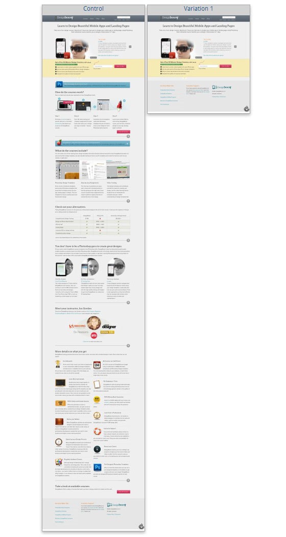
In these cases, you don’t need to go into great detail on what people get. They just want the fastest route to the freebie. Anything else only serves as a distraction.
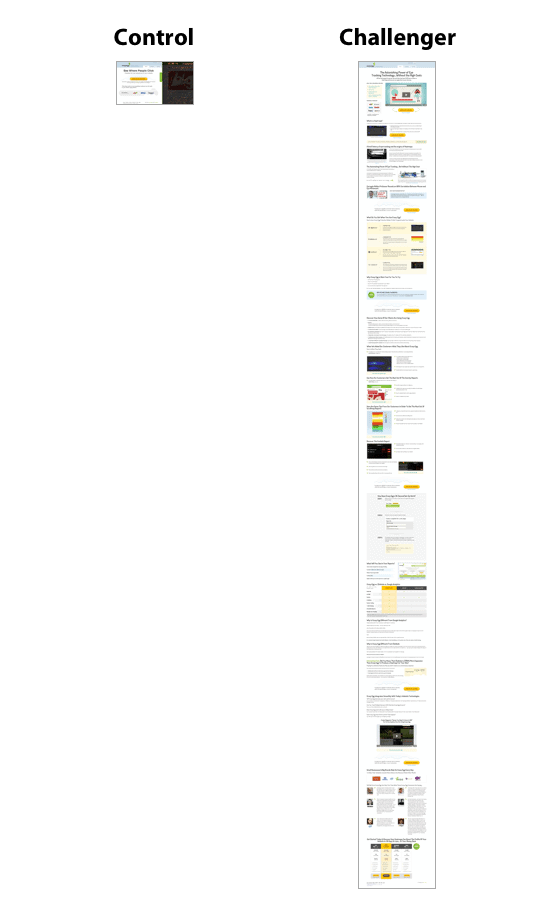
In the case of heat-tracking service CrazyEgg, conversion optimization company Conversion Rate Experts was able to increase the site’s conversion rate by 363% by making the home page about 20 times longer. What did they do with all that extra space? They used it to address common customer concerns, such as how CrazyEgg compared to its competitors, how it compared to Google Analytics and what exactly heat maps were and how they worked.
Because CrazyEgg also has a higher price point than Google Analytics (which is free), a great deal of emphasis also went into the technology behind eye-tracking and how expensive it would be to set up a formal eye-tracking study versus using CrazyEgg’s heat maps.
The result was that using that extra space to better educate customers tripled the conversion rate.
Blog posts
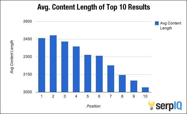
An analysis by SERP IQ of the top 10 search engine rankings for a variety of keywords and industries has shown that longer blog posts (between 2,000-2400 words) tend to rank better than their shorter counterparts.
Remember that search engines are in the business of relevancy. They strive to hit that accuracy mark every time because doing so not only reflects well on the search engine itself, but also improves advertising revenue and marketing targets.
But your job isn’t done even after the ranking dust settles down. You then have to convert the customers that click and achieving this is more complicated than beefing up your word count. There are other factors too, like social signals, links, trust and even how your site is structured.
In writing substantial content, however, don’t forget that you’re writing for scanners as well as full-fledged word-for-word readers. A wall of text is uncomfortable to even think about reading on a computer screen, let alone a notebook or mobile device. Break up paragraphs after every three or four sentences and try to keep lines of text around 12 words or so.
While you’re writing, a good sprinkling of sub-headlines and relevant photos or images (charts, diagrams, etc.) can also improve the flow and encourage scanners to take a closer look.
Email marketing
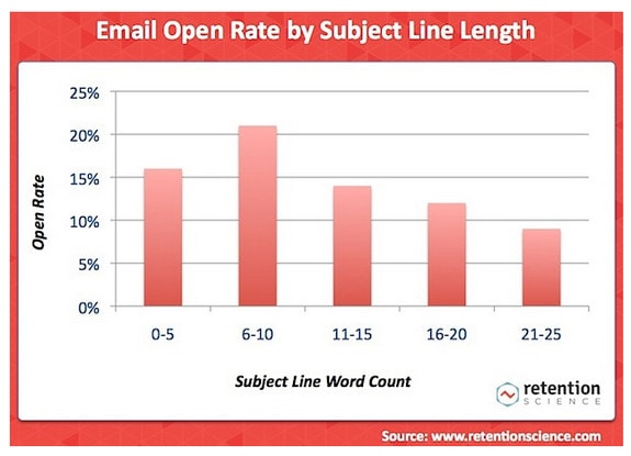
The almighty click-through is the goal for email marketers and subject lines have often been the focus of many tests by the likes of MarketingSherpa, WhichTestWon and eConsultancy. They’ve all conducted studies to determine ideal subject line length. The most recent entrant into the subject line study foray was Retention Science, whose study found that open rates did best at 6-10 words:
But what about the email itself? For starters, the points made above regarding blog post length also apply here.
A notable difference is that making a sale through email is almost impossible unless you’re dealing with a highly targeted list. Inc. magazine’s Geoffrey James went so far as to suggest that an overly “salesy” email message may as well end up in your prospect’s spam box.
He suggests that your first goal should be to get the prospect to hit “reply” or otherwise engage you in a conversation.
Test, refine and observe
I’m sure you’ve heard this one before, but it bears repeating: all the advice, studies and surveys do absolutely no good whatsoever if you don’t test for yourself.
Learning what resonates with your audience and your market will have a much more resounding effect on all aspects of your marketing and revenues than blindly following what others are doing.
By observing trends within your market and conducting your own tests to determine what works for you, you’ll be able to pick and choose long versus short in a variety of applications that will ultimately lead you to higher conversion rates.
