
Your landing page is a virtual pinky swear with your visitors.
People are coming to your landing page because they’re looking for a solution to a specific problem. And they’re looking for you to tell them exactly what it is that you have for them that would solve that problem.
Page Fights, the hilariously brutal (yet educational!) landing page critique show we produce with our friends at ConversionXL, celebrated its first anniversary with an All-Star Edition. Regulars Peep Laja and Oli Gardner were joined by Copyhacker’s Joanna Wiebe, our own VP of Marketing, Georgiana Laudi, as well as a star-studded cast of guest judges with as much conversion rate optimization knowledge as you could possibly pack into one Google Hangout.
You can watch the entire episode here, or read on to learn how to make sure your landing pages are telling your audience exactly what they’re going to get and delivering on your promises.
Promise what you’ll deliver
There are few things that will get people to leave your page faster than copy that doesn’t tell visitors exactly what they’re going to get.
One of the most confusing landing pages of the day was this one, from MBM.
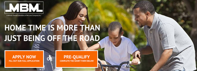
If you only ever got to see this much of the page (a real possibility if you’re viewing on a smartphone), it would be difficult to assess what the page was all about.
As it turns out, this is a landing page for truck drivers seeking employment. And while that headline might ring true with truckers, it could also ring true with any one of the Page Fights judges who travel regularly. They’re covering a lot of ground, and not speaking to any one particular audience. Guest judge Michael Aagaard had this to say:
It’s not enough for people to know what the page is about. This page is for truckers, but the headline is very broad.
Additionally, this headline doesn’t do anything to inform truckers why they should keep reading. There is no promise of what you would get by staying on this page.
Michael went on to suggest that by simply changing the headline to something that promises truckers shorter work hours, readers might be more inclined to stay on the page.
Although there are other issues with this particular page, starting from the beginning is always the best way to proceed.
Start with the promise you’re making to your customers, and tell them exactly what that is. Don’t confuse the issue by offering a whole suite of options. Promise one thing (the thing you do) – and then deliver on that offer.
Maintain a consistent message
Then there were pages that confused people by saying they’re getting one thing in the headline and then throwing in a bunch more stuff into the mix in the bullet points.
Inconsistencies like that can only end in confusion and inaction on the part of the visitor.
Georgiana took issue with a page from eCommHacker, saying “This page has some pretty serious commitment issues.”
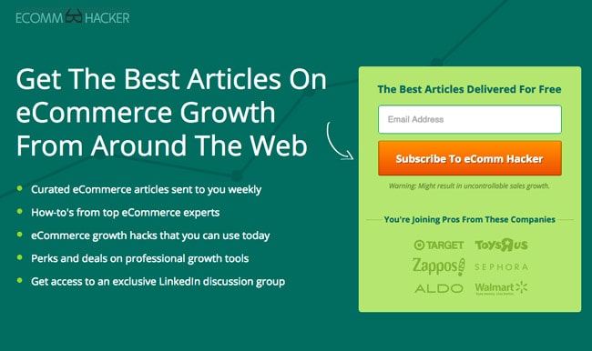
The page starts out by saying that if you sign up, eCommHacker is going to deliver “The Best Articles On eCommerce Growth From Around The Web.” But then they go on to say that they’re going to also send how-tos and growth hacks, and access to a LinkedIn discussion group. Georgiana had this to say:
“All of a sudden this starts sounding more like a community than it does just a list of the best articles from around the web.”
The real problem here is that there is no link between what they’re promising in the headline and what they’re saying they’re going to deliver in the bullets below.
Simplifying the message by focusing on just one offer instead of many could go a long way toward helping people understand and actually sign up for the newsletter.
Deliver on what you promise
Here’s the flip side to the coin above: once you’ve made a promise to your readers and they’ve taken action, you best deliver on it!
Here’s a landing page from Status Hero.
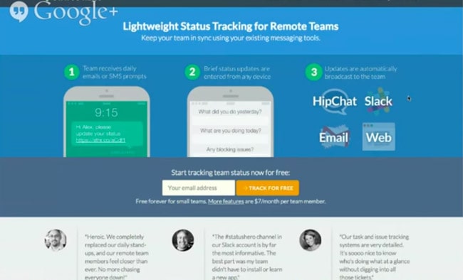
Georgiana was the first to weigh in on this one:
Its offer is not what it appears to be.
There is a “more features” link on this page which would make you think that by clicking on that link you’re going to find out about more features. But in reality, that link directs you to a pricing page that says, “Coming Soon.”
The free version of what they’re advertising on the page (the word “free” appears seven times) doesn’t actually exist yet. This is as good a recipe as any to have your potential customer leave and never come back.
Don’t mislead with your calls to action
Next up is this page from Tap Sell. Michael Aagaard was quick to point out where they’re not delivering on their promise.
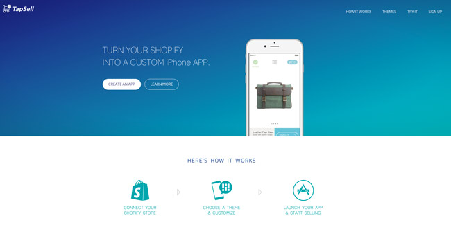
As you can see in the screenshot above, there is a call to action button that reads, “Create An App.”
Instead of going to a page that mirrors what the button says, it directs customers to a registration page. If people need to register before they use the product, that’s fine, but then this page should have a “Register Now” button. That way Tap Sell would be making good on their promise.
Folks, you’ve got to deliver what you’re promising people on your landing page. If you don’t, your readers will pass on your offer more than Scottie Pippen passed the ball to Michael Jordan.
Keep your landing page promises
People remember when you don’t deliver what you promise.
Even if they come across your landing page again, they’ll remember their experience and bounce. And if you can’t explain what it is that they’re going to get while they’re on your page, they’re not going to bother clicking your CTA.
Create your message so that it is as clear as it could possibly be to make sure your visitors know what you have to offer them. If you’re telling them they’re going to get something when they click a button, make it that one thing and that one thing only.
Once you’ve got that down, submit your page to Page Fights, and let our judges decide whether or not you’re making the grade. They’re tough, but like Judge Dredd, they’re also fair.

