Obsessed marketers should never be 100 percent satisfied with their campaigns – and you shouldn’t be either. If 100 percent of your visitors are converting, what’s left to do? (Well, I’d sit on a beach, but there’s no such thing as a 100% conversion rate).
A/B testing can turn around a marketing campaign from sucky to awesome, and I’ll show you how with the following four examples showcasing how others have done it.
Often an A/B testing example may surprise you; some are quite obvious, but each scenario provides a lesson or two that would have otherwise been missed without testing (at the end of the day the most important lesson is that you understand your customers better).
Lesson 1: Highlight the price point
There’s an old saying that if you have to ask for a price, it’s too much. Much like seeing “market price” as the cost of lobster, many customers are put off by this and will bypass it on the menu, being hesitant to order, as they’re unsure of the cost. SafeSoft Solutions saw dynamic results just by adding a bold, noticeable price image to their ad. In fact, the simple addition of the green image, led to a 100% increase in conversions.


Lesson Learned
You need to make your customers aware of the value your services offer. The price-point helps potential customers see the value in your services and may be the driving force in converting decision makers. Be sure to know your competition and their promotions, however. If you’re considerably higher priced and offering similar services, adding your price point may not make the most sense –or you may just be overpriced!
Result: For SafeSoftSolutions, just including the image increased conversions by 100 percent.
Lesson 2: Extend Trial Offers
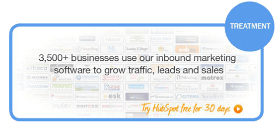
If you’re considering offering a free trial or demo but you’re not exactly sure of the duration of the offer, A/B testing is a great way to find the ideal length. This test by our HubSpot partners showed that increasing their free trial promotion from 7 days to 30 days would also increased their conversions by 110%.

Lesson Learned
Just because it’s free doesn’t mean the offer is compelling enough to drive conversions. You may need to extend the duration in order to boost conversion rates. Ask yourself this: Is 7 days long enough to get an accurate feel for my product? If the answer is no, how do you expect your customers to buy into the offer? Remember, if your offer, the landing page or the product itself is weak to begin with, a free trial might improve conversions, but ultimately won’t boost business.
Don’t forget, once you get the customers to sign up for the free trial, it’s up to you to convert them into brand loyalists.
Result: HubSpot’s customers preferred the longer trial period with 110% increase in conversions just by changing to a 30-day trial.
Lesson 3: Design & Positioning
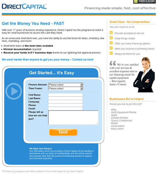
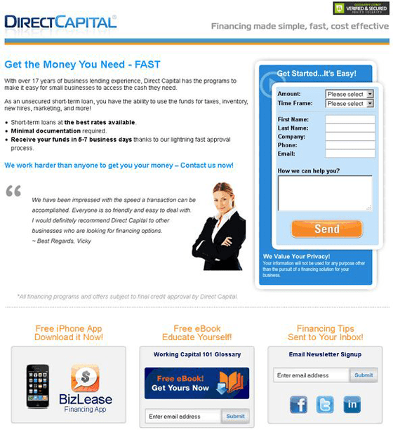
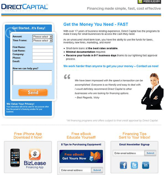
Sometimes, a simple design tweak may be more palatable to your customer, but unless you run an A/B test, you’ll probably never know if a left-adjusted sign-up box is more aesthetically pleasing than one placed to the right. Matt Sullivan of Inbound Strategy changed their site’s landing page, adding more information and playing with the location of the CTA.
Lesson Learned
Don’t become complacent. Always be testing! Although the control page was garnering conversions, Sullivan knew that he could make it better through monkeying with the layout – and it worked. Despite the opinions from others in the marketing department, the left-sided CTA won, hands down.
The left-sided CTA saw a 217% increase in conversions compared to the control landing page and variant A.
Bonus Lesson
HIPPOs aren’t always right. Remember: It’s what your customers prefer that drives conversions, and unless you’re not interested in more sales, your opinion doesn’t matter.
Lesson 4: Simplistic vs. detailed
Just for s**ts and giggles, Ben of PlentyofFish created and tested two versions of a CPC ad for EA Sports’ Need for Speed. The first ad was a standard, professional-grade ad that you typically see for a high-dollar company like EA Sports. The second was a sketch done on Microsoft Paint with limited text and a drawing of a race car that even my 5-year-old could do. Much to everyone’s surprise, it was the amateurish sketch ad that outperformed the glossy.


Lesson Learned
Sometimes, the more simplistic the ad, the more it piques people’s interest; thus, increasing conversions. Never underestimate (or overestimate) your consumers. The hand-drawn, less-than-professional ad tactic won’t work for everyone in every industry. In fact, this concept alone probably won’t work for most. But, it may be worth a test run.
Bonus Lesson
Remove your branding. Another hypothesis surrounding these ads is the variant performed better because it didn’t include the EA sports logo. There has been some speculation that the brand has become less than reputable, drawing more conversions to the unbranded page. If you have any reason to believe your brand name is hindering your conversions, consider removing it and testing. On the flip side, if you’re brand is what sells your product, be sure it’s included.
On another (editor’s note) – if your brand sucks to the poitn where you need to remove it to improve conversions – you are in trouble.
So What Now?
A/B tests shouldn’t just be something you talk about doing; they should be something you do in standard practice. It’s not just a great way to find the right formula for your demographic, but A/B tests also remind you that nothing is ever quite as it seems. Just because you think you have the best landing page, email campaign or ad doesn’t mean your customers will feel the same way.
Minor details sometimes make a world of difference and you’ll never know unless you’re always testing.
