Numerous studies have been conducted to determine “hot spots,” or the areas of a Web page users’ eyes tend to focus on first and those that get the most attention. There’s a natural pattern to the path most users’ eyes follow on a page that can can be used to a designer’s advantage when planning page design and layout.
According to EyeTools.com, an individual eye path, called a heat map, looks like little more than a totally random smattering of points, or hot spots, scattered over the page, but by analyzing the paths of multiple users it’s possible to determine logical or common paths.
This pattern can aid designers in placing key information in common hot spots on a web page or image.
Lack of pattern indicates confusion
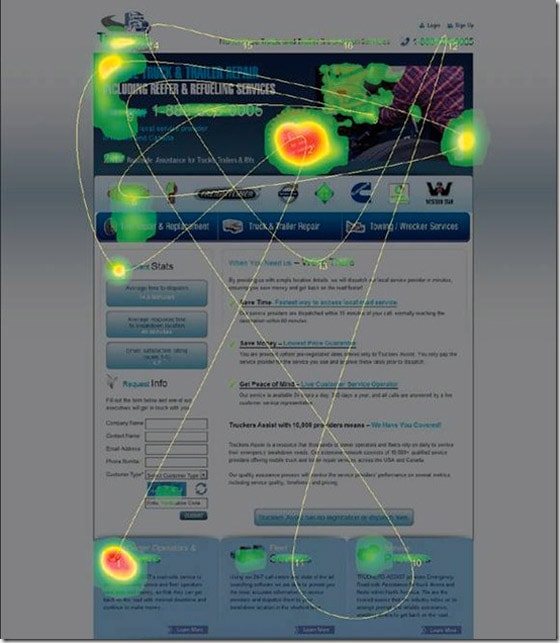
Analyzing heat maps is a useful method to determine whether a landing page or image makes sense to consumers and impacts their experience. Path patterns should emerge when data from multiple users is compiled; scattered or random paths indicate that readers are confused.
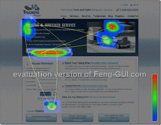
If a heat map demonstrates that readers’ eyes are focusing on unimportant areas of a page, it’s time to revisit the design. Ideally, a heat map should show concentrated areas around CTAs (calls to action). In the example below, the most concentrated focal area is a portion of the header that says “No Fees.” While this is important information, users only briefly visit the “Current Stats” area on the left-hand side of the page, and completely skip over the call to action immediately below it, which reads, “Request Info.”
A good landing page designer knows that every pixel of a landing page has a purpose. Even white space, which not only reduces clutter but helps guide eye path to the most crucial areas of a page. Ample white space surrounding a call to action will help readers quickly focus in on this important area. Further, images can be used to subconsciously direct a reader’s attention. For instance, readers tend to look in the direction of another person’s eyes, so a photo with a person looking directly at a call to action will almost always force a reader to immediately follow the path.

Looking pretty isn’t enough
OneExtraPixel.com notes that many designers get caught up in the idea of creating a flashy, impressive graphic piece that impresses the customer (in this case, the brand or business purchasing the ad or design). Most landing pages designed with attractiveness as the primary factor fall short of conversion goals because they fail to take eye path into consideration.
Author Eric Rowell says,
“A good web design effectively satisfies the purpose of the website first, and then looks pretty second,”
comparing the process to an architect designing a home without windows and doors. In other words, function comes first.
First steps: defining landing page goals
Designing a landing page that converts is next to impossible if the page has no objective. A landing page designer should have a full understanding of the goals of the page prior to undertaking any aspect of the design. There are three important points to consider when defining landing page goals:
- Identify the problem the user is trying to solve
- Provide a solution
- Offer a call to action that solves the problem
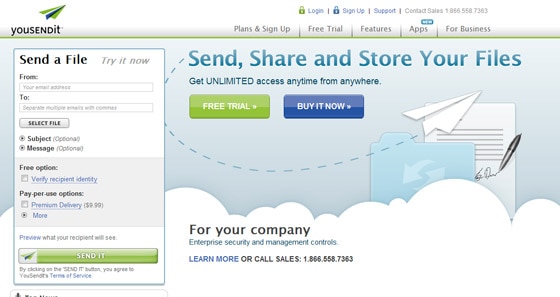
Each of these points should be addressed consecutively through the page design in order to seamlessly move readers through the buying process.
Further, a landing page should accomplish the following goals.
- Differentiate the product, service or brand from competition. What’s the unique selling proposition, or USP?
- Decrease consumer anxiety. Is there a satisfaction guarantee or a no-questions-asked return policy?
- Offer an incentive for completing a call to action. What will be gained or lost by forking over some hard-earned cash?
Proper design guides readers to take action
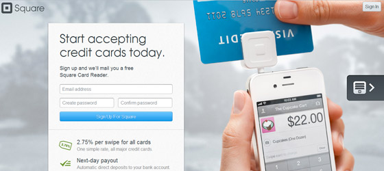
Landing pages are designed to entice readers to take a specific action. Using heat map technology, landing pages can systematically guide readers to various points of a page, each step building on the last to complete a compelling sales message.
The Pixsysm Blog points out a few common pitfalls landing page designers tend to make:
- Objects that compete for a reader’s attention. More than one glaringly obvious call to action creates confusion; when a reader lands on a page, the final call to action should be clear and compelling. There should be no guesswork or decisions to be made by the reader regarding next steps.
- Too many fonts. Choose one or (at the most) two fonts that compliment each other. Use one font to emphasize important points and the other to convey supporting information.
- Don’t use boxes if not for a call to action. Boxes should be reserved for the main call to action, because a box tends to cause readers’ eyes to stop. Randomly-placed boxes appearing before the call to action can cause readers to get lost, confused, or leave the page altogether.
- Use a logical hierarchy of headings. Headings are used to lead a readers’ path through order of importance; like boxes, they should be used strategically to guide readers from point to point.
Using design to dictate eye path
Heat maps for non-landing pages tend to follow an “F” pattern, meaning readers tend to start from the top left and work from left to right and then take a vertical path down the page.
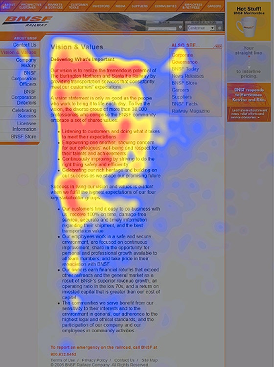
Landing pages, on the other hand, can follow a completely different path as dictated by proper design. In a previous post, Oli covers 8 Visual Design Techniques that can be used to dictate eye path and improve landing page conversions.
Here are a few tips, including some from Triple Moons Design.
- Use white space to your advantage. White space is relaxing and can guide a readers’ eyes to the next important step in the buying process.
- Start with a compelling headline. Most readers start at the top left corner of a page; this is a great place to put the company logo followed by a major headline.
- Use bullet points to convey bits of information. Bulleted lists are enticing to readers, because they briefly convey important highlights.
- Use images as directional cues to guide eye path. Social Triggers says an image of a person looking at a specific area of the page will draw attention to it. Further, images can create subtle arrows that dictate eye path subconsciously. For example, an image of a person with one hand on her hip can point a reader’s attention to the direction the elbow points.
Using eye path in design can be as simple as asking a group of friends to look at a page and note where their eyes fall in order. There are more sophisticated methods of analysis, but a landing page that isn’t converting is a sure indicator that the design doesn’t follow a logical eye path.
