It may be Leap Day, but that’s no excuse to take a blind leap of faith when it comes to landing page effectiveness. Landing page optimization takes more than asking your friends “does the page look pretty?” There are numerous variables that can be tested and refined to maximize conversions:
- Headlines
- Call to action (copy and design elements like color, size and shape)
- Tone or voice
- Form length
- Trust factors (think testimonials, endorsements and customer logos)
- Social proof (social sharing buttons with a ticker showing the number of likes or retweets)
- Videos and images
- Page layout
Soooo, in honor of Leap Year, here are 29 ways to leverage *real* user insight in your landing page A/B tests:
User feedback
1. Integrate a user feedback form on your landing pages. Companies like Kampyle provide easy ways to incorporate forms, which can help uncover issues prospects may be having. For instance, is the price point too high or were customers looking for a more iron-clad satisfaction guarantee? The best part: Forms can be scripted to pop up when a prospect leaves a page without buying.
2. Take part in open forums. Use sites like GetSatisfaction to establish open relationships with your costumers and ask the vital questions: What’s working? What’s not? Similar to using an on-site feedback form, this strategy allows you to obtain real-time feedback from potential customers.
3. Don’t jump to conclusions too quickly. Use a super awesome A/B testing tool like Unbounce (shameless plug) to try a test and watch the statistical confidence level rise until you know when the test is valid. Making conclusions too soon can skew your test results.
4. Participate in live-chat services. Olark, for instance, lets you ask customers the questions you’ve always wanted to ask: Why didn’t you make a purchase today? Were you able to find what you were looking for? Again, real-time feedback is the key to obtaining the most accurate responses.
5. Use a five-second test. Simply ask someone to look at your landing page for five seconds and recount what they’ve seen. If they can’t grasp the concept, then the most obvious thing you’re doing wrong is your core value proposition (your headline that explains in simple terms what the page is about). TIP: Make it really explicitly obvious. A tool by the same name, FiveSecondTest, can help simplify the process even further by finding participants to do the tests for you.

6. The 6ft Test. Print a screenshot of your page and pin it to the wall. Then stand 6-feet back and stare at it. What stands out to you and your colleagues? It should be the headline and CTA. If it’s not, revisit. (Change, rinse, repeat). Avoid biased responses by reaching beyond the design team for test subjects. If you’re super ballsy – go ask strangers on the street and video it to create an extra inbound content source that you can stick on YouTube.
7. Make use of Twitter search. Search using your “companyname” in a Twitter search (TIP: don’t use # or @ in the search as that limits the results – many people will just use your name without these prefixes), you can quickly find out what anyone and everyone is saying about you on Twitter. The good, the bad and the ugly!
8. Use your brand loyalists and ask them for feedback on your site. You may want to consider offering them a little something for their time.
9. Solicit testimonials from those who like you. Use those same brand loyalists from your email campaign and ask for testimonials that can be added to your site to build trust.
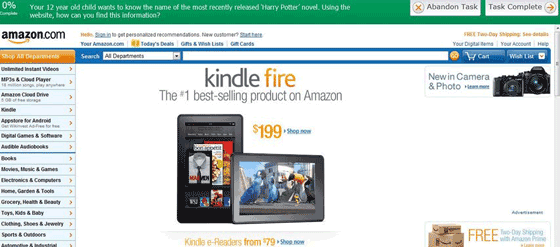
10. Ask for help. Enlist usability testing sites like Loop11 or UserTesting.com which allows you to pose a series of questions to willing participants to help recognize navigational or communication issues.

Demographics
11. Try different user samples. Try A/B tests on different segments of inbound visitors (email visitors, social media visitors, paid search visitors etc.) and see if they react differently to your messaging.
12. Know your target customer. Understand who visits your site. Look at your analytics to know exactly who is coming to your site and what they are doing once they’re there.
13. Use consistency for reliable test results. If you’re toying with price points, make sure the same visitors see the same offer across every page on your site and on repeat visits for the duration of the test. Otherwise, it looks sloppy and renders your test worthless. (And offering different prices to different people at the same time can be seen as illegal – oopth!).
14. Give Google Website Optimizer a try. It’s free and integrated with Google Analytics. What more could a small business ask for? (Well, unbounce.comes to mind – but that’s because it’s A) my biased opinion B) waaaay better :) #JustSayin

Writing
You need to write for your audience. But how?
15. Rephrase calls-to-action and other copy as needed. Landing page copy may seem subtle but can play a significant role in click-through rates. Switch up your phrasing and analyze results. Just promise me that you’ll avoid saying “Click Here” or “Submit”. They’re desperate and meaningless, in that order.
16. Check out Google Analytics. This free tool can help decipher how much time visitors are spending on each page. The average time on page statistic plays a role in conversion rates. Visitors spending too much time on the page may be missing the CTA, while those not spending enough time are likely not finding what they were looking for. TIP: If you find people spending a long time on your page but not converting – add a live chat or survey widget to find out why – then revise and re-test.
17. Message Match? Take a cursory glance at your site. Are your keywords noticeable on your landing page? Visitors are more likely to bounce if they don’t immediately recognize the page as relevant to their search.
18. Ask your users to describe your page in their own words. You’ll be surprised what you can learn by hearing your product or service described in your users voice. Use this to alter your communication style to something that more closely aligns with your visitors communication style.
Design
19. Play around with location of graphics, videos, CTAs and any other vital elements. Having your CTA in the precise location that draws the most attention may make the difference between a click through and a bounce. Use directional cues to point people in the right direction.
20. Add (or remove) a video from your landing page. Don’t jump to the conclusion that video always improves conversions (despite evidence that they do – but that also relies on a decent video). Sometimes, images are better and can be used to guide a reader’s attention straight to your CTA – especially if you use the principals of directional cues, by having a person or animal look directly at your CTA, guiding user attention.
21. Use heat maps to analyze visitors’ eye paths. CrazyEgg can provide comprehensive heat map imaging of your site even if you have low traffic. This helps identify whether your CTA is in the best place, and altering the positioning of page elements can redirect attention to the right spot.
22. Be a minimalist. Don’t change everything. Changing every variable between A and B will lead to confusion about what’s working and what’s not. Test just one element at a time.
23. Pay attention. Attention Insight analyzes your page from a graphical standpoint (vs. users eyes or mouse movements) and shows you what aspects of your page are garnering the most attention, much like a heat map. If your CTA isn’t prominent enough it won’t capture much attention, maybe it’s time for a change.
24. Be bold. Don’t be afraid to test drastic changes to your design elements. You may find your users drawn to bolder colors, fonts or graphics.
25. Be subtle. On the flip side, tone it down a bit. If you’re page is too harsh, you could try something a little more subtle. Run a test with a more simplistic style.
Developing a hypothesis, not a HIPPOthesis
What’s a HIPPO? It’s the Highest Paid Persons Opinion (often your boss) – and they get their way despite not really knowing the first thing about conversion. This is the best reason to run a test, but before running one, build a hypothesis based on what you and your users think the page should achieve – then test it against what your boss thinks. #FUN
26. Admit there is a problem and be willing to rework some of the elements. Don’t be afraid to test. If you’re not getting the results you need from your page, rework some of the elements to see if it performs better. Remember, the first step in addressing a problem is admitting you have one. Then go to Landing Page Rehab for a health check.
27. Be specific. After careful analysis of your page, set specific and measurable goals to test. If you don’t know what you’re looking for you can’t understand why one version outperforms the other.
28. Consider everything. It’s difficult to pick out exactly what’s not working, so be prepared to run multiple tests on a variety of elements.
29. Test and retest. After you’ve completed you first test, look for improvements and ways to make your landing page more user friendly and efficient. A/B testing can be an ongoing process, and it’s important to evolve. Just remember the whole purpose of this post – getting user feedback is often the best way to develop a hypothesis for what to test next.
One of the differentiating factors between digital media and traditional media is that it is a living, breathing organism. It’s constantly changing, constantly being updated and reaches far more people than could ever be reached before. But, it’s that exact advantage that creates some of the biggest challenges for web designers, both expert and novice who pour blood, sweat and sometimes tears into their web baby. Their bias or the bias of a HIPPO within the organization often stalls change and keeps an unproductive site alive and desperately in need of a makeover.
A/B testing is an awesome opportunity to have your customers give feedback on what’s working and what’s not. So what are you waiting for? Leap Year?
