Some of us have the luxury of having talented graphic designers on staff.
For those of us who don’t, designing a landing page that doesn’t get in the way of conversion can be a real pain in the butt.
I’m not just talking about a pretty page. I’m talking about everything that goes into effective landing page design: directional cues, font usability best practices, color theory, layout tricks and more.
If design isn’t your forte, this article’s for you. I’ve scoured the web for the best blog posts on how to make deliberate design decisions that will impact the performance of your landing page – from color psychology to typography to more subtle visual tricks.
Let’s get started!
1. The Psychology of Color by Quick Sprout

This post comprises the fourth chapter in Quick Sprout’s comprehensive guide on understanding consumer psychology. It starts by reviewing color theory, including the different emotional impacts created by pure colors, shades and tints, as well as the science of picking colors that work together.
Colors come with social and cultural connotations, and this guide includes a chart that explains how the meaning of color varies for different social groups (colors that entice in North America are different from those that entice in India, for example).
The guide also looks at:
- The relationship between gender and color preferences
- Studies that show how color impacts conversions
- How to create designs that are more friendly to people with disabilities
Top takeaway
A common mistake made by designers is using too many colors on the same page.
An overload of colors can wind up conveying too many emotions or messages at once, which can potentially confuse the person viewing your design.
Instead, test using one prominent color that is offset by a neutral color like white, gray or black.
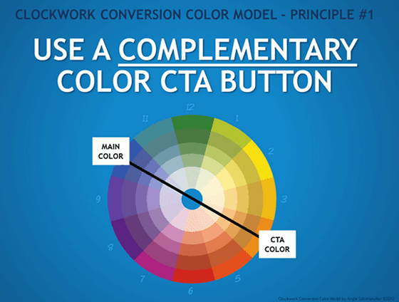
2. Color Usability Optimization: 4 Keys to Harnessing Physiology for More Conversions

Most resources on the relationship between color and conversion focus on the psychology of color; that is, the emotions and qualities that are ascribed to various colors.
But Angie Schottmuller of Three Deep Marketing developed a system for boosting conversions that focuses on how humans process colors physiologically. In other words, what the human eye does to color and how this impacts a user’s behavior when visiting a site.
In this really detailed post, you’ll learn:
- Her “Clockwork Conversion Color Model,” which centers on strategic use of complementary colors to boost conversions
- The four scientifically-based color principles that make up the model, and how you can employ each on your landing page
Top takeaway
Use pure colors for your primary CTA and neutralize the other colors on the rest of the page by mixing in white, grey and black.
This helps you avoid the overuse of pure colors, which can distract and exhaust the eye.
3. Choosing the Right Font: A Guide to Typography and UX

There are a lot of conflicting opinions about what kinds of typography are optimal for the web, and the truth is that it depends entirely on the context for which you are designing.
But UserTesting’s guidelines will give you all the information you need to make an informed, thoughtful decision about how you use type on your landing page. You’ll learn things like:
- The number of optimal characters per line for desktop and mobile
- How to think about the contrast between your text and background
- The differences in the way readers respond to serif and sans serif fonts
Top takeaway
The purpose of any text on your page is to help your users accomplish their goals. Always keep this in mind when choosing typography for your landing page.
Ask yourself questions like:
- What kind of experience are my users expecting when they land on my page?
- What devices are they using?
- What do they want to accomplish on my landing page (shop, learn, be entertained)?
The answers to these questions will help you decide which style and color are right for the type on your webpage. And, like any good landing page designer, don’t rely on gut instinct: make sure to test, test, test.
4. A Non-Designer’s Guide to Typefaces and Layout

Once you’ve chosen all the right colors and fonts, how can you arrange them all on the page in a way that just looks right?
This post by Adam Dachis on Lifehacker breaks it all down for you. It’ll teach you all about typeface and layout best practices:
- How to emphasize various elements on your page with proper sizing, color and spacing
- Why you should only use two typefaces max (and when it’s okay to break that rule)
- How to format your text and images to better communicate your message and have compelling (read: high-converting) visual impact
Top takeaway
Picking poor color combinations can make a page look messy and turn off prospects – so what’s a color blind marketer to do?
Dachis shares the really cool Adobe Kuler tool which helps you discover color combinations that work well together (without having to rely on your gut).
5. 8 Effective Web Design Principles You Should Know

As CRO expert Peep Laja eloquently puts it in this article:
Design is not just something designers do. Design is marketing.
If you’re a marketer who doesn’t really have an eye for design, that statement might intimidate you – which is why Peep provides a breakdown of eight web design principles that will help you create better landing page experiences.
Though many of the examples he provides are for websites rather than landing pages, this post is a must-read.
You’ll learn:
- How you use mathematical ratios and sequences to create web design that looks pleasing to the eye
- How you can take a page from photography’s playbook and use the rule of thirds to select (or crop) images that will look good on your landing pages
- Tons of other psychological and scientific tricks that can subtly affect your prospect’s perception of your landing page.
Top takeaway
The Law of Proximity dictates that elements that are close together on a landing page will be associated together in the prospect’s mind.
Don’t place elements together in your design if they don’t go together thematically. Alternatively, use this law to your advantage if you want to indicate that certain elements do go together!
6. Why These Ugly Designs Convert Beautifully

Now that you’ve got your share of design knowledge and know how to make things look good, let’s flip the script and check out an article that explains that beauty really is only skin-deep.
In this tongue-in-cheek landing page examples post, Mattias Guilotte looks at three not-so-pretty landing pages that convert remarkably well. He shares surprising conversion stats and takes a guess at why each page performs well in spite of being hard on the eyes.
This post is a cautionary tale about why you should always test before blindly following design “rules.”
…Just like the ones you just read in this post.
Wrapping things up
There’s a lot of great information in these articles that will keep you busy for a while. Read through and find hints of where your landing page design may be falling short.
And then run tests to validate your assumptions.
Finally, never forget that only solid copy can give way to beautiful and comprehensive landing page design.
P.S.: Know of any great blog posts about design theory that I didn’t include? Post them in the comments!