Designing a high-converting landing page isn’t just about making it look good.
If you want a long-term relationship with prospects, your page has to have a lil’ brains behind all that brawn – in the form of super persuasive and smart landing page copy.
On a special copywriting edition of Page Fights, judges Oli Gardner and Peep Laja were joined by Copyblogger’s Demian Farnworth to critique landing pages based on their least common denominator: the words on the page. Throughout the episode, they broke down a series of copywriting faux pas.
Here are four things you need to know to create landing pages that go beyond pretty looks – with copy that converts.
1. Don’t assume that prospects know you (or your offer)
Demian explained that you should never assume anything about your visitors:
Start by assuming nothing – that they’re not as sophisticated as you think. Start from step one.
Starting from step one ensures that you’re not leaving out any contextual information that will help make your offer as persuasive as it can be.
Have a look at Jana’s landing page, which opens with a headline that is pretty meaningless to newcomers:
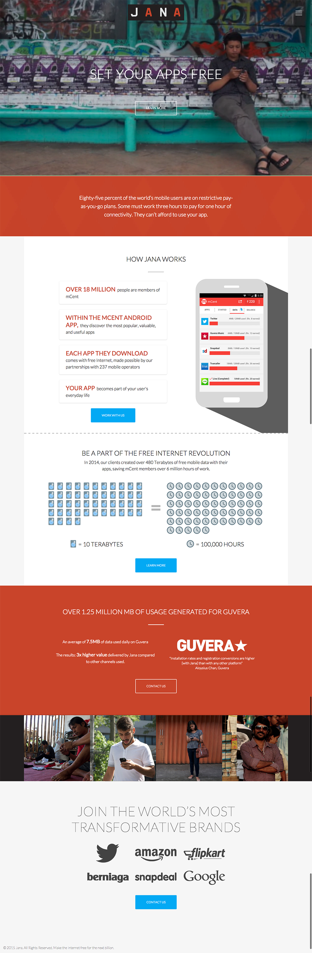
As Peep explained, if you don’t start by framing the problem and explaining how your solution fits into it, you run the risk of alienating prospects (and even pissing them off).
iBoske’s landing page was guilty of a similar infraction, assuming that visitors will understand what a “decision tree” is and how it can help them:
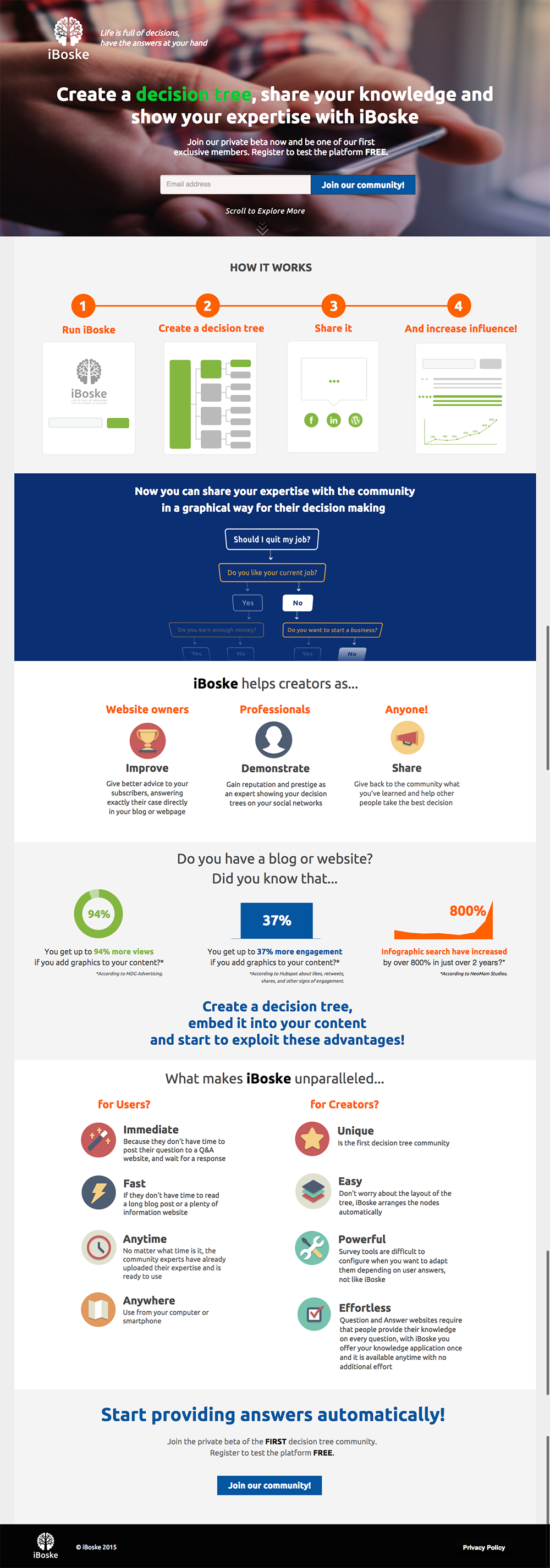
After reading the headline, prospects might ask questions like, “What’s a decision tree? Why share my knowledge? And with whom?” – but as Oli put it:
Your landing page copy shouldn’t add more questions. It should add clarity.
To make sure your landing page is as clear and complete as possible, Demian suggested starting with the problem that prospects have top-of-mind and working backward from there.
If you need to gut check your work after the fact, consider this piece of advice summed up by a Page Fights spectator:
Test your copy with random strangers or friends and see if they “get it” even if they don’t work for your company #PageFights
— Emese (@egaal) February 6, 2015
2. Relate to prospects before you try to sell to them
Sometimes, there’s a fine line between establishing authority and being condescending.
Oli thought that the copy on ArtTutor’s landing page had a lot of personality and sass, but wondered if it was a little much. “Don’t be sarcastic in your copy unless that’s a trait that your readers identify with,” he warned.
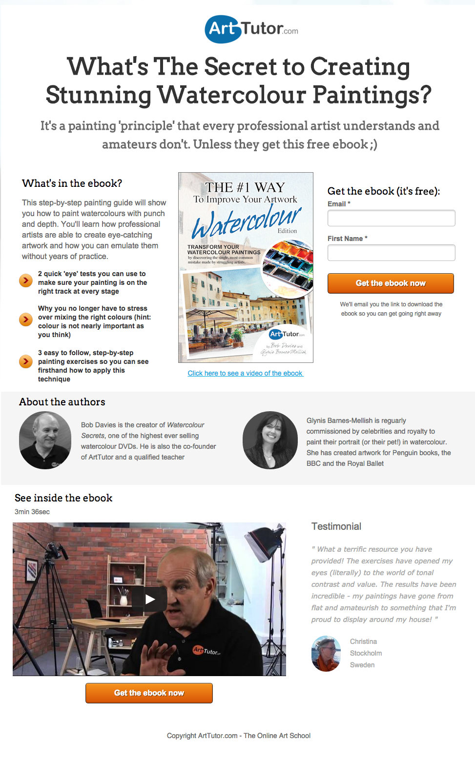
He felt that some of the language on the page was alienating, talking down to prospects instead of relating to them:
Don’t paint me as an amateur. You’re putting a wall up between you and me.
Moderator Tommy Walker from Shopify explained that you should always start by showing prospects that you understand their problem.
Simply demonstrating that you understand will get prospects to like you – but it also helps the credibility of your page. After all, showing that you understand the problem is the first step in showing that you’re the person with the best solution.
3. Skip the superlatives (and be specific)
A few of the landing pages made the mistake of making broad claims that killed credibility. Consider the language on Video Brain’s landing page:

Their use of words like “revolutionizing” made Peep’s eyes glaze over:
Those are not benefits. They’re jargon. You lose credibility if you use generalizing statements and hyperbole.
So how can you be sure to avoid vague, meaningless gobbledygook that sends any ounce of credibility down the drain?
Be specific.
Demian explained that the online marketing space is flooded with vague statements that hurt clarity and ultimately, credibility. For that reason, you have to be clear about the value that you have to offer – value that you can’t get anywhere else.
Even your testimonials should communicate specific benefits.
Lower on Video Brain’s page are some of the most broad, meaningless testimonials the judges had ever seen…

What is the concept? What is great? And why would people in the education vertical care about a testimonial from an entrepreneur?
Demian felt that the vagueness suggested that the page authors didn’t understand their target audience and what resonates with them.
Sometimes, a testimonial can actually be LESS persuasive if it’s vague, seems fake, or offers no actual insight into product #pagefights
— Joel K (@JoelKlettke) February 6, 2015
4. Make all your copy congruent with your campaign goal
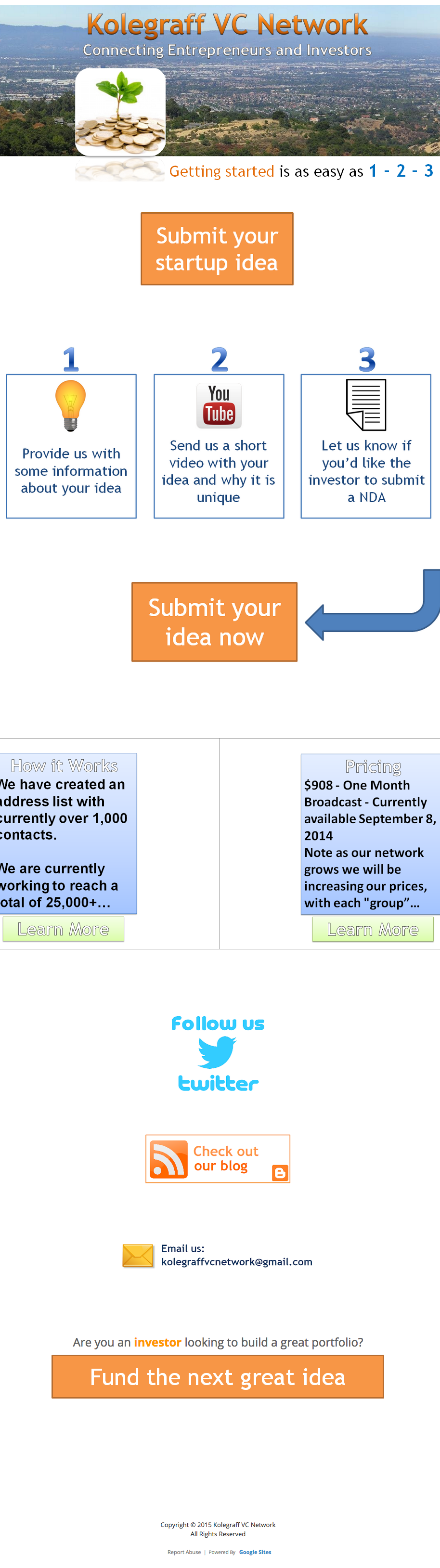
The judges and spectators agreed that Kolegraff VC Network’s landing page was a bit of an eyesore:
As Oli put it:
It looks like someone built this page in MS paint.
Beyond the bad design, Oli felt there was a larger, overarching issue: The page addresses different audiences (and talks about different offers) interchangeably.
While the top part is about startups, the bottom seems to address investors directly with lines like, “Fund the next great idea.”
Similarly, this landing page by Money Quest Corp lacked consistency:
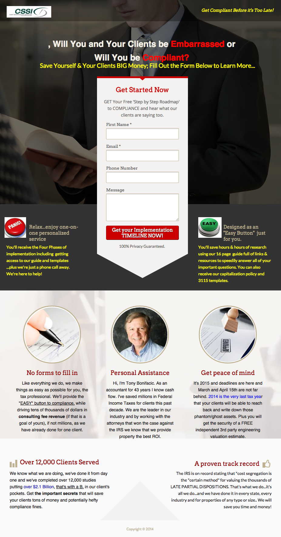
It starts off by talking about compliance and saving money, but concludes with a big, fat CTA that declares, “Get Your Implementation Timeline Now.”
Mistakes like this, Oli explained, basically render the rest of your page useless:
Your CTA should confirm that you’re about to get what the rest of your page is selling.
Every single piece of copy needs to be working together in alignment toward the same, singular goal.
In order words, it’s got to be congruent:
Oli suggested a straightforward exercise to make sure that all the copy on your landing page is aligned with your campaign goal:
- Write down your campaign objective.
- Pull all the copy from your page and write that down, too.
- Ask yourself, “Is each and every piece of copy relevant to the campaign objective?” If the answer is no, either delete or rewrite it.
Before you even think about color schemes…
Before you start thinking about how your page should look, you need to make sure you’ve got your landing page copy down pat. As Oli suggested, start with the words, stripped down:
Write what you need to write and then create a design that helps to present that visually.
So take a step back.
Look at your copy in isolation with the campaign congruence exercise above. Is it persuasive? Credible? Will it appeal to your target audience?
And once you think you’ve got it all figured out, put your page to the ultimate test by submitting it for scrutiny on the next episode of Page Fights.