Imagine you’re an extraterrestrial visiting earth for the first time. Upon landing, you stumble into someone’s home and find a toothbrush, which you’ve never seen before.
While you may not immediately understand how to use the thing, there are certain clues about the object that hint at how it can be used. Its handle, just a little longer than your humanoid palm, implies that you can grip it.
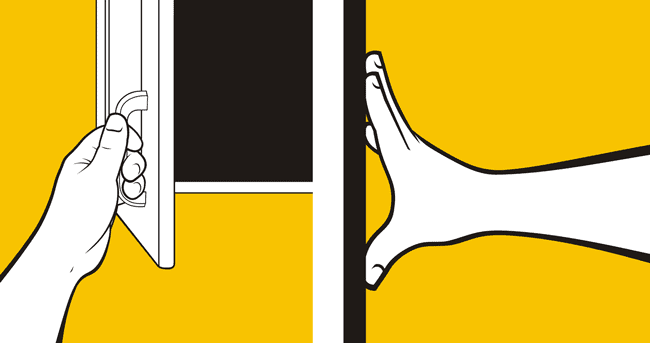
Similarly, certain types of door knobs provide clues as to whether a door should be pushed or pulled…
These visual clues, also known as Affordances, act as signals that an object can be used to perform a certain action. They’re all around us in the real world, but they’ve also bled into the digital realm.
When your visitor first lands on your website or landing page, they’re much like an alien visiting earth for the first time. You need to show them how to use the page by using familiar visual cues.
Let’s dig a little deeper into the world of Affordances and explore how the principle can be applied to your landing pages so you’re not alienating prospects.
What is Affordance?
Cognitive scientist and usability engineer Don Norman first used the term Affordance in his book, The Design of Everyday Things (1988). In it, he quipped:
Affordances provide strong clues to the operations of things. Knobs are for turning. Slots are for inserting things into. Balls are for throwing or bouncing. When affordances are taken advantage of, the user knows what to do just by looking: no picture, no label or instruction needed.
So, the door with a handle on it is meant to be pulled, while the door with the plate on it is meant to be pushed. This should be clear without having to expressly inform a user of the purpose of either the plate or the handle.
Perhaps one of the great examples of Affordance in modern digital life is the play button, as you see below.

There are very few of us who wouldn’t know what to do with that button, and even someone who does not recognize it may be able to easily ascertain its purpose — within a certain context, at least.
The play button drawn on the side of a fence makes little sense, but place it on an MP3 player, and you may be able to guess at its Affordance.
In a nutshell, Affordances should really do two things:
- Get the attention of the person who should use it
- Imply its function
With these two principles at play, an object can be used without having to give a user an extensive user manual. Because at the end of the day, your landing page shouldn’t require instructions, right?
Make Affordances on your landing pages explicit
There are certain design features that tell landing page visitors explicitly what they need to do. A blank field begs to be filled in. A three dimensional button begs to be clicked.
As self-proclaimed “massive nerd” and web designer Natasha Postolovski describes in her Smashing Magazine article about the seven types of Affordances on webpages:
Explicit Affordance is signaled by language or an object’s physical appearance. Text that reads “Click here” explicitly affords clicking. A button that appears raised from the surrounding surface seems tactile and affords pushing.
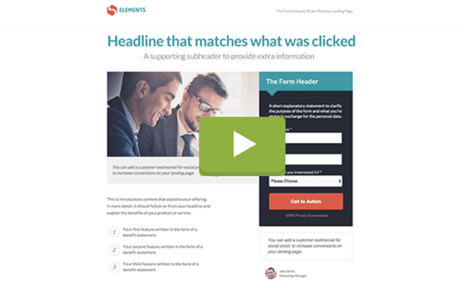
Here’s a good example of that in action on an Unbounce landing page (below). The play button, bold and 3D, explicitly shows that it is meant to be pushed (or clicked).
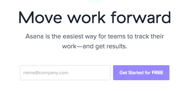
Similarly, this page from Asana uses a greyed-out mock email address (“name@company.com”) in a box to instruct users on where to put their email address.
Using visual language that prospects are already familiar provides gentle instruction that makes your landing page easy to navigate. And that sets people at ease.
Beware of Negative Affordance
Just as certain visual cues imply that an object is meant to be used, other visual cues suggest that items are not to be used. Think of a grayed-out “Save” button that only appears once you’ve entered all required information in a form. In her Smashing Magazine article, Postolovski calls this Negative Affordance.
While this sort of visual cue can come in handy in checkout forms, it is more often than not the enemy of conversion on landing pages.
Think of the recent design trend of ghost buttons, for example:

We have been trained to ignore grayed-out buttons, so when a ghost button or button lacking contrast is used, our first instinct is to overlook it.
To add insult to injury, the button copy does a poor job of serving as Explicit Affordance. “Let’s Go” as a call to action does little to inform the user what will happen next.
When in doubt, test your copy. Test your ghost buttons. But err on the side of being as explicit as you can.
Applying Affordance on your landing pages
Affordances are found everywhere. You can see them on your stereo, your iPad, entranceways and on roads.
When used effectively, they show people how to use an object intuitively. When used poorly, you make your visitors feel like aliens from another dimension.
You want your landing page to be so simple to use that even the kid in the Far Side cartoon above could successfully complete and submit a form on your landing page.
Of course, there are many other principles to consider when designing your landing page. To learn more about using design to convince and convert customers, check out Oli Gardner’s latest ebook, Attention-Driven Design: 23 Principles for Designing More Persuasive Landing Pages.
