Every landing page designer walks the fine line between form and function. It’s not enough just to make a page that’s pretty — that page has to convert, regardless of what it looks like.
That doesn’t mean that beauty in design can’t be a huge factor in conveying your message. It just means that landing page design elements need to accentuate that message, not take away from it.
Here are a few landing page trends that you should be aware of – and when to be wary of them.
Living in a parallax universe
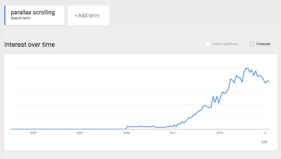
Parallax scrolling is now as ubiquitous as hot dog stands in New York. It has been around for a few years, peaked in popularity a few months ago, and seems to be maintaining speed for the time being, according to Google Trends.
Parallax scrolling refers to background images that move slower than the foreground image while the visitor scrolls down the page.

When used properly, parallax on a landing page can help tell the story you want to convey to your audience. Aspirational images can be used in conjunction with your kick-ass copy to create an immersive experience with the ultimate goal of increasing conversions.
When it’s done well, it doesn’t get in the way of the landing page visitor’s quest for information — instead, it enhances the visitor’s overall experience with that page.
The danger, as with any cool design feature on the web, is that it is often used just for the sake of having that cool effect on a landing page without any real thought as to its purpose.
The intention should always be to accentuate your message and lead visitors to your call to action so that you can convert them.
If parallax helps you do that, then by all means, carry on. If it’s distracting your visitors from converting, then it should be scrapped.
Less is Moore’s Law
You may have heard of Moore’s Law, the “observation that, over the history of computing hardware, the number of transistors in a dense integrated circuit doubles approximately every two years.” In other words, our devices are getting wicked fast.
In response to this, designers are adding more content to landing pages, perhaps believing that they’ll be able to take advantage of faster internet speeds and devices.
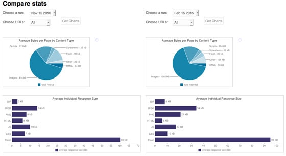
Using the HTTP Archive’s comparison feature, we see that in November of 2010 the average web page was 702 KB. By February of 2015 that number increased to 1,999 KB. We also see that the average sizes of images have increased, and CSS files are now an extra 3 KB on average.
The above is an analysis of web pages in general, but we’re seeing this trend on landing pages, as well. And it must stop. Here’s why.
Page speed is kind of a big deal. By which, I mean that it’s a really big deal. Just one second can mean a 7% decrease in conversions on your page. And 40% of visitors to a page will abandon it if it doesn’t load within three seconds.
By adding elements to your landing page, like high-res images that have not been optimized for the web, you risk losing conversions. It’s as simple as that.
Optimizing your pages for fast load times
You don’t have to sacrifice quality in order to accomplish this. If you are concerned about the size of your page and its load time, you can use several tools to assess size and load time.
Tools like Photoshop and GIMP give you the ability to save images for the web that look great and are light in size.
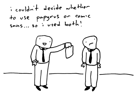
You can also restrict your page size by doing away with external items like fancy fonts and iFrames. The extra time that they take to load could be crucial to your conversion rate.
Pingdom is a good tool that gives you a performance grade, shows your load time plus page size and breaks down the elements on the page, showing you the size of each. Although you should not take the results here as definitive, you can troubleshoot problems with this information by identifying areas of your landing page that are slowing down your load time.
Always remember that your landing page serves only to convert, not to show off your design skills.
Ghosts are scary – especially on landing pages!
It’s hard to point to the reason for the love affair with the ghost button, but we’re definitely seeing them more often on landing pages.

Does the ghost button look good? Maybe, if you’re into that sort of thing. Will it increase conversions?
Hard to say without testing it, but they do violate the conversion-centered design principle of contrast, which says that your CTA button should stand out from the rest of your page.
It’s possible to code these buttons so that they change color on a mouseover event, but other than a happy accident, what’s to draw someone to actually get their mouse pointer over that button?
Sometimes they can look more like content holders than clickable buttons, as in the page below.
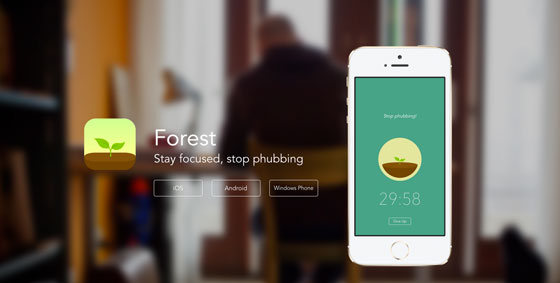
Other times, they just don’t inspire a click. Check out this page (which isn’t exactly a landing page, but uses a ghost button as a CTA):
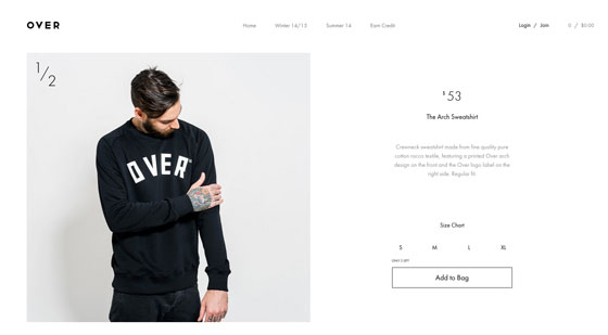
There appears to be no sense of urgency behind that button. No matter what else they’ve done on the page below, it could all be canceled out by this weak CTA button.
Think of your users and how they’re most likely to convert. If you think they might be the type to appreciate the clean aesthetic of a ghost button, validate your assumptions.
Test your ghost button versus a more traditional solid, contrasting one. It never hurts to have more data to work with.
Responding to the need for responsive design
With this query on MeanPath we find that just 3.08% of the 146,599,190 web pages queried have code that responds to the needs of mobile browsers.
Despite the fact that people search for information on their mobile device 80% of the time, designers are still ignoring the need for mobile optimization.
This leaves an amazing opportunity for those of you who are willing to optimize your landing pages for mobile.
Your customers will thank you when they don’t have to pinch and zoom to find the information they’re looking for (they’ll probably just leave your page, anyway), and you’ll have an advantage over almost 97% of the people who decided it wasn’t in any way important to have a mobile presence in 2015.
If that wasn’t enough, designing your landing pages to be mobile-friendly will become a major ranking signal for Google as of April 21, 2015. Google is rewarding those who have taken the time to build landing pages that respond to the needs of mobile customers.
It really is time for landing page designers to sit up and pay attention.
It’s all by design…
If there’s one message to take away from this post and chant as your landing page design mantra, it’s this: Conversion is the ultimate consideration in any landing page design.
If you can use trends in web design to enhance your audience’s experience, you’ll capture the attention of your audience, and you’ll get the conversion – which is what it’s all about.
Are any of these design elements working for you? Let us know in the comments below. We’d love to hear about what’s converting for you.
Listen to Mark John on the Call to Action podcast:
![]()
