In the world of conversion rate optimization, battles are won not based on beauty, but on efficacy. Does your landing page design convey meaning and purpose? Or is it an inscrutable compilation of buzzwords and symbols?
Ten marketers had their landing page designs scrutinized on this month’s episode of Page Fights, featuring guest judge David Kadavy of Design for Hackers, Peep Laja of Conversion XL, and some kind of rhinestone cowboy.
In the process, they uncovered some common design mistakes that reduce clarity and ultimately, conversions. You can check out the recording here or read on for the distilled wisdom.
Illustrations should be illustrative
The first page to be critiqued was from water systems company Kinetico, for their line of water softeners:
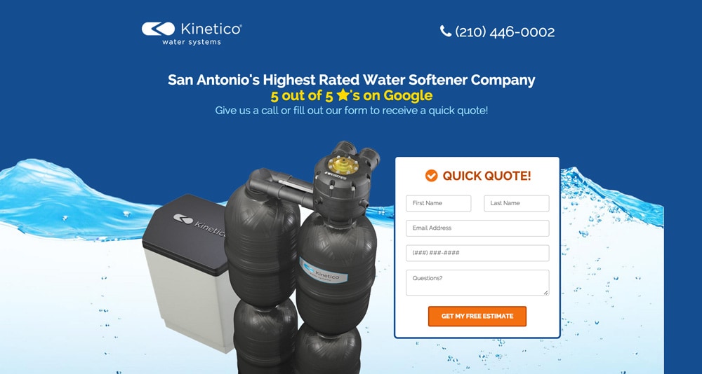
Credit where credit is due: the headline states clearly what the product being offered is, and there’s even a big photo of it! However, as David Kadavy pointed out, the hero shot might not be very relevant to visitors:
Do the people who are shopping for water softeners give a s#$! what they look like? I’m doubtful.
Hero shots are a critical component of a high-performing landing page. While this one definitely shows the product, it doesn’t display any benefit to the product nor the context in which one might use it.
If you didn’t already know what a water softener looked like, this picture isn’t going to be helpful.
Many of the pages critiqued used images and icons to ill effect, but the caricatures presented on Digital Direct’s landing page were the breaking point for Peep.
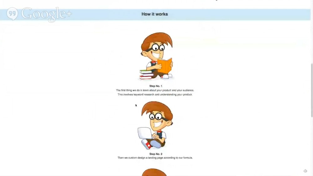
Peep felt that the icons did nothing to communicate the unique value proposition of the digital marketing agency. In fact, he felt that they removed credibility:
You hit me with this stupid, idiotic, cartoon bulls#$!. I’m not going to give my serious money to your funny business.
Aesthetic flourishes like icons and artwork can be a source of delight to your visitors, and could ultimately make your page more persuasive.
But if your graphics don’t serve to clarify what your copy is saying, they’re just distracting from it. Focus on the message. (And then test the heck out of it.)
Want to use video? Either commit or quit
Videos are a powerful way to make your page more engaging and suck up more of that sweet, sweet conversion nectar. But you can’t just stick a video on your page to turn up the conversion dial; if your video is just tacked on as an afterthought, it’s not going to get the attention it deserves.
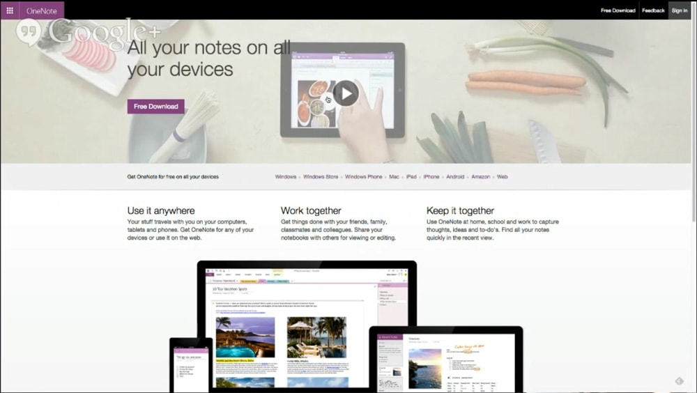
This week’s participants didn’t get the memo — even Microsoft, who unceremoniously dropped a play button onto their washed out, vegetable-laden hero image for their OneNote product.

Oli wasn’t impressed with the way the video was hidden in the page header. He felt that Microsoft should test the video to see if it increases or decreases conversions. If it does increase conversions, it deserves to be more prominently presented. If it doesn’t increase conversions, it shouldn’t be there at all, since it only serves as a distraction from the CTA.
Oli also had problems with Borgess’ video on orthopedic surgery:
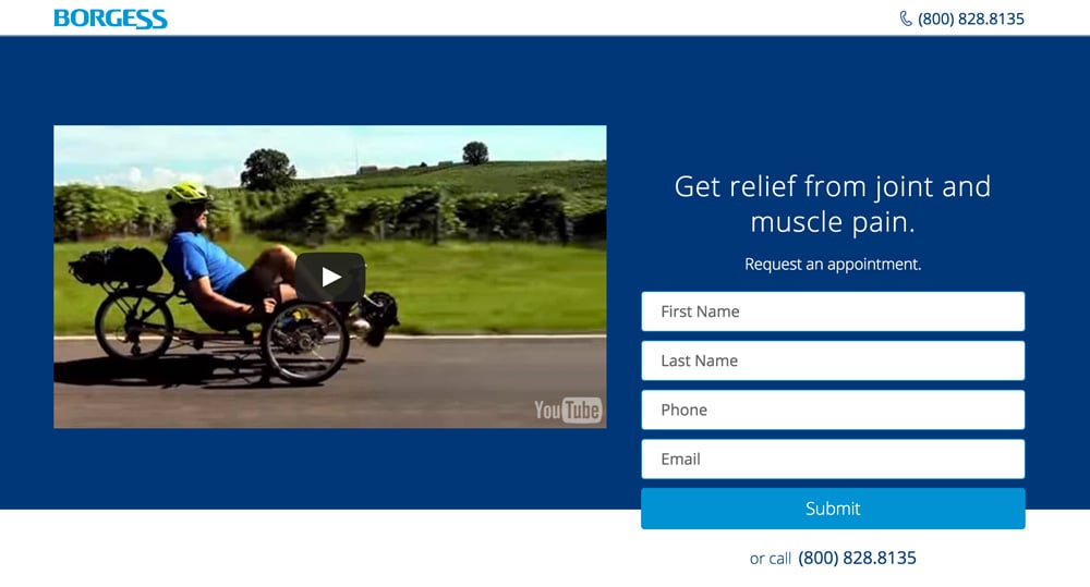
He found the well-produced video to be a good overview of the interesting technology involved in Borgess’ orthopedic surgery — but felt it lacked context and did nothing to compel the visitor to watch it.
The page itself doesn’t explain that this is a surgical procedure until much later, and never goes into detail about it.
If you want to use video on your page, do it justice; give it the space and the context it deserves. And whatever you do, make sure your page still stands on its own without the video. Some people simply won’t watch it.
Copy is your first wireframe
Your page should be structured around what needs to be communicated: your unique value proposition. The words you choose to communicate it can make or break your page.
As Peep put it:
Copy is the only weapon you have for increasing motivation… copy is gonna be the main driver that gets people to take action.
Even if a page is visually pleasing, weak copy can torpedo it.
Take Mezoz, a company that crafts marketing apps for specific verticals. David felt their value proposition — helping salon owners market their business — was a promising one.
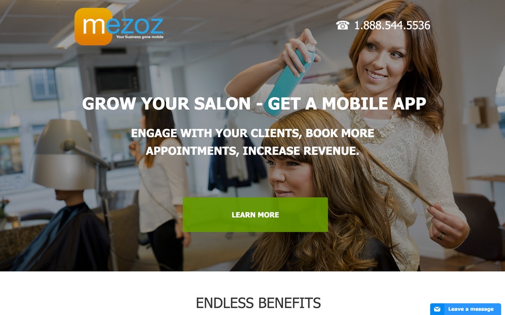
But for David, the headline failed to communicate the UVP clearly. Platitudes like “endless benefits” along with numerous typos throughout the page made the messaging unclear.
Even if your design is beautiful, poor copy creates a poor experience for visitors.
The copy on the page is part of the design, and the first designer to touch your landing page should be a copywriter. As Oli explained:
Copy informs design, not the other way around. People think design is pretty pictures. Design is an experience.
Next time you’re assessing a landing page, read the text alone. Is it persuasive on its own? No? Back to the writing board.
Design for clarity
While having a killer designer on your team is a tremendous asset, you can build delightful landing page experiences on your own by learning how to write with clarity.
If only there was some kind of guide, written by an expert copywriter, freely available on the site you are currently reading — OH THERE IS AND YOU CAN GET IT HERE.
Once your page is both well-written and smartly designed, submit it to next month’s Page Fights! But be warned: the people want blood, and blood they shall have.