Landing page best practices
Building a landing page can be deceptively easy. Using a drag and drop builder (like Unbounce) means you don’t have to be a developer to publish something professional, and you can do it in a matter of hours.
That said, going in blind is not recommended. To give you a better head start, here are some best practices that have been proven time and time again to boost conversion rates and reduce cost-per-acquisition.
Jump to a Landing Page Best Practice
11 essential landing page best practices
The first rule of landing page best practices is this: they are a starting point to help you construct your best first attempt at a landing page. After that, you need to experiment and let the customers decide what they think is the best converting page for the job.
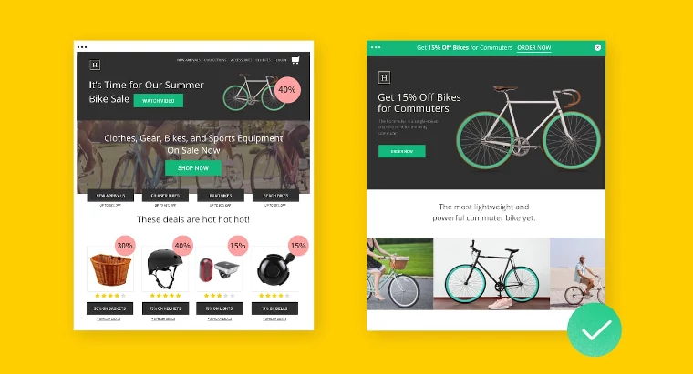
1. Ensure your messaging matches your ads
One major reason you should be using landing pages in the first place is to ensure you’re sending people to a page that matches their expectations. Make sure that you signal that visitors have made a “good click” by matching your landing page headline and copy (and design) to the ads you’re running in search or social.
For example, an ad for retirement communities that brings visitors to a landing page focused on luxury condos is likely drive more visitors away than one that stays on message. If you’re running many ads with different headlines, consider creating variant pages (or using Dynamic Text Replacement) to ensure message match.
2. Keep the action above the fold
The term “above the fold” refers to the upper half of the front page of a newspaper. These days, though, it more often describes what’s visible on a screen before scrolling down. Either way, it’s valuable real estate, and you’ll want to make the most of it.
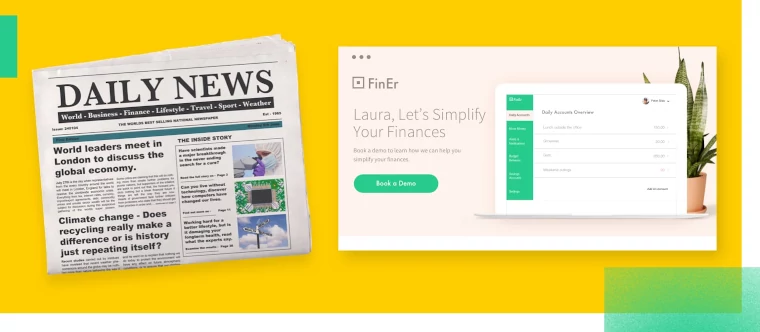
Keep your headline, unique sales proposition, and, most importantly, a strong call to action highly visible by placing these elements above the fold. Don’t cram more than you need to onto the screen—too much above the fold can make it difficult to see your CTA—but make sure everything a visitor needs is visible from the get-go.
PRO TIP. Screen resolutions can vary a lot, so design for the devices most people are actually using and not what appears for your fancy new iPhone or state-of-the-art laptop.
3. Use directional cues to direct the eye
It’s rare that a landing page is so short that nothing appears below the fold, so including visual indicators drawing the eye downward is a good idea. These cues can include literal pointers, like arrows, as well as other shapes, images, animations, or even copy that keep visitors happily scrolling and reading.
Similar directional cues should be used to help prospects find your call to action. Use bold, contrasting colors and an easily recognizable shape—buttons should look like buttons—so that the CTA pops out from the rest. You can even use arrows, animations, or even picture of pointing people to draw further attention to it.
4. Show your product/service in action
Showing your product or service in a real-life context helps visitors imagine themselves as your customer. It’s also an effective shorthand for explaining how your product or service works. Whether you use still photographs, step-by-step animations, or demo videos, visuals can help you to capture and keep their attention. Your hero image section is a great place to do this.
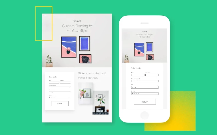
5. Remove navigation and other distractions
A great landing page focuses on a single conversion goal, so minimize other distractions that might carry visitors away. Resist the urge to include unnecessary links away from your landing page, including site navigation, additional calls to action, or even links back to your homepage. Your landing page will work best if it stands alone.
6. Include (authentic) social proof
Most of your visitors are savvy enough to distrust typical marketing spiel. (Unless you’re profoundly original, they’ve heard it all before.) No matter how good you think your offering is, including the voices of satisfied customers and community members can add an air of authenticity to your claims that even the best copy will lack.
But nobody’s going to be convinced by glowing reviews from Jane Doe, Anonymous, and Satisfied Customer. You can humanize these testimonials by including personal details, like full names, job titles, place of residence, date of purchase, biographical details, portraits, or even video.
7. Use clear, compelling copy
Good landing page copy shouldn’t read like copy at all. It should be simple and straightforward. It should be as readable as the back of a cereal box. Though some offerings demand longer copy (and, as a result, longer landing pages), most benefit from keeping things short. Think a clear and compelling headline, fewer paragraphs, more bulleted lists.
PRO TIP. Ask people unfamiliar with your business to read your headline and supporting copy. Then get them to tell you what you’re offering and what problem you solve. If they can’t answer clearly, it’s likely not very effective copy.
8. Keep it fast
According to Unbounce’s Page Speed Report for Marketers, 70% of consumers admit that loading time influences their desire to buy. If your pages are taking more than 3 seconds to load on a mobile device, you’re going to lose a lot of potential customers.
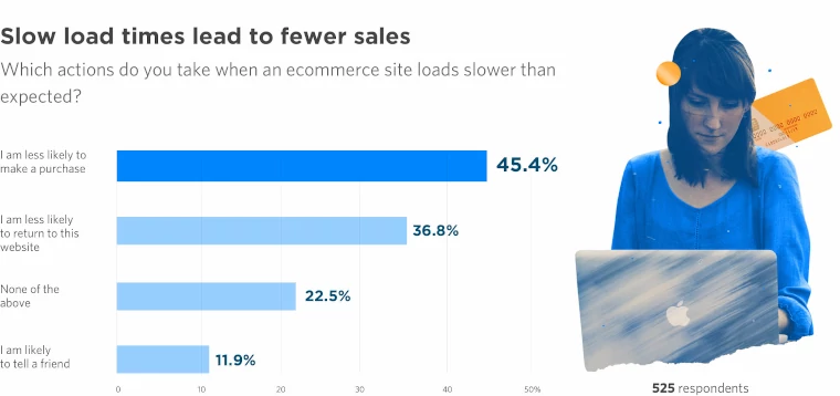
Avoid weighing down your landing page with unnecessary elements that’ll slow it down—everything you add should have a specific purpose. Make sure all images are optimized and that you’ve followed Google’s speed recommendations.
Still not fast enough? Consider using Google’s Accelerated Mobile Pages (AMP) to deliver pages at near-instant speeds.
9. Design for the right device
Many campaigns see a significant number of people browsing on their smartphones. (You might even be targeting people on the go.) This means that screens will be smaller, interactivity will be more limited, and load times will crawl.
None of these qualities are good for your mobile conversion rates, so ensure better performance by designing a mobile-responsive landing page that adapts to these devices. Layouts can be shifted, CTAs made more visible, and images can be shrunk or removed entirely.
10. A/B test and update your landing pages
Best practices are important, but A/B testing your landing pages is the best way to ensure that you’re converting as much as possible.
Have a hunch that your problem-focused headline isn’t working? Want to ask questions in a different order on your form? Is your boss insisting your CTA button should be fluorescent pink?
Test it out before you commit, and make decisions based on data instead of gut instinct.
PRO TIP. Unbounce’s builder lets you split traffic between variants and then track which page performs better. Together with tracking tools like Google Analytics, Hotjar, VWO, and LeadsRX, you can get a full picture to optimize your page.
11. Consider using a landing page template
Everybody wants to be special. But if you’re just starting out (or just have limited developer resources), you can achieve impressive results by starting from a template and customizing it to fit your brand. Sites like ThemeForest sell hundreds of professionally designed landing pages. And Unbounce provides hundreds of conversion-focused landing page templates developed with these best practices in mind.
Landing page design best practices
Now that we’ve covered the core best practices, let’s dig into design. Because here’s the truth—you can create landing pages that look and work better, even if you’re not a designer.
Think of landing page design like setting up a store. Your target audience should know exactly where to go and what to do next. A well designed landing page makes this feel natural, not pushy. In the next few minutes, you’ll learn landing page design best practices that help build converting landing pages every time.
The best part? These tips work whether you’re starting fresh or giving your effective landing page a makeover. Let’s dive in.
1. Give your content room to breathe
Think of your page layout like a good conversation—it needs breathing room. White space isn’t empty space, it’s what makes your landing page elements shine.
Want an engaging landing page? Break up your content into scannable chunks. Add padding between sections to create a seamless user experience. When your visual elements have space to stand out, visitors actually read what you’re saying instead of bouncing away.
2. Design with your landing page visitors in mind
Your landing page layout should match how people naturally read. Think about how you browse websites—your eyes jump around looking for what matters, right?
Guide visitors through your content with smart visual hierarchy. Use images or arrows that point to key elements. Your goal? To grab visitors attention and guide them straight to your desired action. No fancy tricks needed—just thoughtful design that encourages visitors to keep moving forward.
3. Build your pages to look great on mobile devices
The reality is, most of your website traffic comes from mobile devices these days. If your page looks funky on phones, you’re losing people before they start.
Start with mobile design first when optimizing landing pages. Make buttons easy to tap. Keep forms short. Watch that page load time—because nobody hangs around for a slow site. When you nail the mobile experience, your user behavior metrics will show it.
QUICK TIP
The 2024 Conversion Benchmark Report found that 83% of all landing page visits happen on mobile devices.
If you’re using Unbounce, you can do most of the mobile optimization heavy lifting with the click of a button. Just double-check that everything’s formatted as it should be, and you’re set.
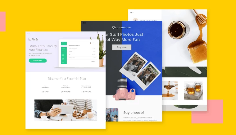
4. Choose high quality images that tell your story
Every image on your landing page should have a job to do. Images aren’t just meant to be pretty decorations—they’re powerful tools to show your value proposition in action.
Smart marketers use images that build trust with potential customers. Think:
- Product shots that show off key features and benefits
- Real screenshots that demo your software in action
- Behind-the-scenes photos of your team or workspace
- Customer action shots using your product (not posed stock models)
- Clear, crisp product mockups on devices people actually use
Want to capture attention? Show your product solving real problems in real situations, like visual customer testimonials. And remember—blurry, generic stock photos scream “I didn’t try very hard.” Your relevant content deserves better than that.
Test your images by asking: “Would this help convince me to buy?” If not, keep looking until you find photos that make visitors think, “Now that’s exactly what I need.”
Lead Gen Landing Page Best Practices
Most of the tips above apply to all landing pages, but lead gen landing pages need a lil’ bit of special magic to work well.
Here’s a few extra pointers that’ll make a difference in your nurture-based campaigns:
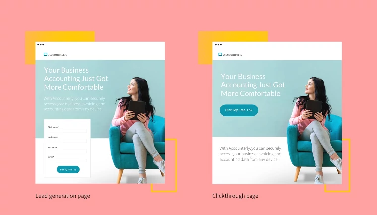
1. Reduce friction with multi-step forms
Nobody likes paperwork. The same goes for long forms. So when you need to ask lots of questions, it’s best to do it in multiple steps. Instead of presenting 15 fields to complete on a single page, spread them over more than one step. And, for goodness’ sake, start with the easier questions (“What’s your name?”) before getting to the sensitive ones (“Are you an innie or an outie?”).
2. Avoid manual entry
Choosing one option from a list of five is less taxing than asking each visitor to type their answers manually—and, as a result, it’ll lead to more conversions. Not only that, if you’re collecting information for reasons beyond lead follow-up, like market research, it also makes crunching this data much easier.
3. Include a privacy policy
Lead-gen forms gather personal information, which requires a little delicacy. Including a link to your privacy policy will reassure your visitors that their data is safe with you. Its inclusion is also mandated by a number of national and international laws, like GDPR. Don’t have a team of lawyers on retainer? There are tons of free privacy policies you can download online. (For instance, this generator made by Shopify.)
4. Say “thank you”
When a visitor to your site completes a form, bringing them to a separate thank you page (or a popup) can create new opportunities. It not only lets them know the form has actually been submitted—a step some landing pages forget—it also gives you the opportunity to re-engage them.
For instance, you can ask if they want to sign up for your newsletter or visit another part of your website. Or you can start upselling a trial customer to a premium subscription right away. Or you can even use the opportunity to sweeten the pot with an additional offer. There are tons of post-conversion possibilities.
Common landing page questions (and our perspective)
Got questions? We’ve heard them all. Here’s our take on the most common landing page puzzles we hear from marketers like you. No fluff—just straight answers based on what actually works.
Does video increase conversion rates?
Another way to boost your conversion rates is by adding video to your landing pages, but that’s a little more involved. Read about the benefits of videos here.
How do landing pages help with SEO?
While landing pages primarily drive conversions, they can boost your organic search results too. Smart search engine optimization means targeting specific keywords that match searcher intent. Even if you’re building landing pages with conversions as the primary objective—you can still target relevant keywords that actually matter to your audience.
What’s different about B2B vs ecommerce landing pages?
B2B landing page best practices focus on longer consideration cycles and multiple decision-makers. Ecommerce landing page best practices, on the other hand, drive faster purchases. While product landing page best practices overlap between both, B2B pages typically need more proof points. When you create your own landing pages, match them to your buyer’s journey.
Should I use my landing page for paid and organic traffic?
In some cases, yes the same pages can drive conversions from paid and organic. But a well-optimized paid landing page doesn’t always look the same as a well-optimized organic page.
For PPC campaigns, your landing pages should be short, direct, and focused on conversion actions. For organic search, you’ll often need to cover topics more comprehensively with additional content (which can lower conversion rates).
What metrics show if my landing page is working?
Look beyond just basic conversion rates to understand your landing page performance. Ideally, your landing page metrics will tell you how visitors are interacting with your page. Look at time on page, scroll depth, and form drop-off rates too. These numbers help you spot exactly what needs fixing.
For a deeper dive, check out these more specific “metrics to measure” lists:
- 10 A/B testing metrics to analyze results and measure success
- 12 CRO metrics to track conversion rate optimization performance
- 40 important PPC metrics to measure the success of paid campaigns
How are landing pages different from regular web pages?
Unlike a typical web page or blog post, landing pages typically have one job: conversion. Other pages might link all over your site, but landing pages stay focused on a single action. Think of it this way—your homepage is a map, but your landing page is the destination.
How Unbounce helps you put these best practices into action
Look, building high-converting landing pages isn’t rocket science—but it does take the right tools and know-how. You’ve got the know-how part from this guide. Now let’s talk tools.
Unbounce makes it easy to put these best practices to work. You can start from proven templates that already nail the basics, customize them to match your brand, and publish without touching a line of code. Plus, you get:
- A/B testing tools to see which design tweaks actually drive conversions
- Mobile-responsive layouts that look great on every device
- Built-in social proof elements to showcase customer wins
- Smart copy suggestions that help you write headlines that convert
Ready to build landing pages that actually work? Start your 14-day free trial of Unbounce and see how much easier landing page design can be when you’ve got the right tools backing you up.
Remember: Great landing pages aren’t born—they’re built. And tested. And improved. Let’s help you build yours.
