The anatomy of a landing page
Every great landing page is composed of a core group of elements. These building blocks, as you might call ’em, should be used as a guide when creating your content.
Some readers won’t like to hear this. After all, isn’t good marketing all about finding ways to stand out from the crowd? Why would you lock yourself into a pre-existing landing page format? Won’t your content end up being … formulaic?
We get you. But there’s an old maxim that applies here:
Know the rules well, so you can break them effectively.
It turns out that almost all landing pages that convert well do so because they’ve got the fundamentals down. No matter their conversion goal. No matter their intended audience. No matter the price point of what they’re offering. And no matter the type of campaign they’re running. This is largely because the structure of a landing page aligns to persuasion and there are elements that help persuade.
By understanding the anatomy of a landing page, and by making sure you stick to these rules, you’ll ensure you actually convert. Then you can find unique and clever ways to optimize the heck of it.
Take a look at the illustration. Though your own pages might look a little different, the same basic building blocks of landing page structure should be present. Below, we’ll discuss each in more detail.
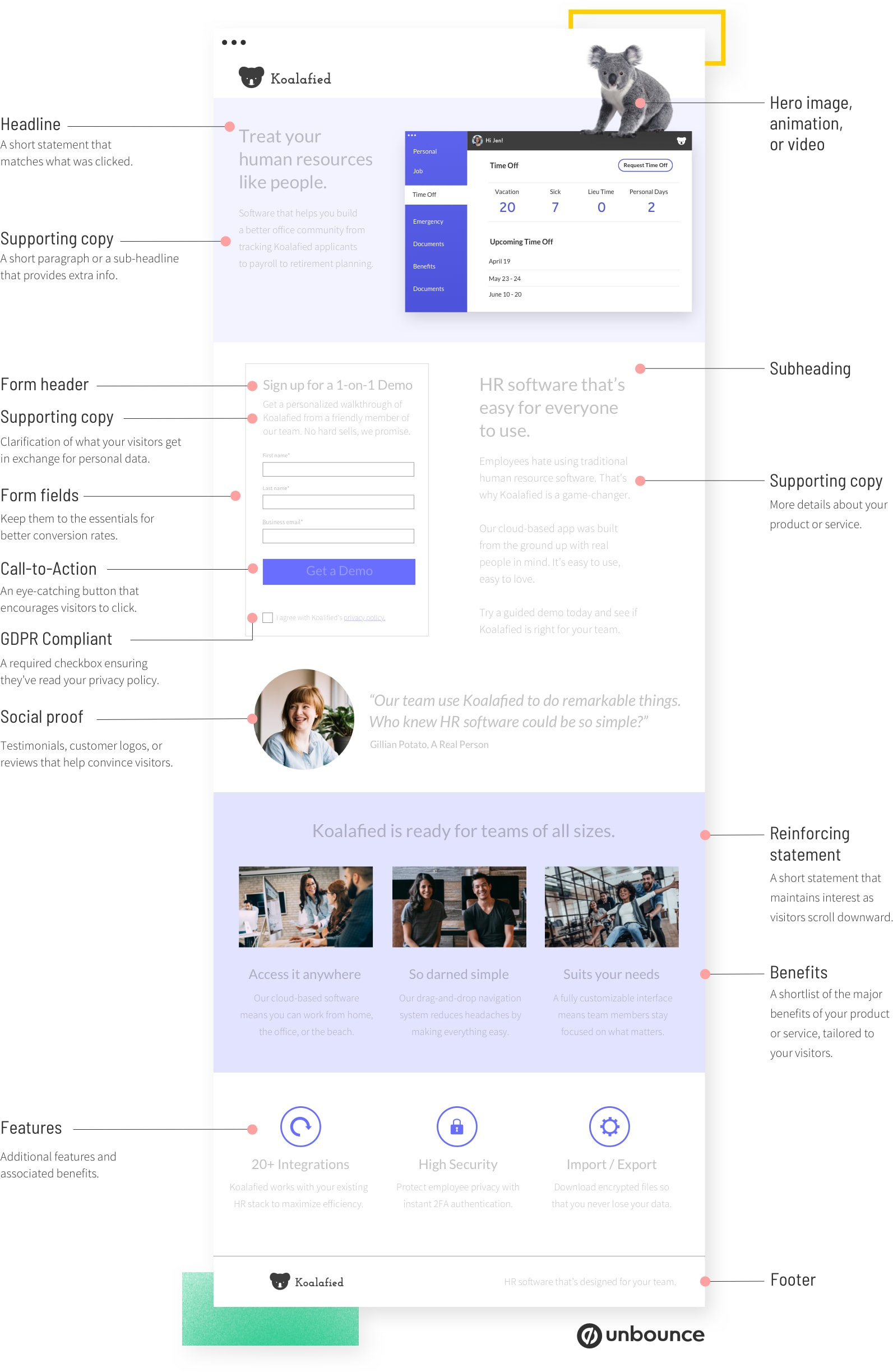
Click here to see a full-size version of the anatomy illustration (opens in a new tab).
Components of a Landing Page
No two landing pages are the same. That said, there are five core elements that every high-converting landing page must have:
- A unique selling proposition (USP)
- A hero image or video
- The benefits of your offering
- Some form of social proof
- A single conversion goal (or your call to action)
1. Your Unique Selling Proposition (USP)
Your unique selling proposition is the sizzle that sets your product or service apart from the competition. It’s the answer to the nagging question, “What makes this offer so special?” Don’t get hung up on the whole “unique” thing. Think of your USP as how you position your offering as different (and better!) from all the rest.
Landing pages need to communicate this proposition in a succinct way so that your visitors immediately understand what makes your product or service appealing. A series of page elements tell the story of why your offering is unique:
1a. The main headline
Your landing page headline is the first thing that your visitors will read. So it’s critical that it very clearly describes what a visitor stands to get from your product or service. Keep your headline punchy and be direct about your USP—this isn’t the place to compose surrealist poetry.
Here’s a great one from an Unbounce customer:
1b. A supporting headline
Since headlines need to be short and sweet, sometimes you’ll use a subheading to provide a touch of extra info. Don’t get carried away here either, though. As with the headline, shorter is better. A supporting headline can take two approaches:
- It can act as a direct extension of the headline, essentially finishing the thought. (Your headline should stand on its own, though.)
- Or it can offer additional value or convey a secondary persuasive message that’s still related to your headline.
1c. A reinforcing statement (optional)
If your landing page runs long, it makes sense to remind visitors of your USP with a reinforcing statement toward the middle of the page.
When writing one, consider what your reader knows that they didn’t when they first clicked. What do they know now that they didn’t before? How can you drive your USP home now that they’ve been sufficiently primed and hyped?
1d. A closing statement (optional)
A closing statement backs up your unique selling proposition and gives your visitor one last chance to convert. It’s your mic drop, the climax of the story you’re telling about your offering, so make it count.
A strong closing statement might provide a little urgency or it could remind the visitor why they’re there in the first place. For a clickthrough page, it should also repeat your call-to-action (see below) to eliminate the need to scroll back up.
2. The Hero Image
First impressions are important, and the hero image (or background video) is likely the first visual element of your landing page that visitors will see.
Ideally, a hero image should show the context of use. If you’re running a SaaS company, this could be your killer app running on a sleek modern device. Or, if you’re in ecomm, it could be someone blowing a massive bubble of your vegan chewing gum.
(If you can convey emotion by using real people, all the better, but avoid using goofy stock images that’ll ring false.)
3. Benefits
Your landing page needs supporting copy beyond the headline to persuade most people. The key here is to describe specific benefits along with features.
What’s the diff’? A feature is a specific quality of your product or service, while a benefit describes a positive impact that the feature has. (Here’s a simple example: that lemonade you’re peddling may be ice cold, but it’s the fact that it keeps you cool on a hot day that’s a benefit.)
Sometimes you’ll hear people say you should write benefits, not features. If you’re looking to drive more conversions, though, it’s usually smart to show off features and benefits together—but lead with the benefit when you can. For example:
- “Keep cool with an ice-cold Sunshine Lemonade.”
- “You can create landing pages by yourself, without help from a developer, using Unbounce’s drag-and-drop builder.”
4. Social Proof
Simply put, social proof is the influence that people around us have on the decisions we make. It’s the reason suddenly everyone buys an Instant Pot, or why you might regret that WuTang Clan tattoo that Cindy talked you into.
On a landing page, social proof takes many forms:
- Direct quotes from customers
- Case studies (or links to case studies)
- Video interviews or testimonials
- Logos of customer companies
- Review scores from sites like Yelp, Amazon, or Capterra
Social proof is arguably the most powerful tool at your disposal, but there are two best practices to keep in mind.
First and foremost, you can’t fake it! If people smell a rat, you’ll have a hard time winning them back. And, second, be specific. Whenever possible, give ’em the who, what, when, why, and how of your customer’s experience. A testimonial will be most effective if your prospect can identify with the person giving it.
PRO TIP. Be sure to make your testimonials a whole lot more convincing by including real customer names and photographs instead of stock photos and fake names.
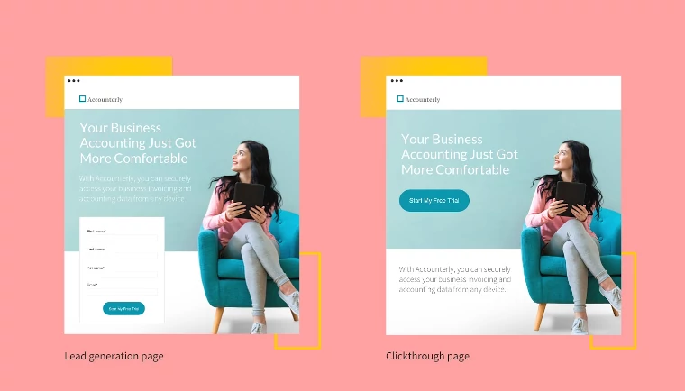
5. A Conversion Goal (Your Call to Action)
Last but not least, a landing page should be focused on just one conversion goal—or else it ain’t a landing page (see the previous section). To your visitor, this is presented as a call-to-action (CTA), which can be either a standalone button on a clickthrough page or a form on a landing page designed for lead generation.
There are all sorts of advanced resources about creating the optimal CTAs, but here are three fundamentals to get you started:
- Avoid bland button text like “CLICK HERE” or “SUBMIT.” Use conversational language and let your visitors know exactly what they’ll be getting for their precious clicks (“START MY FREE TRIAL” or “GET 50% OFF YOUR PURCHASE”).
- Keep forms as short as possible and include a privacy statement to provide reassurance that their data is safe (and to comply with GDPR regulations).
- Since small differences can have a big impact on your conversion rates, CTAs are always strong candidates for A/B Testing. You can read more about that here.
So, How Can I Use Landing Pages?
Now that you understand the components of a landing page, it’s time to explore when and why you should use them. (Or if you’re ready to start building, you can check out the conversion-ready landing page templates offered by Unbounce.)
