What makes a good landing page design?
Ever walked into a store where everything feels perfectly placed? That’s exactly what a good landing page should feel like for your visitors—intuitive, welcoming, and designed with purpose.
Let’s talk about why design matters so much for your landing pages (and trust me, it matters way more than you might think).
The basics of landing page design
Think of landing page design as your most persuasive sales pitch—but in digital form. Every element on the page needs to work together to guide your visitors toward one specific action.
Here’s what makes up a high-converting landing page design:
- A clear, compelling layout that draws attention where it matters
- Brand colors and fonts that build recognition and trust
- Strategic images that support your message
- Copy that speaks directly to your visitor’s needs
- Forms and buttons that make it easy to take action
Unlike your website with multiple paths and options, landing page design is all about focus. You’re creating a dedicated space for one goal—whether that’s getting someone to sign up, make a purchase, or download your guide.
If your website is a choose-your-own-adventure book, your landing page is a single, compelling chapter with just one perfect ending. Every word, image, and button works together to lead readers to that final “yes.”
Want to know the best part? When you nail this focused approach to designing a landing page, your conversion rates typically go through the roof. Why? Because you’re removing distractions and giving visitors exactly what they came for.
Emily Omier
Emily Omier is a freelance content marketing writer who specializes in helping B2B SaaS companies make complicated ideas, products, and USPs engaging and accessible. Check her out on LinkedIn.
» More blog posts by
Emily Omier
Paul Park
Paul is a writer on Unbounce’s content team who lives and breathes storytelling. (It’s like oxygen but with better plotlines!) Ask him what he’s up to at any given moment and you’ll get answers ranging from folding paper dragons (y’know, origami) to catching up on the latest cool tech, and finding other ways to channel his inner geek.
» More blog posts by
Paul Park
Why design matters for conversion rates
Let’s talk numbers for a second. You’ve got about 50 milliseconds to make a first impression. That’s barely enough time to blink.
Bad design sends visitors running. But when you focus on converting visitors? That’s when the magic happens:
- Clean designs build instant trust
- Clear visual hierarchy guides attention
- Strong calls-to-action drive results
- Mobile-friendly layouts keep people engaged
And here’s the thing: conversion rates tend to jump when design and messaging work together seamlessly.
Understanding your visitors
Before you start pushing pixels around, you need to know who you’re designing for. Your target audience isn’t just random internet travelers—they’re real people with specific problems they’re trying to solve.
- What do they care about most?
- What might make them hesitate?
- What information do they need to make a decision?
Smart design speaks directly to these needs. For example, if you’re targeting prospective customers in the tech space, your design should be clean and to-the-point. The goal? Make it super easy for them to say “yes.”
Remember: The best way to encourage visitors isn’t through flashy designs or clever tricks. It’s about creating an experience that feels natural and builds trust from the first glance.
Want to see how all this works in practice? Let’s dive into the essential building blocks that make up a killer landing page.
Essential landing page design elements
Ready to build a page that converts? Let’s break down the exact pieces you need—and why they matter so much.
Hero section design
Your hero image needs to do more than look pretty—it needs to make visitors lean in closer. Think about the last time a bold visual stopped your scroll. That’s the power of a great hero section.
The secret? Your hero needs to nail these key features:
- A headline that makes visitors think “This is exactly what I need”
- Eye catching imagery that pulls people in (no generic stock photos!)
- Visual appeal that matches your brand perfectly
- A button that screams “click me!”
Landing page layout and visual hierarchy
Here’s the thing about landing page layout—it’s not about cramming in every feature you can think of. It’s about creating a clean layout that guides visitors exactly where you want them to go.
Your page sections should flow naturally, creating a minimalist design that feels effortless. No confusing jumps or distracting sidebars—just a smooth journey from top to bottom.
Color and typography
Picture your color palette like a tour guide—it shows people where to look and what matters most. A dark background can make your content pop, while bright colors draw attention to your most important elements.
White space isn’t just empty real estate—it’s breathing room for your content. The right balance makes your page feel professional instead of cluttered.
- Is your contrast strong enough to read easily?
- Do your colors match your brand?
- Does every element have room to shine?
Images and media
Let’s talk about what really grabs attention—video testimonials and supporting text that work together to tell your story. Different versions of your message (like images, videos, and text) help visitors absorb information their own way.
Bold visuals do more than decorate—they:
- Show your product in action
- Build trust through authentic imagery
- Break up long sections of text
- Guide eyes down the page
Call to action
Here’s where emotional connection really matters. Your call to action isn’t just a button—it’s the moment where interest turns into action. Your key points should lead naturally to this moment, making clicking feel like the obvious next step.
Think compelling copy that speaks directly to what your visitors want. Instead of “Submit,” try “Get My Free Guide” or “Start Saving Today”—copy that reminds them why they came in the first place.
Remember: These elements shouldn’t feel forced or bolted together. When they work in harmony, your page doesn’t just look good—it converts like crazy.
Landing page design ideas and best practices
So how do you design a landing page that looks so good it deserves a chef’s kiss?
Before we jump into some landing page design examples (or feel free to have a look now, if you’re eager), here are some of the features you typically see on great-looking landing pages.
Single focus
Want to know the secret weapon of high-converting landing pages? While everyone obsesses over button colors, the real magic happens when you give visitors just one thing to focus on.
Here’s the deal: overwhelming visitors with choices kills conversion rates. Your landing page needs one clear goal, supported by a consistent brand message throughout.
Think about your favorite Netflix show. They don’t interrupt the climactic scene to show you ads for other series, do they? Your landing page should work the same way. Strip away those distracting other elements that might pull focus from your main goal:
- Navigation menus that lead visitors away
- Social media feeds and sharing buttons
- Links to other products or services
- Multiple competing calls to action
Remember: Every extra option you add is another chance for visitors to second-guess their decision. Keep their path focused, and watch those conversions climb.
Minimize scrolling
The whole page should hook visitors faster than a Subway Surfers TikTok video. If people need to scroll forever to find your offer, something’s wrong.
Here’s what visitors should see right away:
- Your most compelling benefit
- Easy access to key details
- A clear next step
- Proof that builds trust
- A CTA button that demands attention
Studies show you’ve got about 8 seconds to grab attention. That means your above-the-fold content needs to work overtime. Sure, you can use other pages for extra info—but only if they truly add value. Think strategic lightboxes instead of endless scrolling.
Relevant, engaging visuals
Let’s talk about what makes visitors actually stop and pay attention.
No matter how technical your offer (see the Panoply example below), you need something to break up the text. But creating an emotional connection isn’t about random stock photos—it’s about visual appeal that makes people think “Finally, someone gets it!”
Your visuals need to tell a story at a glance. Instead of generic office photos, show real people getting actual results with your product. Make it easy for visitors to picture themselves succeeding.
- Move your story forward
- Support your main message
- Guide eyes naturally to your CTA
- Feel intentional and purposeful
Remember: People process images 60,000 times faster than text. Make those split seconds count.
Effective copy
Good copy moves visitors smoothly from curiosity to action. Short paragraphs aren’t just easier to read—they’re easier to understand and remember.
Strong landing page copy needs:
- Benefits that feel personal and relevant
- Bullet points that drive key messages home
- Headlines that make scanning easy
- Natural language that builds trust
The secret? Write like you’re explaining your offer to a friend. Keep it clear, keep it concise, and always focus on what matters to your visitors.
If you’re uncertain how to craft the most effective copy for your landing page, not to worry—we’ve got some tips that can help. And if the idea of writing your own copy gives you the heebie-jeebies, we’ve got your back there, too with our AI copywriting assistant.
Consistent branding
Strong brand visuals build instant trust. Your landing page should feel like a natural extension of your brand—not a distant cousin who’s trying too hard.
Colors, fonts, and key information need to match visitor expectations. When someone lands on your page from an ad or email, everything should feel familiar and professional.
Think about your favorite brands. They never confuse you with mixed messages or jarring design choices. Your landing page deserves the same thoughtful consistency.
Use F and Z patterns
Smart page layout guides visitors naturally through your content. Research shows people read web pages in predictable patterns—like F and Z patterns—use this to your advantage.
- F-pattern: Perfect for text-heavy pages
- Z-pattern: Ideal for visual storytelling
- Mixed approach: Combines both for longer pages
Place your most important content along these natural eye paths. Your message becomes clearer, and your CTAs get more attention.
Mobile responsiveness
Your visitors are busy people. They’re checking out your page while waiting for coffee, riding the bus, or multitasking during meetings. That’s why responsive landing pages matter more than ever.
Most of your traffic comes from mobile devices these days, too. In our 2024 Conversion Benchmark Report, mobile accounted for 83% of all landing page visits. Your page needs to work flawlessly on every screen size—no pinching to zoom, no tiny buttons, no frustration.
Picture this: Clear text that’s easy to read, buttons sized perfectly for thumbs, and images that load fast on spotty connections. That’s what keeps mobile visitors around long enough to convert.
Conversion-centered design
Good design does more than look pretty—it guides visitors toward taking action. Every element on your page should point toward your goal like signs on a highway.
Essential elements include:
- Clear visual hierarchy that drives attention
- White space that lets important content breathe
- Contrasting colors that make CTAs pop
- Design patterns that feel natural and intuitive
If you’re not sure how to hit the sweet spot between design and conversion, check out these seven principles of conversion-centered design to get started.
Remember: Design choices should make conversion feel like the natural next step.
Research and testing
Smart marketers know that converting visitors starts with understanding them deeply. Testing isn’t about hunches—it’s about discovering what actually works for your target audience.
- Track how people use your page
- Test different content versions
- Monitor what features get attention
- Let data guide your changes
After you’ve published your landing page it’s time to shift into testing mode. Follow these steps to do landing page testing right and you’ll be able to squeeze every ounce of effectiveness out of the page you’ve put so much work into.
The best part? Small tweaks based on real data often lead to big wins.
How to design a landing page (in 6 steps)
Look, we could tell you to design your landing page from scratch—but that’s like building furniture without instructions when there’s a perfectly good IKEA nearby.
Sure, you could do it, but… why?
Especially when you’ve got drag-and-drop builders like Unbounce that turn this whole process into basically playing with digital LEGO blocks. (Yeah, we’re biased, but have you tried building a page from scratch? Exactly.)
Here’s an over-simplified step-by-step guide on how to design a landing page:
Step 1: Sketch your visual hierarchy
Grab a piece of paper—yes, actual paper—and map out your page like you’re planning a tiny city. Start with rough wireframes that show where everything goes. Think big blocks: hero section up top, benefits below, social proof, then close with a strong CTA.
The key? Design landing pages in chunks. Again, think of it like building with LEGO blocks. Each section should naturally lead to the next. Your clean layout needs to guide visitors exactly where you want them to go—no detours, no confusion.
Step 2: Define your primary and secondary colors and fonts
Here’s where your page starts getting its personality. Pick a color palette that aligns with your brand—but keep it simple:
- Two main colors for big elements
- One accent color for CTAs
- Two fonts max (one for headlines, one for body text)
Remember: Minimalist designs aren’t just trendy—they often convert better because they’re easier to understand and skim.
Step 3: Design your hero and form sections
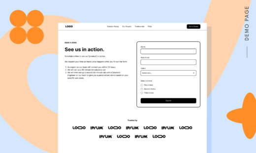
These two sections make or break your conversions, so nail them first. Your hero image needs to grab attention while your headline seals the deal. Want the secret sauce? Match your form’s length to your offer’s value. Asking for an email? One field. Want them to book a demo? Then you can ask for more.
Think about it like a first date—you need to make a great first impression (hero) and make it easy to say yes (form) to a second.
Step 4: Design the rest of your page
Now’s when you connect the dots between that killer hero and your closing CTA. Each section needs its own mini-story: benefits that pop, social proof that builds trust, and features that make sense.
Break up long sections with visuals that actually mean something. No stock photos of people high-fiving in conference rooms, please. Show your product in action or real customers getting results.
Step 5: Zoom out and make it shine
Time to put on your perfectionist hat. How’s that spacing looking? Any sections feel cramped? Add breathing room between elements, bump up those headline sizes, and make sure your CTAs pop off the page.
Here’s a pro move: Physically squint at your page. If you can still see what matters most, you’re on the right track. If everything blends together, time to crank up those contrast levels.
Step 6: Plan your first A/B tests
Got a hunch about that headline? Not sure about your button color? Write them down—these are your first tests. But don’t go wild testing everything at once. Pick one major element to test first, like your hero image or CTA text.
Think of A/B testing like a science experiment, but way more fun. Form a hypothesis, test it, and let the data tell you what your visitors actually prefer.
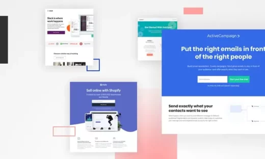
10 real landing page examples (to inspire your own)
Need some landing page inspiration that actually moves the needle? We handpicked 10 examples that nail both form and function.
Whether you’re hunting for fresh landing page ideas or just want some design inspiration for your next project, these pages showcase what works—and more importantly, why it works. Let’s dig in.
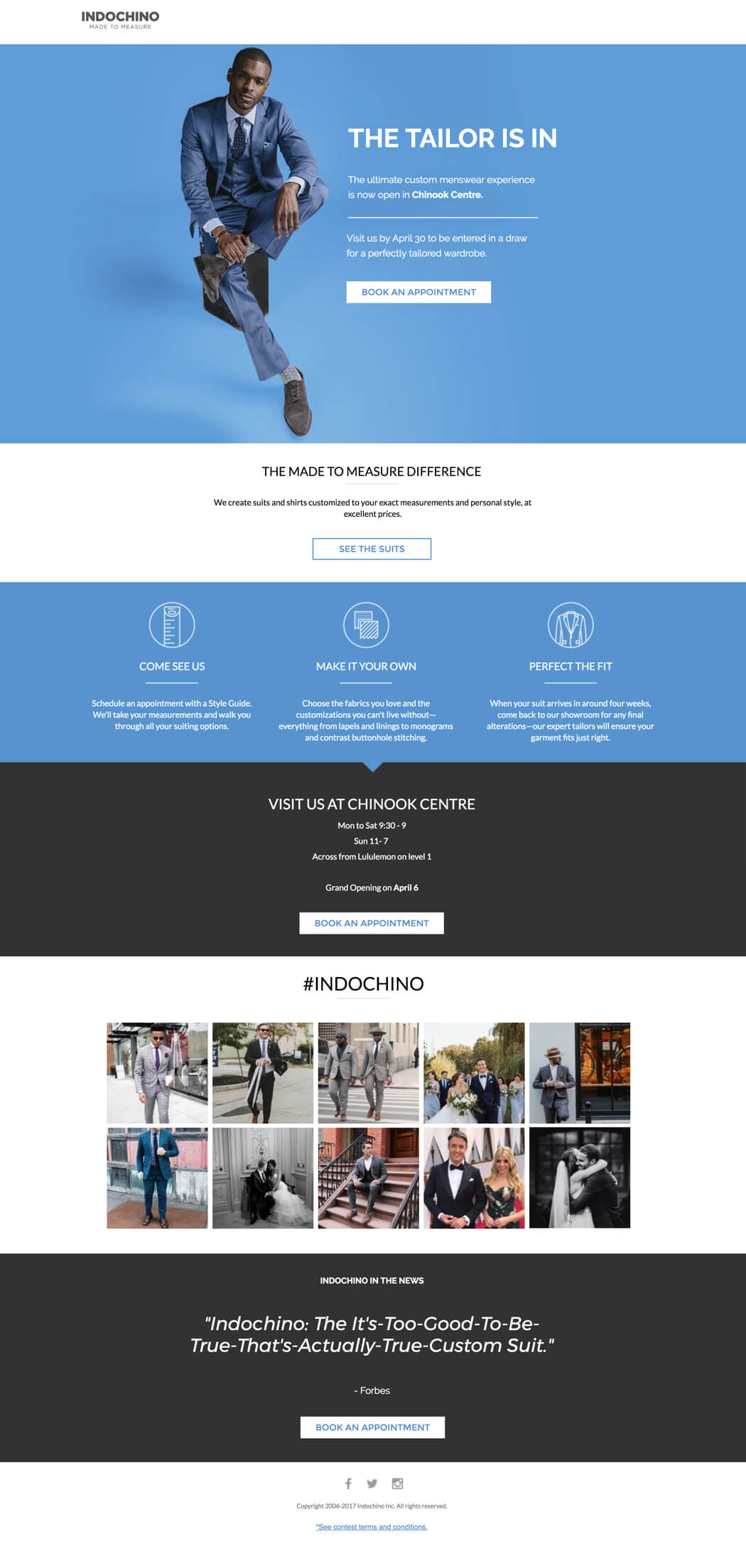
1. Indochino: product landing page design
Image courtesy of Indochino. (Click image to see the full page.)
If you’re creating a good-looking landing page, it helps to have an attractive product, which Indochino has covered. The Unbounce-built page above is an example of how Indochino provides not just handsome, tailored suits, but also handsome, tailored landing pages.
What’s awesome about this landing page design:
- Great visuals: If you’ve got an attractive product, show it off. We get to see Indochino’s suits modeled here—and the dynamic pose helps visitors see how suave the product looks in the context of use.
- Use of space: Just as importantly, visitors have all the information they need without a ton of scrolling. The CTA button is prominent and focused. This page’s design is simple and understated, but it gets the job done.
- On-brand: The header text here is in a font that looks similar to the company logo, which helps create a feeling of brand consistency.
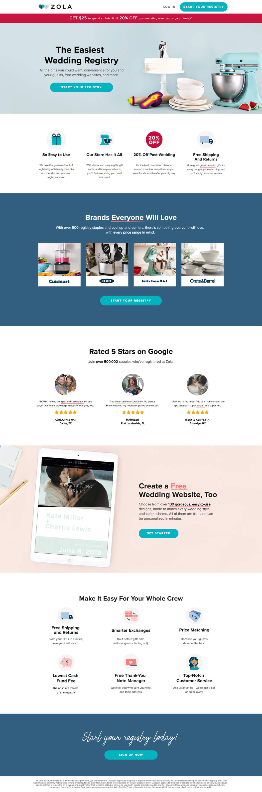
2. Zola: service landing page design
Image courtesy of Zola. (Click image to see the full page.)
If you’re in the wedding industry, like online retailer/gift registry Zola, you know that design matters. The example page above showcases the company’s design savvy by serving up a simple, elegant landing page for brides and grooms-to-be.
What’s awesome about this landing page design:
- Consistent branding: It’s not immediately apparent if you’re a first-time visitor, but Zola’s branding uses shades of bluish-grey (see the hearts in the company logo). The backdrop maintains those colors while also providing excellent contrast for the images—that white wedding cake needs a contrasting background to pop.
- Simplicity: Zola’s main ecommerce site is pretty busy. If the landing page included any of the standard navigation, visitors might get distracted by clicking around instead of starting their registry, which is the page’s goal. Keeping it simple means more visitors will complete the action instead of wandering aimlessly through the website. This page is perfect for directing their paid ads to as a way to lower cost-per-click.
3. Lujo: product landing page design
Image courtesy of Lujo. (Click image to see the full page.)
This Z-pattern landing page designed for Lujo by the conversion gurus at digital agency KlientBoost manages to provide a ton of context while not being overwhelming. You could argue that there are two CTAs here—shopping the collection and watching the video. Lujo gets away with it because the video is presented so discreetly, as an extension of the product photos. It’s clear that the most important CTA on this page is checking out the collection of loungers.
What’s awesome about this landing page design:
- Stunning (and consistent) visuals: Not only is the product photography excellent, but it supports the Z pattern of landing page design while reinforcing the brand’s messaging. Lujo’s tagline is “Put life on pause,” and everything about the visuals in this landing page reinforces that branding—from the sunhat resting on the video box to the deck shoes and the iced tea. Design should work hand-in-hand with messaging so that the text and the images combine to create an overall experience that makes sense. Lujo does that well in this landing page.
- Obvious USP: Right below the photos, Lujo articulates—with both text and design elements—three unique selling points: free shipping, a five-year warranty, and New Zealand craftsmanship. Finding a way to subtly work those three ideas into the design means the visitor might not need to keep exploring before clicking that CTA button—they see these major benefits and that could seal the deal.
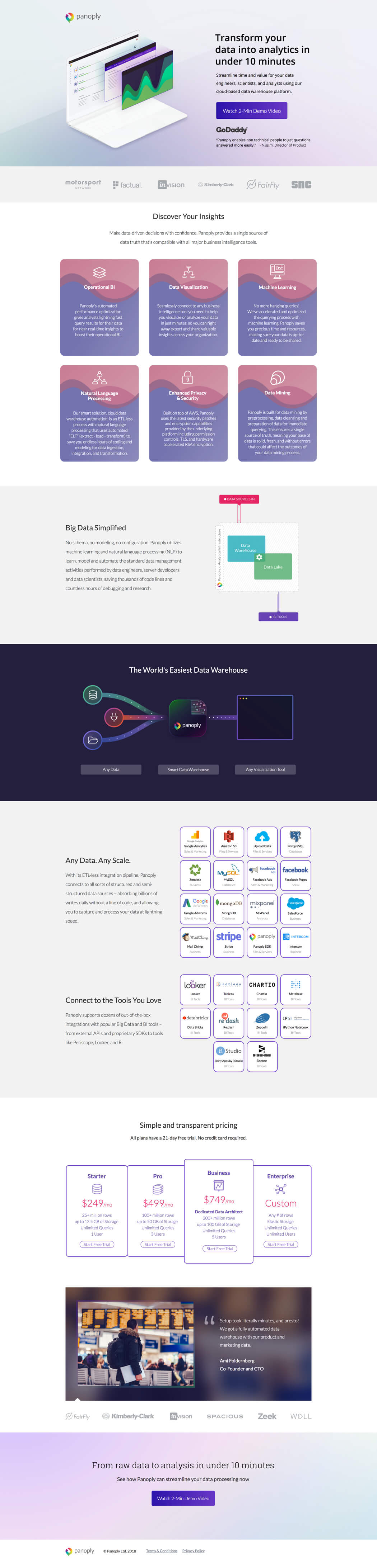
4. Panoply: B2B landing page design
Image courtesy of Panoply. (Click image to see the full page.)
Unlike some of the other examples, data analytics tool Panoply doesn’t have an especially visually attractive product to show off—after all, it’s analytics software and not, say, a snazzy suit. But Panoply’s landing page (designed by Directive Consulting) stands as a gorgeous testament to the fact that design and beauty are important even for technical B2B products and services.
What’s awesome about this landing page design:
- Clever visuals: Creatively showing off Panoply’s user interface in a subtle (but clear) way is one of the biggest wins of this landing page. Interesting visuals are always important, even when the product doesn’t lend itself to photography.
- Social proof: Including industry awards and a testimonial from GoDaddy above the fold—and doing so in a way that matches the overall design—is another great touch. A visitor doesn’t need to go anywhere else on the landing page to know that industry experts trust Panoply.
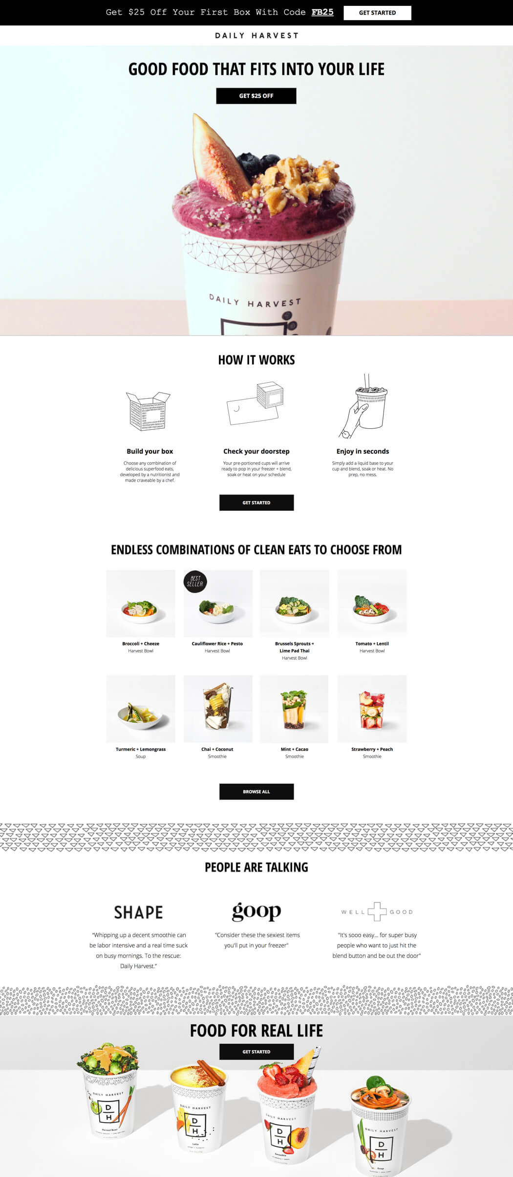
5. Daily Harvest: product landing page design
Image courtesy of Daily Harvest. (Click image to see the full page.)
Using imagery to evoke a strong emotional reaction might not be easier with any product than food. (People just need one look to tell whether or not they want to put something in their mouths.) Fortunately, Daily Harvest has a great-looking line of healthy snacks, and they’ve made strong design choices to help showcase that on this landing page.
What’s awesome about this landing page design:
- Animated visuals: It would have been easy for Daily Harvest to use a static image of one of their smoothies here, but the brand takes it one step further. This animated hero shot is engaging—the smoothie looks like something I could have right now, if it weren’t for this darn computer screen—and the how-to GIFs help me immediately understand how this service works.
- Product examples: The rest of the landing page is arranged with loads of lovely product images. It’s one thing to tell me you’ve got a huge catalog of nutritious treats—it’s another to show me actual examples of the meals I can order after I sign up.
6. Greats: product landing page design
Image courtesy of Greats. (Click image to see the full page.)
Fashion is all about social identity, and it’s essential for brands to exhibit attributes that consumers want to ascribe to themselves: qualities like authenticity, quality, and cool. This landing page for footwear brand Greats (built by WITHIN) does a beautiful job of brand-building through design while still driving visitors to convert.
What’s awesome about this landing page design:
- Amazing video: This whole landing page is pretty sleek, but what really knocks it out of the park is the video just below the fold. Not only does the stop-motion animation style look awesome, but it also gives Greats a chance to elaborate on their unique selling proposition—one stitch at a time.
- Rule of threes: Greats applies the rule of threes throughout this layout, making the benefit statements both visually striking and easily digestible.
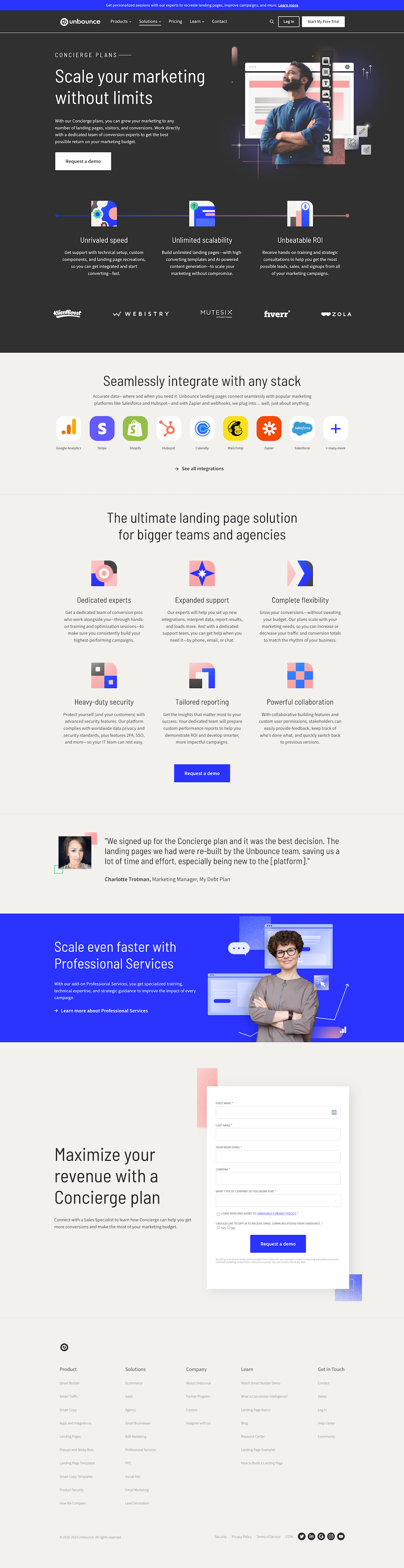
7. Unbounce: service landing page design
Image courtesy of Unbounce. Hey, that’s us! (Click image to see the full page.)
If we do say so ourselves, this landing page is great at immediately communicating why marketers will want to explore our Concierge plans. When visitors land on this page the first things they see are an attention-grabbing headline, a striking image, a benefit-filled description, and a clear CTA—all of which combine to create a quick impression of just how helpful and useful the Concierge plans are. If this service is what visitors are looking for, it’s a sure bet they’ll scroll down and check it out.
What’s awesome about this landing page design:
- Balance between images and text: Most of the text throughout the page is accompanied by images, which creates a nice visual balance and avoids the “wall of text” phenomenon that reduces readability.
- Multiple CTAs: Having CTA buttons near the top and middle of the page, both of which link to the form at the bottom, gives visitors multiple opportunities to engage. This also saves them the trouble of having to manually scroll all the way down to the bottom to fill out the form and request a demo.
- Chatbot: For any visitors who want an immediate response to their questions, the chatbot in the lower right corner provides a quick and frictionless way to get quick answers.
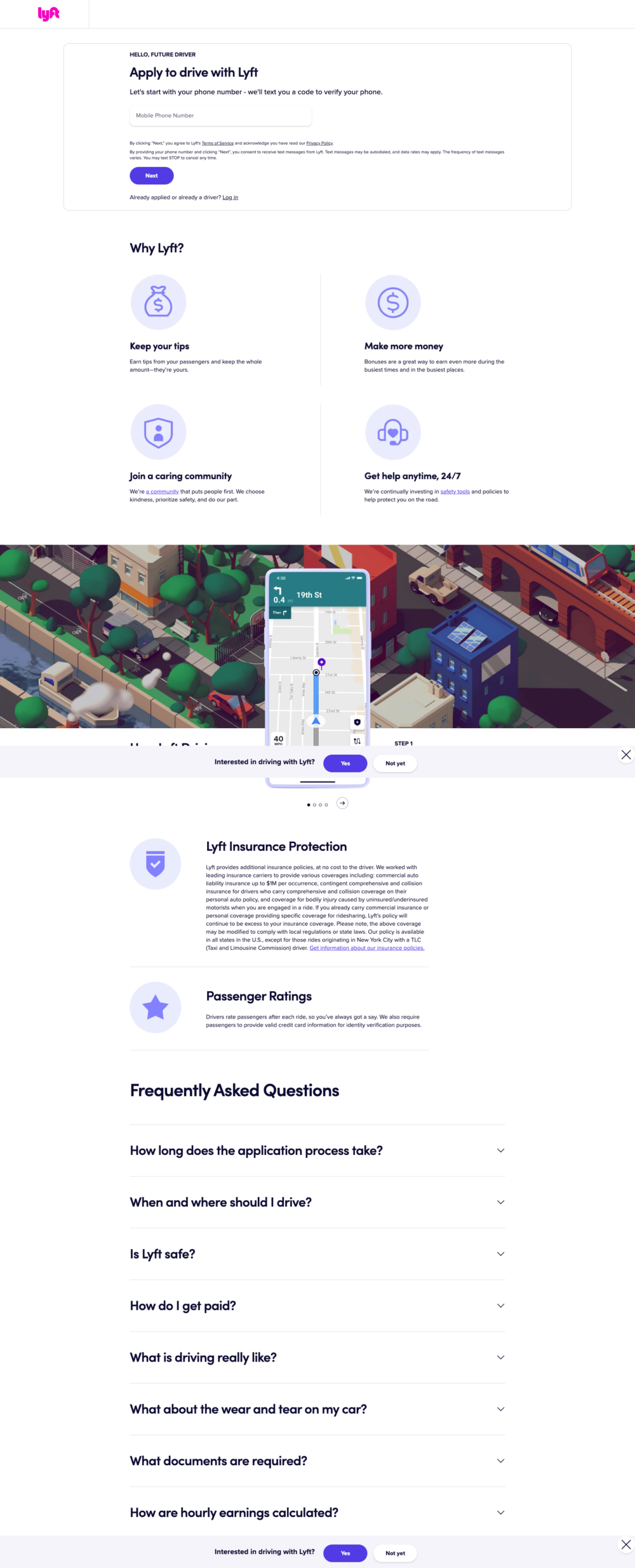
8. Lyft: service landing page design
Image courtesy of Lyft. (Click image to see the full page.)
The design of this page is kind of like motor oil—it reduces friction and helps things move along smoothly. If you’re interested in making some cash by driving for Lyft, this landing page makes it super easy to get started.
What’s awesome about this landing page design:
- Simple and direct design: The designers of this page made the (good) decision to strip away absolutely everything except what absolutely needs to be here. From the short copy to the white space-filled design, this entire page is laser-focused on streamlining the process of becoming a Lyft driver.
- Supporting benefits and details: What if a visitor lands on this page but they haven’t yet decided if they want to drive for Lyft? No problem—by scrolling down the page they’re presented with clear, easy-to-understand benefits of being a Lyft driver, how the program works, and some FAQs.
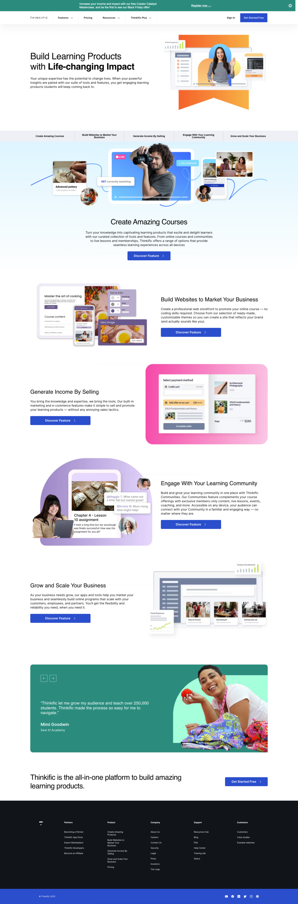
9. Thinkific: service landing page design
Image courtesy of Thinkific. (Click image to see the full page.)
Just a few decades ago, the idea of being able to access the entire world’s repository of knowledge felt like something that was only seen in science fiction. Now, thanks to the internet, anyone across the globe can share what they know with students in any country.
Thinkific’s platform provides a seamless way to create online courses and share them with the world, and this landing page makes it easy to understand how it all works.
What’s awesome about this landing page design:
- Easy navigation: Just below the hero image and copy you’ll find a horizontal row with five features of Thinkific’s platform. This makes it easy to see what information is contained on the page, and jump directly to the one that interests you most.
- Social proof: Below the five main features visitors will find testimonials from two of Thinkific’s happy customers, with short quotes describing why Thinkific works so well for them. As social animals, we humans pay a lot of attention to the thoughts and opinions of the people around us, which is why social proof can be so influential.
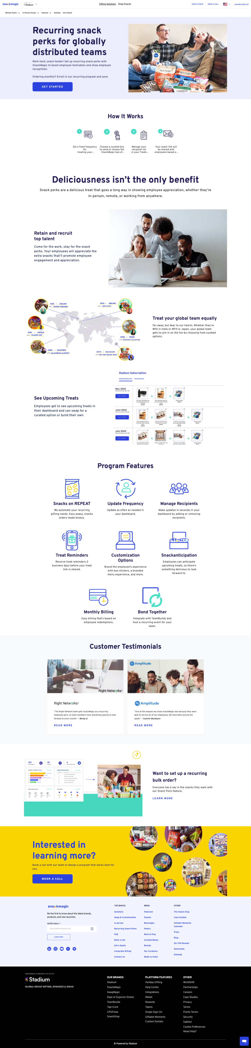
10. SnackMagic: product landing page design
Image courtesy of SnackMagic. (Click image to see the full page.)
“I hate snacks” is a statement that has been said by no one ever, because snacks are awesome. SnackMagic is a recurring program that makes it easy to provide yummy snacks to workplace teams, no matter where they’re located.
What’s awesome about this landing page design:
- Playful tone: Just like you’d expect from a service that’s all about snacks, the tone and design of this page are fun and light-hearted. From the hero image of two people enjoying some tasty treats on the couch to the tone of the copy (“Easy peasy, snacks orders made breezy”), the entire page speaks to the spirit-lifting appeal of snacks.
- Variety of visual elements: The images scattered throughout the page are composed of a mixture of photos, infographics, screenshots, and icons. The designers understood that each type of visual element has their own unique stren
Common landing page design mistakes to avoid
After walking through all those beautiful examples, you might be wondering: “What could go wrong?” Well, plenty. Let’s look at five common mistakes that can tank your landing page’s performance—and how to avoid them.
1. The “everything but the kitchen sink” approach
Remember how we talked about single focus earlier? Yet we still see landing pages stuffed with multiple links, social media posts, and competing calls to action. Your value proposition gets lost in the noise.
Great landing pages do one job really well. If you’ve followed our earlier tips about sketching your hierarchy first, you’ll avoid this trap. Keep it focused, keep it clean, and let your main message shine.
2. The ghost town hero section
You know your hero image needs to grab attention (we covered this in the essential elements section), but too many landing page design examples still lead with bland stock photos or—worse—no visuals at all. A visually appealing hero section isn’t optional—it’s your first impression.
Remember those real landing page examples we just looked at? Notice how each one used their hero section strategically. Whether it’s Indochino’s dynamic suit photo or Daily Harvest’s mouth-watering smoothies, they all nail that crucial first impression.
3. The mobile mess
Despite everything we covered about mobile responsiveness, too many folks still design landing pages on desktop and call it done. Remember those stats from our Conversion Benchmark Report? With 83% of traffic coming from phones, responsive landing pages are mandatory.
When you build landing pages, think mobile-first. Just like we saw in the Lyft example—big buttons, clean layout, and design elements that stack beautifully on any screen.
4. The template trap
Yes, a free landing page builder makes it tempting to just grab a template and run. But great landing pages take that template and make it unique—just like we saw in those web design examples earlier.
Take some landing pages design inspiration from others, but remember what made each of our examples special: They adapted proven formulas to fit their unique brand and goals.
5. The conversion killer
Ever seen those landing pages design inspiration galleries full of pretty pages that probably convert like cold molasses? Beauty without strategy is a conversion killer. The best landing page examples balance clever design with conversion principles—exactly what we saw in examples like Panoply and Zola.
Focus on creating a simple landing page design that guides visitors naturally toward action. Use web design principles to support your goals, not overshadow them. After all, as we learned from our examples, effective landing page design isn’t about winning design awards—it’s about winning customers.