40 best landing page examples of 2026 (for your swipe file)
Here’s our starting principle:
A polished, professional landing page can improve your conversion rates.
(And a messy one can hurt them.)
TABLE OF CONTENTS

Luke Bailey
Luke writes words and stuff for Unbounce. While he likes to use a little alliteration in his work, he’s also aware that readers aren’t always in awe of his atrocious adjective additives. You can follow him on Twitter @LukeBailey.
» More blog posts by Luke Bailey

Colin Loughran
Colin was formerly a content wonk at Unbounce (and editor-in-chief of this blog). He’s been known to sling a big word or two, but he’s got a soft spot for the cute lil’ ones. He adores search engines, digital marketing, and descriptive grammar. He’s so fun at parties. 🥃
» More blog posts by Colin Loughran

Paul Park
Paul is a writer on Unbounce’s content team who lives and breathes storytelling. (It’s like oxygen but with better plotlines!) Ask him what he’s up to at any given moment and you’ll get answers ranging from folding paper dragons (y’know, origami) to catching up on the latest cool tech, and finding other ways to channel his inner geek.
» More blog posts by Paul Park
Pretty simple, right? You’ve probably heard something similar before. But what the heck does it mean to be “polished” and “professional” on a landing page, anyway? And when it comes to conversions, what’s the magical x-factor that sets exceptional marketers apart?
With these questions in mind, we want to show off some of the best landing page examples to inspire your next creation. Go ahead and save their smartest, slickest, and snappiest elements for your swipe file.
Throughout, we’ll offer an Unbounce-certified perspective on what makes each page so darn good—and, occasionally, how each could be improved. (Incidentally, most of these examples of landing pages were actually built with Unbounce, too.) Let’s go.
Key takeaways
- High-converting landing pages are built on a foundation of a single, clear goal.
- Utilize persuasive elements like social proof and strong headlines to build trust and urgency.
- Remove distractions and guide the visitor with a clear, prominent call to action.
What is a landing page?
A landing page is a standalone web page created specifically for a marketing or advertising campaign. It’s where visitors “land” after clicking on a link in an ad, email, or other marketing channel, with the goal of converting them into leads or customers.
Before looking at the examples, it’s worth highlighting some of the qualities that most great landing pages share. (Itchin’ to see what good landing pages look like? Jump ahead for the top landing page examples.)
What makes a landing page effective?
Here are a few fundamental elements of high-converting landing pages:
QUICK TIP
Without a drag-and-drop landing page builder, implementing anything you like from the examples here will be 10x more difficult than it needs to be.
If you’re using Unbounce, you can build new pages in minutes. You don’t even need to connect your domain right away. Just set up your account and create a new page—easy as that.
The 40 best landing page examples
You can use these links to jump to any specific example you’d like. If you see a brand you know and like or one from your industry, you can jump straight to it.
- Calm (SaaS: Health and Wellness)
- Zola (Ecommerce: Weddings)
- CD Baby (SaaS: Entertainment)
- Netflix (SaaS: Entertainment)
- LinkedIn (SaaS: Professional Services)
- Goby (Ecommerce: Health and Wellness)
- DoorDash (SaaS: Food Delivery)
- SEM Rush (SaaS: Marketing)
- Coco Village (Ecommerce: Furniture)
- Grass Roots (Ecommerce: Food and Nutrition)
- Amazon (SaaS and Ecommerce)
- Branch Furniture (Ecommerce: Furniture)
- Western Rise (Ecommerce: Clothing and Apparel)
- Athabasca University (Education)
- Bariatric Eating (Food and Nutrition)
- blow LTD. (Beauty)
- Blue Forest Farms (Ecommerce: Cannabis)
- Border Buddy (Travel and Shipping)
- Rover (Pet Services)
- Campaign Monitor (SaaS: Marketing)
- Class Creator (SaaS: Education)
- Fast Mask (Ecommerce: Clothing and Apparel)
- Good Eggs (Ecommerce: Food and Nutrition)
- HomeLoanGurus (SaaS: Finance and Insurance)
- Jet Pet (Pet Services)
- Mooala (Ecommerce: Food and Nutrition)
- NANOR (Ecommerce: Wellness and Gifts)
- Panda7 (SaaS: Finance and Insurance)
- Lyft (Transportation)
- Perfect Keto (Ecommerce: Food and Nutrition)
- Gusto (SaaS: Human Resources)
- Roomeze (SaaS: Real Estate)
- Smalls (Ecommerce: Food and Nutrition)
- Sundae (SaaS: Real Estate)
- Wavehuggers (Travel and Leisure)
- Woolx (Ecommerce: Clothing and Apparel)
- Zumba (Health and Fitness)
- Mailchimp (SaaS: Marketing)
- Spotify (Ecommerce: Audio Streaming)
- Snackpass (Ecommerce: Food and Nutrition)

1. Calm – SaaS: Health and Wellness
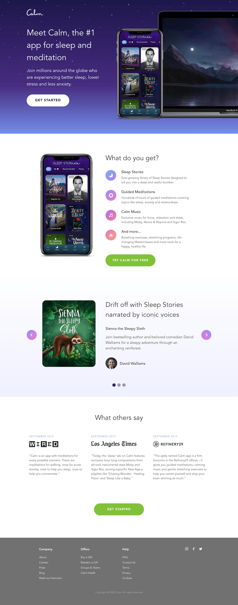
Most of us could use some more tranquility in our lives, and Calm aims to bring us exactly that. It’s a meditation and sleep app filled with features designed to invite a little bit of relaxation into our otherwise chaotic lives. This landing page website example is the first thing people see once they visit the app’s site—right away, it encourages visitors to get started and engage more deeply with Calm.
Industry: SaaS / Health and Wellness
Why it inspires…
- Short n’ sweet: Calm practices what they preach through the look of their landing page. The copy is clean and straightforward to avoid overwhelming visitors with too much information. The headline, “Meet Calm,” lends a feeling of harmony and peace to the content.
- Clear purpose: Calm’s main goal is clearly spelled out. (Better sleep, lower stress, and less anxiety? Sign me up!) The landing page gets straight to the point by inviting the reader to join millions of others around the globe on their path to wellness.
- Soothing colors and photography: The background of Calm’s landing page invites a sense of, well, calm. There is a simple, serene evening sky with bright stars, highlighting the universe’s most relaxing color (blue). Soft colors and shades are easy on the eyes and create a sense of serenity—something all of us are craving!
2. Zola – Ecommerce: Weddings
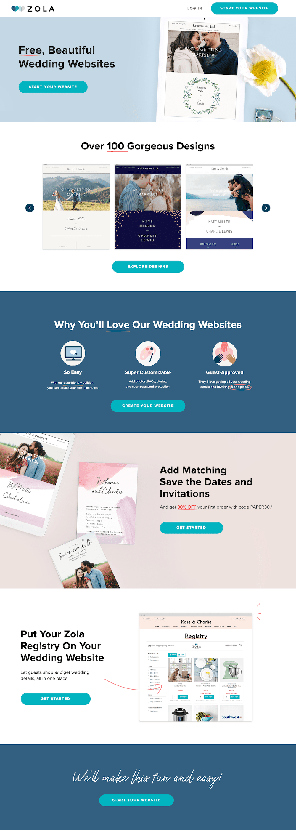
Zola is the latest startup that’s breaking the mold when it comes to wedding planning. Their philosophy is simple: Make it easy for couples to plan their big day, from the invitations through the honeymoon. From an online wedding registry to a directory of wedding venues and vendors, Zola is a one-stop-shop for brides and grooms-to-be.
Industry: Weddings
Why it inspires…
- Free website templates: The first word we read on the landing page is free, immediately having a powerful effect on future brides and grooms who want to save on wedding costs but still get a polished-looking product.
- Professional photography: The professional wedding shots on the landing page give readers an idea of what their engagement photos will look like in Zola’s designs.
- Discount for a related offer: Zola gives customers an incentive to pair their free website with save-the-date cards by offering a discount. This makes it easy to bundle services so couples can kill two birds with one stone.
3. CD Baby – SaaS: Entertainment
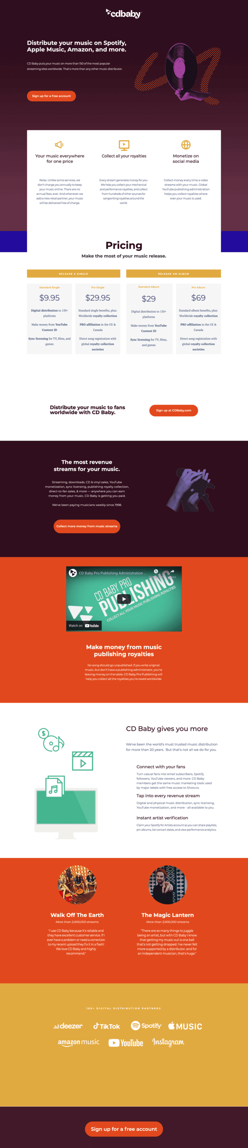
CD Baby is a music distributor that gets your tracks to the ears of the masses. The platform aims to help independent musicians get on all the top platforms to get the widest distribution. Not only that, CD Baby wants to make sure that musicians are receiving the royalties they deserve.
Industry: Saas / Entertainment
Why it inspires…
- Top 3 reasons: The landing page points out why musicians benefit from their service (beyond just getting their music out there as much as possible). CDBaby does it all for one price, so musicians know exactly what they are getting upfront.
- Lists top streaming platforms: Musicians want to know they can get their music in front of as many fans as possible, and being on the top streaming platforms (Spotify, Apple Music, and Amazon) is a huge part of that.
- Video: The video featured on the landing page addresses the main pain points for musicians (hi, where are my royalties?) and highlights how their service solves the problem.
QUICK TIP
Landing pages with video can increase conversions by 86%.
If you’re building your pages with Unbounce, you can easily add video elements or use a video background in the builder. Get started with a 14-day free trial to test it out for yourself.
4. Netflix – SaaS: Entertainment
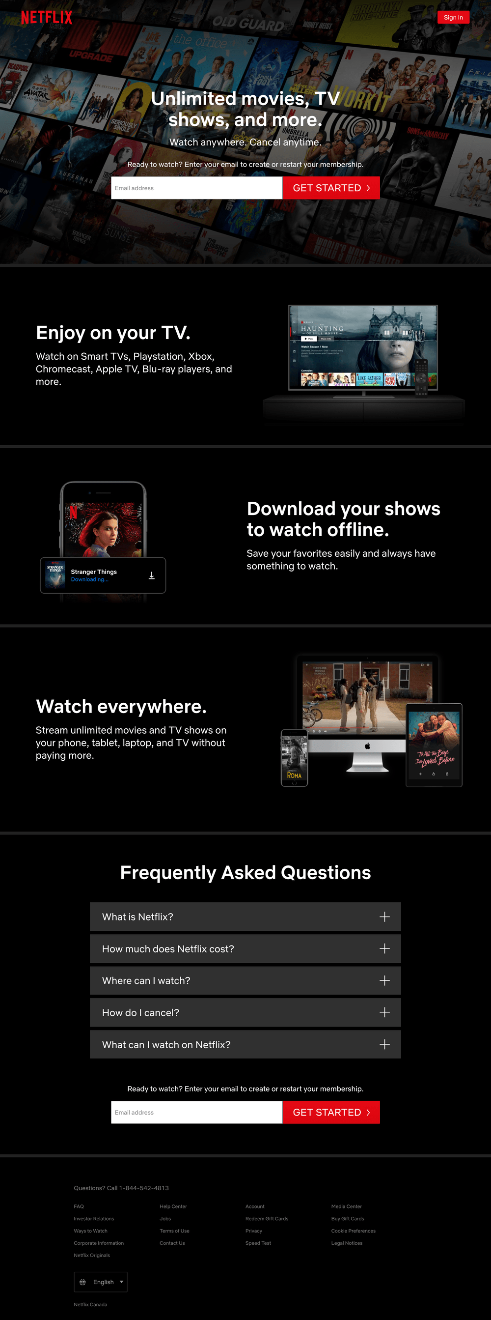
Remember the first time you heard about Netflix? The streaming service seemed almost too good to be true with unlimited movies and TV shows for less than $10 a month. What a killer value proposition… it’s no wonder they put the competition out of business. (RIP, Blockbuster.) This simple landing page example reinforces those most important benefits without making it seem too complicated or difficult for anyone to sign up. And obviously this strategy has been working—recent reports show Netflix currently sitting at over 300 million subscribers worldwide.
Industry: SaaS / Entertainment
Why it inspires…
- One-field form: A big, intimidating form on this page could easily scare away folks who aren’t tech-savvy. But Netflix wants to appeal to everyone *and* their grandparents. That’s why they make the first step super simple—just enter your email to get started.
- Drop-down FAQ: Over the years, Netflix has raised its pricing a number of times. That’s why they’ve moved down this part of their value proposition into a drop-down FAQ at the bottom of the page. They’re still telling you that info on the page so you don’t click away, but they’re no longer making a big deal out of it.
- Short-form content: While many Netflix shows take a long time to binge through, you can digest this landing page in just a few seconds. There are fewer than 200 words of copy here, and every benefit only has a line or two of supporting text. This is smart since according to Unbounce’s Conversion Benchmark Report media and entertainment landing pages below 350 words tend to convert better.
5. LinkedIn – SaaS: Professional Services
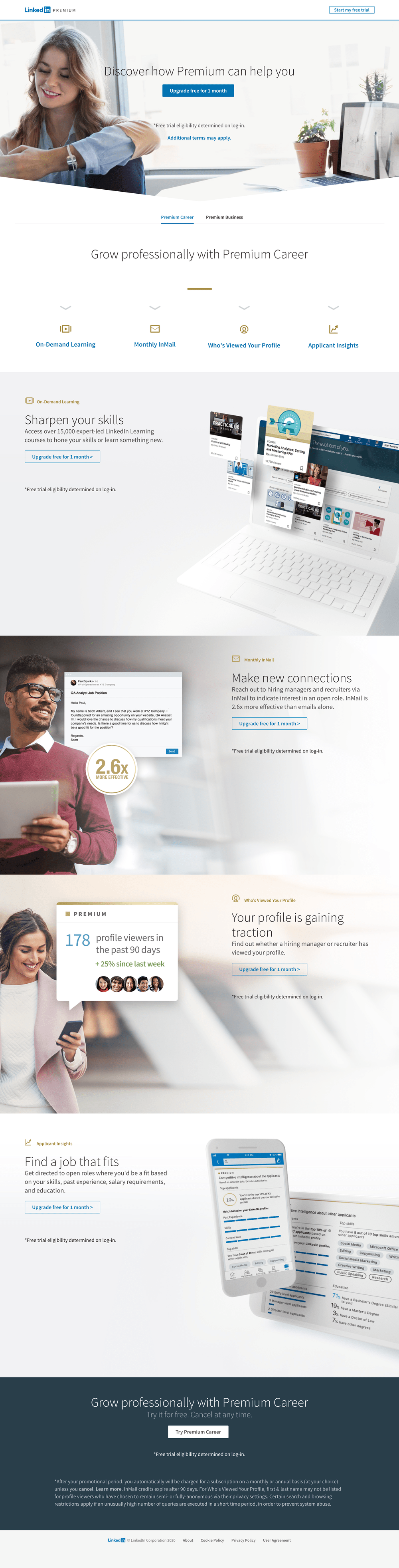
Just about everyone has a LinkedIn profile these days, but only the people who are serious about advancing their careers have signed up for LinkedIn Premium. This landing page highlights the benefits of upgrading your account specifically for job seekers who are looking to stand out in the job market. (Because apparently my dad’s advice about giving a firm handshake and making lots of eye contact isn’t enough anymore? Who knew.)
Industry: SaaS / Professional Services
Why it inspires…
- People over product: It’s always a tricky balance in SaaS whether you should show a screenshot of your product first or a photo of a customer who’s actually using it. That’s why I really like the approach LinkedIn has taken here, mixing custom photography of smiling job applicants (who is that happy when they’re applying for a job?!) with 3D images showing off Premium features. Truly the best of both worlds.
- Jump links: For longer landing pages like this one, it can be helpful to place anchor links at the top of the page. This way, visitors can skip ahead to the parts that interest them most.
- Powerful statistics: There’s no real social proof on this page (a testimonial from a LinkedIn Premium user would be nice to see) but there is a powerful bit of data. “InMail is 2.6x more effective than emails alone.” That’s HUGE for job seekers looking to connect with hiring managers or recruiters, and I would guess it’s probably one of the main reasons why visitors sign up for Premium in the first place. I’d recommend running an A/B test to see if bringing that stat into the page headline would increase conversions further.
6. Goby – Ecommerce: Health and Wellness
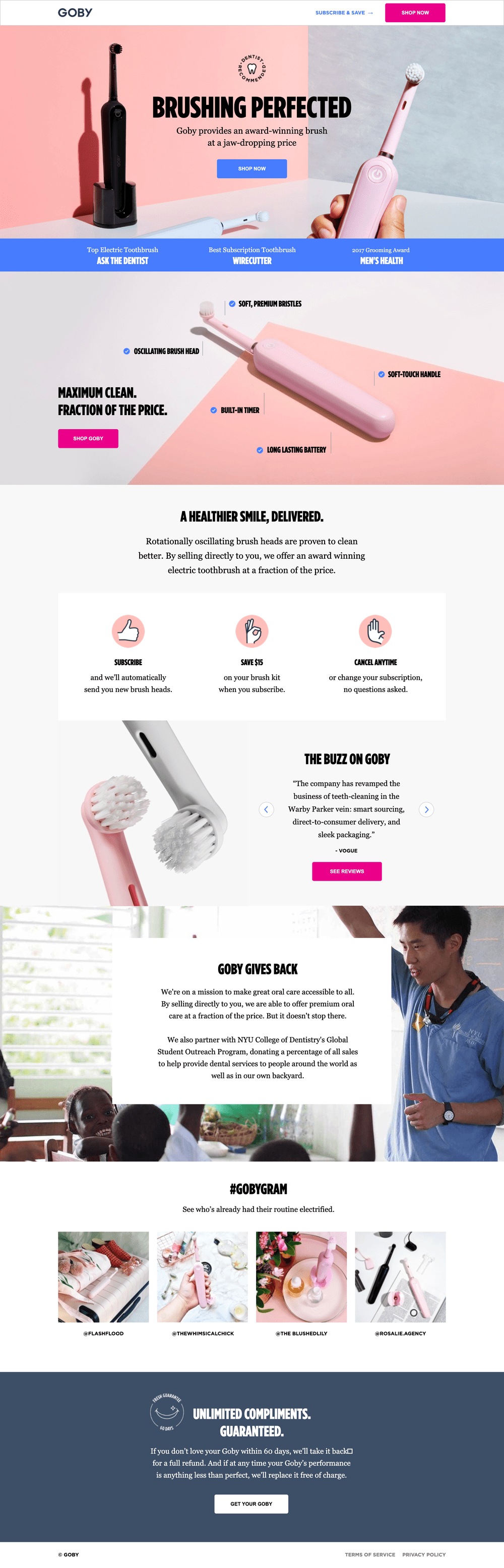
“Brushing perfected.” That’s what this landing page from Goby promises right at the top, giving visitors the confidence and curiosity to click-through. Not only does their award-winning electric toothbrush come with some impressive accolades, but it’s also affordable and backed up by a money-back guarantee. Now that’s worth a smile!
Industry: Dentistry
Why it inspires…
- Anatomy of a toothbrush: Check out the section of the page that breaks down every element of the toothbrush. Rather than just talk about these features in the copy, visitors can actually see for themselves the “Soft, Premium Bristles” and the “Oscillating Brush Head.”
- Social impact message: Shoppers increasingly want to support brands that align with their values and give back to the community. That’s why we dig the section towards the bottom of the page that highlights how Goby is donating a percentage of every sale to the NYU College of Dentistry’s Global Student Outreach program.
- Instagram photos: There are all sorts of great social proof on the page, but the carousel of Instagram photos at the bottom really puts the cherry on top. Not only does each pic somehow make a toothbrush look downright trendy, but the Instagram handles are also right there if you want to see for yourself what each influencer had to say. Nice!
7. DoorDash – SaaS: Food Delivery
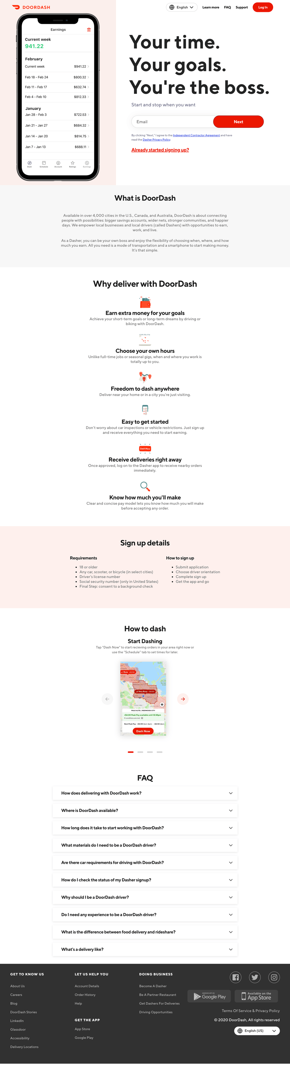
Food delivery is big business, and companies like DoorDash are using landing pages to get more drivers to sign up for their service. This page helps you visualize what it will be like to deliver food for a living and highlights just how much money you could be making with your new full-time gig or side-hustle.
Industry: SaaS / Food Delivery
Why it inspires…
- You-focused headline: What’s the biggest advantage of being a food delivery person? It’s not the fact that you’ll learn every traffic shortcut in your city, nor is it the delicious smell of food that permeates into your vehicle (10 years later and my car still smells like pepperoni pizza). The biggest advantage is the freedom you get. You can work your own hours and be your own boss. And this landing page nails that feeling right in the headline.
- It’s all about the money, too: If freedom is the main benefit of becoming a DoorDash driver, the other benefit has gotta be the money. Check out that hero graphic that shows your potential weekly earnings. (Not bad for driving around town with some tacos in your trunk!)
- Qualifying requirements: DoorDash doesn’t want everybody applying for a position and overloading their HR department. That’s why they make a point of listing the requirements here on the first page of the sign-up process. So if you don’t have a car or still haven’t turned 18 yet, you know not to get your hopes up.
8. SEM Rush – SaaS: Marketing
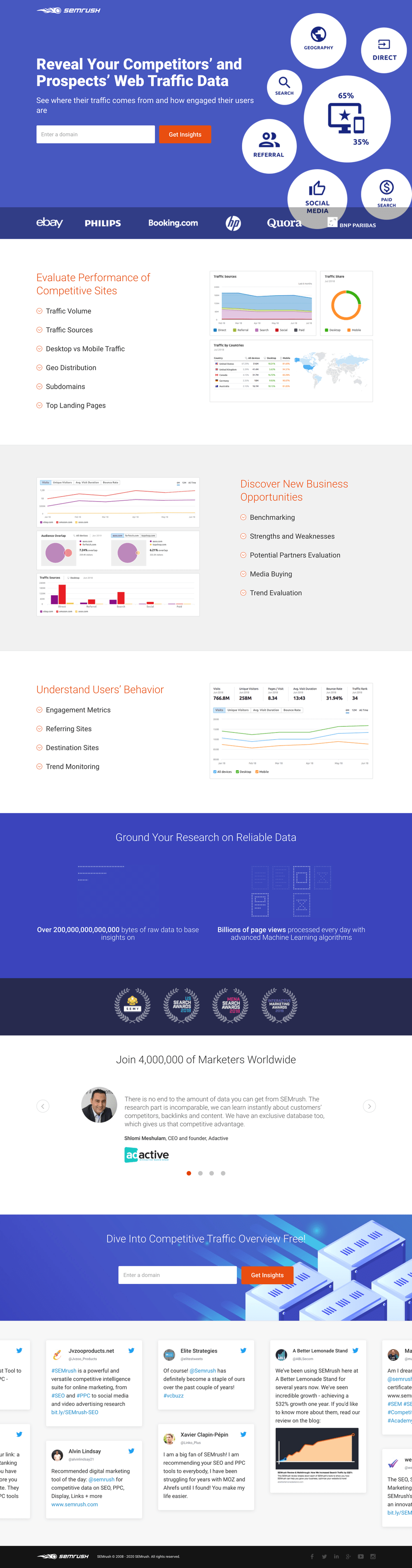
If you’re a digital marketer, you’re probably already familiar with SEM Rush. Their platform offers an all-in-one toolkit for SEO, content marketing, PPC, social media, and market research. But rather than try to sell you on all of these things at the same time, this landing page narrows its focus on just one thing: how you can use their platform to learn more about your competitors.
Industry: SaaS / Marketing
Why it inspires…
- Ultra-compelling CTA: The CTA on this page taps into every marketer’s innate desire to spy on the competition. (Wait, is that just me?) The one-field form asks you to enter *any* domain name before prompting you to click the big button and “Get Insights.” And the supporting text in the hero section really helps to sell you on the idea: “See where their traffic comes from and how engaged their users are.”
- Strong social proof: This landing page hits almost every type of social proof out there. Logo bar with recognizable brands? Check. Industry awards and credentials? Check. Testimonials from real marketers? Check. And if that wasn’t enough, there’s also a carousel of Tweets at the bottom showing off recent chatter about the platform online.
- Audience-aware copy: To create a high-converting landing page, you’ve got to know your audience and speak to the benefits they care about most. The copy here focuses on big data and machine learning algorithms because they’re after data-driven marketers. Smart.
9. Coco Village (Agency: J7 Media) – Ecommerce: Furniture
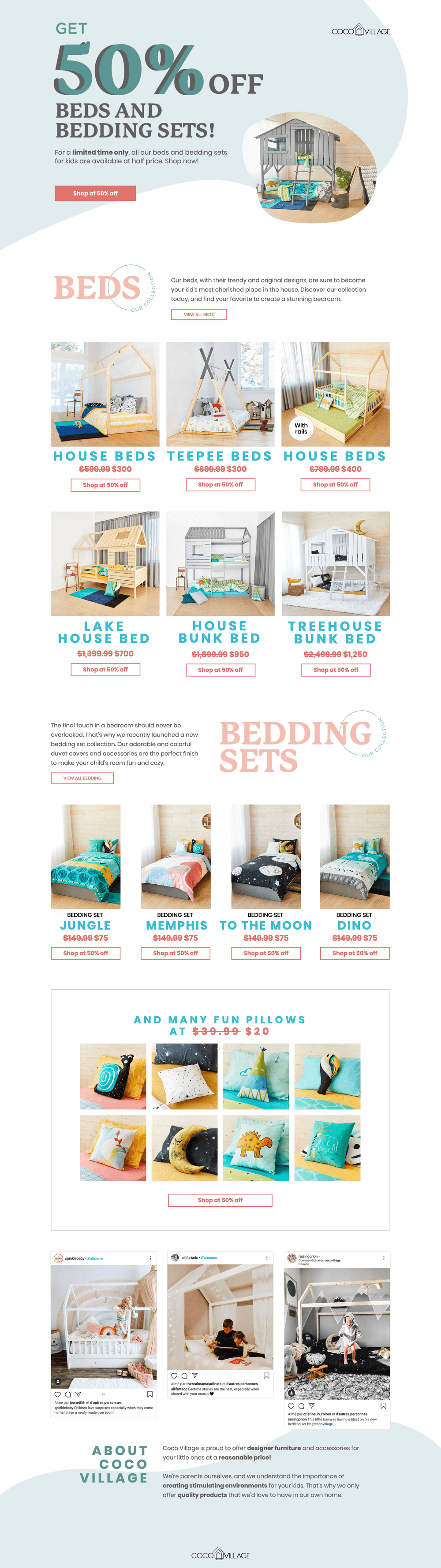
Even as a full-grown adult man, I still squealed with delight when I saw some of the beds and bedding sets on this landing page for Coco Village. (A treehouse bunkbed?! My inner child is dying of jealousy.) The marketers over at J7 Media, a Facebook Ads agency, did a phenomenal job on having this landing page show off a collection of different products, while still keeping it focused on a single, click-through goal.
Industry: Bedding
Why it inspires…
- Focus on the sale: When you’re offering a big sale or discount, you want *everyone* to know about it. And visitors on this landing page can’t miss the fact that they’re offering “50% Off Beds and Bedding Sets.” Not only is that the main headline, but it’s also repeated under each product on every CTA. They even strikethrough the original prices to illustrate how much money you’ll be saving. Nice!
- Shows off the goods: With ecommerce landing pages, it’s not always the best choice to focus on just one product or item. This page demonstrates how you can show off multiple different options for visitors while keeping them focused on one CTA goal.
- Additional products: OK, so maybe you’re like me and think the beds look cool but you don’t really need one of those right now. That’s when the page hits with you some of the adorable pillows for sale, at much lower price points. (I may or may not be purchasing the one that looks like a snail for myself.)
10. Grass Roots (Agency: MuteSix) – Ecommerce: Food and Nutrition
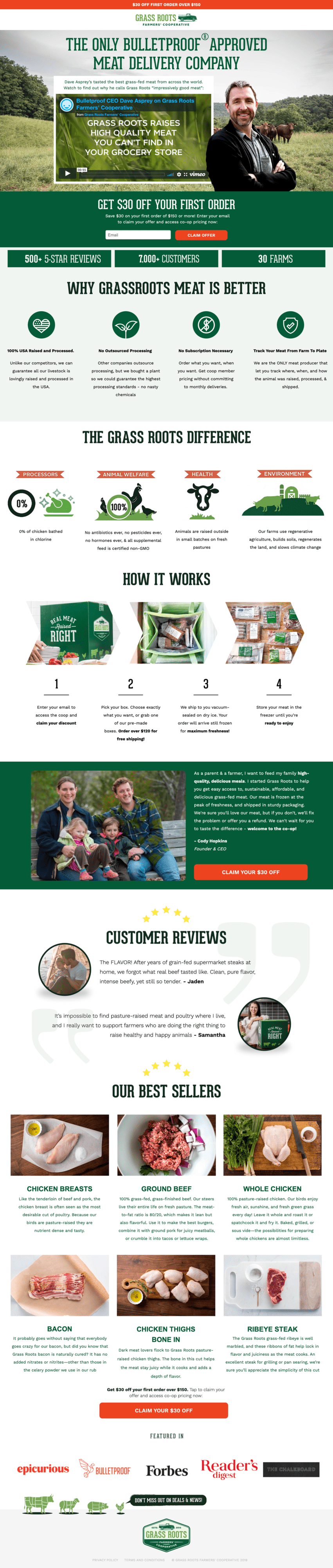
There’s a growing demand for grass-fed meat, which is where this landing page from the Grass Roots Farmers’ Cooperative and the agency MuteSix comes into the mix. As you scroll through the page, you’re taken on the full customer journey—from problem awareness (understanding why grass-fed meat is better), through consideration (seeing why you should choose Grass Roots as your protein provider), to making a purchase (“Claim Your $30 Off”).
Industry: Food and Nutrition
Why it inspires…
- Feature video: At the top of the page is a 1-minute video featuring the founder and CEO of Bulletproof, Dave Asprey. It explains how challenging it can be to source high-quality grass-fed meat, and why Dave uses Grass Roots for the meat he can’t find in the grocery store. This sets the tone nicely for the rest of the page and gets you in the right mindset for making a purchase.
- Storytelling approach: The entire page uses storytelling in a similar way, really getting you to buy into eating more grass-fed meat as a lifestyle choice. As you scroll, you can’t help but feel like you’ve been missing out on this healthier (and more tasty) style of beef, chicken, and bacon.
- Strong social proof: Not only does this page show off that Grass Roots is the only Bulletproof-approved meat delivery company, it also promotes that they have over 500 5-star reviews and 7,000 happy customers. (“I’ll have what they’re having.”)
11. Amazon – SaaS and Ecommerce

Here’s a landing page that on paper doesn’t seem to work at all. The colors here are incredibly disjointed. There are multiple different art styles. The content seems to be all over the place. Heck, the page even has multiple links out to other pages and exit points. (The horror!) But Amazon somehow manages to get away with breaking all of these rules because they know their offer is too good to pass up.
Industry: Ecommerce / SaaS
Why it inspires…
- Smart benefits hierarchy: Ask people why they sign up for Amazon Prime and they’ll answer you in the same order these sections appear on the landing page. Free shipping is the main benefit, followed by Prime Video. The rest are bonuses, so they’re shown as add-ons as you get farther down the page. (And with the average scroll depth only being about 50%, it’s smart of ’em to put the most important stuff in the top half of the page.)
- Click-through CTA: Whether you consider this a SaaS page or an ecommerce page, the marketers at Amazon made the right call to use a click-through CTA instead of embedding a form on the page. According to the Unbounce Conversion Benchmark Report, click-through CTAs perform better in both of these industries.
12. Branch Furniture – Ecommerce: Furniture
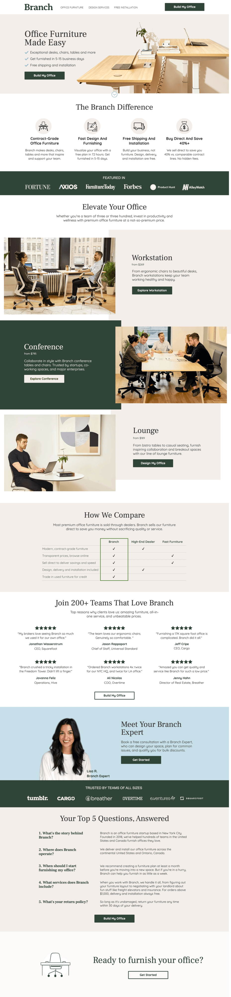
As someone who had to recently furnish a home office, I know exactly how difficult it can be to find desks, chairs, and tables you like online. (And that was just for one person!) Branch Furniture understands that this can be a problem for office managers, which is why their landing page instantly reassures you that you’re in the right place. Their service makes it fast and easy to get your office furniture designed, shipped, and installed.
Industry: Office Furniture
Why it inspires…
- Powerful headline: “Office Furniture Made Easy.” In just four words, you understand who this landing page is trying to target and what their unique selling proposition (USP) is. You don’t want to be building 100 desks for your new office Ikea-style, with nothing but a socket wrench and a dream. It seems like a much better idea to let Branch Furniture handle all those details for you.
- Clever CTA copy: Although the page has multiple CTA buttons, they all end up taking you to the same place. Switching up the copy is a clever way to help visitors visualize the next steps of the process, whether you want to “Design My Office” or explore a specific product.
- Expert consultation: You don’t have to furnish your office alone. The landing page highlights that this is a collaborative shopping experience, with a free design consultation and included installation fees.
13. Western Rise – Ecommerce: Clothing and Apparel
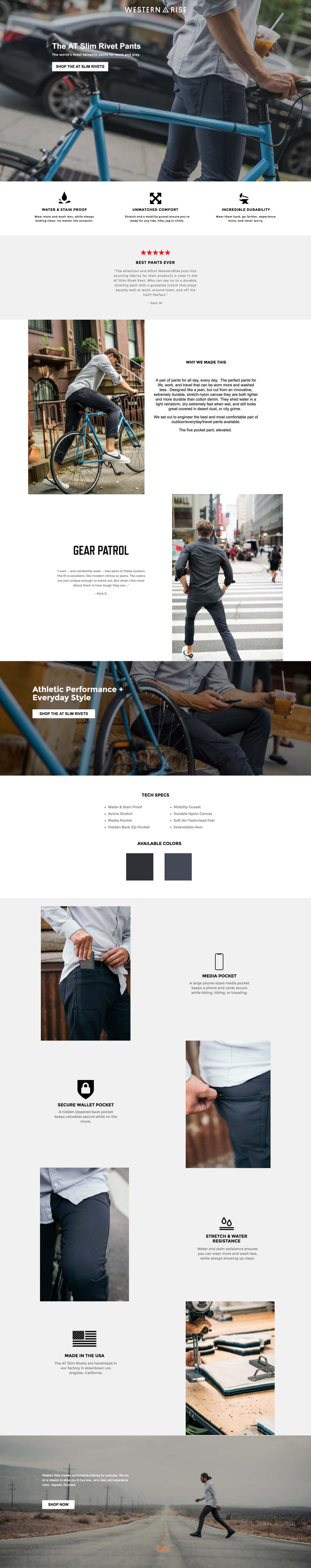
Sometimes when prepping a piece like this one, you end up buying the product. I’m very, very close to pulling the trigger on a pair of Western Rise’s AT Slim Rivet Pants. And why not? This sharp landing page quickly establishes the appeal of the product through visuals and copy that stresses the benefits of these “elevated” pants. It may be time to give up on my ratty jeans altogether.
Industry: Clothier
Why it works…
- Bold visuals: These pants may be handmade in Los Angeles, but many of the photos here (including the hero shot) scream Brooklyn. It’s easy to imagine wearing the AT Slim Rivet Pants as you peddle your fixie through traffic, balancing a latte on your handlebars on the way to a chic rooftop cocktail party.
- Stressing the benefits: I never thought I’d be writing about the common pain points associated with wearing pants, but here we are. On this landing page, Western Rise addresses them all. Jeans are prone to tearing and tend to overheat. Chinos get dirty and wrinkled. Dress pants are for squares, man. By promising versatility (“pants for all day, every day”) and keeping the benefits up front, Western Rise offers a solution to a problem you didn’t know you had.
- “Tech specs”: Though there’s some clever copy on display here, Western Rise is extremely straightforward about the features of the AT Slim Rivet Pants in the “Tech specs” section on the page. They provide precise details about materials (“Durable Nylon Canvas” and “Gusseted Crotch”) and design (“Media Pocket” and “Extendable Hem”) in a clear, concise way.
14. Athabasca University – Education

Athabasca University pioneered distance education in Canada in the 1970s. Today, it uses landing pages to boost its online enrolment initiatives, including this example representing its 14 certificate programs. It’s a smart choice since landing pages allow AU to focus a visitor’s attention on a particular slice of its many online program offerings.
Industry: Education
Why it inspires…
- Smart copy: It might be worth testing out a more direct headline, but the copy here matches the school’s other branding initiatives elsewhere. It’s also very sharp. The target is clear: people who might further their education but don’t feel they have time to pursue it. This landing page says otherwise (in words and in its hero image).
- You-oriented copy: This page is all about me (or, uh, “you”) and not about the “Great and Powerful” Athabasca University. Marketers working in education understand the need to appeal to self-interest better than many of their counterparts in other industries, who can slip into bragging. I’m not sure what part of Maslow’s hierarchy of needs calls for tech bro flexing, but AU does better by appealing to a desire for self-actualization.
- Testimonials: A little bit of inspiration never hurts. Here, the social proof shows pathways to personal success before people make a significant investment. I’d test to see if doubling down doesn’t produce even better results here. Giving each testimonial more visibility and offering a smidge more biography—along with portraits to humanize them—might provide a little boost. (Of course, it might not. But that’s why we test!)
- Z-pattern: This page is a classic example of a Z-pattern at work. That is—its visual hierarchy takes advantage of the way people typically scan a webpage. In this case, the eye is encouraged to travel from the Athabasca University logo to their tagline (“Open. Flexible. Everywhere.”), then diagonally across the heading to the supporting copy, and then finally right to the call to action. (Pow!) Other visual queues also encourage the eye to move down (including, cleverly, the pointed tip of Athabasca crest).
15. Bariatric Eating (Agency: Sevah Creative) – Food and Nutrition
Here’s a page for Bariatric Eating that shows why personality and style are so important to your landing page. You can easily imagine a version of this campaign that looks much more clinical and scientific—but the marketers over at Sevah Creative have infused it with a colorful and friendly design to make the subject matter much more approachable. The approach seems to be working too… This page has an impressive conversion rate of over 39%.
Industry: Food and Nutrition
Why it inspires…
- Colorful design: The playful design extends to every element of the page. The font choices, the illustrations, the colors—everything comes together in a way that perfectly matches their brand personality.
- SMS lead gen: Most commonly, lead generation landing pages are used to collect email addresses from visitors. Instead, this page asks for your mobile phone number so they can text you the PDF plan. This seems like a smart (and unique) way to get a direct line of communication with your prospects.
- Collapsible FAQ: How do you make sure your landing page has enough info on it without overwhelming visitors? Hiding some of your wordiest sections with a slide-down button can help to keep things neat and tidy.
16. blow LTD. – Beauty
If you look past the buzzy “Uber for beauty” thing, UK brand blow LTD. solves a genuine problem in a genius way. They offer affordable, professional beauty services that come to you, and—more importantly—you can book an appointment with one of their pros straight from their app. Smartly, landing pages are a big part of their campaign strategy. The example, for instance, promotes in-home eyelash extensions in clever ways.
Industry: Beauty
Why it inspires…
- Crystal-clear value statement: This landing page doesn’t mess around with cute copy (e.g., “Eyes That Amaze”). Instead, it clearly states the offer and relies on value (and maybe a little bit of novelty) to win over prospective customers. A promise doesn’t get more unambiguous than “Eyelash Extensions At Home,” and that’s precisely why this headline is so effective.
- Promo code: Providing a promo code to visitors sweetens the pot, but it’s also doing something more. The call to action (“Book Eyelash Extensions”) redirects to their main website, where they might get distracted or frustrated. The promo provides extra motivation to carry visitors through to complete a booking. Want these savings? Then ya’d best use that code before you forget.
- Social proof: People are understandably picky about who does their hair and makeup, so providing social proof is a must. The testimonials here have been selected to highlight the personalized nature of the experience too. Since blow LTD. only works if prospects feel they can trust their professionals, providing social proof helps humanize the service and start building relationships.
- Simple steps: Looking further down the page, we might pause over the “How It Works” section. In this post-Uber world, the service offered by blow LTD. is pretty easy to understand, so why bother including a three-step breakdown of it? That’s just the point, though. This landing page includes these steps to highlight this simplicity. I mean, come on—step three is “Sit Back & Relax.” That’s something I can get behind.
- Subtle app promotion: Rather than aggressively funneling visitors into an app, the landing page ends with a gentle reminder that you can download the app on your iPhone or Android. (I’d test a mobile variant of the CTA that goes straight to the app.) Some people will certainly get excited about booking with blow LTD. on the go, but visitors don’t feel too pressured to whip out their smartphone. Once a visitor has converted, there’ll be plenty of other opportunities to onboard them to the app.
17. Blue Forest Farms (Agency: Champ/Cannabis Creative) – Ecommerce: Cannabis

We love this incredible design for Blue Forest Farms by Champ and Cannabis Creative. Hemp farmers sometimes have trouble disassociating themselves from cannabis culture. (Tie-dye colors, bong water, and that funky smell coming from your older brother’s van.) But this stellar B2B landing page takes modernized and, dare we say, adult approach to wholesale hemp oil extracts. From its clean design to persuasive copy, it makes a strong case that this is an industry that demands to be taken seriously.
Industry: Hemp
Why it inspires…
- Expert copy: Unlike B2C landing pages, this page speaks to a professional crowd. By which I mean, people who know what it means when plant extract contains “natural terpenes” and has been “decarboxylated.” We might suggest going with a more impactful headline, but wholesalers are likely very aware of the benefits. Cutting to the chase can’t be a bad thing.
- A ‘refined’ approach: Blue Forest Farms markets hemp oil in several states, from crude oil to white label products ready for the market. Beyond just listing these options, this landing page lays out the process through which their hemp is refined, emphasizing the care and craft that go into it.
- Low-intensity lead gen: I’ve seen shorter forms, but the lead gen here is relatively straightforward for B2B. (They could test including first and last name in the same field and change some of the language.) It’s smart to leave an optional field for additional notes since wholesale deals are far more complex than most.
- Simple design: The kind of conversation that needs to happen in wholesale will stretch beyond a single landing page. Instead of cramming too much information onto the page, Blue Forest Farms keep it short and sweet to encourage contact as soon as possible.
18. Border Buddy – Travel and Shipping

Ever try to cross the border with a 10-pound wheel of Wisconsin cheddar strapped into the passenger seat (and disguised as your wife)? Me neither. But if I did, I’d want Border Buddy behind me. This landing page works by evoking common anxieties and then offering to solve them without fuss.
Industry: Customs
Why it works…
- Presenting the problem: The headline starts with the pain and insecurity (“Importing and Exporting Is Hard”) that any visitor who hits this landing page from a PPC campaign is likely to be feeling. Crucially, though, the promise of a solution appears with equal clarity above the fold: “We do the hard part for you,” says Border Buddy. Perfect.
- Simplicity: Bringing your purchases across the border can get very messy, so keeping this landing page clean is essential. There’s no more information here than what you need to know. No legalese either. You’ll have a customs broker worrying about all those small details for you.
- Speed: At Unbounce, we have a lot to say about the impact that page speed can have on your conversion rates. But Border Buddy is already ahead of the curve on this one. On mobile, this landing page takes less than three seconds to hit the first meaningful point. Border Buddy avoids weighing down the page with unnecessary media or scripts, ensuring immediate visitor engagement. (Prepping an SVG version of their logo could shave a few kilobytes off of what’s already a very lean page.)
- Unexpected vibrancy: Sometimes marketers associate the push for faster speeds with a need to sacrifice the visual appeal of a landing page. This example from Border Buddy shows that this doesn’t have to be the case. They’ve made careful choices in terms of font, layout, and visuals to maximize impact and reinforce branding (without distracting the visitor).
- F-pattern: Like the Z-pattern, the F-pattern layout mimics the way our eyes move across the screen when we look at content. It reduces cognitive load and ensures that the key pieces of the message (including the call to action) are located in the places where they’ll be the most noticeable.
19. Rover (Pet Services)
Love pets? Then you might want to sign up to be a pet sitter with Rover. This landing page is a masterclass in clean, benefit-driven design. It doesn’t overwhelm the visitor with too much information, instead guiding them through a clear, easy-to-follow flow that builds trust and excitement.
Industry: Pet Services
Why it inspires…
- Crystal-clear value proposition: The headline “Get paid to play with pets” is genius. It’s concise, evokes emotion, and immediately tells the visitor the primary benefit of the service. The supporting copy reinforces this by highlighting the unique selling point: a massive network of pet owners.
- Strategic visuals: The hero image is a high-quality, authentic photo that perfectly captures the essence of the service. It shows a happy, relatable person interacting joyfully with a dog, instantly creating an emotional connection. Further down the page, more images show real people and pets, reinforcing the core message and building a sense of community.
- Simple and scannable design: The page uses a clean, modern layout with plenty of white space. Key information is broken down into easily digestible sections with bold headings and bullet points (“Flexibility puts you in control,” “The tools to succeed”). This makes it easy for visitors to quickly scan the page and find the information they need without feeling overwhelmed.
20. Campaign Monitor (Agency: ConversionLab) – SaaS: Marketing

Here’s a SaaS landing page that gets it right. Built by the fine marketers over at ConversionLab, this page for the email marketing platform Campaign Monitor brings together many of the landing page best practices that help to boost your conversion rates. It includes clear, compelling copy. (Check.) It includes authentic social proof. (Check.) And it’s focused on a single, actionable goal: “Design Your First HTML Email Now.” (Oh baby, check.)
Industry: SaaS
Why it inspires…
- Strong, specific CTA: I know we already mentioned this above, but how good is that main CTA button? No “Learn More” or “Get Started” here. Instead, it’s “Design Your First HTML Email Now.” The copy is so specific and immediate that you know exactly what will happen when you click-through to the next page. (And the objection-handling copy underneath makes it even stronger.)
- Focus on the people first: In SaaS, it’s so easy to just choose a screenshot of the software and make that your hero image. But it’s always worth testing a variant with real photos of people, too. This can help you tap into the emotions of your visitors and can sometimes make them more likely to convert.
- One singular message – Notice how many times the words “HTML emails” show up on the page? By staying focused on this one goal (and using these as keywords for your PPC ad campaigns) you can increase your odds of building a high-converting page.
21. Class Creator – SaaS: Education
Australia-based Class Creator uses this Unbounce landing page to make inroads in the US market (and, hopefully, help the company secure US partners) when school’s between sessions in their home country. The page showcases many of the product’s features as well as the primary benefits. It targets high-level decision-makers who need as much information as possible before they buy.
Industry: Education/SaaS
Why it works..
- Breakin’ the rules: I know what you’re going to say. “That’s not a landing page. It’s a homepage. It breaks all the rules. Just look at that navigation bar! Look at all those different links. The Attention Ratio is out of control!” Grumble, grumble, grumble. But there’s a lesson here for anyone looking for landing page inspiration: stay flexible. Tim Bowman, Class Creator’s CEO, told me they’ve found more success with this homepage than a traditional conversion-focused landing page. I wanted to include it here as an example of just what you can do.
- Floating navigation bar: If you must include a navigation bar, it’s best to keep it in view at all times. This also lets Class Creator keep the primary call to action (“Demo School”) at the top of the page so that no scrolling is necessary for their visitors to find it.
- The numbers don’t lie: Above the fold Class Creator marshals some pretty serious numbers as a form of social proof. They leverage the 10,000+ educators in 13 countries who’re already using their software as a powerful persuasive device.
- Easy access to a product demo: In the SaaS space, it’s remarkably common to see companies throw up too many barriers between potential customers and demoing their product. (“Submit your firstborn for access to our 5-minute free trial.”) Class Creator knows that it’s essential for prospects to get their hands dirty with a demo or trial version of the software. This ensures that they get to evaluate the product in action, generating qualified leads (with a simple email form) and carrying them further down the funnel.
- Smart use of lightboxes: This landing page (acting as a homepage) already has a ton to say about Class Creator. Relegating any additional information to lightboxes works to keep it out of the way. It’d certainly be worth their while testing different versions of this page that swap out features for benefits or put the testimonials in a more prevalent place.
Editor’s Note. If you’re looking for the creative freedom to make whatever you want, the Unbounce Landing Page Builder offers that flexibility, whether you want to make a popup or sticky bar, a long-form landing page, or an SEO-optimized page. Learn more here.
22. Fast Mask (Agency: J7 Media) – Ecommerce: Clothing and Apparel

Here’s another example from J7 Media that’s all too timely. Fast Mask creates and sells bandanas and face masks that are designed to be used on a motorcycle, ATV, or while cycling. This page targets thrill-seekers and shows off some of the rad designs you can choose for your mask along with some of the different ways you can wear ‘em.
Industry: Clothing and Apparel
Why it inspires…
- Highlight best-selling products: Fast Masks have over 100 different designs listed on their website, but this landing page shows off just five of their most popular options. It’s enough to give you a sense of the different styles available (from a Canadian flag to a Spider-Man mask) without turning the page into one big product list.
- Keep your target audience in mind: This is a landing page that knows its audience. You can instantly tell you’re in the right place if you’re a thrill-seeker who enjoys motorcycles, paintball, snowboarding, hunting, or other extreme sports.
23. Good Eggs – Ecommerce: Food and Nutrition
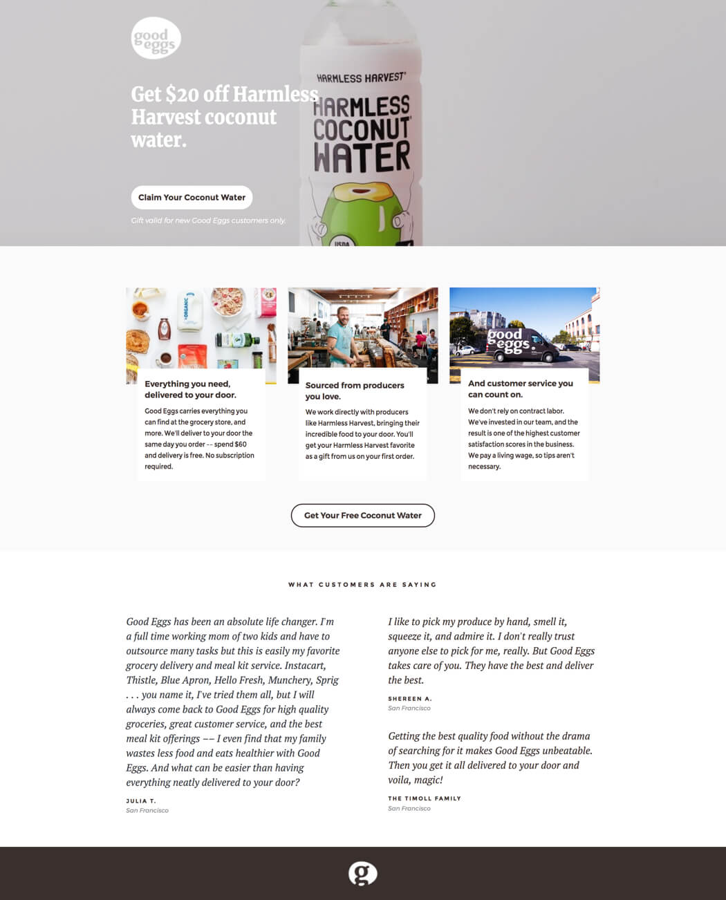
The good people at Good Eggs know how to use slick marketing. In fact, I think a lot of their landing pages would be a great fit for this post about landing page design. This particular example, which promotes free coconut water, is no exception, but it also offers a masterclass in restraint. It shows how to use a promo to score conversions without becoming overbearing.
Industry: Grocery Delivery
Why it inspires…
- Freebies: Free seems universally good. But in this case, the promise of free is doing more than appealing to our instinctual love of not paying for stuff. It builds goodwill, provides a sample of a product that Good Egg carries, and quickly establishes a lifestyle match between the service and the visitor. What do I mean by lifestyle match? Well, if you’re thrilled by the idea of getting free coconut water from Harmless Harvest, you already know Good Eggs will be a great fit for you.
- Added value: At first, I was taken aback by the headline here because I thought you’d hit harder with the whole free thing (like, I dunno, “Free Coconut Water” could work?). But it’s likely the average Good Eggs customer has more on their mind just getting a deal. Here, the promotion helps show off brand values of wellness, sustainability, and ethical labor practices. So it’s not just free, it’s also a good thing.
- Testimonials: It can be a little risky to mention your competitors, but Good Eggs gets around this problem by letting a customer do it for them. Sometimes testimonials can get a little samey, repeating the same point in different voices. (That’s not always a bad thing.) Here, though, they’ve been carefully selected to reinforce the three value propositions listed above.
24. HomeLoanGurus (Agency: ConversionLab) – SaaS: Finance and Insurance
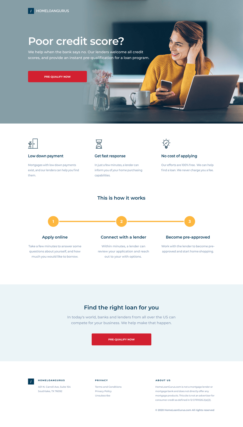
Here’s another landing page example from the expert marketers over at ConversionLab. HomeLoanGurus is a service that connects homebuyers with lenders—even when you have a poor credit score. (Is 670 a bad credit score? I’m asking for a friend.) This landing page does an excellent job of explaining how their service works in simple terms and encouraging visitors to apply online for their first loan.
Industry: Finance and Insurance
Why it inspires…
- Problem-focused: The headline here isn’t about the service—it’s about the visitor. “Poor credit score?” You know right away if this is the situation you’re dealing with, and the page immediately expresses empathy before suggesting HomeLoanGurus as a solution.
- Process-oriented: Getting a home loan can be suuuuper complicated. There’s lots of paperwork, terminology, and regulations you have to wrap your head around. This landing page spells out the process in simple steps and helps to make it seem much easier for the visitor who might be worried about taking the first step.
- Keep it short: Financial landing pages vary in length, but data from Unbounce’s Conversion Benchmark Report suggests that those with fewer than 200 words tend to convert best. This example shows how you can say a lot without making your page too long.
25. Jet Pet – Pet Services
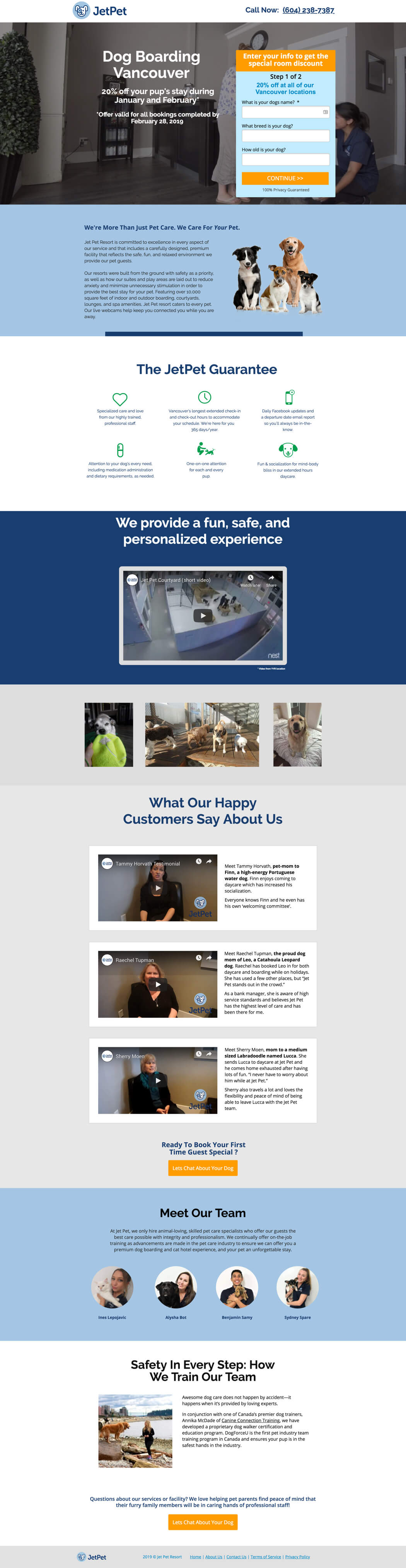
For every person living in Vancouver, there must be at least six dogs. Jet Pet understands this city’s love of pooches, and they’re big fans of using the Unbounce Builder to advertise their premium dog boarding service and three locations to locals. We’ve included it here because this landing page is an inspiration for anyone targeting a select geographic area.
Industry: Pet Care/Boarding
Why it works…
- Clear value statement: A simple heading (“Dog Boarding Vancouver”) lets the searcher know they’ve hit the jackpot. For paid campaigns, Jet Pet can also use Unbounce’s Dynamic Keyword Replacement (DTR) to swap in a search keyword (“Dog Kennels Vancouver”) for improved message match. Then, when a prospect clicks on an ad in Google, they’re brought to a page with a headline that matches their expectations.
- Two-stage form: Typically, using multi-step forms can lead to higher conversion rates than a single, long form. Here, a two-stage form reduces psychological friction in two ways. First, it minimizes the perceived effort in signing up for the service. (And even if the second form proves frustrating, someone who’s already filled out the first form is invested and more likely to continue onward. Sunk cost fallacy FTW.) Second, a two-stage form can delay asking for more “sensitive” questions until later.
- Friendliness: Speaking of the form, I love that the first thing they ask you (and the only required field on the first page) is your dog’s name. I’d expect this question if I walked into one of their locations with my pup on a leash, but seeing the same question here made me smile. Jet Pet’s page is full of friendly gestures like this one that make them memorable.
- Trust building: Trusting somebody else with your dog requires significant peace of mind. So it’s important that Jet Pet uses copy that builds that trust and leaves their customers feeling secure that they’ve left Fido with ”loving experts” who have his best interest in mind. The reassuring language that Jet Pet uses across the page reinforces this message, including emotionally loaded terms like “care,” “safe,” and “love.”
- Video testimonials: You don’t always need a video to have an effective testimonial, but in Jet Pet’s case, I think this is a smart move. There’s a lot of questionable testimony out there, so showing actual dog owners speaking to the camera helps build further credibility. (I’d love to see the dogs in these videos too.)
26. Mooala (Agency: BuzzShift) – Ecommerce: Food and Nutrition

So it turns out you can milk a banana. Who knew? (Mooala Organic, that’s who.) Created by BuzzShift, the landing page reflects the brand’s playfulness and sense of fun embodied by their mascot. It’s also straightforward in a way that inspires a lot of confidence in their product. Cameron Gawley, BuzzShift’s co-founder and CEO, puts the choices here in a whole-funnel context:
This specific page worked well in the consideration phase of our social ads. Our goal was to add value via a coupon, by capturing an email as a soft conversion and then nurture them forward in the rest of the journey. Most brands have a huge opportunity to lower their CPA and increase conversions by focusing more on awareness and consideration.
Industry: Beverages/Dairy Alternatives
Why it inspires…
- From landing page to offline purchase: As Gawley points out, the promise of a coupon does double duty as a soft conversion. It builds an email nurture track and encourages an in-store purchase. Since tasting is believing, this is a crucial component of Mooala’s digital marketing strategy.
- Meeting objections head-on: Banana haters gonna banana hate. But Mooala should be commended for immediately kicking one possible objection to the curb: “What is Bananamilk, you ask? It’s not a sugary-sweet banana smoothie, as you might think.” By boldly tackling this concern, the copy helps reset expectations and promote the product as “a light, dairy alternative that you can enjoy guilt-free.”
- A smartly placed animation: Videos and animations can be extraordinarily useful, but they can also serve as a distraction if not positioned correctly. I love the inclusion of animation at the bottom of the page, where it’ll draw the eye toward the CTA instead of distracting from Mooala’s primary messaging.
- Social queues: Encouraging visitors to follow the brand’s social media accounts increases the opportunities to be delightful and stay top of mind.
27. NANOR (Agency: Webistry) – Ecommerce: Wellness and Gifts
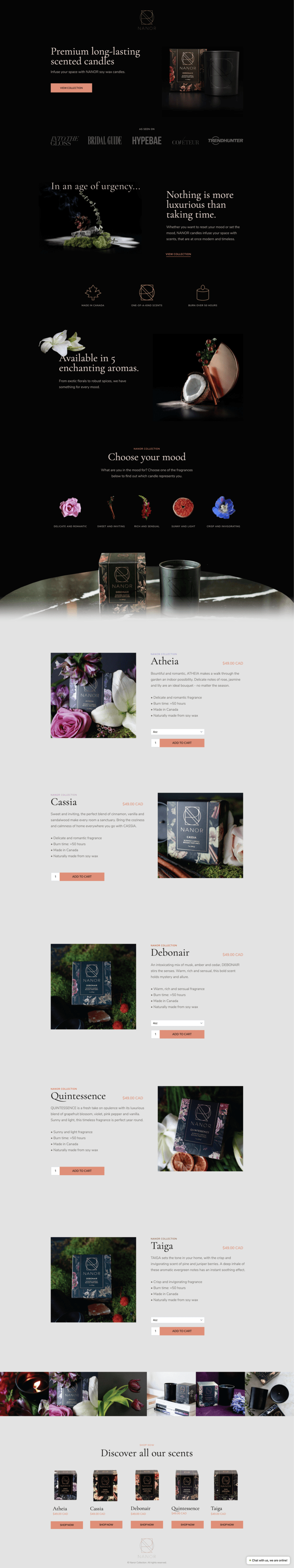
With many ecommerce products, it’s as much about selling the experience as it is about selling the product. Take a look at this page for NANOR scented candles (created by the agency Webistry), and you get an immediate impression of the luxury that’s in store for you. It’s a beautiful page that just makes you want to light one of these bad boys up and get into the bubble bath with a glass of chardonnay.
Industry: Wellness/Gifts
Why it inspires…
- Dark background: This landing page instantly stands out because of the black background. The coloring provides an upscale, premium atmosphere on the page that really helps to put the product in the best possible spotlight as a luxury experience.
- Images you can practically smell: Some items are notoriously tricky to sell online. Candles, for example, seem like just the type of thing that most people would want to smell before they buy. (And until someone reinvents smell-o-vision for the modern era of advertising, that’s gonna be hard to pull off.) This page does a fantastic job of describing each candle aroma and showing off beautiful images of grapefruits, flowers, herbs, and spices to represent each fragrance.
- “Add to cart” button: To make it easy for visitors to buy right on the landing page, Webistry used custom “Add to cart” buttons. Check out their post in the Unbounce Community to see how you can add a Shopify checkout to your landing page.
28. Panda7 (Agency: Webistry) – SaaS: Finance and Insurance
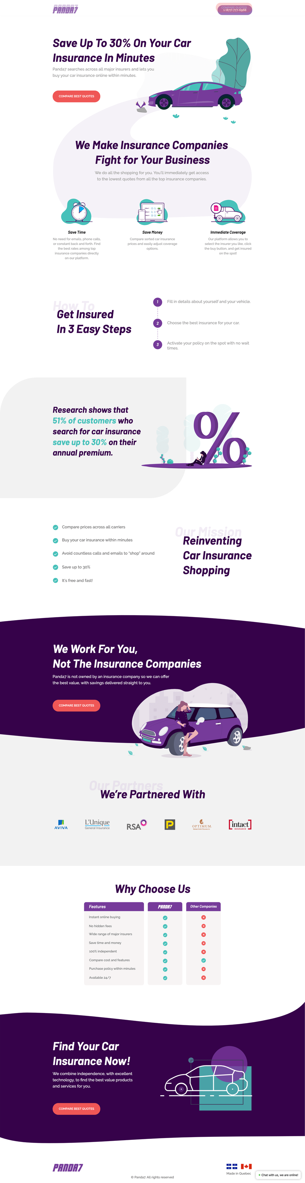
Does anybody actually enjoy the process of getting car insurance? (Unless you’re a talking gecko, the answer is probably no.) You’ve got to contact multiple different insurers, compare their rates, and then painstakingly look through the contracts for hidden fees. But this landing page for Panda7 (another one built by Webistry) promises to make things much easier for drivers—their service lets you compare quotes from all the major insurers and buy car insurance within minutes. Yes, please.
Industry: Finance and Insurance
Why it inspires…
- Clear benefits: The page makes it clear that there are two major benefits of using the service. First, it saves you time by letting you compare the best rates online. Second, it saves you money (up to 30%, in some cases). These two points are made over and over again in several different ways, so you can pick up on ‘em even if you’re skimming.
- On-brand visuals: The page seamlessly integrates the royal purple brand color throughout the page, in everything from the illustrations to the background section colors. Very cohesive, and very professional looking.
- Floating CTA header: Check out that floating header. The button smartly responsively changes from a phone number at the top of the page to the main “Compare Quotes” CTA as you scroll. Very cool.
29. Lyft – Transportation
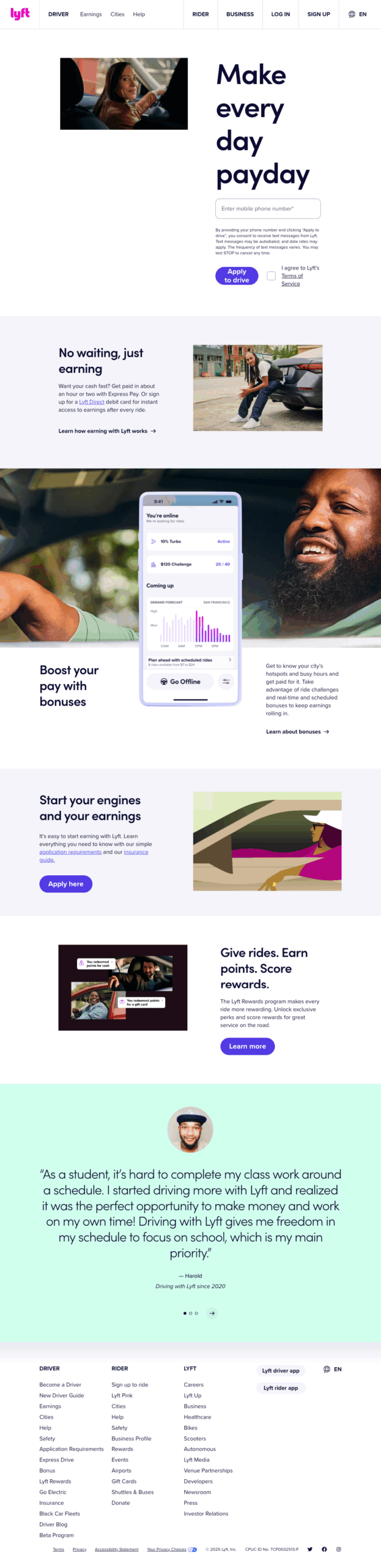
The Lyft driver landing page is a fantastic example of a direct, benefit-oriented design that speaks directly to its target audience. It expertly addresses the key motivations and concerns of potential drivers, making the value proposition clear and compelling from the very start.
Industry: Transportation
Why it inspires…
- Emphasizing core benefits: The headline and supporting copy immediately get to the point, highlighting the most important selling points: quick payments (“No waiting, just earning”) and increased income (“Boost your pay with bonuses”). This speaks directly to some of the primary reasons someone would consider driving for Lyft, capturing their interest instantly.
- Direct and authentic social proof: Lyft features real quotes from their drivers. These aren’t generic testimonials—they include the driver’s name and how long they’ve been driving for Lyft, which adds a layer of authenticity and trust. Phrases like “Driving with Lyft is the perfect way to make money and be there for my family’s needs” resonate with potential drivers.
- Clear and actionable CTA: The primary call-to-action, “Apply to drive,” is placed throughout the page. The button is a vibrant purple, standing out against the white background and making it impossible to miss. It’s a clear, simple instruction that guides the user toward the next step in the conversion funnel.
30. Perfect Keto (Agency: Webistry) – Ecommerce: Food and Nutrition
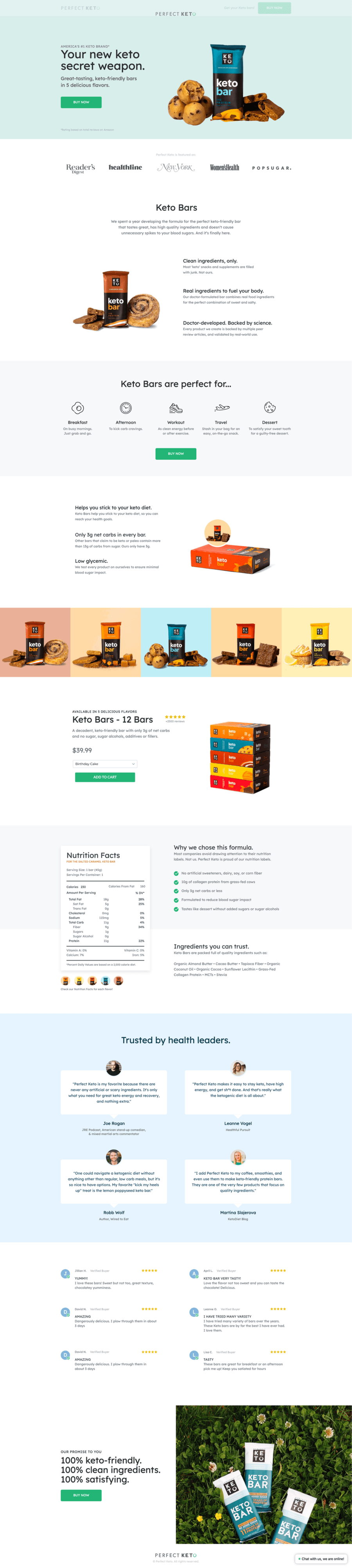
Here’s one more example from Webistry for Perfect Keto protein bars. The page does a great job not only selling these bars as the tasty treats that they are, but also highlighting their health and nutritional value. (Only three grams of net carbs in every bar? That means you could have six bars a day without coming out of ketosis!)
Industry: Food
Why it inspires…
- Healthy social proof: The page includes testimonials from a number of different keto diet influencers and authors. (Including… Joe Rogan? Sure, why not.) But there’s a lot more social proof too—they show off having over 2,500 reviews and having their brand appear in publications such as Women’s Health, Reader’s Digest, and Popsugar.
- Nailing the nutrition question: Keto dieters have to track their nutrition very closely, which is why this page is smart to include a close-up screenshot of the nutrition facts. Visitors can see for themselves the breakdown of calories in each bar, and examine each quality ingredient.
- Includes use cases: About a third of the way down the page, I love the little section that tells you about what situations these keto bars are perfect for. From travel, to workouts, to grab-and-go breakfasts—you can imagine eating these as a snack or a meal in all sorts of different scenarios.
31. Gusto – SaaS: Human Resources
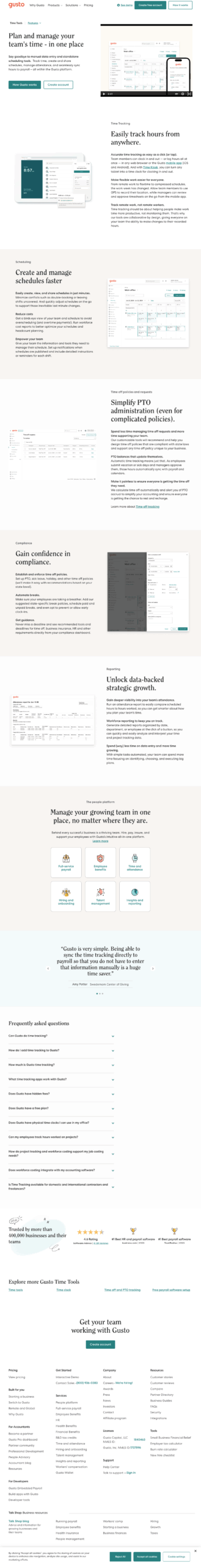
Nobody likes landing pages that feel like a chore to read, and Gusto’s Time Tools page is an example of the perfect antidote. It’s a masterclass in making a complex product feel effortlessly simple, proving that the most effective pages don’t just sell a product—they tell a story about a better, easier way of getting stuff done.
Industry: SaaS – Human Resources
Why it inspires…
- Video demo: The page immediately captures attention with a short video right beside the headline. It visually demonstrates how this tool works, making the functionality—like tracking time and submitting hours—easy to understand. (And it also reveals that the company’s name is pronounced “gustoh,” not “goostoh”.)
- Benefit-oriented copy: The page uses clear, benefit-driven headlines and copy to explain why a business needs this product. The copy isn’t just a list of features—instead, it translates those features into tangible benefits like easy, accurate time tracking, simple PTO administration, and reduced costs.
- Social proof: To build credibility and encourage conversions, the page includes several forms of social proof. Gusto understands that visitors are more likely to trust the word of other customers, so the page effectively uses customer testimonials and trusted customer logos to instill confidence.
32. Roomeze (Agency: Snap Listings) – SaaS: Real Estate

I’ve had my share of bad roommate experiences, so I was immediately interested in this Roomeze landing page by Snap Listings. Their service promises to matchmake you with vetted roommates around New York City and get you set up in an apartment for less than $1,000 a month. I wonder if there’s a way to check to make sure your future roommates don’t play the trombone? (Because trust me. You don’t want a roommate who plays the trombone.)
Industry: Real Estate
Why it inspires…
- Style for miles: Moving can be stressful, but it can also be a lot of fun. The colorful illustrations on this page capture the latter feeling, making you excited about the prospect of a fresh start with new roommates.
- Compelling CTA: The main CTA on the page asks a question: “What can $1,000/mo get you?” If you’re at all familiar with New York City real estate, you know that a lot of places charge an arm and a leg for even a shoebox-sized apartment. The idea that you could find a potentially nice apartment for that price is very compelling.
- Visual form: Check out the bottom of the real estate landing page, where they ask you to fill out a simple form to take the first step. The UX here is pretty great, with the first two questions being simple checkboxes (including illustration visuals) to help get you started. (And for more examples of great real estate landing pages, check these out.)
33. Smalls – Ecommerce: Food and Nutrition
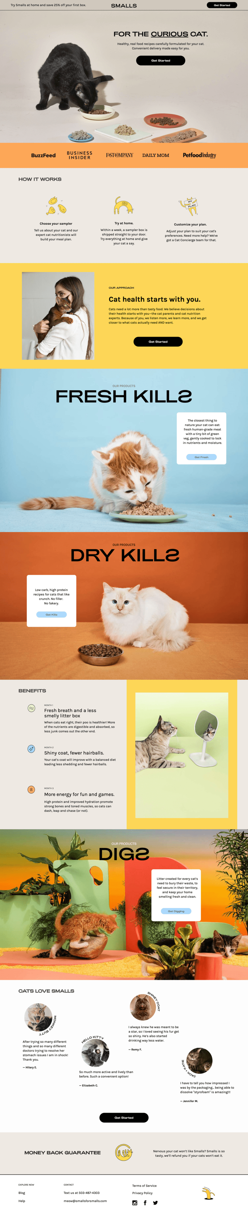
Have you ever tasted cat food? (No, me neither. That would be weird.) I’d imagine that most of it doesn’t taste great though, and it’s probably not too good for you either. But that’s why this landing page for Smalls Food for Cats caught my attention. Their subscription-box service offers human-grade quality food for your feline friends. No fakery, no filler. There are wet and dry varieties that give your cat fresher breath in just one month—which means you can finally see what your cat’s breath smells like when it doesn’t smell like cat food.
Industry: Pet Food/Subscription Boxes
Why it inspires…
- Coupons: For subscription boxes, a coupon or discount can go a long way towards persuading visitors to give it a try. This page highlights that you can get 25% off your first box by using a sticky bar at the top of the page.
- Colors: Orange! Yellow! Blue! The page breaks up each section with a different background color, giving the whole thing a fun and playful feel. (Check out those adorable illustrations in the benefits section, too.)
- Cats: This landing page features over 11 fun photographs of cats enjoying the product, being held by their owners, and admiring themselves in the mirror (no doubt contemplating the delicious meal they just ate). The testimonials even show pictures of cats instead of people! Too. Much. Cuteness.
34. Sundae – SaaS: Real Estate
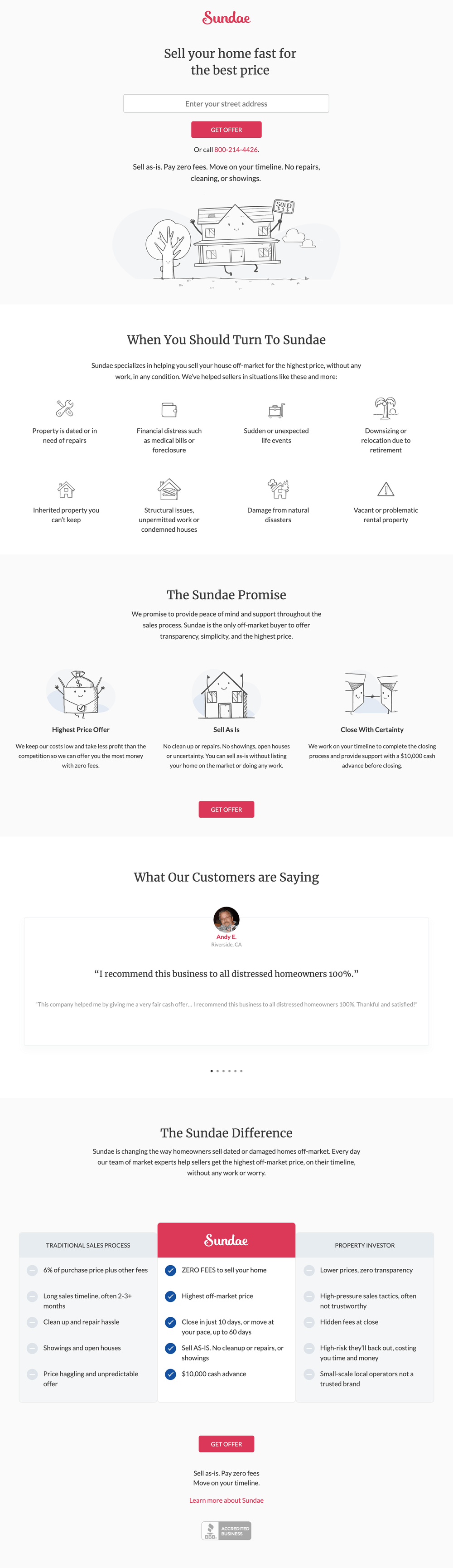
When you own real estate that is dated or damaged, sometimes you just want to sell it as quickly as possible (for as much money as possible, of course). That’s where this landing page from Sundae makes it easy for you—their service helps you sell your home quickly for the best price possible.
Industry: Real Estate
Why it inspires…
- Minimalistic design: This landing page strips away almost all of the photography, animations, videos, and distractions that you find on other pages. It uses lots of white space to give you breathing room as you read, which is important in an industry that often clutters you with information and high-pressure sales tactics.
- Self-identifying copy: There are lots of reasons for someone to use a service like Sundae, and this page smartly calls them out right near the top. Whether you’ve inherited an older piece of property that you can’t keep, have uncovered structural issues, or suffered from natural disaster damage—Sundae specializes in helping you sell your home off-market in any condition.
- Persuasive comparison chart: It can sometimes be risky to directly compare your service to other options or competitors, but this page does it very well. They even highlight their two biggest benefits by putting them in all caps: “ZERO FEES” and “SELL AS-IS.”
35. Wavehuggers – Travel and Leisure

This brilliant landing page connects safety and fun together through carefully selected visuals and clear, concise messaging. According to the designer, this design was all about standing out:
Our goal in creating the page was to cut through the clutter and crowded market of businesses here in southern California offering surf lessons—both on Google and Facebook. Getting each important conversion component (i.e. social proof, urgency, hero shot, CTA, etc.) into the page, mostly above the fold, was tricky but in the end we found a way to segment these out so each part catches the eye.
Industry: Surf Lessons
Why it inspires…
- Yelp score: Even the crummiest of products or services can gather together a few positive testimonials. (“The CEO’s mom thinks we’re cool.”) That’s why high scores from Yelp, TripAdvisor, Amazon, or Google can complement testimonials, as they do here. It’s much more challenging to maintain strong scores on these sites. (Just remember that visitors can always verify your score for themselves.)
- Timed special offer: Like many of the examples here, Wavehuggers add urgency to the landing page with a limited-time promotion. It may not seem like much—this kind of thing is almost a marketing cliche at this point—but even small tweaks like adding “for a limited time only” to a promo code can affect your conversion rates.
- Safety, comfort, fun: Prospects are likely seeking out lessons to feel more comfortable on the water. Everything on this landing page focuses on the promise of a positive experience. The copy on this landing page reassures them throughout that surfing is “not as scary as you might think.”
- Real customers: The photographs here don’t have the polish of some of the others on this list (see Western Rise below), but guess what? They shouldn’t. A stunning stock photograph of a professional surfer hanging ten would be far less effective than these visuals of kids having fun on their boards. From the cursive fonts to the hand-drawn arrows, Wavehuggers’ style reflects the relaxed vibes of surfer culture.
36. Woolx – Ecommerce: Clothing and Apparel
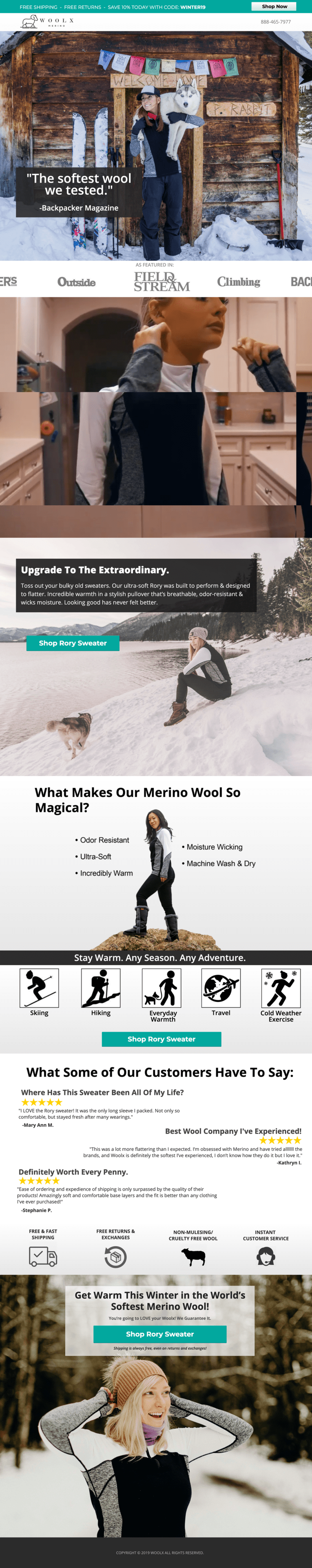
This landing page from Woolx uses high-resolution photography and video backgrounds to give visitors an up-close and personal look at their Rory Sweater. The product is made from 100% Australian Merino wool (that’s a type of sheep, FYI) to provide a stylish, breathable, and ultra-comfy piece of clothing. Now I think I finally understand what “apres-ski chic” means.
Industry: Clothing/Apparel
Why it inspires…
- Eye-catching photography: The photos here span the entire width of the landing page, meaning you can’t help but admire the details of the sweater and imagine yourself wearing it on a snowy winter day. (They’re also making me want to adopt a cute husky puppy, but maybe that part was unintentional.)
- Sticky bar promotion: Check out that sticky bar at the top of the page offering a 10% discount for visitors. Limited-time offers like this are a great way to improve your click-through rate and get people to switch mindsets from browsing to buying.
- Feature video: With apparel like this, it’s important to sell the lifestyle of the brand as much as it is to sell the product itself. The video on the page shows a woman preparing for an early-morning bike ride by lacing up her shoes and zipping up her sweater. It’s a subtle way of reinforcing who the target audience is.
37. Zumba (Agency: MuteSix) – Health and Fitness
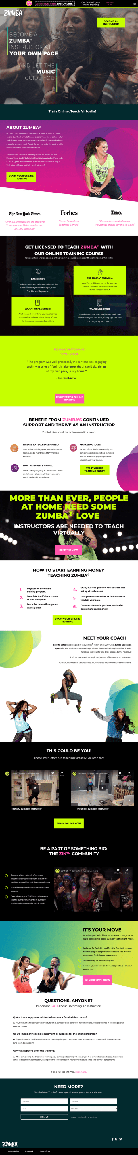
I’m not very good at most exercises. I don’t really have any dance skills. And I certainly don’t have good rhythm. But for some reason… I think I maybe want to become a Zumba instructor now? That’s how good this landing page for teaching Zumba (created by the agency, MuteSix) is. They make it seem totally accessible (and a whole lot of fun) to learn the steps and start teaching.
Industry: Fitness
Why it inspires…
- Active photography: Zumba is all about movement, and this landing page captures that kinetic energy with high-res photos of people jumping, dancing, and laughing. The energy is practically radiating off the page, pumping you up to start your online training.
- Inspiring copy: With words like “booty-shaking” and “fresh music” used throughout the page, the copywriting here helps to hype up visitors as well. Even better, they promise that you’ll “thrive as an instructor” and “be part of something big” when you sign up.
- Supporting videos: With fitness programs, it’s always important to show some video content to give visitors a taste of what it’ll actually be like to try this themselves. The page uses a combination of professional videos and instructor-created content to give you an inside look into the world of Zumba.
38. Mailchimp – SaaS: Marketing
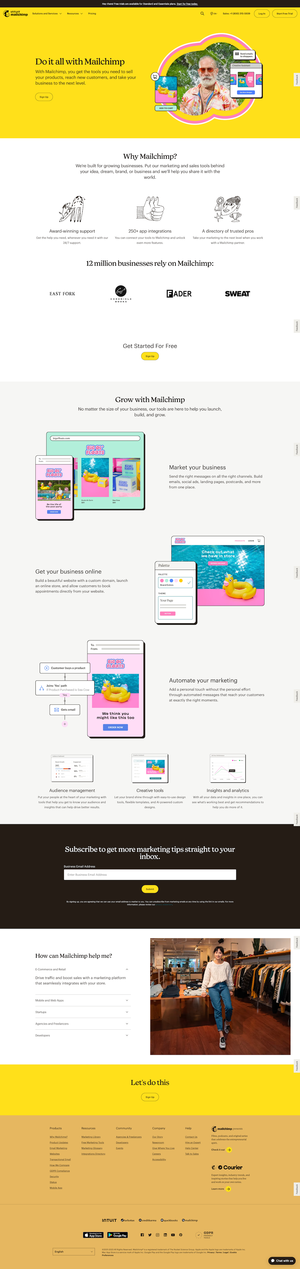
When you land on this Mailchimp page, the first thing that your eyes absorb is the bright, cheery yellow background. (Either that, or the funky-looking dude with the awesome outfit. Gotta admit, I’m kind of jealous of those shades.)
Choosing yellow as part of their brand style was likely a deliberate design choice since that color is commonly associated with fun, energy, and grabbing attention—all core parts of Mailchimp’s brand. This is a great reminder that design elements can be an effective part of boosting your landing pages’ conversion rates.
Industry: SaaS / Marketing
Why it inspires…
- Drawing attention through design: After smacking you upside the brain with the attention-grabbing hero banner, the page’s design maintains an off-beat, yet appealing style with hand-drawn illustrations and brightly-colored screenshot examples. The design makes this page a delight to scroll through, and that can only be a good thing for readers.
- Brief, but beneficial: The copy scattered throughout the page is short, but to the point. As we’ve mentioned in previous examples above, shorter amounts of copy can help increase conversion and Mailchimp manages to describe plenty of benefits in not so many words.
- Personal perspective: Near the bottom of the page, Mailchimp includes a section titled “How can Mailchimp help me?” By using the first person (“me”) point of view, the copy pulls the reader in and makes them feel more involved, which increases the sense of engagement.
39. Spotify – Ecommerce: Audio Streaming
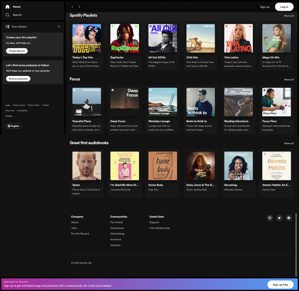
Everybody knows Spotify. Heck, almost everyone is using Spotify. But even for those who aren’t streaming their tunes, podcasts, and audiobooks through this platform, Spotify’s brand recognition is pretty much universal.
That’s why they didn’t waste any real estate on this landing page describing the service or how it works. Instead, the page immediately launches into the main thing that people want from Spotify—streaming audio. Thanks to this simplified design, filling your earholes with the latest tunes, podcasts, or audiobooks is just a few clicks away.
Industry: Audio Streaming
Why it inspires…
- Giving users what they want: As soon as the page loads, you’re presented with a variety of music playlists and audiobooks to choose from. Spotify knows what you’re here for and they’re giving it to you, front and center.
- Minimalist design: The main portion of the landing page is filled with three rows—yup, just three—of audio streaming options, and the left-hand column provides quick access to playlists and podcasts. No unnecessary filler or distracting details on this page—it’s all about providing the quickest and simplest access to streaming audio.
40. Snackpass – Ecommerce: Food and Nutrition
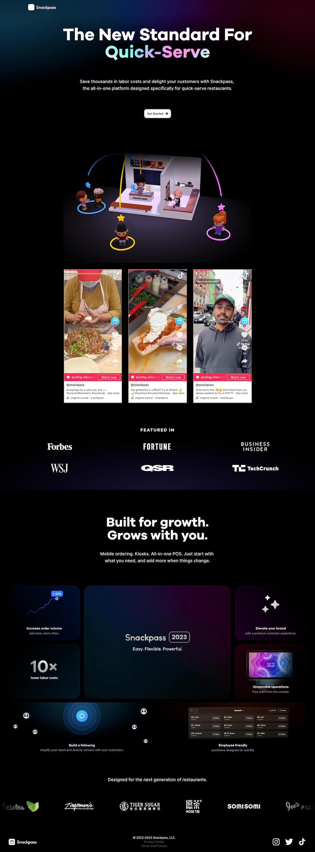
When you’ve got a hankerin’ for brown sugar bubble tea (with mango coconut jelly, of course) or Japanese-style fresh fruit crepes, you don’t want to wait—you want that yummy deliciousness now. Snackpass is a social commerce platform that makes it easy for quick-serve restaurants (like bubble tea cafés and dessert joints) to streamline their operations and reduce customer wait times.
Snackpass’s landing page uses a streamlined design and a heavy social media focus to speak to what these quick-serve restaurants are all about—buzz-worthy snacks that are practically designed to be shared (and drooled over) on Instagram and TikTok.
Industry: Food and Nutrition
Why it inspires…
- It’s all about the socials: When you scroll down past the header copy and admittedly adorable graphic of a quick-serve restaurant, you’re presented with embedded videos from Snackpass’s TikTok feed, showcasing some of the hot new snack joints. The marketing lifeblood of many quick-serve restaurants flows through social media (gotta go viral!), and by highlighting the social feeds Snackpass is basically telling their potential customers: “We understand what drives your business. We gotchu.”
- In the news: As a hot new startup, Snackpass has been making waves in established media outlets like Forbes and TechCrunch. They made sure to broadcast this on their landing page by listing some of the notable news platforms they’ve been featured on, which lends credibility to their brand—not to mention their prospects for the future.
- Visually appealing benefits: Anybody can use a basic (and boring) list of bullet points to describe their benefits. Snackpass opted instead to add simple, yet attractive graphics to each of their benefits, making them easier to understand (and less likely for people to just scroll past them).
Best landing page examples for specific goals
Landing pages can have many different goals, from selling a product to building an email list. To help you better understand which approach is right for you, we’ve broken down some of the most common landing page goals and matched them with examples and benefits from the list above.
| Goal | Example(s) | Why It Works |
| Get signups and leads | Netflix, Amazon | Simplified design with laser-focus on this goal |
| Sell more products | Perfect Keto, Branch Furniture | Highlight benefits, not just features |
| More signups for free trials | Class Creator | Primary CTA is always visible |
| Use storytelling to increase interest | Grass Roots | Creates emotional reaction in visitors |
| Increase registrations | Athabasca University | Attention-grabbing copy, reduced friction |
| Show value quickly | Bariatric Eating | Highlight benefits right at the top |
There you have it. These are some of the best landing page design examples we’ve come across here at Unbounce, selected to represent a wide swath of industries with many different conversion goals. They don’t follow every best practice out there, but we hope you’ve found some landing page ideas that can inspire you.
How to start creating a high-converting landing page
We have a detailed guide for this, but here are the 10 main steps:
- Plan your landing page strategy
- Choose your landing page builder (hint: Unbounce offers a free 14-day trial, no credit card needed)
- Write copy
- Craft CTA
- Select images
- Design the landing page
- Make it mobile-friendly
- Connect your landing page
- Preview and publish
- Set up A/B tests
Then rinse and repeat from there.
Remember—no page is perfect, but every page can be better.And what works for one page (with one target market) won’t necessarily work for you. With this in mind, you should always be testing your landing pages.
Be the Michael Jordan of landing pages
When I was in middle school, I had a friend who gave up playing basketball after watching Michael Jordan in the NBA Finals. “I’ll never get anywhere near his level,” he told me, “So what’s the point?”
Great landing page examples like the ones above should inspire you. But sometimes seeing other people’s awesomeness can have the opposite effect.
But don’t give up!
The good news is that most of these examples were built with Unbounce’s drag-and-drop builder. Though many take advantage of custom scripts to kick it up a notch, almost all these examples started in the same place as you will—with a brand, a blank page, and a big idea. Heck, some of these inspiring landing pages even started as Unbounce landing page templates, though you’d never know it by looking at them. And we’re not tellin’.
So swipe a few ideas from these examples, load up your favorite template, and, yeah… be the Michael Jordan of landing pages.

FAQ: Commonly asked questions about landing pages and conversions
A landing page is a standalone web page designed for a specific marketing campaign with a single, clear goal (e.g., lead generation, product sale). A homepage, on the other hand, serves as a central hub for a website, offering a broad overview of the business and navigation to various sections. It’s important to understand the difference so you can choose the right type of page to meet your goals.
Common mistakes include having too many calls to action, unclear value propositions, distracting elements, long and intimidating forms, and not optimizing for mobile devices.
Matching your primary headline to the ad or email CTA provides a seamless transition for the visitor, focusing on the reason they clicked and landed on your page.
A clear and concise value statement, placed above the fold, helps visitors immediately understand the purpose of the page and the benefit they will receive.
“Above the fold” refers to the content visible on a webpage without scrolling. It’s crucial for a clear value statement to be placed here so visitors immediately understand the page’s purpose.
A/B testing is an essential tool that allows you to test new ideas and elements on your landing page to discover what resonates best with your audience, ultimately improving conversion rates and providing insights into visitor preferences.
While the median landing page conversion rate across all industries can vary, there isn’t a single “good” conversion rate. It’s best to set your own marketing goals and continuously work on improving your current conversion rate through optimization practices.
To improve conversion rates, focus on optimizing headlines that clearly convey the offer and benefits, copy that outlines the value proposition, images that complement the text, compelling calls to action (CTAs) that stand out, and forms that are as short and simple as possible.
Understanding why visitors arrive at your landing page gives you a better sense of your target audience and what their needs are. This allows you to tailor your messaging and offer to their specific motivations, increasing the likelihood of conversion.

Related articles