We’ve all heard the term “less is more”. And we’ve been told this applies for landing pages too. I.e. your forms should be short and only ask for only the bare minimum of required information if you want to convert.
However, when used across the board, this advice can backfire.
As an example, one of the main questions someone typically has when faced with a landing page is is how much your offer will cost. But if the offer on your landing page is for a free quote, you can’t necessarily disclose pricing on the page. When there’s no pricing, but instead a form requiring a name, phone number, and email, the visitor knows:
- They’re going to need to talk to someone to get an answer to their question (they’re well aware you can’t give a customized quote from such limited info), plus, prospects are very reluctant to give their information out to just anyone.
- They can click the back button and find a competitor that will give them what they want faster.
So why would we expect a form with super generic fields to be compelling enough for someone to engage with us in all cases?
As we’ve found at our agency KlientBoost, by increasing the amount of steps and the amount of form fields, we could actually increase conversion rates. The key here for us has been the order in which we present our steps and what info we ask for first.
Can more form fields really increase conversions?
As you may know, adding form fields goes against everything we’ve typically been advised to do:
And while there are certainly cases in which fewer form fields are best, we’ve found adding more of the right form fields in progression can help ease conversion anxiety. When done correctly, it can take your free quote/lead generation landing pages to the next level.
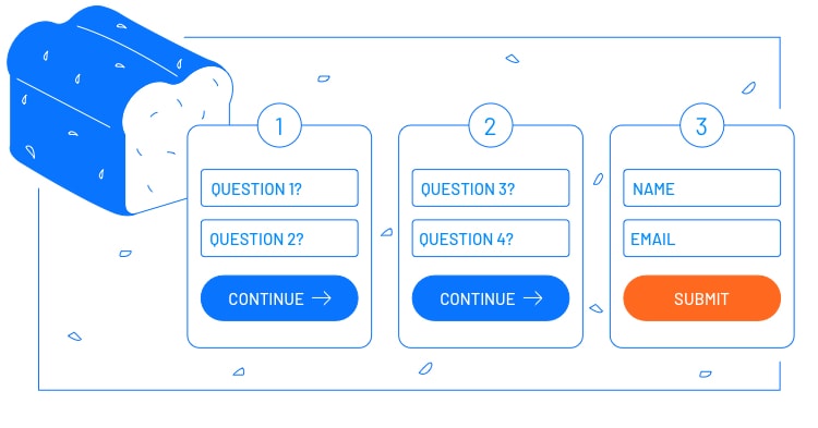
At our agency we call our multi-step form approach the Breadcrumb Technique – think Hansel and Gretel where the breadcrumbs lead them in the right direction.
Experimenting with the Breadcrumb Technique
This is the landing page version of the sales technique called the “Yes Ladder”. It’s the art of eventually getting to what you want (the conversion) as a marketer, by getting visitors to say yes to much smaller requests first.
Instead of having one page and one form to capture leads, you spread the form fields across two or more steps. So potential leads that visit the first page via your ads will fill in a short form and, after clicking the CTA button, they’re directed to the next step.
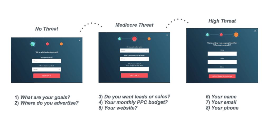
The first step starts with the least personal questions that allow the visitor to stay anonymous, whereas the second (and possible additional steps) ask for more, (albeit) reasonable, personal information. Here’s an example from one of our clients ZipLending. Their landing page offers a quote for rates on mortgages:
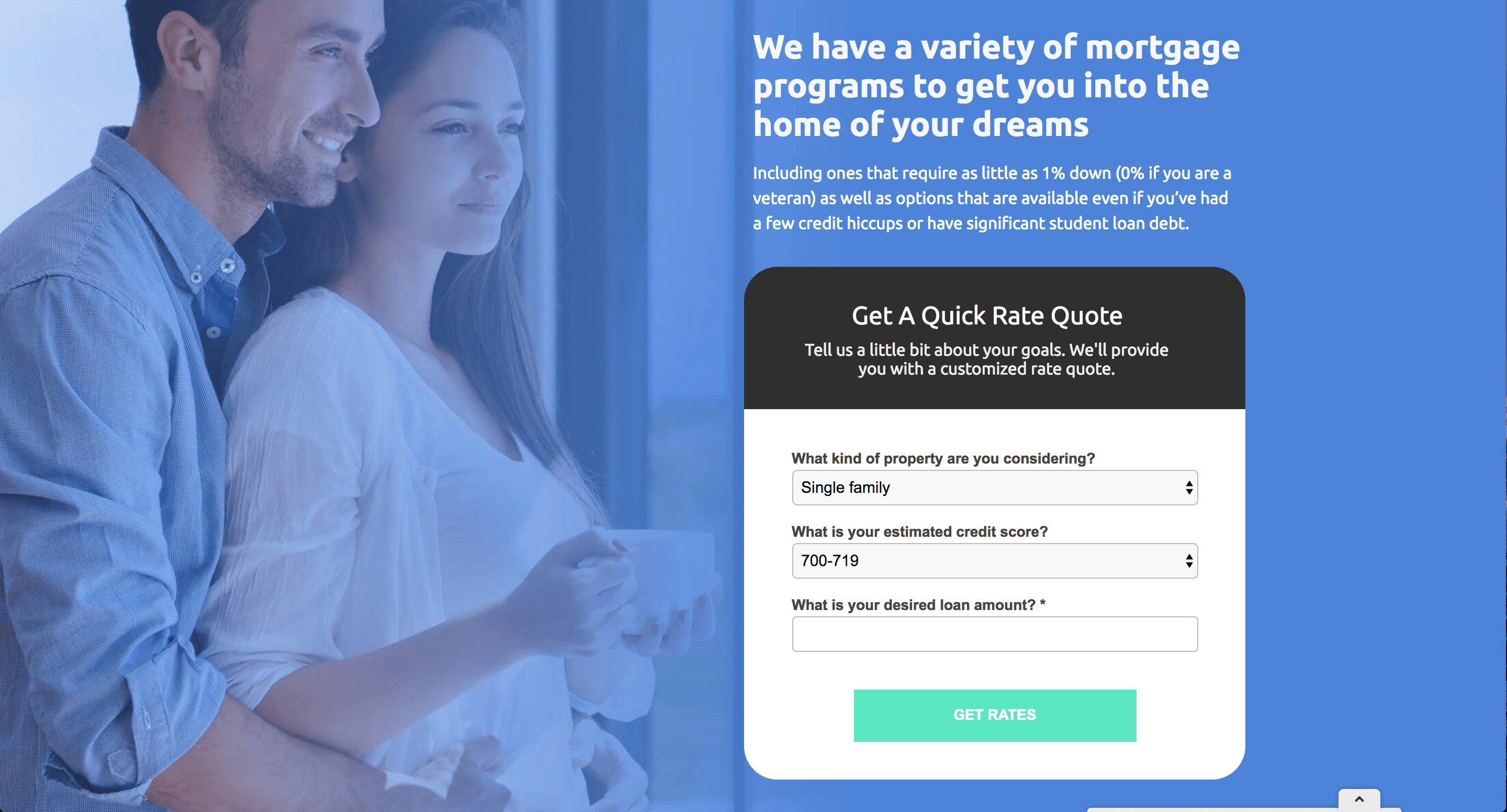
Notice the questions being asked in the step one form:
- What kind of property are you considering?
- What is your estimated credit score?
- What is your desired loan amount?
All fairly low threat questions that allow the prospect to stay anonymous but feel like they’re going to get a quality answer they’re looking for, tailored to them.
Next, they’re directed to the second step form fields:
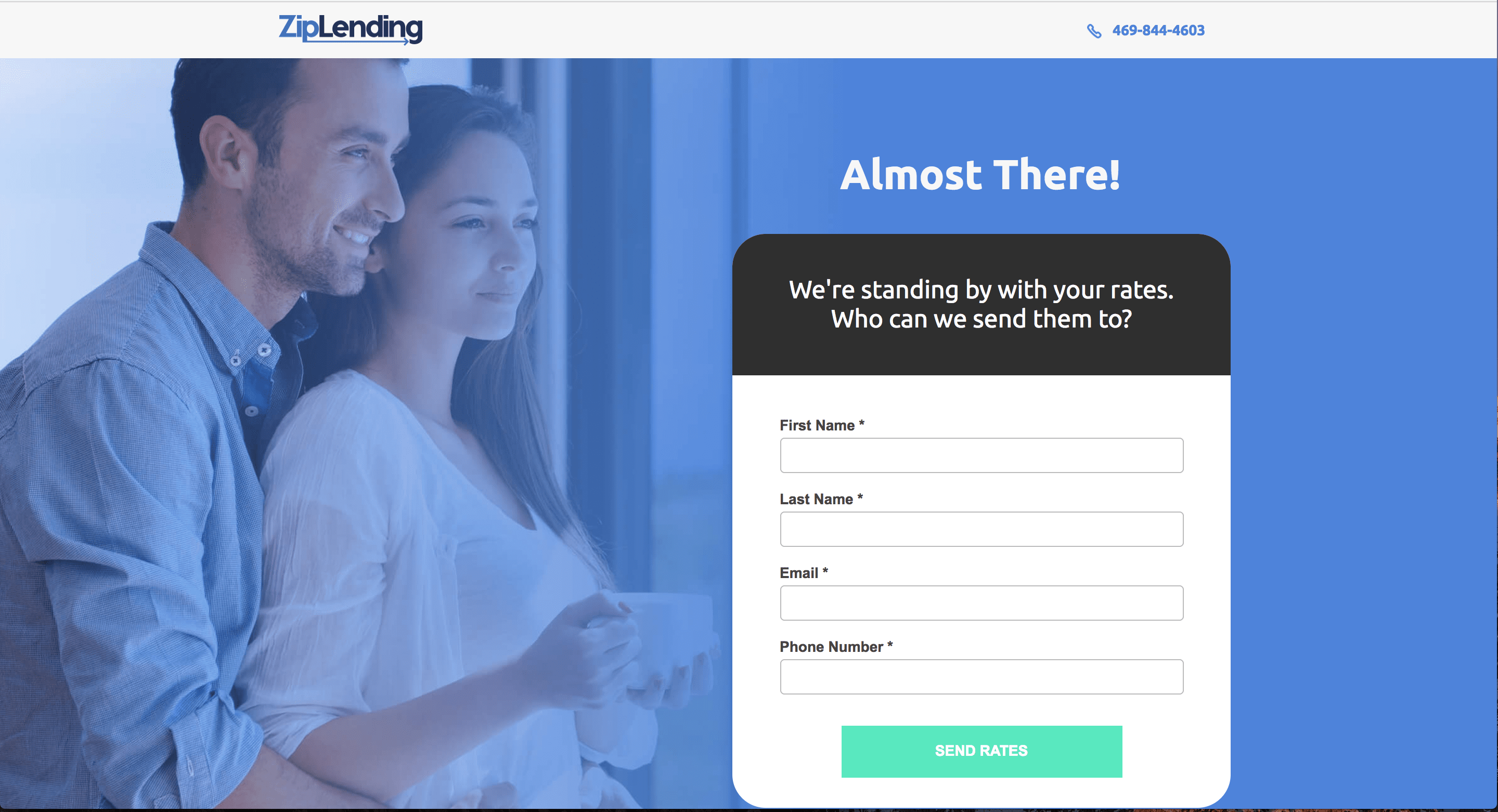
This step asks for more personal information, but logically reminds the prospect we need this information to send custom rates their way.
And while I can’t share the nitty gritty numbers of this test, I can share some high-level results. After the multi-step changes were made in the form above, we were able to bring in 35 more leads for ZipLending from March 2017 to May 2017. The client also noticed they were really high quality leads because of the qualifying questions we had included in our first step.
When we experimented with a multi-step form for another client, Garza Law, we were able to steadily increase the number of leads, bringing in 66 more in March 2018 than in December 2017, for example. Here’s a look at that:
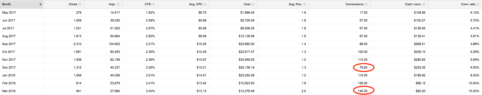
Depending on the industry you’re working with and the typical value of a lead, 35-66 more leads in a given month can be a huge upgrade for a client and it’s why we’re thrilled to be able to deliver this via the multi-step form approach.
Why the BreadCrumb Technique is a cool experiment
If you want to try this with your landing pages, on the first step form, you set up questions pertinent to what the prospect might ask had they called you on the phone. This establishes the custom nature of what they will receive in return.
In the particular example we’ve outlined above, the visitor is interested in getting a no-obligation quote. So surely we’d need certain information on what they’re looking for to be helpful, and because the prospect understands this they’re more willing to participate for the perceived, increased value.
Replacing highly personal, red-flag-raising questions in the first step with questions that help the prospect hone in on exactly what they’re looking for will not only grow your conversions, but often improves lead quality as well.
Additionally, on the ZipLending page, notice the the headline changes between step one and two to let people know that they’re not yet finished with the process.
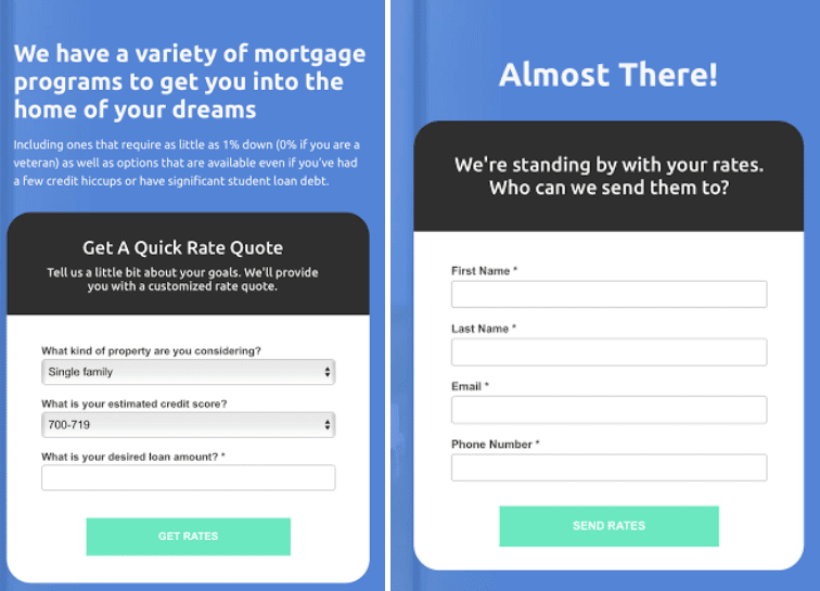
The “get rates” CTA button text also changes to “send rates”. If the language does not differ from your step one to step two, this could cause a drop in conversions as people may think the form just refreshed and they’re done with the process.
The psychology backing up this technique
After filling out the initial questions in step one, the last step of filling out the more sensitive fields like name, email, phone number becomes much easier because of compliance psychology.
Dr. Robert Cialdini said it best:
“Once we’ve made a choice, we will encounter personal and interpersonal pressures to behave consistently with that commitment.” Influence – The Psychology of Persuasion
In other words, once you commit to small things, you’re more likely to continue onto bigger commitments aligned with your initial decision.
Scott Fraser and Jonathan Freedman also conducted research on how to get people to say yes. They went door to door asking people to put up a sign that read: “Drive Carefully” in their front yard, but only 20% of people agreed to this.
They then did the same test in a nearby neighborhood, but this time they asked people to put much smaller signs in their yard. This created the opportunity to get them to eventually say yes to putting up the original, larger signs.
Next time around, 76% people agreed to put up the larger signs compared to the original 20%. Psychology baby!
Following the multi-step model designed to ease visitors into a commitment, here’s another successful built-in-Unbounce landing page example from one of our clients:
The first step
The second step
Successful multi-step forms weren’t a one-time thing for us
What’s cool is that this multi-step landing page technique has worked for us at KlientBoost several times for different clients.
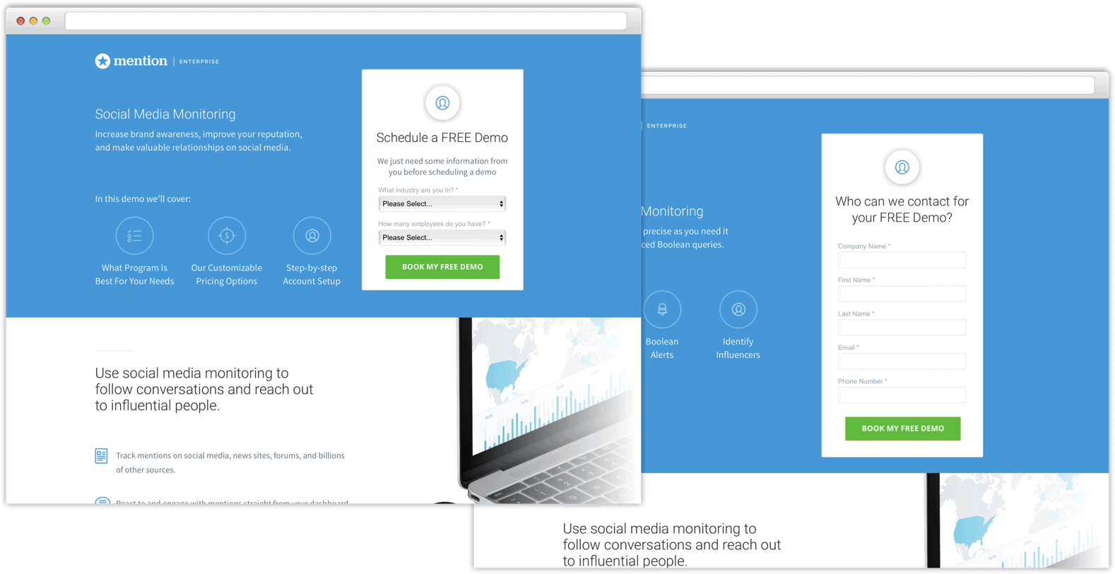
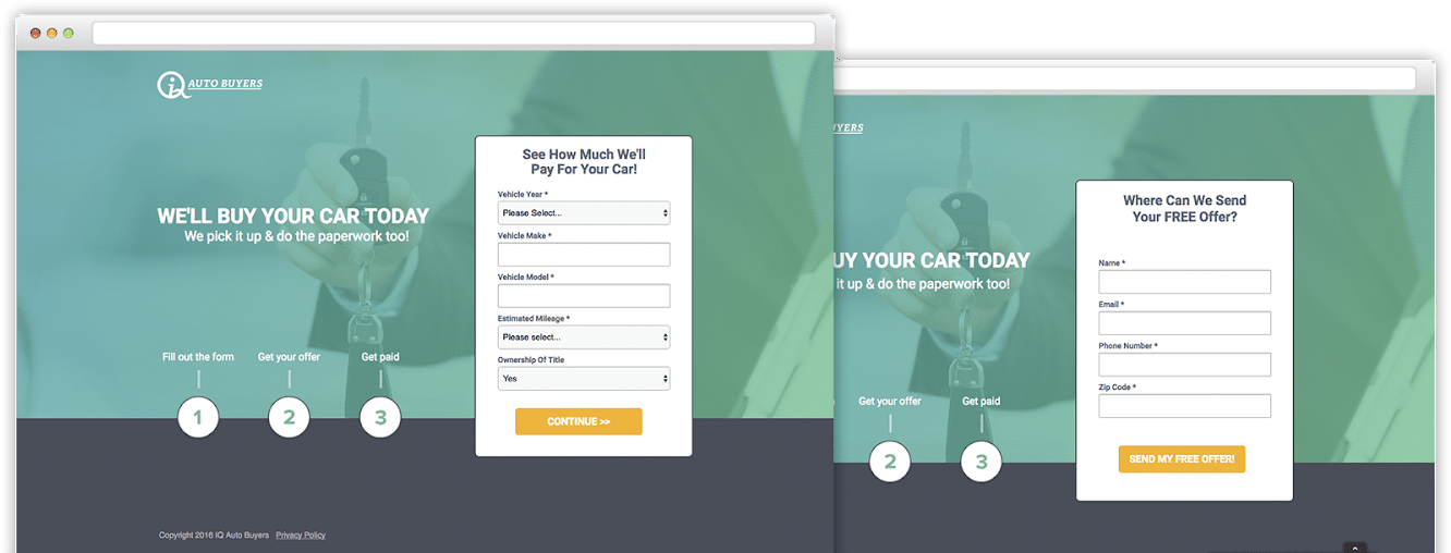
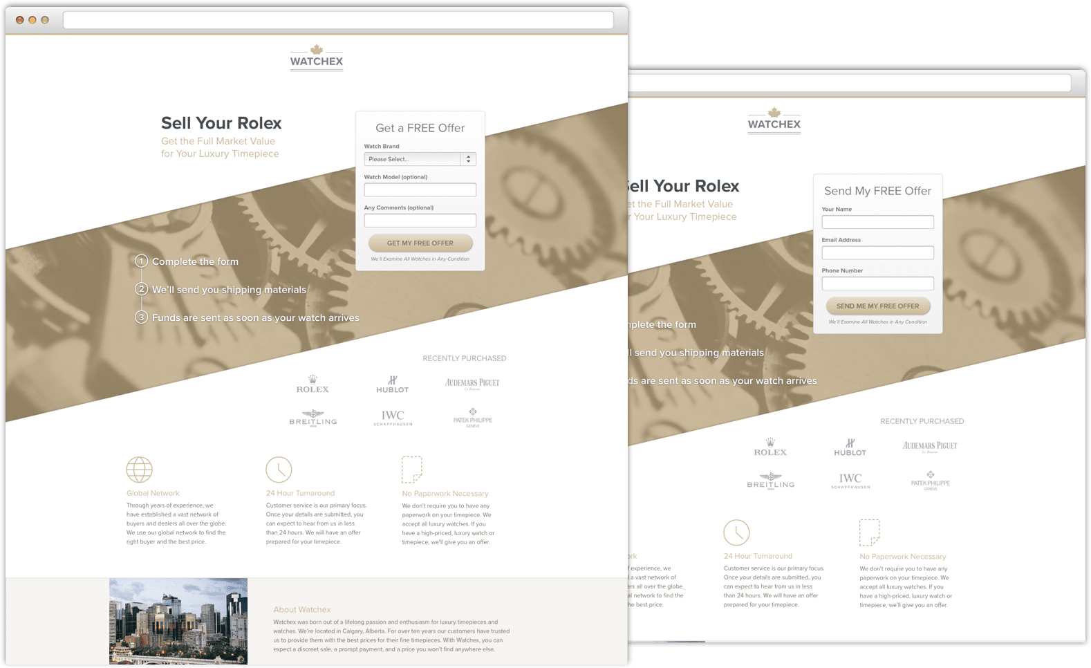
Below you can see our client Mention’s Unbounce landing page offering their free demo, Auto Buyer’s landing page for their offer on your vehicle, and Watchex’s estimate for purchasing your Rolex. These campaigns all followed the same breadcrumb technique:
Progress bars can help light the way
When it comes to multi-step landing pages, something to consider testing is adding a progress bar, or a step wizard. This is especially handy when you have more than two steps, like the following example:
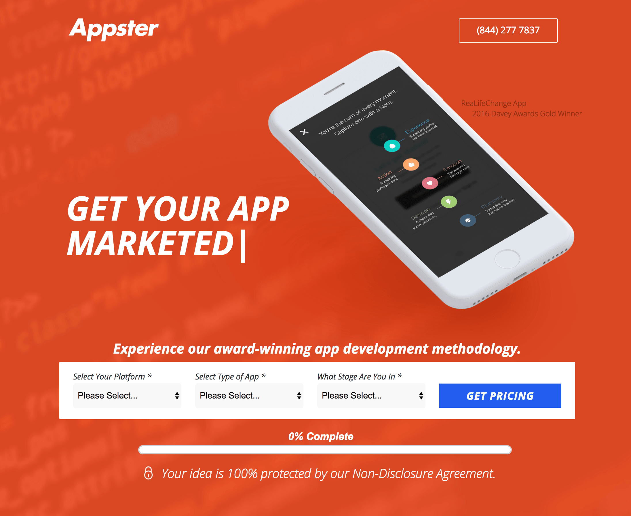
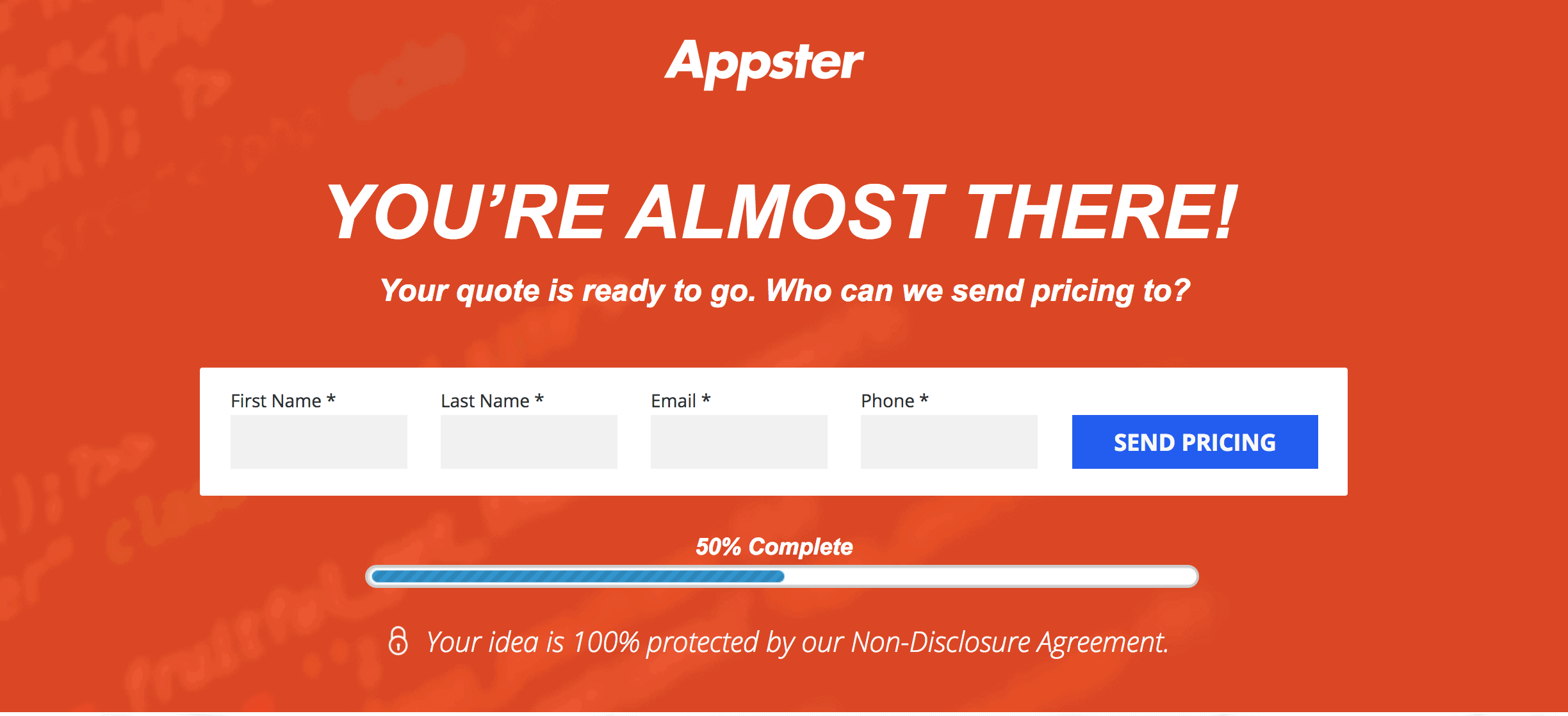
The wizard signals to people just how much they will need to fill out, which can help ease any uncertainty about how much information is required.
How do you try out The Breadcrumb Technique on your Unbounce landing pages?
It’s easy! Instead of having your usual one-step form, head to your form confirmation dialog and make your first-step’s form destination direct to the url of your second step (See below).
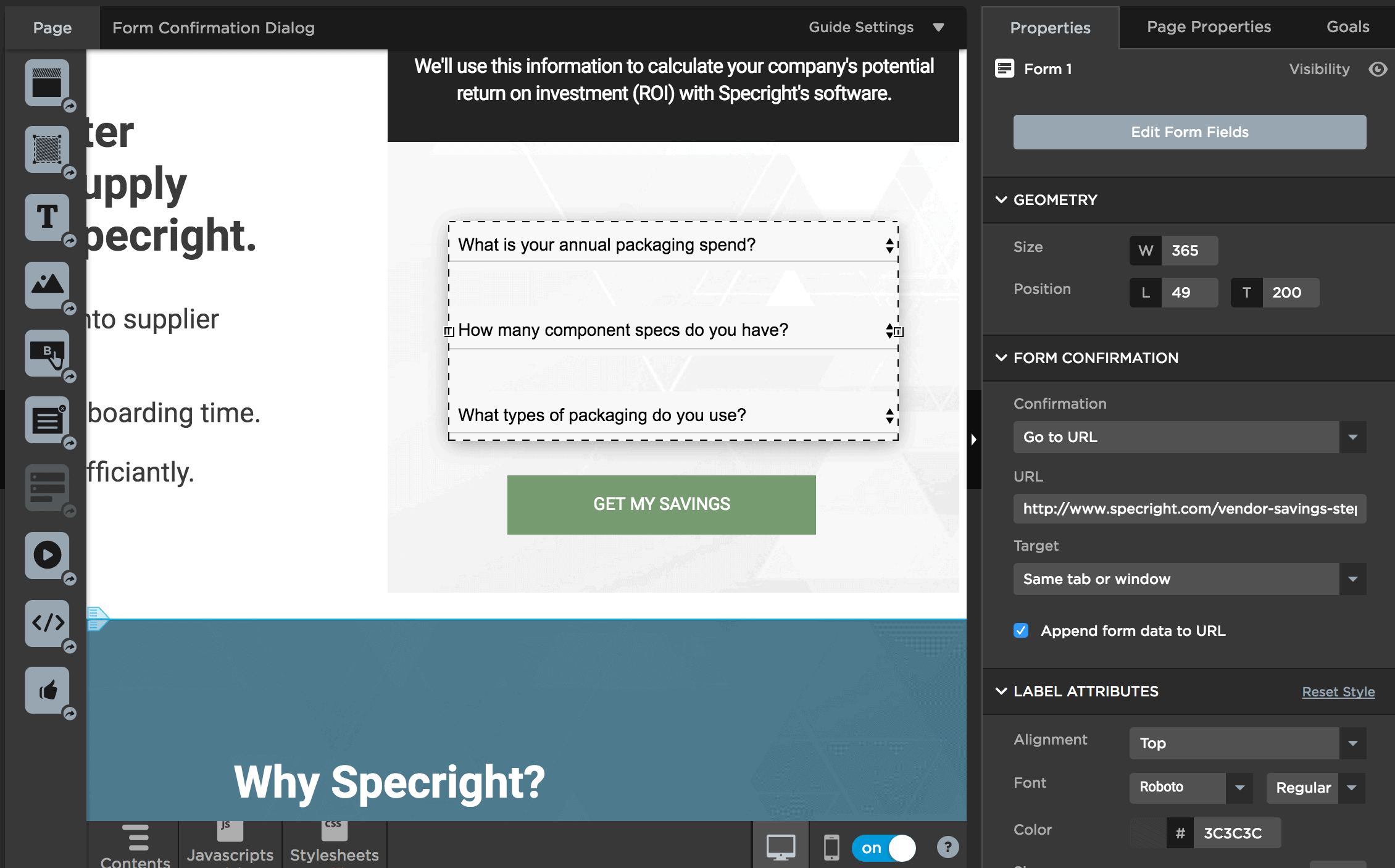
When you select the form in the Unbounce builder, you will see options on the right of where the form confirmation goes. Under confirmation, select “Go to URL”, then paste in the url of the second step form, and make sure that the “Append form data to URL” is checked.
For the second step of the form, you must make sure a very crucial step is completed, otherwise the information from your first step will not pass over and you will not receive a full lead. See below:
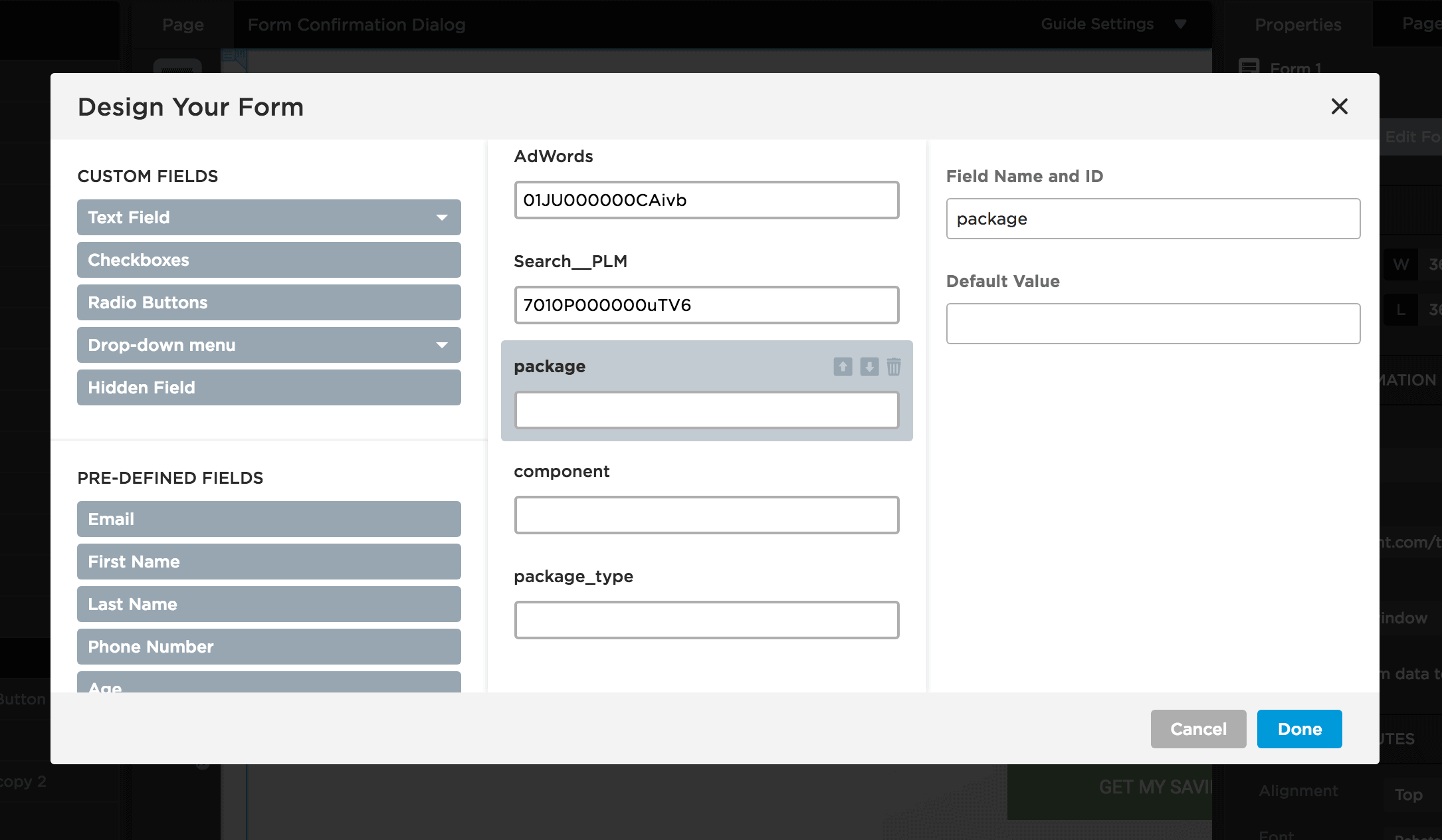
You will need to create hidden fields with the same field IDs of the form fields on your first step. If they don’t match, the information will not pass over. As long as you have all fields from the first step as hidden fields on the second step, you should be just fine.
Now that your first and second step are linked together correctly, you can continue with your regularly scheduled programming of sending the second step form to your form confirmation dialog (or a thank you page). All done!
Unbounce has an easy multi-step function
There’s always more than one way to do something! Although this requires some development work, Noah Matsell from Unbounce has some helpful tips on creating multi-step forms within the same page/url. This means you won’t need to paste in the second form url as the destination of your first form.
Note that this workaround allows you to create a form with one field per step, so this may not work for those who would like to have several form fields appear in a given step, however you can test out what works for you.
To create these multi-step forms on the same page:
Step 1.
Create your form in Unbounce.Step 2.
Create a new button element for your ‘Next’ button and one for your ‘Previous’ button. Keep in mind when positioning these buttons (and your form submission button) that only one field will be shown at a time.Step 3.
Copy the JS from ‘multistep_form.js’ and paste it into the Javascripts section of your page with placement ‘Before Body End Tag’.Step 4.
Update the script with the ID of your ‘Previous’ and ‘Next’ button elements. Tip: Make sure you exclude the ‘#’ in the ID.
Step 5.
Copy the CSS from ‘multistep_form.css’ and paste it into the Stylesheets section of your page.
Test out the technique on your next landing page
It might take a bit of practice to figure out the correct questions to be asking on your first step, or to find out the type of language to use on your form; but that’s what conversion rate optimization is all about: testing and trying new things to see what sticks. Ask the questions your visitors want answers to, and ask the questions your sales people need answers to to give a prospect a more personal answer.
If you give this a try, we would love to hear about your experience with a comment below.
