SaaS landing pages have changed a lot over the years. Long gone are the days of blocky designs, cold informational copywriting, and generic stock photos that show suspiciously-attractive people shaking hands in what looks like a very important business meeting.
To get the best possible conversion rate these days, you need to explain the complexities of your software without boring the pants off your prospects. You need to use authentic visuals that show visitors they can really trust your brand. And you need to target your landing page so the right audience sees it at just the right moment of their customer journey.
Just take a look at a landing page we used to advertise our trial of Unbounce back in our early years, compared to a landing page we’re using today…
And it’s not just us—you can do the same comparison with any SaaS brand that’s been in the landing page game for a long time. The design, copy, branding, tactics…they’ve all gotten better, like little Pokémon evolving into—uh—bigger, better-looking Pokémon. (OK, you got us. We’ve never actually played Pokémon.)
But while SaaS landing pages have come a long way, there’s still plenty of room for improvement. We recently went through and manually reviewed 200 real-world SaaS campaigns to see if we could learn what works (and what doesn’t).
Keep reading to see what we learned in the process, some examples you can use for inspiration, and some tips on how to optimize your SaaS landing pages like a pro this year.
But before we jump into the insights, let’s cover some of the basics first.
What is a SaaS landing page?
A good landing page is a page that’s laser-focused on accomplishing just one goal, whether that goal is to sell “make your own bubble tea” kits or to gather leads for your eBook about why bubble tea is the greatest drink of all time. (Are you thirsty all of a sudden? Us too.)
Luke writes words and stuff for Unbounce. While he likes to use a little alliteration in his work, he’s also aware that readers aren’t always in awe of his atrocious adjective additives. You can follow him on Twitter @LukeBailey.
Paul is a writer on Unbounce’s content team who lives and breathes storytelling (it’s like oxygen but with better plotlines!). Ask him what he’s up to at any given moment and you’ll get answers ranging from folding paper dragons (y’know, origami) to catching up on the latest cool tech, and finding other ways to channel his inner geek.
So it follows that the best SaaS landing pages should be focused on a specific SaaS-related goal, such as selling subscriptions or getting people to sign up for your webinar. And part of the magic behind why a consumer-facing or B2B SaaS landing page can be so great for your bottom line is because it’s designed to maximize conversion.
Sure, your homepage is great for introducing visitors to your organization and providing a general overview of what you offer, but when it comes down to the nitty gritty of actually getting visitors to convert, a SaaS landing page is your most effective tool.
And it’s pretty versatile, too. You can start building hype for your upcoming service with a SaaS pre-launch landing page, or create a SaaS product landing page to show off your product in its best light. You can also use a SaaS pricing landing page to help convince customers that it’s totally worth it for them to fork over their hard-earned dollars because of the value they’re getting in return.
If you’re eager to have a look at some great examples of SaaS landing pages that knocked it out of the park, feel free to jump down to them. Otherwise, keep reading as we explore how you can create SaaS landing pages that really, well, land with your audience.
What are the essential elements of a SaaS landing page?
Here’s your recipe for creating the best SaaS landing pages. By adding these ingredients you’ll be able to whip up high-converting SaaS landing pages that’ll supercharge your conversions.
Unique selling proposition (USP)
Before you do anything else, start by answering this question: What is it about your service or product that makes it stand out from the competition? The answer to that question is your unique selling proposition, and by identifying that you’ll be able to set a direction and focus for your SaaS landing page. Basically, everything on the landing page should, in some way, be connected to the USP.
Hero section
This is the top of the page (“above the fold”) that contains your headline and hero image. A good headline will grab attention while also clearly identifying the purpose of the page, so visitors immediately understand where they’ve arrived. It also shouldn’t be too long. (Does this sound a bit, um, challenging? Thankfully we have a solution for that.)
The hero image is the first visual element that visitors see when they arrive on the page. You know that old saying, “You never get a second chance to make a first impression”? Don’t waste your chance—by including a strong hero image, you’ll set a good tone for the rest of the page. (We’ve got a lot more to say about hero images here.)
Page design
Speaking of good impressions, the overall design of the page can say a lot about your product and brand even before the visitor reads a single word. By keeping the design clean, uncluttered, and focused on the objective of the page (sign-ups, lead gen, etc.) you’ll be better able to nudge visitors towards taking action.
A feature is a detail about a product, like “this car has heated seats.” The benefit explains why you want that feature, such as “so you can keep your buns toasty warm even during frigid temperatures.”
Use short, punchy copy (and images, if it makes sense to do so) to describe your product’s features and benefits. Remember, the point here is to clearly explain why visitors will want what you’re selling.
Comparison tables are a great way to lay out features and benefits in a way that’s easy for readers to scan through, and maybe even show how your product stacks up against (i.e. dominates) your competitors.
Social proof
Remember that time you were chatting with a friend or coworker and they were raving about the new restaurant that you just have to try out because it was so awesome? You probably felt tempted to pull out your phone and make a reservation, right then and there.
Social proof on your SaaS landing page works in a similar way. By including a recommendation or testimonial from a reputable source, you signal to your visitors that your product is, indeed, as amazing as it seems to be.
Demo video or animation
If your product or service is a bit more complicated or difficult to explain, consider inserting a video or animation. This way you can show your visitors how great it is, rather than just tell them, and help them understand how it will fit into their lives (and budget).
Call to action (CTA)
There’s an old sales maxim that says, “The most important part of selling is asking for the sale.” (Otherwise you’d just stand there in an awkward silence?) The CTA serves this vital purpose by nudging the visitor towards taking the action you want them to take. (If you want to dig deeper into CTAs, we’ve got you.)
It’s perfectly fine to include multiple CTAs on a single landing page, as long as they all point towards the same destination. Don’t include multiple CTAs that link to different pages or you might find your conversion rate dropping like the vase your cat just knocked over.
Forms
If your landing page’s purpose is to collect leads, you’ll need to include a form. (No kidding, Captain Obvious.) To reduce friction and increase the likelihood that visitors will actually hand over their details, keep the form as short and easy to fill out as possible.
Mobile optimization
The majority of people who visit your landing page will probably be doing it through their phones, so it’s essential that the page is optimized for smaller screens. If you force visitors to view a desktop-formatted landing page on their smartphone, your bounce rates will skyrocket.
27 examples of modern SaaS landing pages that do it right
Looking for some inspiration for your next campaign? Here are 27 SaaS landing page examples, some of which were built in Unbounce, that impressed us with their smart, tailored approaches to copy and design.
1. Confluence
Click to see the entire page.
Industry: Online collaboration and information sharing
Description:Confluence is an online workspace where teams can create, collaborate, and organize in one place.
What we love about this page:
Snappy subheader: “Confluence is your organization’s single source of truth.” This short and punchy subheader gets straight to the point.
Real feedback: Sprinkled with multiple testimonials throughout the page, adding a dash of trust and credibility.
Crisp copy: Utilizes short copy with engaging headers and subheaders, making the content a breeze to read.
Plan previews: Offers a sneak peek at different plan tiers, making it easy for users to compare options and pick the best fit.
2. RingCentral
Click to see the entire page.
Industry: Business phone communication
Description:RingCentral helps you stay in touch with customers and teams through AI-powered phone calls, SMS, faxes, and more on all your devices.
What we love about this page:
Trust galore: Features social proof and trust badges that shout reliability from the rooftops.
Chat ready: A handy chatbot is always there for immediate responses, helping to clear doubts on the fly.
Show, don’t tell: Abundant screenshots visually demonstrate the service in action, so users know exactly what they’re getting.
Bite-sized content: Boasts short, digestible copy that’s easy on the eyes and heavy on information.
3. CloudTalk
Click to see the entire page.
Industry: SaaS
Description: CloudTalk provides sales and support teams with a unified voice software that offers international coverage and AI voice agents.
What we love about this page:
Compelling copy: Kicks things off with a headline that actually says something. CloudTalk tells visitors what it does and who it’s for—no jargon, just clarity that clicks with the right audience.
Proof in numbers: Real reviews and customer logos show up with one strong stat: teams save 1–2 hours per day on onboarding. That’s not just proof—it’s persuasion.
Say it loud: Calls to action aren’t hiding. Bold colors and straight-shooting copy (“Start free trial,” “Book a demo”) guide visitors without confusion or clutter.
Clarity over hype: Screenshots show off AI smarts, from auto-transcriptions to real-time call summaries with bite-sized captions that explain just enough. No guessing, no fluff.
4. Gusto
Click to see the entire page.
Industry: HR
Description:Gusto is an all-in-one platform that provides many of the tools needed to hire, pay, and manage a team.
What we love about this page:
Quirky design: Sports fun, hand-drawn style elements across icons and backgrounds, giving off major friendly vibes.
Minimalist magic: A clean, minimalist design paired with simple visuals and succinct copy keeps the focus sharp.
Positive vibes: Uses checkmarks beside bullet points, subtly nudging a feeling of positivity and accomplishment.
Award-winning: Lists accolades to showcase its recognized excellence, boosting its bragging rights.
5. Kajabi
Click to see the entire page.
Industry: Online courses
Description:Kajabi offers a robust platform tailored for creating, marketing, and monetizing online courses.
What we love about this page:
Dynamic visuals: Utilizes animated GIFs to vividly demonstrate key features.
Social proof: Multiple forms of social proof including testimonials.
Accessible entry: Features several “Start for free” CTAs to lower entry barriers.
Interactive assistance: A chatbot is readily available to engage visitors.
Competitive edge: Provides comparisons with competitors, showcasing its advantages.
FAQ: Addresses common queries to reduce uncertainties.
6. Restream
Click to see the entire page.
Industry: Livestreaming
Description:Restream equips you with everything needed to create a high-quality live stream directly from your browser.
What we love about this page:
Engaging hero image: An animated GIF captures attention right off the bat.
Casual design: Hand-drawn elements contribute to a friendly, informal atmosphere.
Corporate customers: Lists high-profile customers, adding layers of credibility.
On-hand help: Features an easily accessible help button for instant support.
Compelling testimonials: Uses customer stories to illustrate real-world benefits.
7. GoTo Connect
Click to see the entire page.
Industry: Communication and collaboration software
Description:GoTo Connect seamlessly modernizes and centralizes your communication, enhancing customer engagement with its cutting-edge cloud-based solutions.
What we love about this page:
Navigational ease: A row of links acts like a table of contents for quick access to page sections.
Instant interaction: A chatbot provides immediate answers, enhancing user experience.
Established trust: Displays trust badges to reassure potential customers.
FAQ: Addresses common questions at the bottom, enriching user knowledge.
8. Keap
Click to see the entire page.
Industry: CRM and business automation
Description:Keap simplifies customer and marketing management for small businesses with its comprehensive CRM and business automation tools.
What we love about this page:
Inviting hero image: Features a friendly face, welcoming visitors right away.
Commitment-free trial: Offers a “Try free” option without needing a credit card.
Process breakdown: Clearly explains the automation process in simple terms.
Ready responses: Includes a chatbot for real-time inquiries.
FAQ: Provides answers to frequently asked questions for further clarity.
9. UserTesting
Click to see the entire page.
Industry: Customer feedback
Description:UserTesting offers a dynamic platform to observe and understand real-time reactions from people as they interact with your designs or products.
What we love about this page:
Educational video: A video in the hero section clearly explains how the platform functions.
Interactive chatbot: Ensures questions are answered instantly, improving user experience.
Innovative layout: Uses horizontal scrolling to add visual interest and break the traditional scroll.
Diverse applications: Showcases different use cases and user types to demonstrate versatility.
Solid social proof: Strong endorsements reinforce trust and credibility.
10. Birdeye
Click to see the entire page.
Industry: Reputation management and digital customer experience
Description:Birdeye drives multi-location business growth through advanced reputation management, social media insights, and customer experience strategies.
What we love about this page:
Eye-catching hero image: Grabs attention and sets the tone.
Interactive pop-up: A small, persistent pop-up for contact and demos adds functionality without being intrusive.
Impactful statistics: Clearly articulated stats highlight the benefits, enhancing decision-making.
Visual trust: Scrolling customer logos and detailed testimonials provide proof of effectiveness.
Convenient messaging: An easy-access message popup facilitates quick communication.
11. Xero
Click to see the entire page.
Industry: Accounting software
Description:Xero offers cloud-based accounting solutions designed to simplify financial management for small businesses globally.
What we love about this page:
Compelling hero section: Combines a benefit-driven headline with an eye-catching image and trust badges.
Visual diversity: Uses different backgrounds to separate sections clearly, enhancing readability.
Detailed illustrations: Small, hand-drawn elements underscore key features subtly.
Industry-specific solutions: Lists various use cases, helping prospective customers identify with the product.
12. Bitly
Click to see the entire page.
Industry: URL shortener
Description:Bitly provides efficient link management and URL shortening services across social media, SMS, and email platforms.
What we love about this page:
Sleek design: Clean and uncluttered, focusing user attention on key actions.
Immediate utility: Allows users to start shortening URLs right below the fold.
Concise copy: Bullet points make the information easy to absorb.
Social proof: Features testimonials, although adding names could further enhance credibility.
13. Connecteam
Click to see the entire page.
Industry: Team communication and collaboration
Description:Connecteam offers a comprehensive suite for communication, task management, time tracking, and scheduling, positioning itself as a superior alternative to Slack.
What we love about this page:
Direct comparison: Clearly highlights its advantages over Slack with a dedicated comparison chart.
Engaging CTAs: Multiple “start for free” calls to action lower entry barriers.
Personal touch: Includes testimonials with names and ratings, adding a layer of trust.
Accessible support: A messaging popup ensures support is just a click away.
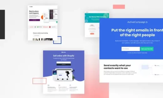
14. Shopify
Click to see the entire page.
Industry: Ecommerce platform
Description:Shopify provides a fully customizable website builder designed to empower merchants by simplifying the creation and management of ecommerce sites.
What we love about this page:
Quick start: Users can begin by simply entering an email address.
Clear value proposition: Promises a website creation in minutes, appealing to time-sensitive users.
Visual guidance: Includes screenshots of currently existing Shopify sites and step-by-step building instructions.
Human element: Photos of the support team add a relatable, personal touch to the service.
15. Workstatus
Click to see the entire page.
Industry: Time tracking and productivity
Description:Workstatus optimizes team efficiency with its advanced time tracking software, designed to streamline management and enhance productivity across all team types.
Free trial that’s truly free: Offers a free trial without the need for credit card details.
In-depth content: Provides extensive details for those interested in deep-diving into functionalities.
Organized information: Uses bullets for easy reading and comprehension of key points.
16. Invision Freehand
Click to see the entire page.
Industry: Collaborative workspace for online teams
Description:Invision Freehand acts as a central hub for teams to collaborate seamlessly, integrating tools for complete project and product development lifecycle management.
What we love about this page:
Visual demonstrations: Animated GIFs across the page showcase important features dynamically.
Prominent testimonials: Features feedback from reputable organizations, enhancing credibility.
Interactive hero section: Visually engaging elements in the hero section depict the app’s functionality.
17. Microsoft Teams
Click to see the entire page.
Industry: Communication and collaboration app
Description: Part of the Microsoft 365 suite, Microsoft Teams enhances team collaboration with chat, video conferencing, and integrated file storage solutions.
What we love about this page:
Informative updates: Keeps users informed with the latest developments and news.
User guidance: Provides tips and tricks to maximize the use of Teams.
Success stories: Includes case studies demonstrating how various organizations leverage Teams for success.
18. SurveyMonkey
Click to see the entire page.
Industry: Survey and customer feedback platform
Description:SurveyMonkey enables you to deploy tailored surveys for various applications like market research, feedback collection, and competitive analysis.
Quick start: Allows users to choose templates and start surveys with minimal clicks.
Prominent branding: Features logos from notable customers, adding to its credibility.
19. Jobber
Click to see the entire page.
Industry: Home and commercial service software
Description:Jobber streamlines service business management by offering tools for quoting, scheduling, invoicing, and receiving payments all in one cohesive platform.
What we love about this page:
Visual appeal: Large, vivid images that break up text and clearly illustrate the benefits.
Feature showcase: Multiple screenshots effectively demonstrate the software’s features.
Customer endorsements: Features multiple testimonials, enhancing credibility and trust.
20. TunnelBear
Click to see the entire page.
Industry: VPN
Description:TunnelBear provides a straightforward and user-friendly VPN service, emphasizing simplicity and security.
What we love about this page:
Thematic consistency: Uses a fun bear motif throughout the page to create a memorable brand identity.
Clarity in communication: Short copy points that clearly explain features and benefits.
Detailed security information: Offers comprehensive details about security and safety—crucial for a VPN service.
Helpful FAQ: Addresses common user concerns and questions.
21. Remote
Click to see the entire page.
Industry: HR
Description:Remote simplifies global employment processes, allowing companies to onboard, pay, and manage international employees and contractors with ease.
What we love about this page:
Unique design: Features dynamic design elements with a distinctive spherical globe motif.
Visual engagement: Includes animated elements to draw attention and add emphasis.
Conciseness: Uses short, well-written copy that communicates key information effectively.
Navigation cue: An arrow above the fold in the bottom left corner encourages scrolling.
Interactive support: A chatbot and FAQ section provide immediate assistance and information.
22. Brandwatch
Click to see the entire page.
Industry: Consumer intelligence platform
Description:Brandwatch offers robust solutions in consumer intelligence and social media management, helping brands harness the power of social insights.
What we love about this page:
Subtle animations: As users scroll, key elements subtly shift to capture attention without being distracting.
Prominent clients: Displays logos of notable customers, boosting trust and authority.
Branded aesthetics: Uses brand colors in copy headers to draw attention to key terms.
Ready assistance: Features a chatbot for real-time user engagement and support.
23. Mixmax
Click to see the entire page.
Industry: Sales engagement platform
Description:Mixmax is a sales engagement platform that boosts pipeline growth for organizations by automating routine tasks and optimizing the workflows of sales and customer success teams.
What we love about this page:
Customer-centric headlines: Unlike many SaaS landing pages that focus on the product, Mixmax emphasizes the visitor’s needs.
Engaging copy: The text speaks directly to the user with phrases like “De-clutter YOUR email. Prioritize YOUR focus. Automate YOUR day.”
Benefits highlighted: Clearly outlines the advantages of the software, centering on how it solves problems for the user.
Resonant framing: Uses a visitor-oriented approach that makes a strong connection with the audience.
24. Miro
Click to see the entire page.
Industry: Collaborative workspace for online teams
Description: Miro is a visual workspace designed for innovation, where teams can manage projects, design products, and build collaboratively.
What we love about this page:
Alternative to live demos: If visitors are too busy for a full demo, Miro offers a short demo video as an effective alternative.
Clean design: The landing page boasts a clean, uncluttered layout with ample white space, enhancing focus on important elements.
Effective copy: Utilizes short and impactful text to communicate key messages quickly.
User experience reflection: The simplicity of the page mirrors the seamless user experience of using Miro itself.
25. Peakon
Click to see the entire page.
Industry: Employee engagement and feedback platform
Description: Peakon, a Workday platform, enhances employee engagement through real-time analytics and actionable feedback, enabling organizations to improve their workplace culture and productivity.
What we love about this page:
Emphasize social proof: At the bottom of the funnel, it’s crucial to use social proof to reassure visitors. Peakon excels by showcasing logos from prominent companies.
Simplified form: Features a straightforward form to encourage sign-ups.
Objection-handling microcopy: Includes reassuring text such as “Peakon is free to try for 30 days. No credit card required.”
26. Shoelace
Click to see the entire page.
Click to see the entire page.
Industry: Growth marketing
Description: Shoelace assists businesses by managing paid marketing and implementing growth strategies to scale brands across various digital channels.
What we love about this page:
Pop art design: The landing page features on-brand illustrations and animations, enhancing its appeal.
Engaging copy: Emphasizes the problem and introduces the downloadable deck as a fun and attractive solution.
Secondary CTA: Includes a “book a demo” option in the top navigation bar. Despite deviating from typical landing page practices, the secondary CTA effectively caters to visitors already familiar with the solution and ready to engage further.
27. HiPeople
Click to see the entire page.
Industry: Hiring
Description:HiPeople streamlines the collection of comprehensive talent insights, enhancing hiring decisions with rich data.
What we love about this page:
Trusted ratings: Showcases ratings from G2 and Capterra, highlighting widespread approval.
Real experiences: Includes both written and video testimonials to enrich credibility.
Visual how-to: A video demonstrates the platform’s interface for ease of use.
Clear guidance: Features a “How it works” section that navigates users through the process.
Simplified content: Employs short, straightforward copy for quick comprehension.
The big problem: SaaS marketers are converting less
For the 2024 Conversion Benchmark Report, our team of data scientists (yep, they have lab coats) have been using machine learning and a rigorous methodology to study more than 44,000 landing pages and 33 million conversions.
One of the perks of working here is that we got an early look at some of their research. And we don’t want to sound overly dramatic here, but one data point made us raise our eyebrows two-and-a-half inches higher than usual…
On average, SaaS landing pages convert 10.46% lower than the overall conversion rate baseline.
This means that SaaS pages are less likely to convert than the majority of other industry landing pages covered in their in-depth research—including ecommerce and education pages. (“Whaaaat?!”)
Now there could be a few reasons for this. For starters, software can be pretty intangible and boring-looking, making it harder to market. (Although, believe it or not, we have seen some supersexy bookkeeping platforms.) It can also be complicated to explain in simple terms what your software does, who it’s for, and what all the different features do that make it special. Plus, most SaaS businesses are targeting a very specific niche, in an industry that’s constantly changing—and there’s typically a longer sales cycle, too.
All of these challenges add up to make SaaS landing pages a particularly tough nut to crack. And Talia Wolf, the Founder and Chief Optimizer at GetUplift, says they often cause marketers to miss out on what’s really driving conversions on their landing pages…
Most SaaS marketers know what a great landing page looks like. They get the concept of focusing on a singular offer and leading visitors down the funnel. But there are other parts they miss out on ALL THE TIME. Strategy, emotion, persuasion, and most importantly—creating a customer-centric landing page. If you don’t go back and optimize for these things, then your page will never get the results you really need for your business.
– Talia Wolf
Yikes! It might be a bias we have here at Unbounce, but we believe you should never “set it and forget it” with your landing pages. (Though, we totally get how easy that is to do with all you’ve got going on.) To score those above-average conversion rates, you need to optimize each page before and after you hit publish.
And by optimize, we don’t just mean tweaking your button colors. To shape up your landing pages the way the experts do, you’ve gotta make smart decisions based on data and research. Track who is visiting your page and understand what they’re looking for. Use tools to discover whether your copy is actually resonating. And record what happens after someone clicks your CTA.
Because it’s only if you keep iterating and optimizing over time that you’ll be able to uncover the true conversion potential of your landing pages.
What is the average SaaS landing page conversion rate?
This is an important question to ask because it’s the key to knowing if all of your optimization hard work is paying off, or if there’s more you need to do.
By digging through the Conversion Benchmark Report, you can see that SaaS landing pages have an average conversion rate of 9.5% and a median conversion rate of 3.0%. (Not sure about the difference between average and median values? This should clear it up.)
If your conversion rates are falling below the figures above, then it’s time to get to work.
SaaS landing page trends (a qualitative look)
We spent a couple of weeks studying 200 randomly-selected SaaS landing pages built in Unbounce. The goal was to look for qualitative trends and commonalities between the pages, and get a sense of what a high-converting SaaS landing page looks like.
Our methodology was pretty straightforward. We’d open a SaaS landing page, check it for some of the different elements, then mark it off in a spreadsheet. We went with a smaller sample size (200) that was manageable enough for us to take a self-guided look and satisfy our own curiosity.
Before we dive into the data though, there is one other caveat. While we did our best to keep only the pages that looked, felt, and smelled like SaaS, some of the sampled companies might not sell their software on a purely subscription basis.
Sound cool? Then let’s get to the good stuff…
What types of landing pages are SaaS marketers creating?
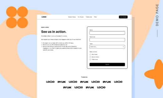
The most popular type of SaaS landing page we saw was the “Demo/Consultation Page.” Marketers are using these to get visitors to try a demo of their software or reach out for a free consultation to learn more. No surprises here—it’s that classic “try before you buy” approach that gets leads in the door.
“Sign-Up Pages” were the next-most popular at 24%, which skip the demo and ask visitors to get started right away with either a free trial or paid plan. These work well at the bottom of the funnel—but you’ve gotta make sure you target them properly so only the decision-ready people are clicking onto your landing page. Otherwise, you’ll just end up scaring folks away.Coming in third place were “Lead Magnet Pages” at 21%. These are your webinar registration pages, your ebook download pages, and… well, that’s pretty much it, actually. Seems like those are still the two most popular ways to get top-of-funnel leads into your email database.
How long is the average headline on a SaaS landing page?
Here’s an interesting data point—the average H1 headline we saw on these SaaS landing pages was 44 characters long, which usually comes in at less than eight words. In general, this gives you just enough space to communicate the problem your software is going to solve for visitors. (E.g., “Rescue Customers When They Need Quick Support.”)
And while we know we tend to think the shorter, the better when it comes to headlines, that’s not always the case. As we went through these 200 pages, one thing we noticed was that the shortest headlines were usually just the names of the software or literal descriptions of what they did (e.g., “AI Dialer”). This is a classic mistake that SaaS marketers tend to make—making the landing page all about you and your software, and not enough about the problem you’re solving or the people who need it most. (Further proof? Words like “You” and “Your” only appeared in about 27% of the H1 headlines on the SaaS pages I sampled.)
Curious about what other problems are plaguing SaaS landing pages? CRO expert Talia Wolf has identified three other mistakes marketers make and put together step-by-step instructions on how to solve them in the epic new guide—How to Optimize Your SaaS Landing Pages.
What types of images are SaaS marketers using in their hero section?
When it comes to the images being featured at the top of SaaS landing pages, there were a few surprises. For starters, it seems like most marketers are still choosing to show off their software at the top of the page (40%), rather than a photograph of people (27%) or an illustration (8%). This is despite the fact that many SaaS brands have moved towards using illustrations on their websites in the last couple of years. Seems like marketers are choosing to go literal on their landing pages, instead.
Even more surprising? Almost one in four SaaS landing pages are choosing to use no images at all in their hero section. This isn’t a bad strategy—cutting down on the design elements of your page can help visitors focus on what’s important (like your headline and that big, beautiful CTA) and help your content load faster too.
How many SaaS landing pages use social proof?
Social proof is one of the most valuable things you can have on your landing page. Not only does it build trust with your visitors, it can also help to highlight key software benefits and features that you want prospects to know about.
And yet—only 54% of the SaaS landing pages we sampled featured a testimonial of some kind. (And that number gets even lower if you only count the testimonials that feature photos of the customer and their real, full names.)
But you don’t have to take my word on why you should use social proof—here’s a testimonial (omg, see what we did there?) from Andy Crestodina, Co-Founder and Chief Marketing Officer at Orbit Media.
When you say it, it’s marketing. When your customer says it, it’s social proof. This is why testimonials are so powerful. The substance is better; it’s an objective, third-party perspective. The style is also better; it’s more authentic, less polished.
– Andy Crestodina
How distraction-free are SaaS landing pages?
Here’s some good news! When it comes to keeping your landing page distraction-free, most SaaS marketers seem to be on board. 91% of the pages we sampled had no top navigation, and 73% of them had only one, singular CTA for visitors to click on. Keeping eyes on the prize—that’s the landing page advantage.
What are the most popular CTA buttons?
Your CTA has to do a lot of heavy lifting. Not only should it inspire action from your landing page visitors, but it should also make it clear exactly what will happen when someone clicks through.
The word cloud above shows which CTA buttons SaaS marketers are using most frequently on their landing pages. “Get Started” and “Get Free Demo” are two of the most popular phrases, with other classics like “Start Your Free Trial” and “Try Now” coming in close behind.
Should you include a form on your landing page?
The majority (72%) of SaaS landing pages we sampled feature a form of some kind for visitors to fill out. This means rather than have visitors click-through to a sign-up flow or some other registration page, marketers are opting to collect lead info right on the landing page itself.
The forms we saw ranged in type and size. The largest had over 10 fields to fill out, including mandatory boxes asking for your “Type of Organization,” “Job Title,” and “Company Website.” (It also had a box at the end asking if you had any “Questions/Comments.” Which, of course you do. But this landing page form probably isn’t the best place to put them.)
The average number of form fields came in between four and five, with the shortest forms asking you to only fill out one thing: your email address.
SUBSCRIBE
Don’t miss out on the latest industry trends, best practices, and insider tips for your marketing campaigns
Are you ready to start optimizing?
Every year, SaaS landing pages keep getting better. More marketers in this industry are becoming optimization experts in their own right, which means they know how to target the right people with their campaigns, use copy that taps into visitor emotions, and drive more conversions.
To help you optimize like a bonafide expert, Unbounce has teamed up with Talia Wolf and ActiveCampaign to create an epic guide. Inside, Talia has identified the four biggest problems on SaaS landing pages today (like having a UX that bleeds visitors) and is sharing the customer-centric checklist she uses to make sure her client campaigns are high-converting.
Get actionable insights, expert advice, and practical tips that can help you create high-converting landing pages, improve your PPC campaigns, and grow your business online.