You’ve heard the word before. Marketers, copywriters, and salespeople talk about attention all the time. It’s like a nervous tic, always sitting on the tip of the tongue.
It’s curious, though, because another word that marketers don’t often use is “patience.” And patience is just as important.
Sure, our first objective is to gain the attention of our prospects. But with sign up pages, it’s also about making that registration process as painless and as easy as possible. In other words, it’s not enough just to get your visitors’ attention—you shouldn’t test their patience either. Not with additional questions. Not with confusing copy. Not with incongruent design.
As UX expert Steve Krug once famously put it, “Don’t make me think.”
Today we’re going to cover 15 examples of sign up pages that get both patience and attention right. But before we get our hands dirty, let’s take a closer look at what a sign up page is.
What is a sign up page?
A sign up page is a dedicated landing page that turns visitors into users, customers, or subscribers. It’s that simple.
For software companies, your sign up page might lead people straight into starting a free trial. For ecommerce brands, it could be where shoppers create an account or join your email list. And for service businesses, it’s often where potential clients take that first step to work with you.
The magic of a sign up page is its focus—it’s built for one thing only: getting those registrations. Nothing more, nothing less.
Why you need dedicated sign up pages
Picture this: A visitor clicks “sign up” from your blog post and—bam—they’re staring at a blank form asking them to enter their email and choose a password. No context. No explanation of what happens next. Just a form floating in space. That’s what happens without a dedicated sign up page, and it’s a conversion killer. Here’s why you need one:
Less friction, more conversions
When potential customers hit a dedicated registration page, they know exactly what they’re getting into. Your sign up page tells the full story—what they’ll get, how it works, and why it matters. This context builds confidence, and confident website visitors are way more likely to complete your signup process.
A guided experience that works
Think of your sign up page as your digital sales rep. It walks your target audience through what to expect, answers key questions, and removes doubt. Without this guidance, you’re basically asking people to make a decision in the dark. And in the dark? That’s where form conversions go to die.
Control over the journey
A dedicated landing page lets you craft the perfect path to conversion. You can test different messages, tweak your user friendly flow, and optimize every element that matters. When you know exactly where and how people are converting, you can make it better every single time.
Valerio is a SaaS copywriter and content creator with a passion for tech and combat sports. Armed with a PhD.c in North Korean propaganda studies, he lives in Bangkok with his partner and his dog, who he tortures all day long with his tone-deaf singing. He wiles away his days playing story-driven open-world games, and reading comics and popular physics books. You can read more about him @ Copygun.com.
Paul is a writer on Unbounce’s content team who lives and breathes storytelling. (It’s like oxygen but with better plotlines!) Ask him what he’s up to at any given moment and you’ll get answers ranging from folding paper dragons (y’know, origami) to catching up on the latest cool tech, and finding other ways to channel his inner geek.
Josh is the founder of Backstage SEO, an organic growth consulting firm that helps B2B SaaS companies capture demand from search. He’s a self-proclaimed spreadsheet nerd by day, volunteer soccer coach by night (and weekends), and wannabe fantasy football expert every fall.
Here are the main types of sign up pages you’ll run into—and when each one makes the most sense.
Multi-step account creation
Think of these as the choose your own adventure books of the signup process. Instead of hitting users with one massive form, you break the account creation flow into digestible chunks. Each step feels like a small win, making the registration process less daunting.
Here’s why they work:
Users create accounts without feeling overwhelmed
Form fields appear one step at a time
The signup process simple and clear
Perfect for complex products or services
Email collection pages
Sometimes, you just need an email. These pages are all about making newsletter signup dead simple. No password fields, no twenty questions—just an email signup form that gets straight to the point.
The magic here? Your user’s email address is the only thing standing between them and your valuable content. When you’re offering something really good, that’s all you need.
Quick registration pages
These registration pages are built for speed. Users fill out a bare minimum of info and boom—they’re in. It’s perfect when you need a signup form that doesn’t scare people away with too many questions.
The key is keeping it ultra-focused:
One simple form
Clear error messages
Strong form conversions
Essential info only
Wanna learn how other SaaS marketers use landing pages to connect with customers? See how you can get a handle on your business and achieve unprecedented growth in our guide for SaaS marketers from Talia Wolf.
Essential elements of a high-converting sign up page
Like most landing pages, a high-converting sign up page must have some essential elements, like:
A clear benefit-driven headline
Your headline needs to grab your target audience’s attention right away. Instead of a generic “Sign up,” tell website visitors exactly what they’ll get. Think about what makes new users click—then make it pop with eye catching design elements that draw them in. “Start creating stunning designs today” beats “Sign up” every time.
Copy that provides any necessary details
Keep your essential information clear and user friendly. Your copy should focus on allowing users to understand exactly what they’re getting—and when. The best effective sign up forms don’t overwhelm with details; they give you just enough to feel confident clicking that button.
An attractive, eye-pleasing design
Your signup page needs to look sharp and professional. Build a user interface that feels hassle free from the first glance. Look at any good form example from top companies—notice how the design helps you focus on what matters.
A compelling call-to-action
Your call to action button is where everything comes together. Whether it’s for a free trial or business account, make your sign up button impossible to miss. The best simple signup form pairs a strong visual CTA with text that makes clicking feel natural and exciting.
“But wait.”
Yes, you there with your hand raised.
“Where’s the form?”
Exactly!
A great sign up page is one that might as well be yelling, “Look, ma. No hands!” You want to keep the f-f-f-friction to a minimum, either by keeping your form as short as possible or even hiding it until the right might moment. (Some smart examples of this tactic below.)
You can do this by having them click on the call-to-action, and voilà! A form appears, seemingly out of thin air. From there, you’ve got options. Will you lead them down a multi-page sequence? Or will you collect their email and get them to log onto your platform, where they’ll be prompted to follow dopamine-triggering queues? Or will you email them and start nurturing them that way?
15 great sign up landing page examples
A great sign up page follows all the principles of a great landing page with the aim of getting people to willingly hand over their details. Since we have 15 examples to review, let’s focus on actionable takeaways.
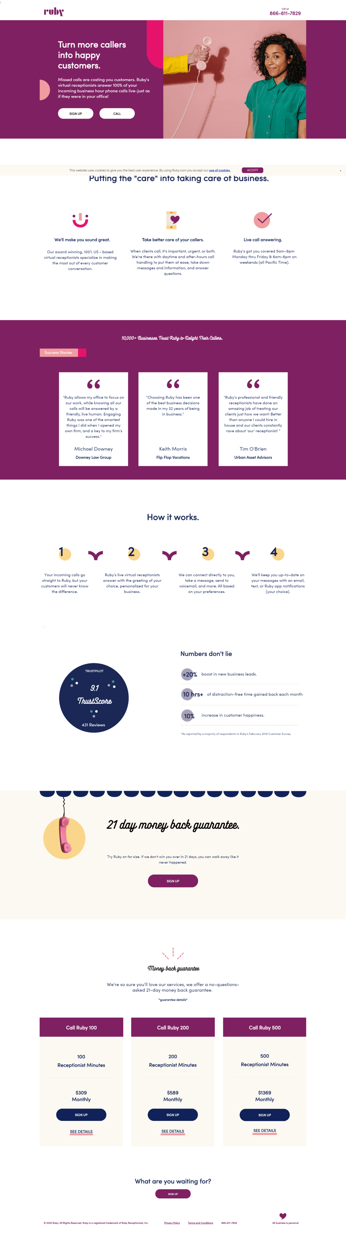
1. Ruby (registration sign up page)
Image courtesy of Ruby. (Click to see the whole thing.)
Ruby is a virtual receptionist and chat company that gets the power of branding. Their gorgeous above-the-fold setup for this landing page is a perfect example of sign up done right.
Key points about this sign up page example:
Direct headline: Make more sales when people reach out to you. They promise to help you create “happy customers” while you’re at it.
Clear body copy: The first sentence (“Missed calls are costing you customers”) is a swift punch to the gut. Hit ‘em where the pain point is. Then, tie that to your offer, with a bow. Well done.
Striking hero image: The yellow sticks out like a broken thumb, and the hand is tightly gripping the phone. There’s a clear gap between the caller and the target audience, symbolizing silence. Her expression. What is she thinking? This isn’t your typical stock image.
Two buttons: We’d probably A/B test this setup against a single button, since you can easily find their phone number on the top right-hand corner. It might yield higher conversion rates.
Also, comparing this sign up page with Ruby’s homepage illustrates the different approach you need to take with your landing pages:
Fair headline, right? Unlike the sign up page, though, it ain’t about the target audience at all. “Meet Ruby” sounds a lot like something you’d say when introducing someone at a party. The body copy focuses on the company too. And the CTA? “Watch OUR Video.”
But the most significant difference lies in all those menu options. Buttons are popping out at you from almost every corner. That’s five buttons you get exposed to even before you start scrolling. Everything is calling for your attention, and you’re more likely to begin exploring than to convert.
This works for a homepage, of course. It’s beckoning you to browse and get to know Ruby. But Ruby’s sign up page had a much tighter focus in its messaging suited to converting traffic from a paid campaign.
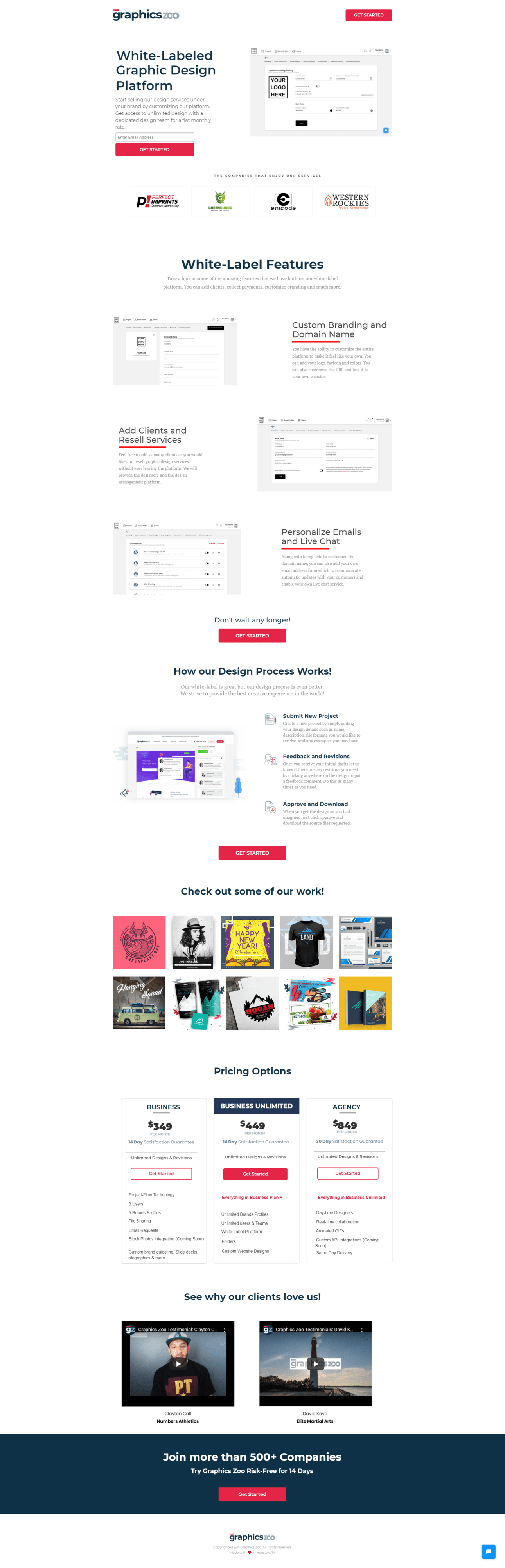
2. GraphicsZoo (email sign up page)
Image courtesy of GraphicsZoo. (Click to see the whole thing.)
GraphicsZoo offers white-label design services for agencies. Its sign up page is sizzling hot in its simplicity. As a white-label graphic design service, they get landing page design. The GIF above gives you a sneak peek of the platform. That’s all you need to know that it’s got a gorgeous, useful, and intuitive UI.
Key points about this sign up page example:
Straightforward copy: The headline explains what the app is in simple terms. (That’s fine, but it might be worth testing a benefit-oriented headline. Something like, “Scaling white-label design services just got a whole lot easier.”)
Streamlined design: There are no menu items on this registration page. Just a single call to action, and it only wants your email address. Keeping the ask small makes it more likely that visitors will convert.
3. Flyhomes (registration sign up page)
Image courtesy of Flyhomes. (Click to see the whole thing.)
Flyhomes makes buying and selling your homes easy, and profitable. (Their website copy is a fun read as well.)
Key points about this sign up page example:
Well-designed form: Mm mm mm! If there’s one thing that’ll make me do a double-take, which is a super weird thing to do by yourself, it’s a remarkable form. (No, seriously.) Just look at that CTA: Start Now. There’s not a misleading word in there. (For example, it’s not, “Sign up now,” which wouldn’t be quite true.) And when you click on it, you’re prompted with, “Let’s Get Started.”
Interactive design: Everything fades into the background when you click. All you need to do to get started is to give Flyhomes your email and whisper the sweet words every marketer wants to hear: “Nurture me.”
PointsBet is an online bookmaker for sports and entertainment, based out of New Jersey. Props to Zeller Media for putting this one together. The agency did a fantastic job creating this sign up page.
Key points about this sign up page example:
Irresistible offer: This example shows that you don’t need a long-form landing page to convince prospects to convert. Think about this for a moment. Not only is this registration page asking you to sign up, but it’s also straight-up telling you that you need to make a $10 commitment.
So how do you do that without scaring off your target audience? Offer them 10 times the amount back. Literally.
Veteran copywriter Roy Furr calls this the irresistible offer. Even a non-gambler can see the appeal. And for a gambler? It’s a no-brainer. Slip me an easy $10, which is peanuts, and you get $100 back. That’s a $90 profit! I’m no math scientist, but that’s a hell of a deal.
Grow your agency with landing pages. Find out how Unbounce can help you win more conversions for your clients and extend your menu of services using landing pages—no coding required.
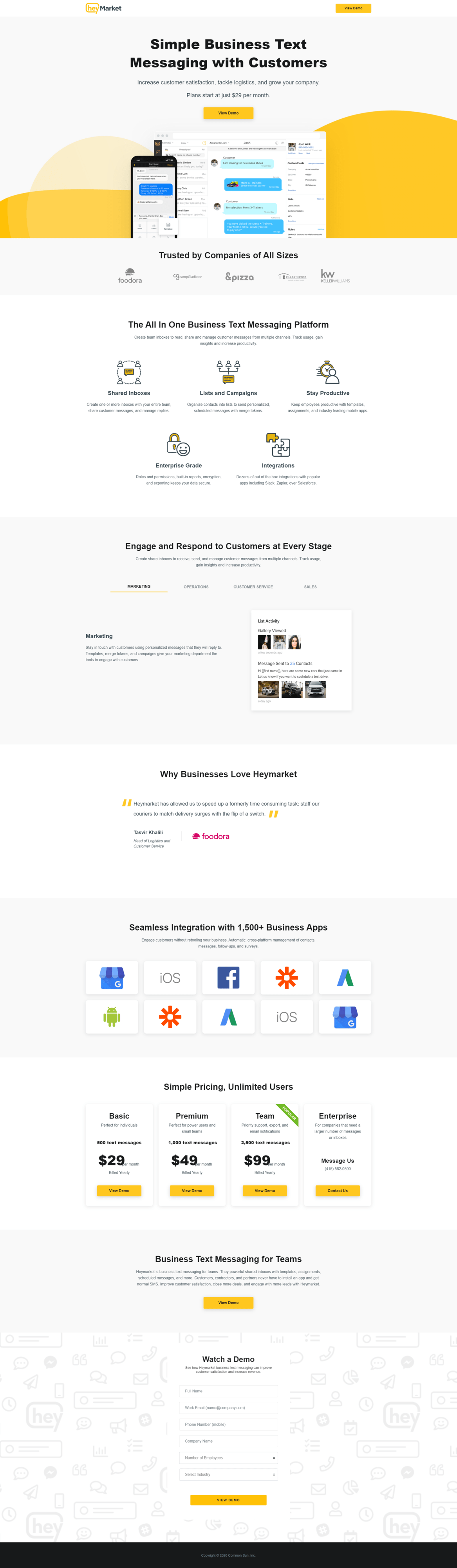
5. Heymarket (demo sign up page)
Image courtesy of Heymarket. (Click to see the whole thing.)
Heymarket is a powerful SaaS platform that lets teams collaborate in business text messaging with customers.
Key points about this sign up page example:
Strong headline: We like the headline in gray (“It’s not personal, it’s business”). It takes a saying that a villain in a movie might say to someone they’ve screwed over, and turns it on its head. This is business. Then the page tells you what the product is and ties it directly to the benefit in the headline.
Supporting body copy: The body copy simply expands upon the headline, before presenting the initial pricing. The image is also immediately recognizable as a SaaS design, so there’s no mistaking where you are when you land.
Prioritized CTAs: Though sometimes multiple CTAs spell trouble, the double-dip on the calls-to-action here is a nice touch. This landing page puts the primary CTA under the body copy and the secondary CTA on the top right, space traditionally reserved for the menu. What we love about this is that the primary CTA invites the target audience to view a demo first, while the top-right button instead prompts the target to hop right into a free trial.
Design variant testing: We’d love to test this type of design against variants with photos of people as well as copy. The SaaS industry is competitive. It’s becoming an increasingly saturated market, one where visual branding will play a greater role.Beyond a single landing page, A/B testing can provide useful insights into which direction you should be guiding your brand.
Zire is an advertising platform for musicians, and it’s thoroughly impressive in its ease of use. In terms of visual style, this sign up page is my favourite with spot-on branding and fluid design.
Key points about this sign up page example:
Awesome UI: Zire has designed an interface that’s both attractive and easy to use. Have a look:
If you’re already on a platform like Spotify, as soon as you put your name in, your name, song, or album will pop up as a suggestion. When you click on it, the page prompts you to add relevant images and upload a clip of your song. Then, once you finish clicking a few buttons here and there, you end up with a summary of your efforts:
The GIF example above is sped up, by the way. The actual flow is a lot smoother, and it’s a pleasant experience through and through. Zire did a fantastic job with every aspect of this.
Wait! (Cue the record scratch.)
Are we missing something here?
Right. They haven’t asked for my email yet. But I’m engaged with their services, and ready to convert. Now that’s slick.
7. Intouch Insight (free trial sign up page)
Image courtesy of Intouch Insight. (Click to see the whole thing.)
Intouch Insight is a B2B company that provides software solutions for companies aiming to scale.
Key points about this sign up page example:
Straightforward, yet appealing layout: At first glance, there’s a lot of text, and the form is long. But if you’re offering me a 60-day trial, I’m intrigued enough to want to read through the copy and find out what I’m getting into. (Still, it’d be worth testing a variant with trimmed copy or a shorter form.)
My favorite thing about this page, though, is how they’ve managed to squeeze all this essential information into an easily digestible and clean landing page. The fine print under the CTA also does a good job of addressing common objections: when they offer a 60-day free trial with no commitment, the company means business.
Free-trial pages have been around since modems used to screech at you. This sign up landing page is a solid example showing that the underlying principles behind high-converting landing pages have changed little since the good ole’ days.
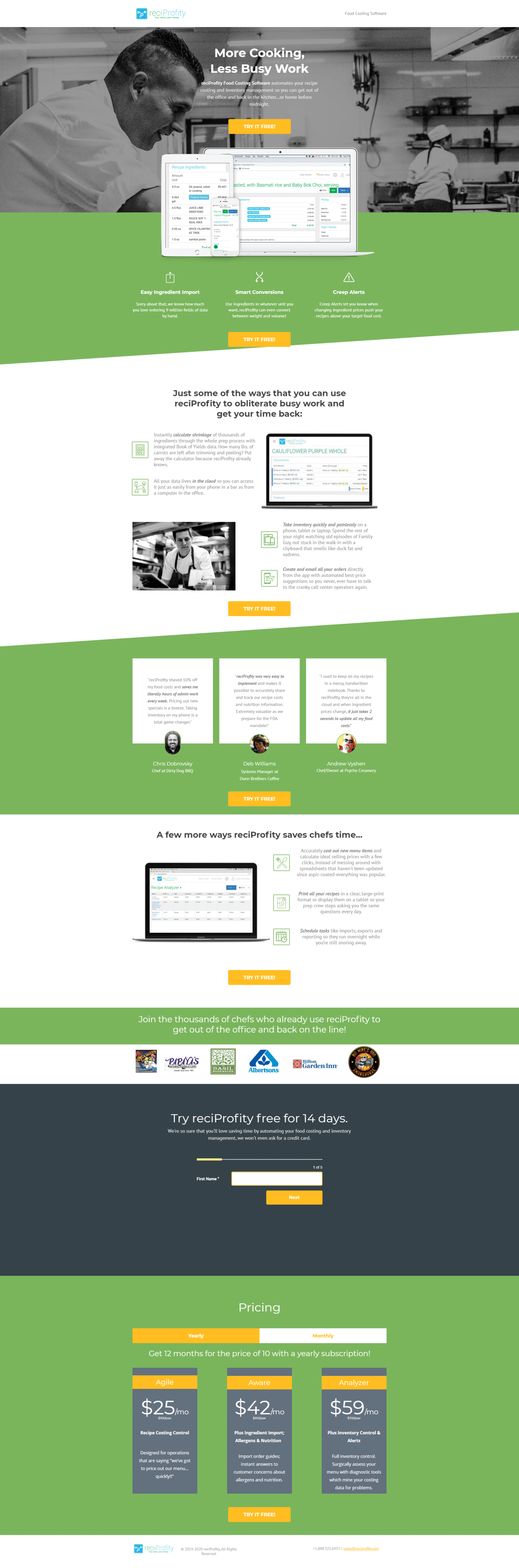
8. reciProfity (demo sign up page)
Image courtesy of reciProfity. (Click to see the whole thing.)
“Food costing software”? Never heard of it, but the target audience (professional chefs) certainly has. reciProfity—their name combines the words recipe, profit, and reciprocity—is an inventory management system for executive chefs who dream of being “home before midnight.”
Key points about this sign up page example:
Strong intro elements: Notice how the headline and hero immediately signal the appeal of this software to busy executive chefs, like the one pictured above, and the brief supporting copy above the fold outlines the problem.
Effective imagery: The product shot that’s cut off at the bottom encourages visitors to scroll down further, without leaving the page. (And guess what you’ll find when you do? More pattern interrupters that keep you scrolling to the bottom of the page.)
Copy details: While the copy on this page works to convince visitors to try reciProfity, this landing page also takes advantage of the top-right menu space to describe their software in exact terms. If the eye drifts up to their menu, they see a succinct description of the software instead. It’s a small thing, but it helps keep visitors focused.
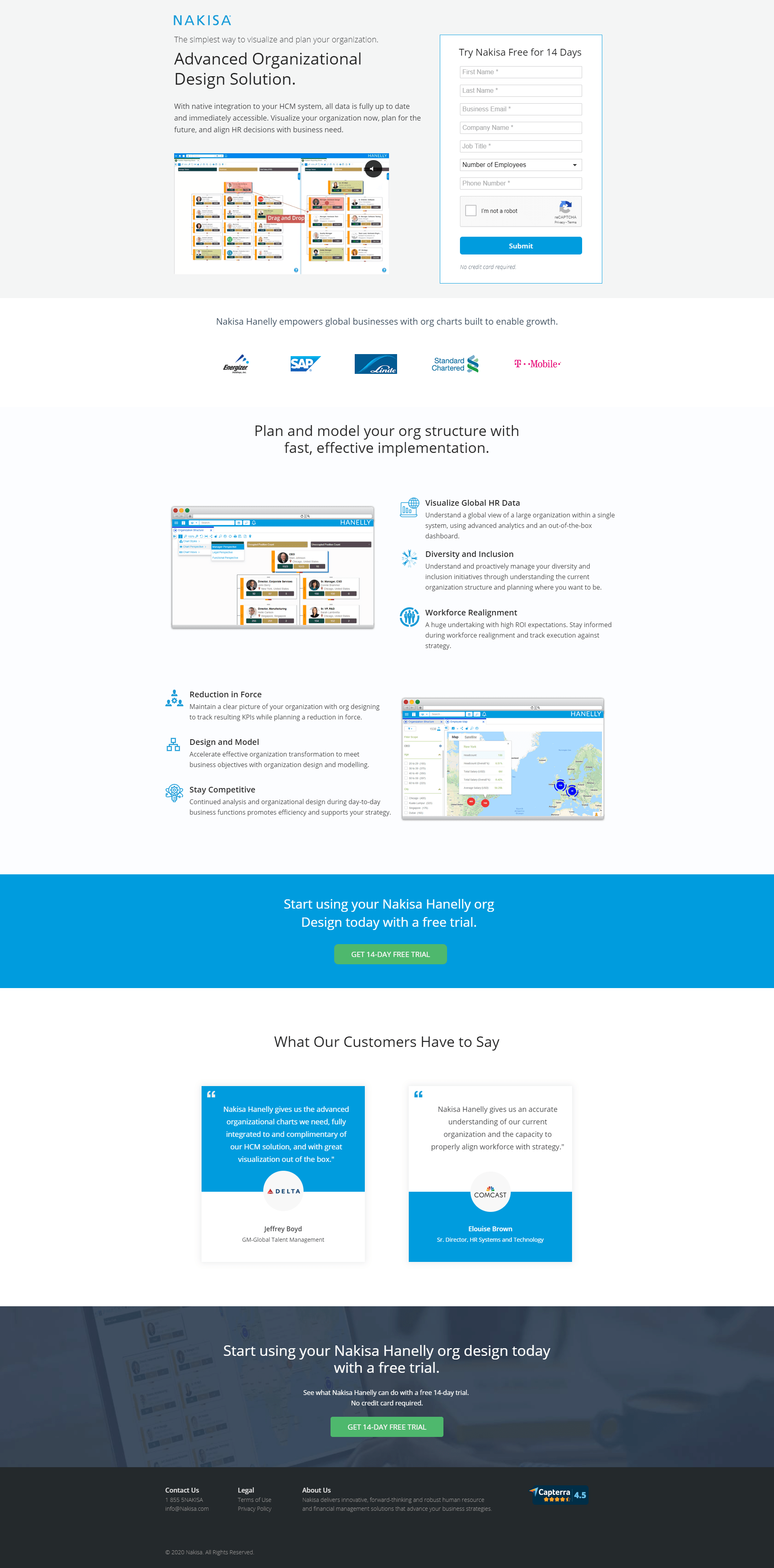
9. Nakisa (free trial sign up page)
Image courtesy of Nakisa. (Click to see the whole thing.)
Nakisa helps companies visualize their organizational structure so that they can make better business decisions. On this sign up page, Nakisa makes the wins for its prospects easy to understand, specific, and tangible.
This type of landing page can work well for SaaS B2B, in particular, for a couple of reasons: first, a B2B visitor is ready to buy because they’re actively shopping around for a solution. But the buyer journey isn’t linear because the B2B buyer tends to be research-savvy. They jump back and forth between the interest and consideration stages, and the consideration stage is much longer.
Second, B2B buyers also more interested in technical features than emotional appeals compared to B2C. That’s because they want to know all about the performance and return on their investment.
Key points about this sign up page example:
Focus on benefits: For the B2B target audience, the copy is direct and appealing to B2B buyers. The landing page includes a visually compelling clip of organizational design that shows how their software works. And the 14-day free trial offer lowers the barrier to test driving the product.
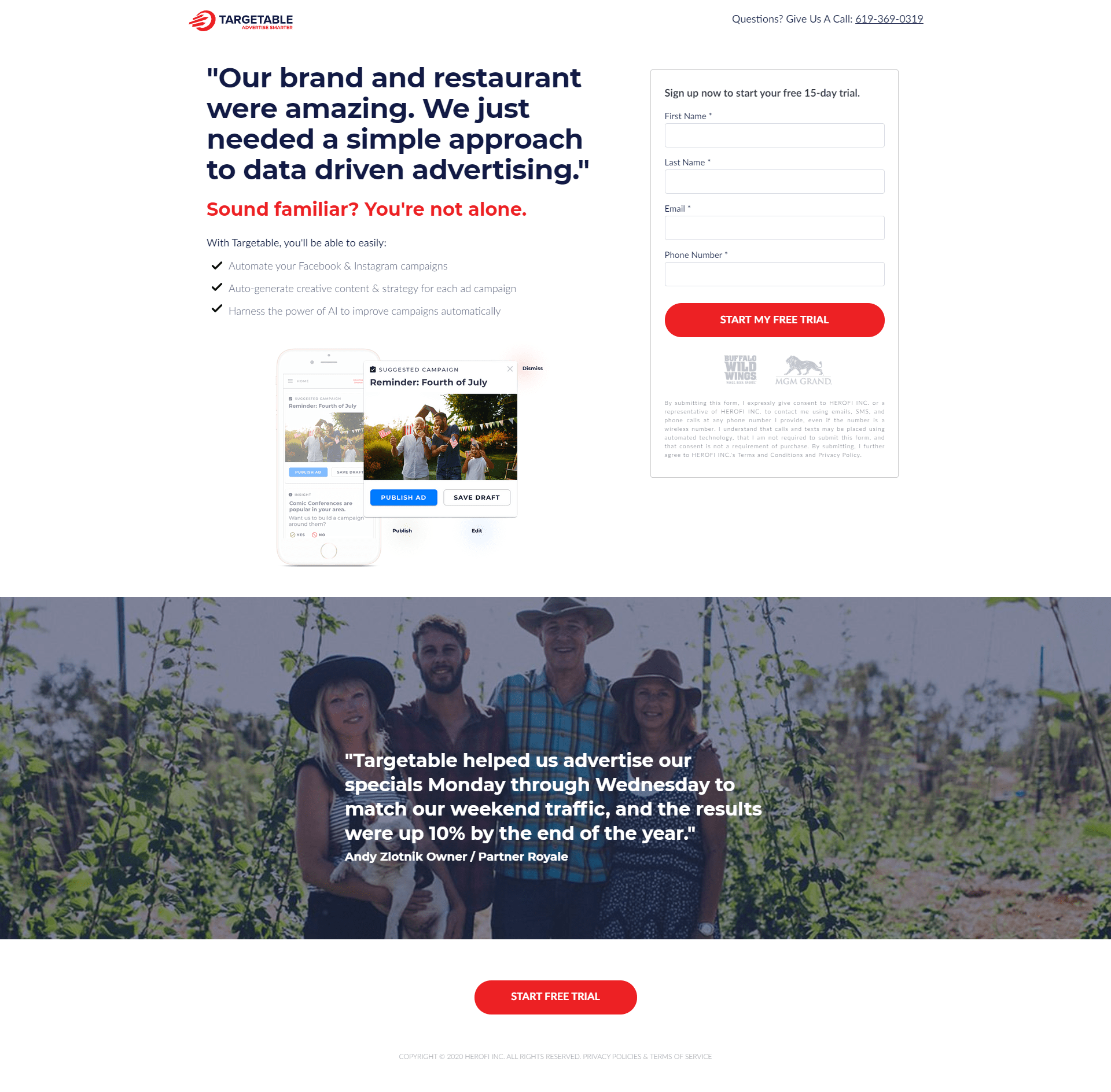
10. Targetable (free trial sign up page)
Image courtesy of Targetable. (Click to see the whole thing.)
Targetable is an advertising platform that uses AI to help restaurants make more money with data.
Look at the quote they use as a heading on this sign up page. Are there many restaurant owners who believe their restaurant is “amazing”? Sure. But this quote isn’t functioning as a testimonial, per se. Instead, the bottom subheading (in red, which helps it stand out) asks if you share this common sentiment. Then it presents a list of benefits that address this pain point, with a simple visual showcasing a platform feature.
Key points about this sign up page example:
Creative copy: This page is an excellent example of using creativity to vary your copy, while pushing the boundaries. (It’s also a great opportunity to A/B test the different ways you can present a pain point.)
Options to explore: Here, they’ve gone with a quote, but maybe something more direct would be more effective? Or perhaps a touch of humour would work? And some audiences could respond better to one headline, while others respond better to another. (A/B testing or using a tool like Smart Traffic can help you find out what copy works best for winning new sign ups.)
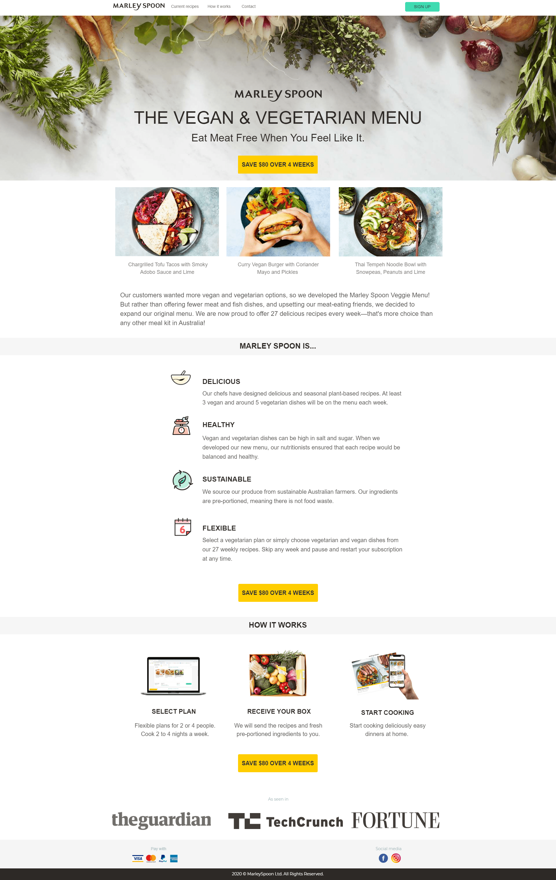
11. Marley Spoon (registration sign up page)
Image courtesy of Marley Spoon. (Click to see the whole thing.)
Marley Spoon is a meal plan delivery service with healthy food options, but that isn’t the only thing that’s tasty around here. Nom, nom, nom. This sign up page does a couple of things extremely well.
Key points about this sign up page example:
Knowing when to break the rules:They included a menu! I know, I know—earlier, I noted that excluding the menu is the obvious move. (It’s certainly a landing page best practice.) But this menu here works, and here’s why I think it does: since Marley Spoon is a food subscription service, they provide a chance to look at the menu before taking advantage of the coupon.
Use of colors: The buttons are in different colors, and for a good reason. You know, even without reading the call to action, that these two buttons have two separate appeals. One’s a simple sign up button, whereas the main CTA is a clear benefit-driven one: Save $80 in 4 weeks. That’s a strong 1-2 copy punch combo: Achieve X in Y amount of time.
Effective account creation flow: The steps are numbered and labeled, clearly managing visitor expectations every step of the way. All the visitor is required to do is click away at the options as they reach the last leg of the race (indicated in glowing gold!). Talk about giving the visitor a sense of satisfaction.
They make getting all that food delivered right to your doorstep look effortless. (And tasty too.) Mwah! A chef’s kiss.
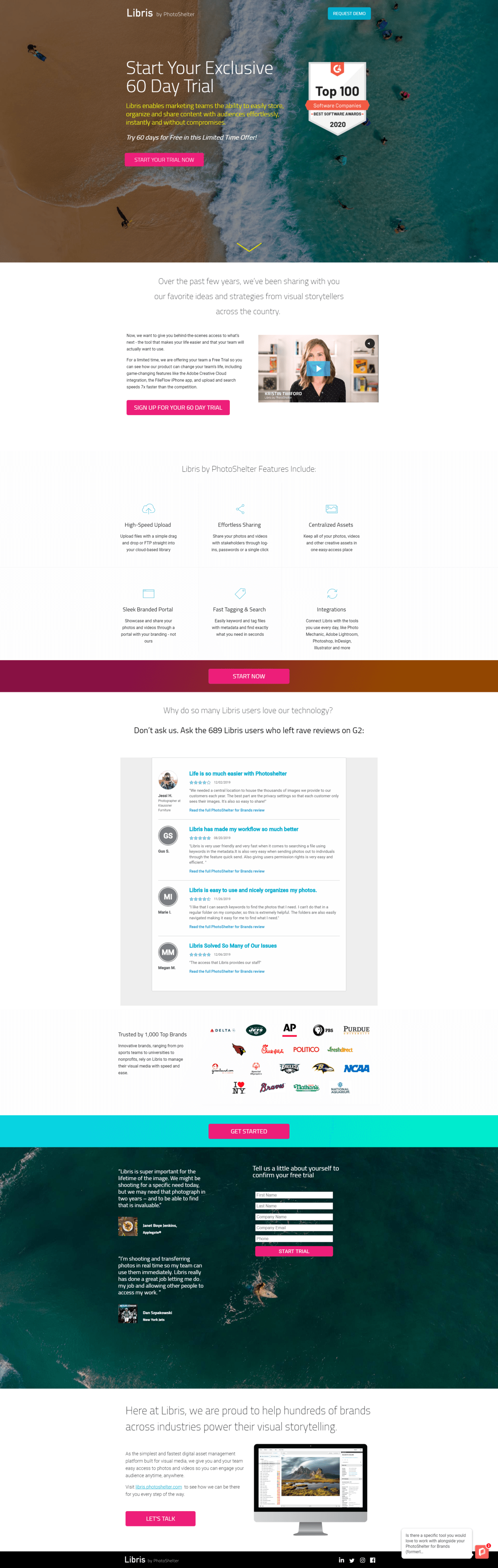
12. Libris/PhotoShelter (free trial sign up page)
Image courtesy of PhotoShelter. (Click to see the whole thing.)
Libris by PhotoShelter is the final boss of digital asset management tools. If you need a way to manage your visual assets, then you just can’t say no to Libris, and this landing page shows you why.
Key points about this sign up page example:
Libris’ no-brainer offer ticks all the boxes.
60-day trial? Check.
Body copy explaining how Libris can make life a little easier for your marketing team? Check.
Two different-colored buttons hinting at different purposes? Check.
Awesome aerial shot of a beach with very few people to line this up with the “exclusive” feel and mention in the headline? Check.
A badge showcasing a super-recent award as a Top 100 software company from G2? Amazing!
If you’ve got it, flaunt it, especially if you’ve received a significant award and recognition from an industry leader in your space. The award from G2 is a major trust booster and signals indirectly to your visitors that they’re missing out if they don’t try Libris out.
One thing I would test is the “limited time offer” message. When something’s limited, you should indicate the period or the deadline. Don’t do it, and your message can feel somewhat generic and fall flat. Do it, and make your target audience perceive and feel the scarcity. Feeling inspired yet? (If you need even more inspiration, check out these examples of evergreen SaaS landing pages.)
Sometimes a sign up landing page’s design can say a lot without saying a lot (of words), and the sign up page for software company Atlassian is the perfect example of that. The overall design is actually pretty simple, but underneath that simplicity lies a foundation that was built with a lot of planning and forethought.
Key points about this sign up page example:
Simplicity: If you want to sign up using your email address, all you have to do is toss it into the single field and you’re ready to move on to the next step. What could be easier?
Versatile sign-up options: By offering the ability to sign up using well-known services from Google, Microsoft, Apple, and Slack, this page not only provides seamless convenience but also shows off their tech chops. Basically, they’re saying, “Yeah, we know our stuff, and we work with the big players in the tech industry.”
Brand consistency: Visitors who are already using other Atlassian products have the option to sign up using their currently existing Atlassian login details. This eliminates the need to create separate login accounts for different products.
While putting together a blog post about how to create excellent sign up landing pages, we couldn’t resist including an example from Typeform, a company that specializes in creating sign up forms. Since getting people to sign up is at the heart of their business, Typeform obviously knows how to do it right.
Key points about this sign up page example:
Clean, attractive design: The uncluttered layout, the simple black/white motif, and minimal copy—everything about this page feels welcoming and easy to absorb. Even the main headline on the left is like a friendly greeting: “Sign up and come on in”.
Streamlined sign-up process: On the right side Typeform offers three simple sign up options: Google, Microsoft, and email. It doesn’t get much easier than that.
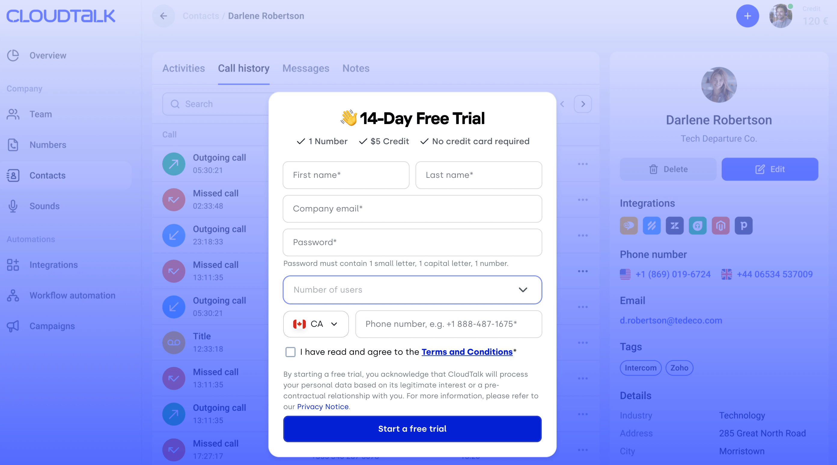
Conversion rate optimization starts with minimizing friction and CloudTalk, a cloud-based call center solution for sales and support teams, nails it. The sign-up page clearly outlines what users can expect (like no credit card required) and gives them a subtle preview of the product experience before committing.
Key points about this free trial page example:
Product preview without pressure: A visual sneak peek behind the form gives visitors a taste of the product’s interface, building confidence and curiosity.
Low-commitment entry point: CloudTalk highlights that no credit card is needed and even offers a credit incentive—reducing friction and increasing the chance of conversion.
Visually clean and modern: With strong contrast and a gradient-based design, the page is easy on the eyes while guiding attention where it matters.
How to create a sign up landing page
Before you dive in head-first on your own, let’s break this down into manageable steps that’ll set you up for success.
Step 1: Map the flow
Picture the perfect signup process. How smooth should it feel? Start by mapping exactly how users create their accounts—from the moment your form appears to their first login. Write down each step, then ruthlessly cut anything that feels like a roadblock.
Step 2: Write the copy
Your copy needs to speak directly to your target audience. Think about what makes potential customers click “sign up” and run with it. Here’s what you need:
A headline that grabs attention
Benefits (not features)
Social proof that builds trust
Clear error messages for when things go wrong
Simple instructions for grabbing their user’s email address
Quick tip: Highlight the benefits of signing up, not just the features of your product or service. And if you need a hand with your copy, try Smart Copy—our AI-powered assistant that helps you generate fresh ideas and new copy options in just a few clicks.
Step 3: Design the page
Your sign up page design sets the tone for everything. Create a separate page that’s clean, focused, and impossible to ignore. A good user interface guides eyes right where you want them—to that signup button. No distractions, no confusion, just pure conversion potential.
Quick tip: Use a visually appealing color scheme and high-quality images that resonate with your target audience. Remember, the goal is to make a lasting first impression. And if design isn’t your thing, no problems—we’ve got hundreds of templates you can choose from.
Step 4: Perfect your CTA
This is the moment of truth. Your call to action button needs to be a no brainer click. Make it hassle free to spot, crystal clear about what happens next, and hard to resist. Remember: good CTAs don’t sell—they invite.
Step 5: Mobile optimize
Look at any successful page example and you’ll notice something: they’re built for thumbs first. Make your simple signup form work beautifully on phones by:
Sizing form fields for finger taps
Making the password field easy to use
Keeping your own icon and branding clear
Testing on multiple devices
Step 6: QA the page
Time to break things—on purpose. Try every way possible to mess things up. Test wrong email and password combinations. Click everything twice. Make your sign up forms bulletproof before launch.
Step 7: Run A/B tests
Don’t guess what works—test it. Look at different sign up page examples, then create variations of your own. Test one thing at a time, whether it’s copy, design, or flow. Watch those form conversions climb as you learn what your website visitors actually want.
Quick tip: Use A/B testing to check the performance of one element at a time. Or you can save time and effort by using Smart Traffic, the AI-powered optimization tool that automatically directs visitors to the variant of a webpage that’s most likely to resonate with them, based on their characteristics or past behavior.
Need a deeper dive on the ABCs of creating a sign up landing page that converts? This step-by-step guide will show you everything you need to know.
SUBSCRIBE
Don’t miss out on the latest industry trends, best practices, and insider tips for your marketing campaigns
Signing up for success
All right, time to saddle up on your business horse and show your chops by creating some high-converting sign up pages. By following the tips we’ve provided above, you’ll be well on your way to hitting your conversion goals and getting that well-deserved high-five from your boss.
Listen—building high-converting sign up pages doesn’t have to be complicated. With Unbounce, you’ve got everything you need to make it happen:
Page builder: Drag-and-drop your way to beautiful signup pages with our intuitive builder.
Smart Traffic: Let AI automatically send visitors to the version of your page they’re most likely to convert on.
Smart Copy: Transform your landing page copy in minutes with our AI copywriting assistant.
A/B testing tools: Test everything from headlines to form fields and watch your conversion rates climb
The best part? You don’t need to be a developer or designer to create pages that convert. Our landing page templates are built to make you look good, and our optimization tools are there to help you convert even better.
Want to see how easy it can be?
Start your free trial and build your first signup page today. No coding required—just pure conversion power.
Get actionable insights, expert advice, and practical tips that can help you create high-converting landing pages, improve your PPC campaigns, and grow your business online.