
Despite the constant barrage of shiny new apps and social platforms out there, email marketing has still got it. In fact, 77% of marketers are seeing more email engagement than ever before in 2021.
Of course, it’s one thing to get results from your existing email subscribers and a whole ‘nother one to get those subscribers in the first place. Have you tried optimizing your landing page for email list signups?
Let’s see how you can create an email list your subscribers will enjoy and how you can structure your signup landing page to get a much better chance of getting eyes on your emails.
Get Your Email List Ready for Subscribers
Before you encourage people to sign up for your email list, you wanna make sure that you send emails your customers will stick with. If you don’t send consistent and compelling emails, your subscribers are more likely to leave, putting you back at square one.
While you set up your email campaign, ask yourself these questions:
- Do I have a schedule planned for my emails? CoSchedule recommends 6 a.m., 10 a.m., 2 p.m., or 8 p.m. for delivery times, and Tuesday, Wednesday, or Thursday for delivery days. (Note: Think of those times as a starting point and keep an eye on your metrics to see what your readers like best.)
- Do I have valuable content lined up to send to my list? Don’t write your emails at the last minute. Craft them ahead of time and in campaign-based batches. At the same time, don’t be afraid to start sending out emails to your early subscribers.
- Am I segmenting my emails for different audiences? Create unique emails for audiences with different goals and positions in your pipeline. This practice is called email segmentation—and it’s a key tactic in email marketing.
Once you square away these parts of your email list strategy, you can start promoting your email list with your landing page.
How to Structure Your Landing Page for Signups
There are four things you can look at when you’re trying to improve sign-up rates on your landing pages.
Layout
Imagine yourself reading someone else’s landing page. You’re skimming for the most relevant tidbits of information, right? That’s how your visitors read your landing page, and you gotta adjust accordingly by sharing your info in the right order.
You gotta place your email signup space in a spot your audience will look at even when they’re skimming. Everyone follows a specific visual hierarchy when they consume online content, based on placement, color, and contrast. Try using the “squint test” on your landing page. What stands out when you squint your eyes?
Your signup space format will also affect its impact on your layout. For example, a single text field will perform differently from a form with multiple fields, depending on your page layout and brand. You could also consider how a pop-up or sticky bar would work with your visual hierarchy and audience’s preferences.
Check out how BoxyCharm nailed the layout for its signup landing page for the BoxyLuxe box:
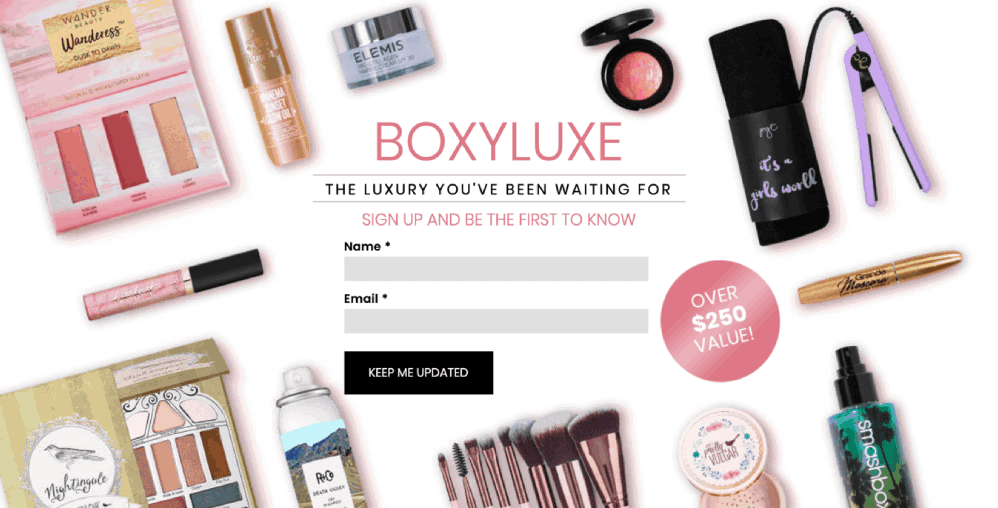
BoxyCharm placed their signup form at the very top of their landing page and framed it with images of the products that go into their boxes. As a result, your eyes are drawn to the text and form in the center, encouraging you to join the promotion list.
Copy
Keep the copy describing your email list as short and punchy as possible. You need to summarize all of the good stuff you’ll offer your audience into a few short sentences or sections. As the Unbounce landing page copywriting guide puts it, it’s not about your features, it’s about your benefits.
When you’re writing your landing page’s pitch for your emails, you wanna mention these two details:
- Your email frequency: Mentioning the exact days you send your emails is even better.
- A brief overview of what your audience can gain from your emails: You’ll ideally wanna drop a note about your credibility. Even a short add-on like “get the latest insights from industry experts” will help boost your authority.
IMPACT’s signup page for its newsletter, The Latest, presents information in easy-to-digest bites and sets clear expectations:
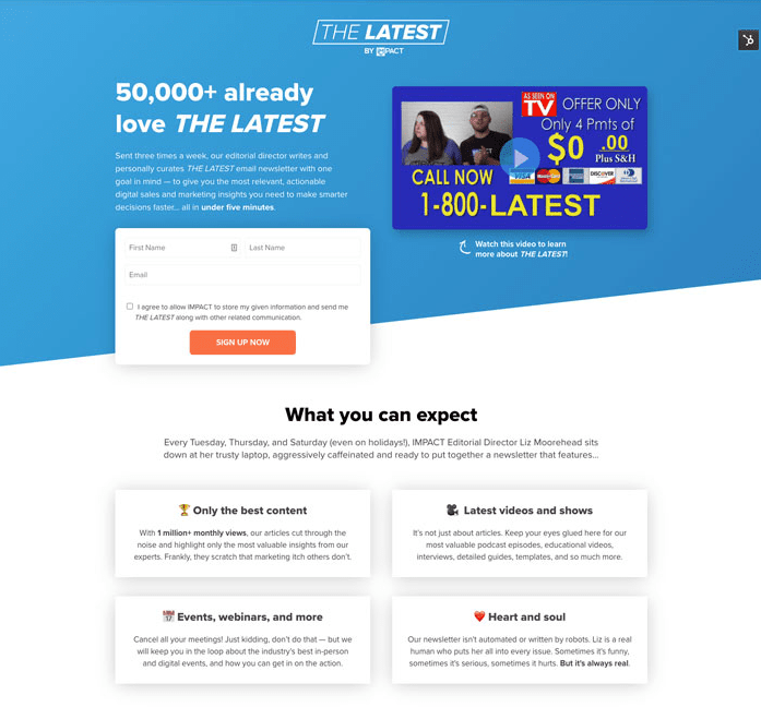
The landing page starts with a one-sentence elevator pitch which establishes that IMPACT sends the newsletter three times a week and that their editorial director curates it. The second section defines the exact days the newsletter goes out and presents its benefits. For example, it doesn’t just mention that it shares videos and shows—it shares the latest videos and shows.
Call to action
Your call to action (CTA) is the lead-in to your newsletter signup space and your chance to seal the deal with your visitors. You wanna be strategic about your CTA’s phrasing and placement to get the best shot at snagging signups.
Frame your CTA around the benefits your visitor will receive from signing up. For example, you could swap the phrase “sign up for our newsletter” for “get the latest insights.” That adjustment shows how signing up will benefit your visitor instead of you.
You should also prioritize your CTA in your layout and visual hierarchy. Keep it in a location your readers will see easily, and make sure it doesn’t get lost in the rest of your content.
Believe it or not, your signup button has a huge role to play in your CTA’s effectiveness. High-performing CTA buttons have contrasting colors, logical placements, and actionable text.
Take a peep at how Tespo inspires visitors to sign up for emails about their upcoming nutrition service:
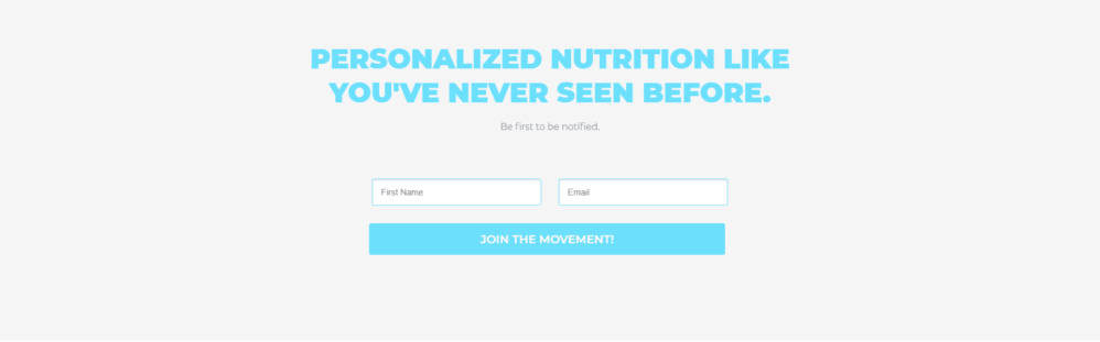
The body text “Be first to be notified” makes the reader feel like they’ll be in the know if they sign up for Tespo’s list. On the submission button, you’ll see the phrase “Join the Movement!” which offers a sense of unity. According to this CTA, you’re not just signing up for a list—you’re becoming part of a nutrition-savvy movement.
Incentive
In today’s marketing world, many folks won’t give you what you want without getting something back. That’s why it’s popular for many companies to incentivize email signups through lead magnets.
What’s a lead magnet? It’s a download—think a goody like an ebook, guide, or template—that requires the recipient to submit their contact information. Your visitor gets a resource and you get their email. It’s a win-win.
If you decide to spiff up your signup page with a lead magnet, make sure it’s relevant to your audience’s interests, like in this example from By Regina:
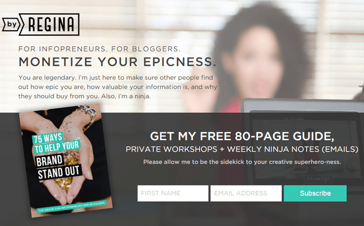
The lead magnet—a guide to helping your brand stand out—meshes perfectly with the list’s emails on creative business advice. A person interested in the guide would also have a good chance of liking the emails, so they won’t get blindsided with irrelevant content and bounce.
Want More Newsletter and Email Signups? Make It Easy
Landing page visitors want the easiest experience possible when they’re deciding to sign up for your emails. Over 67% of people who try to fill out a webpage form will abandon it if they come across any issues. You gotta keep your email signup page experience smooth to sway your visitors.
As you build your landing page, put yourself in your visitor’s shoes. Would someone without any knowledge of your email list understand what they’ll get from it? Could they spot your signup form among the rest of your information? It’s all about reducing friction—the seventh principle of conversion-centered design. Find out the other six from the official Unbounce guide.

