We’ve all been told not to judge a book by its cover—but what about its landing page?
When we click a link or ad for any type of downloadable content, it’s the landing page that helps us decide what to do next. Ideally, the choice is clear: Fill out the form and get the goods! But what if it’s not so clear? What if poor messaging and confusing design get in the way?
Now, let’s flip to the marketers’ perspective.
Let’s imagine that you’ve just published a shiny new ebook. You’ve poured countless hours and resources into this thing. All that research, planning, writing, designing, and revising has finally paid off. You set up a targeted campaign to bring people to your ebook download page, and traffic is trickling in.
Obviously, this is a big moment. Not only will this ebook help establish your expertise, but it’ll also bring in revenue and grow your mailing list (hellooo, self-vetted prospects). But before you can wow your readers, you need to get them to click “download.”
The hard truth is that getting people to download your ebook can be tricky, even when it’s free.
If you send visitors to a generic web page or fail to communicate the value of downloading, then all of your efforts might be wasted. But the good news is that by improving your landing page, you can encourage more downloads—and, ultimately, generate more leads.
Below, we’ll dig into some examples of ebook landing pages done right, but first, let’s establish some basic definitions and metrics.
A landing page for ebooks is your golden ticket to capturing leads or driving sales for your ebook. Whether you’re offering a free resource to build your email list or selling a must-read masterpiece, the primary goal of an ebook landing page is to encourage downloads. This isn’t just another page on your website; it’s a dedicated space with a singular focus—no links, menus, or distractions to lure visitors away.
Think of it as a spotlight on your ebook, highlighting its value and enticing readers with the benefits they’ll gain. By keeping the ebook landing page design clean and the message clear, you create a streamlined path for visitors to grab your ebook effortlessly. A well-crafted ebook landing page can transform curious browsers into engaged readers and potential customers.
By the way, when we say “ebook,” it can include white papers, guides, tip books, textbooks, and more—basically, anything that can qualify as a “digital book.”
What is the conversion rate for ebook landing pages?
It’s not easy to come up with a definitive average conversion rate for all ebook landing pages because it can depend on which industry you’re looking at. Our own Conversion Benchmark Report, which analyzed data from over 44,000 landing pages and over 33 million conversions, shows that conversion rates can vary across different industries.
Emily is a freelance writer and content marketer from Toronto. She helps tech companies and startups develop awesome content for their blogs, websites, and social media. When she’s not writing or thinking about writing, Emily can be found chilling on her yoga mat, loitering in bookstores, or exploring the city with her super cute (and super spoiled) corgi, Wilbert.
Paul is a writer on Unbounce’s content team who lives and breathes storytelling. (It’s like oxygen but with better plotlines!) Ask him what he’s up to at any given moment and you’ll get answers ranging from folding paper dragons (y’know, origami) to catching up on the latest cool tech, and finding other ways to channel his inner geek.
Have a look at the chart below to see the average conversion rate for your industry, and that should give you a target to aim for. (And if you’re looking for examples on how to boost your conversion rates, we’ve got you covered.)
10 ebook landing page examples that convert
You might be wondering: Should all ebooks have landing pages? You bet! Paid, free, long, short—all ebooks are beautiful and deserve their own landing page. This applies whether the ebook itself is the product (like an EPUB file you buy to read on your Kindle) or gated content (like a PDF you download in exchange for your email) that’s part of a larger marketing strategy.
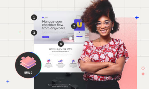
Yup, this is our baby. We created an ebook that busts the myths about how difficult or stressful it is to use A/B testing to improve your landing pages, then put together a landing page to showcase the ebook.
Why we love this ebook landing page example
Putting aside our rather obvious (but still valid) bias, we think this lead magnet ebook landing page is pretty darned nifty for these reasons:
The headline is big, bold, and clear about the main benefit of the ebook: how to use A/B testing for better results (with less).
The secondary copy just below the headline provides more details about this message, as well as some other details about the ebook.
Right beside the header copy is a striking hero image, showcasing the ebook’s cover and further speaking to how A/B testing doesn’t have to be a quest.
There are no distracting links that could lead readers astray—instead, the only links on the landing page are the multiple CTA buttons, all of which lead to the form in the middle of the page.
The form only has a small number of fields to fill in, which reduces friction and makes it more likely that readers will fill it out. All they have to do is enter their name and email, check a couple of boxes, and then they’re in.
If the top part of the page hasn’t already convinced readers about the value of this ebook, the bottom half of the page goes deeper into its main benefits. This helps convince readers that getting this free ebook is worth their time.
2. Copyhackers: Copywriter’s guide to persuasive design
Click to see the whole page.
Who’s behind it?
Joanna Wiebe and her team at Copyhackers have established themselves as one of the most knowledgeable voices in the marketing copywriting industry.
Why we love this ebook landing page example
The strong, benefit-driven headline works alongside the title of the ebook to grab your interest.
Whether you’re an experienced copywriting veteran or someone who’s just building their writing career, it’s essential to have an understanding of how copy and design can work well together. The copy even explicitly spells this out: “…boost your value as a double-threat conversion expert.”
As you might expect from an expert and experienced copywriter, the landing page’s CTAs use interesting and personality-filled messaging. How can you resist a CTA like “Be twice as badass with persuasive design chops”?
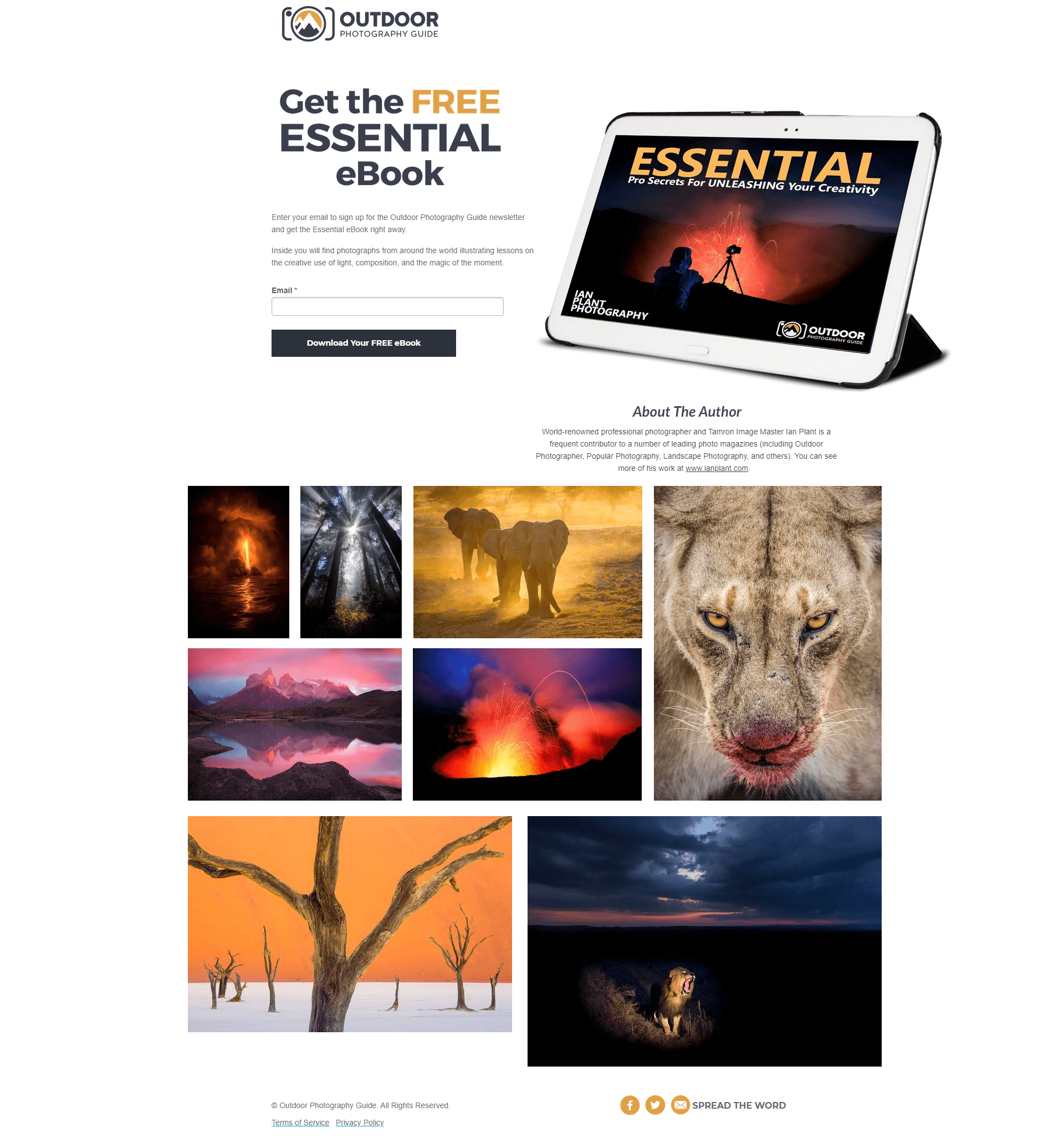
3. Outdoor Photography Guide: Essential pro secrets to unleash creativity
Click to see the whole page.
Who’s behind it?
This ebook download landing page was created by TN Marketing for Outdoor Photography Guide (OPG)—a community and resource for nature and wildlife photographers. Their wide range of video courses is designed to teach, challenge, and inspire shutterbugs of all skill levels.
Why we love this ebook landing page example
What’s the first thing you notice above this page? For us, it’s the striking hero image. Not only is it a cool visual, but it also tells us quite a bit about the download before we’ve scrolled or read anything.
First off, the bold color and contrast suggest this “essential” ebook is bursting with interesting visuals that will inspire photographers to truly unleash their creativity.
Second, the silhouetted camera tells OPG’s ideal audience (photography buffs) that this content is geared specifically toward them.
Third, by showcasing the ebook on a tablet, visitors immediately understand that they’ll be able to access it on their device of choice.
All things said, this landing page packs a punch. It invites visitors to visualize themselves both with the ebook in hand and in the shoes of the photographer on the cover. And that’s all happening above the fold.
Once visitors start to scroll, it’s easy to see exactly what the ebook offers. If the page appears image-heavy to you, remember that’s the point: it appeals to photographers and provides a peek at the promised visuals. It’s also clear that this is a free download, which is a helpful distinction given that much of their video content is paid.
A quick note about social sharing: OPG is a community-based organization, so it makes sense that they included social buttons on the landing page for this ebook. It’s a simple design choice that encourages readers to spread the word with fellow photography buffs.
That said, it’d be interesting to test how moving social buttons to the confirmation page impacts downloads and traffic. Wouldn’t visitors be more likely to share an ebook after they’ve read it?
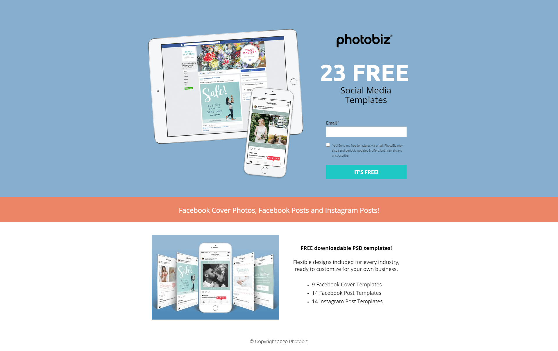
4. Photobiz: Free templates
Click to see the whole page.
Who’s behind it?
This landing page comes from another photographer-friendly platform. Photobiz is an easy-to-use website builder for professional and aspiring photographers who want to grow their business. Photobiz helps photographers showcase their portfolios, win over clients, and book more jobs.
Why we love this ebook landing page example
As with the OPG example above, the single field download form keeps things light and inviting. It’s also loaded with relevant information—without feeling crowded. This is in part due to the easy-to-skim layout and smart color blocking.
Readers instantly know what the offer is (23 templates), and the value is clearly highlighted with specific use cases (cover photos, Facebook posts, Instagram posts). They even specify the format (PSD files—which are way more useful than plain old JPEGs), so readers know exactly what they’re getting.
By going above and beyond to define their download as a collection of templates, Photobiz builds trust and manages expectations.
Aside from what we can learn from the landing page itself, this example is a good reminder that you don’t need to box yourself in by sticking to the typical ebook format. Instead, focus on creating content that’s meaningful to your customers in whatever form might make sense—whether that’s a lookbook, course, interactive guide, outline, template, or something completely different.
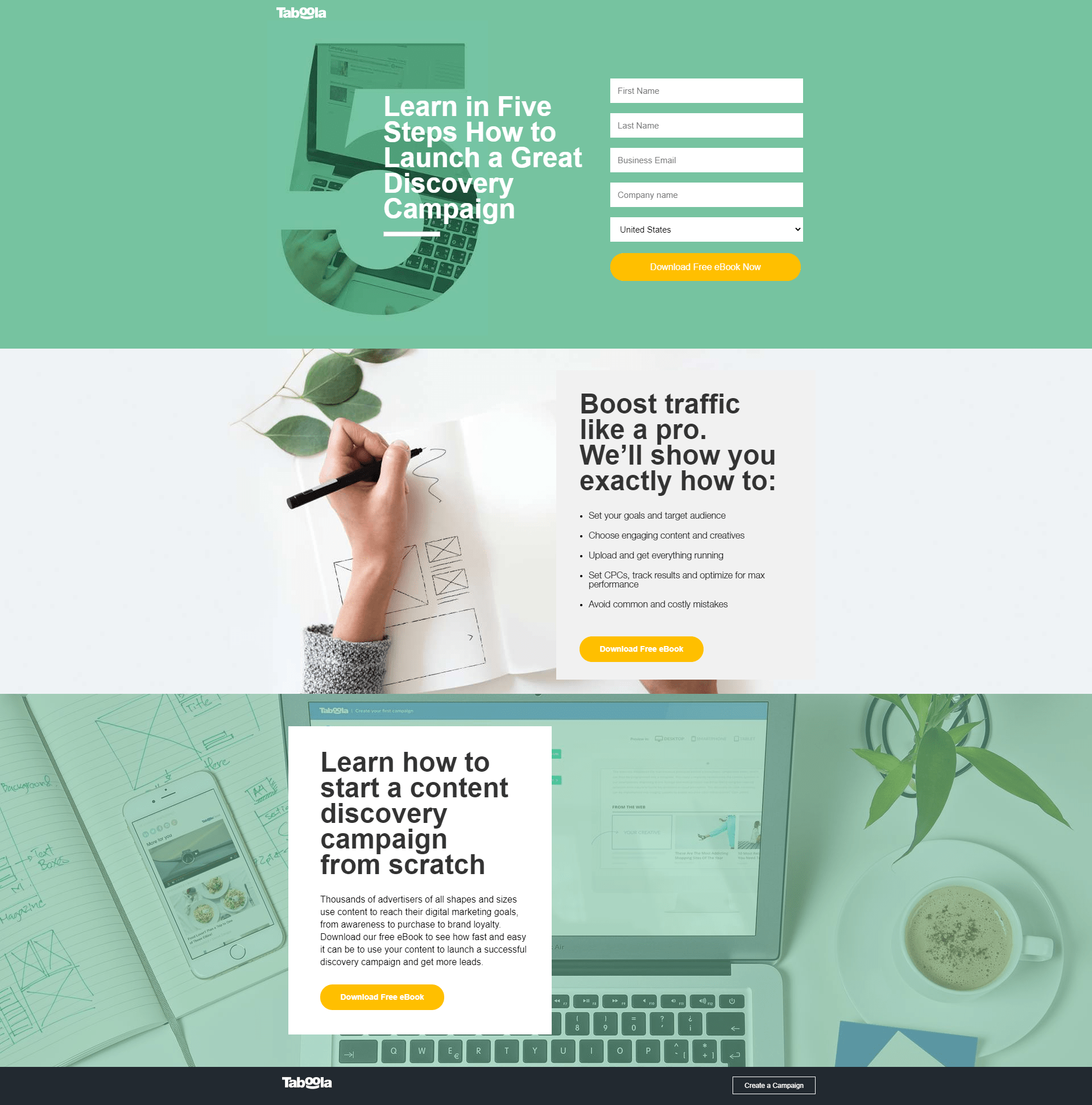
5. Taboola: How to launch a great discovery campaign
Click to see the whole page.
Who’s behind it?
Ah, another fantastic ebook landing page. This one comes from the lovely people at Taboola, a discovery platform for marketers and publishers. Taboola matches products, services, and messages to audiences and delivers relevant creative to the right people at the right time.
Why we love this ebook landing page example
The landing page copy speaks directly to marketers, using repetition to really drive home the benefits of getting this ebook—namely, how it’ll help them pull off a discovery campaign. Assaf Spiegel, Sr. Digital Marketing Manager at Taboola, says the landing page plays a key role in the company’s lead gen efforts.
“The aim was to provide potential advertisers with information on how to create good campaigns,” he explains. “Interest in the content featured on this page clearly qualifies leads as relevant prospects for advertising with Taboola.”
This page also gets points for its great design (it just looks good). Color is used to cleanly break the page into three skim-friendly sections, each with its own orange CTA button that pops against the background.
Spiegel credits Taboola’s talented designers for the visual appeal and adds that much of what we see on the page is strategic. More specifically, he says his team wanted to ensure that:
“First, the form appears above the fold in both desktop and mobile;second, a clear CTA appears several times on the page; and, third, a secondary CTA appears on the footer—in case a user is ready to create an account right away.”
It’s also worth noting that the points under “Boost traffic like a pro” set expectations by explaining what each of the five steps covers. Whether it’s quick bullet points or a list of chapter titles, providing this type of high-level overview is a quick way to tell visitors what’s in the book and what they’ll gain from it.
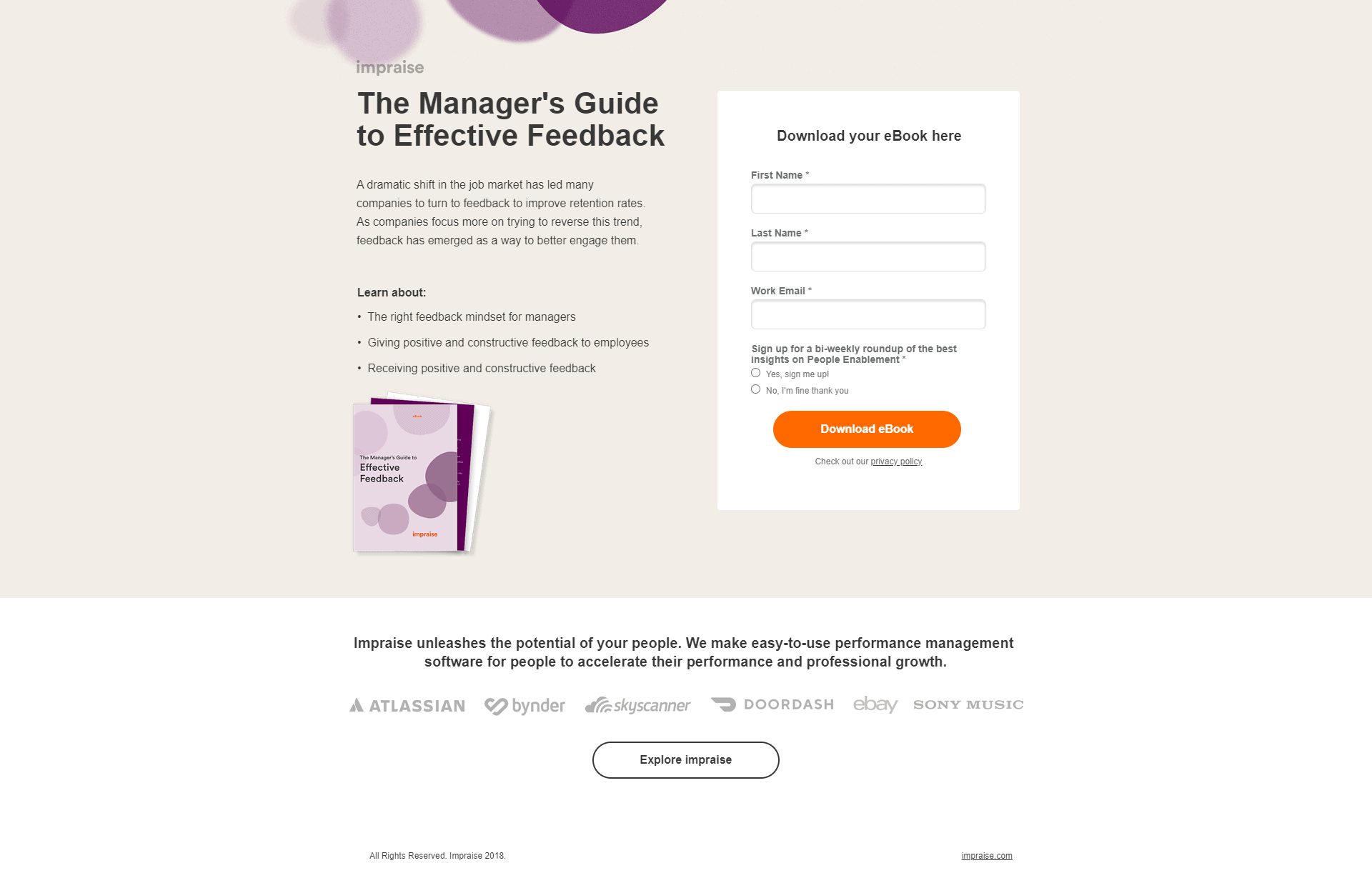
6. Impraise: Manager’s guide to effective feedback
Click to see the whole page.
Who’s behind it?
This ebook landing page was created by Impraise, a performance management platform for business owners and team leads who want to inspire and connect with their people. Impraise helps teams grow together by making it easier to have those crucial (but sometimes tough) talks about performance, goals, and professional growth.
Why we love this ebook landing page example
At first glance, there’s not a whole lot going on with this landing page. There aren’t any flashy images or bold claims. In fact, aside from a picture of the ebook cover (and a matching pop of color at the top of the page), there’s only one element that stands out: the orange download button.
As for layout, the page intentionally gives equal space to the ebook information and the download form. This balanced design allows visitors to scan for relevant information without getting pulled away from the download form.
In other words: This page is simple but functional. It tells readers what the ebook will teach them (which answers why they should download it) and gives them a clear step forward (i.e., fill out the form and get the download). Whether or not a similar approach would be effective in your case depends entirely on who your audience is and what they’re looking for.
It works well for this campaign because the target audience isn’t all that interested in Impraise or their product (at least, not yet). Managers and business owners who click on an ad for this ebook want to learn about the “right feedback mindset for managers,” but they aren’t ready to pay for a solution. By downloading this ebook, readers willingly identify themselves as problem-aware leads.
As you can see above, there’s not much hiding below the fold, either. But scrolling does reveal a bit of context and a link to the website, which helps prevent traffic from bouncing. If someone is further along in the funnel, there’s a higher chance they won’t want this ebook—but they might click through to learn more about Impraise’s software.
7. Smarter Marketer: Rules to help in-house marketers thrive
Click to see the whole page.
Who’s behind it?
This page was created by an agency called Rocket to promote Smarter Marketer by David Lawrence and James Lawrence. In this case, the offer is a real-live book, available as both a hardcover product and a Kindle download.
Why we love this ebook landing page example
Compared to the other landing pages we’re looking at today, this example is by far the longest. Sometimes less is more, but in this case, more is just right. The entire page is loaded with tons of social proof, author credentials, and sneak peeks into the content.
One of the reasons this works so well is that Smarter Marketer isn’t a free download—it’s an actual book, with a ton of value for readers. (Though this doesn’t mean the book isn’t also a smart way to promote Rocket.) So, rather than keeping things short and sweet, this page makes an effort to answer any questions a reader might have.
In a way, the landing page replaces what might otherwise have been a generic Apple or Shopify product page. However, because it’s a dedicated landing page at the heart of a paid campaign, Rocket has the space and flexibility to make a bolder argument for why marketers should buy the book.
It checks every box on the list of best practices we talked about earlier. This example is as much a sales page as it is a landing page.
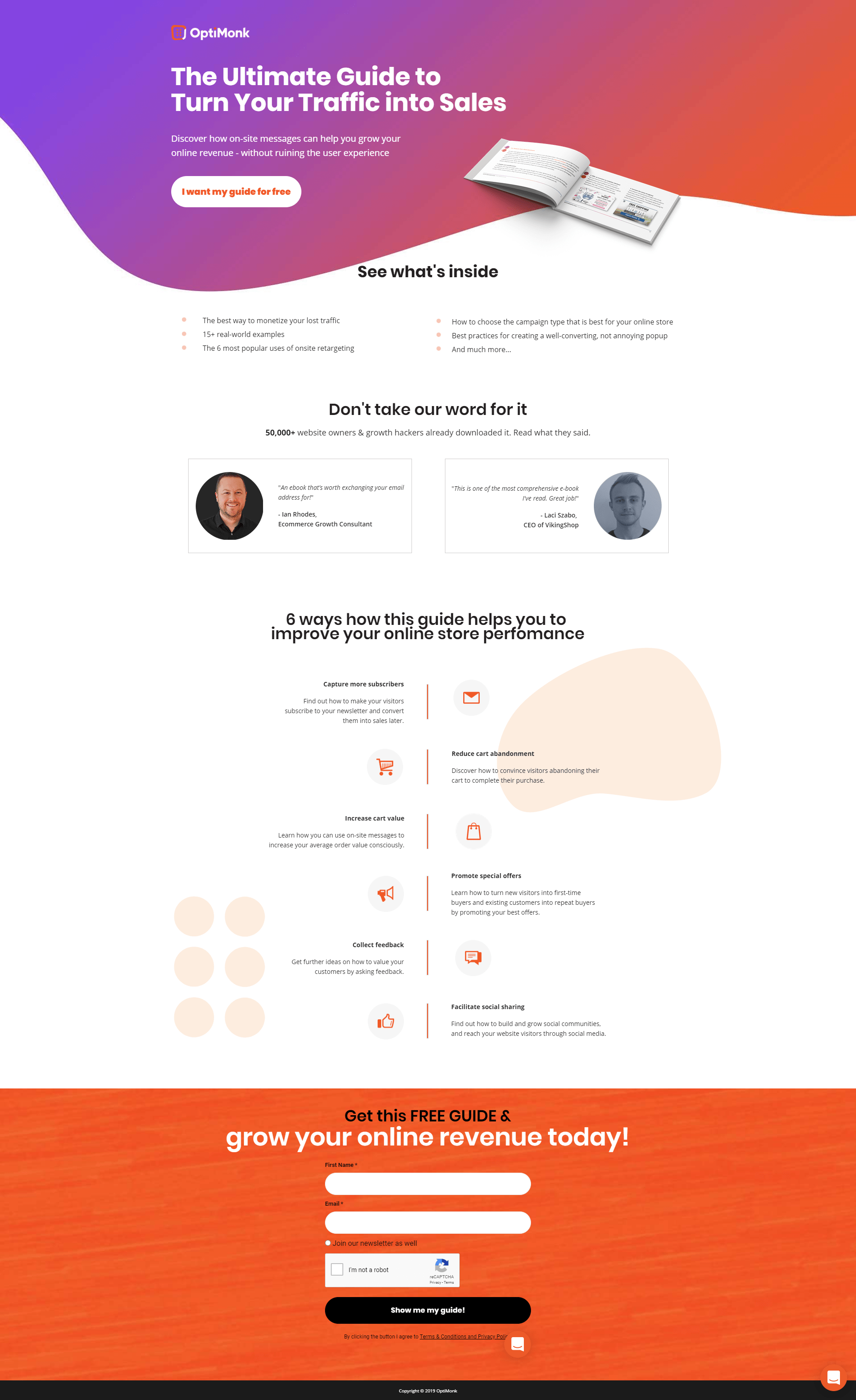
8. Optimonk: Ultimate guide to turn traffic into sales
Click to see the whole page.
Who’s behind it?
This example by Optimonk brings us back to traditional ebook territory. Aversatile tool for online retailers, Optimonk uses perfectly-timed messages to help online stores drive sales and reduce cart abandonment.
Why we love this ebook landing page example
Despite its clean design, this page has quite a bit going on. Right off the bat, visitors are pulled in by a bold header, a first-person CTA (written from the reader’s perspective), and an invitation to “see what’s inside.” Anyone who’s ready to download right away can click “I want my guide for free” to access the form at the bottom of the page.
Next, Optimonk builds our confidence by offering social proofand acknowledging the credibility of testimonials vs. self-promotion (“Don’t take our word for it”).
Further down the page, the benefits of downloading the guide are spelled out even more clearly. The graphic below reminds online sellers that this content is, in fact, made especially for them and shows that Optimonk understands the unique challenges facing online retailers.
This is probably our favorite part of this landing page. Notice how each lesson in the ebook is presented as a solution that corresponds with a specific stage of the buyer’s journey? This resonates with online retailers because they can actually visualize where the content will come in useful—and highlights value by suggesting that the download contains relatable examples and use cases.
Interestingly, this is the only example that doesn’t actually say the name of the ebook. Instead, it focuses 100% on the benefits.
9. Transform: Macro counting 101
Click to see the whole page.
Who’s behind it?
This vibrant ebook landing page example comes from Transform, a fitness company and app that offers personalized programs (including macro-based meal plans and one-on-one coaching) to help people live their best (and healthiest) lives.
Why we love this ebook landing page example
First of all, can we take a second to acknowledge how on-brand this page feels? (It just looks healthy, doesn’t it?) We love everything from the colors and imagery of fresh produce to the clean lines and easy-to-read, grocery-inspired checklist.
Not only is the hero shot bright and colorful, but it also shows the ebook on a tablet for context. The focal point is the bright red CTA button, which simply reads “Get the ebook.” That’s it—simple, clear, easy-to-follow instructions.
By telling visitors what’s inside the download, this landing page hits on key problems relevant to the target audience and presents clear solutions (i.e., using a diet to manage weight loss, build muscle, and develop healthy habits).
Further down the page, we’re greeted with a smiling photo of the authors. Putting a face (or two) to the ebook makes the content feel more approachable—which can be especially powerful for lifestyle and health brands. It allows visitors to see that there are real humans behind Transform’s aspirational programs.
We know as well as anyone that when it comes to ebooks, you need to provide something really valuable to get people over the hump of filling out your form. That’s why we recruited bona fide CRO expert, Talia Wolf, to develop the most powerful, helpful SaaS landing pages guide we could—and promoted her on one variant of our landing page.
Our favorite thing about this landing page is that it changes depending on who’s lookin’ at it.
So, if you click here you might see the version above, featuring Talia. Or you might see the version below. (And why not grab the guide, while you’re at it?)
By combining the principles of optimization with the magic of machine learning, Smart Traffic automatically matches each and every visitor to the landing page most likely to convert them. The coolest part is that after turning on Smart Traffic for this page, both variants saw a boost in conversions.
Ebook landing page best practices for getting folks to download
When it comes to landing pages for ebooks, what separates the best of ‘em from the rest of ‘em? Our favorite ebook landing pages are designed around one goal: Get more downloads. (But they have a few other things in common, too.)
What’s at the heart of all top-converting ebook landing pages? A laser-focused call to action that serves one clear purpose.
Don’t water down your call to action with secondary links or conflicting messaging. Including more than one call to action splits the visitor’s attention and eats into your conversion rate. In fact, it can reduce conversions by up to 266%.
If you do include more than one CTA (probably because your page involves a decent amount of scrolling), then all roads should lead to download.
Hook visitors with a strong headline
Your visitors need to stick around to convert—and it’s up to you to give them a reason. You only have less than a minute to make a strong impression, so your headline is your best chance to hook readers.
A snappy headline is great, but it also needs to be clear about what the topic is. As soon as someone visits your landing page, they should be able to tell that your ebook is relevant to them.
Need some help crafting headlines (and other pieces of copy) that’ll maximize conversion? Try out our AI-powered copy generator to create copy perfect for any situation.
Use images on your landing page to draw readers in and provide context. A picture of the physical book or (if it’s digital only) the ebook displayed on a device helps visitors see exactly what they’re getting. A “download” can be somewhat intangible, so seeing it in use on a device can help add value.
Preview the benefits, not just the content
Optimize by showing off the benefits (i.e., what readers will learn from your book or how it will improve their lives) rather than just telling visitors what the book is about (although, chapter overviews can be a handy way to preview the content if the book is substantial).
Put simply: most of your readers want to know why before they care about what. This is one of those “obvious” rules that some marketers still forget about.
Build credibility with social proof
If ever there’s a time and place to be humble, your ebook landing page is not it. People are more likely to download your ebook if they see that others have already done so (and gotten real value from it).
Reviews from other readers and testimonials from experts are powerful. Plus, 88% of customers trust online reviews as much as recommendations from a friend. The only caveat here is that any social proof needs to be legit. Your readers will smell B.S. a mile off.
Keep lead gen forms short and simple
Gated content shouldn’t be hard to access (or they’d call it…captive content?). Make it as easy for readers to download your ebook by keeping lead gen forms short and sweet. Only ask for as much information as you need. Asking readers to jump through fewer hoops means more downloads.
How to create an ebook landing page of your own
Now that you’ve got tons of fresh landing page examples in your mind, let’s talk about how you can bring your vision to life.
It can be tricky (and time-consuming) to build an eye-catching landing page from scratch. With a landing page builder like Unbounce, you can launch high-converting ebook landing pages in a single afternoon—no dev required.
Sound good? Here’s how you can build your very own ebook landing page without eating into those precious dev resources. (If you’re not a customer, you can start a free trial to see just how easy it is—and maybe even get your campaign up and running.)
Step 1: Choose a template
Start with an ebook download page template and make it your own. Adjust colors, fonts, and copy to match your campaign. Add images, drag, drop, and swap out elements, or customize your form.
SEO settings: Choose whether or not you want search engines to be able to see and rank your landing page. If so, optimize with a keyword-powered title and meta tags.
Set a conversion goal: Total downloads? Clickthrough rate? You decide how to measure your success.
Step 3: Go live
Set your URL, preview, publish, and bring it to life. Easily add tracking, custom scripts, and set up integrations to pass leads directly into your CRM.
Step 4: Optimize for even more downloads
Scale with ease: Duplicate your landing page with a single click and adjust to suit each campaign.
Find your best formula: Create different versions and split test (this is where Smart Traffic comes in helpful) to maximize conversions—whether your goal is click-throughs or lead gen.
Get more downloads with these ebook landing page templates
As we mentioned in Step 1 on how to create an ebook landing page, starting with a template is the easiest way to kickstart your ebook landing page journey. Here are a couple of templates to spark some ebook landing page ideas:
The Listing Lab template: Showcase the benefit
Why this template is great
In this template the big, bold header shouts an attention-grabbing message. You can ask a question, make a strong statement, or highlight a key benefit to pique the reader’s interest.
The form is small and friction-free, with only two fields to fill out. Of course, you can change this as you see fit, but keeping forms as small as possible is generally a good idea.
Sourcebooks template: Judging a book by its cover
SUBSCRIBE
Don’t miss out on the latest industry trends, best practices, and insider tips for your marketing campaigns
Why this template is great
In the Sourcebooks template the book’s cover is front and center, making it the first thing the reader sees. Your ebook’s designer put a ton of work into designing the cover, so why not show it off on the ebook landing page?
This template provides multiple spaces for testimonials. As we mentioned above, social proof is a super effective way to build trust, so why not share how much other people love your ebook?
Now it’s your turn! Whether your goal is to boost conversions (sales or clicks) or build your email list, we’ve got a template for you—just choose the template that best fits your needs.
Ready to bring your ebook landing page to life? Start here with one of our awesome ebook landing page templates. Steal one as your starting point and customize it to your heart’s content.
Master the ebook landing page game
By focusing on compelling copy, eye-catching design, and strategic calls to action, you can transform casual visitors into avid readers and potential leads. Remember, it’s all about providing value and making it irresistible for your audience to click that download button.
So, take the time to experiment, analyze, and refine your approach. With these tips in hand, you’ll be well on your way to creating ebook landing pages that not only captivate but convert.
Get actionable insights, expert advice, and practical tips that can help you create high-converting landing pages, improve your PPC campaigns, and grow your business online.