Georgia sells boutique hot sauces online and she’s starting to get some traction.
With five years of marketing experience under her belt, she launched her store on Shopify as a side hustle. It’s blown up since then, allowing Georgia to turn peppery products into her full-time gig.
To manage growing demand, she relied on an ecomm agency that promised her 7X ROAS. But the $3,000 monthly retainer didn’t make sense, especially since she wasn’t even close to matching that in ad spend.
So, Georgia set out to do some research on her own. She’s smart, and she’s no stranger to marketing. That’s when she discovered the secret sauce to scaling her ecommerce business.
It wasn’t sriracha. It was landing pages.
Georgia knows you don’t need to be a spice savant to creating marketing campaigns that bring the heat—you just need to know what converts. Read on to learn how Shopify landing pages can help you transform your ecomm sales from mild to five-alarm hot.
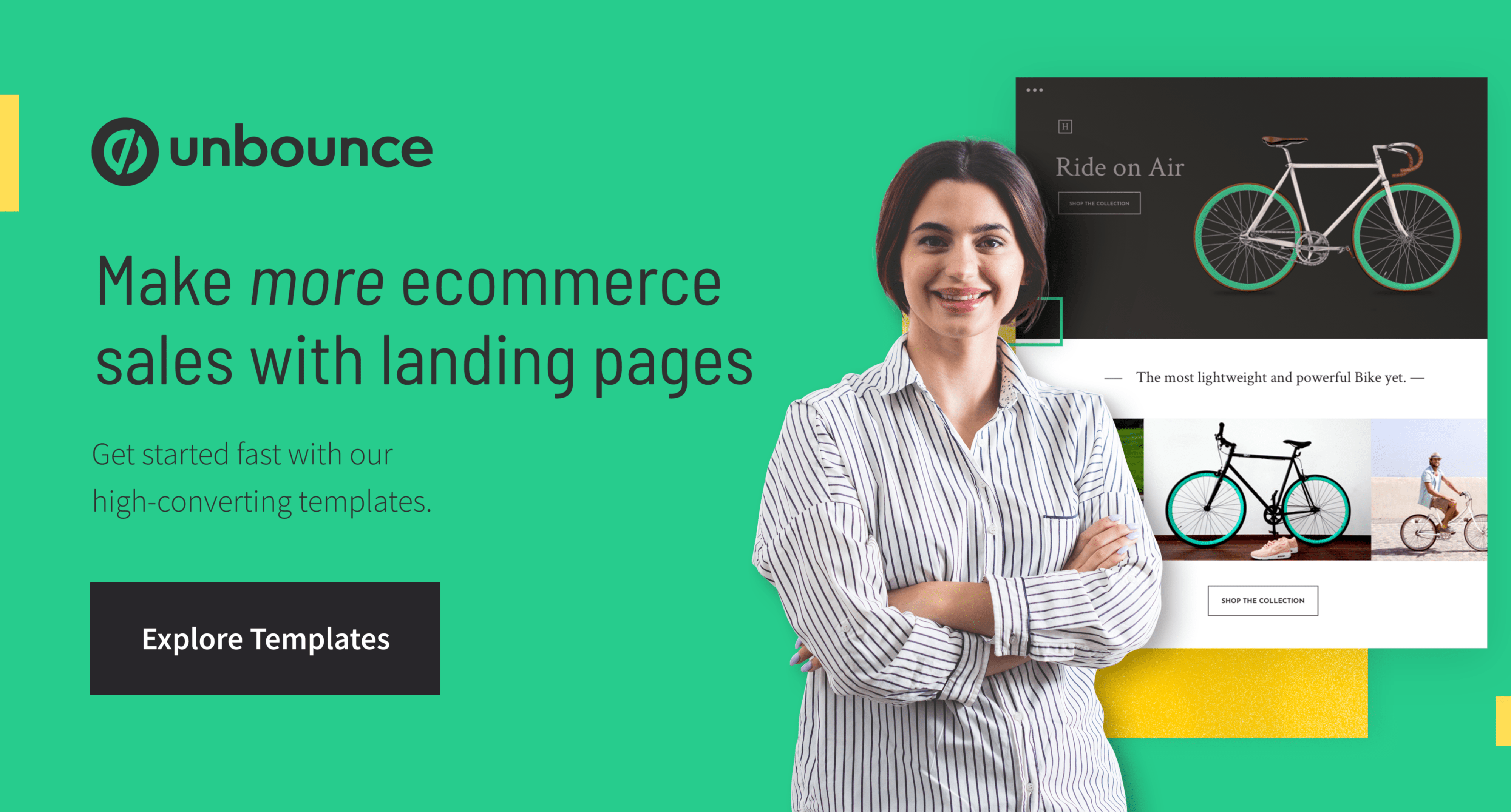
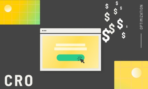
What is a Shopify landing page?
Let’s break it down and start with the fundamentals. A landing page is a page where visitors “land” after they’ve clicked through from an ad, social media post, web link, QR code, etc. Shopify, as everybody and their dog knows, is a platform for setting up ecommerce stores.
Put them together and you get a combination that’s even better than chocolate and peanut butter—you end up with Shopify landing pages, which are super effective at getting sales and boosting your revenue.
A Shopify landing page is like the flashy storefront window at your favorite store, but in the digital world. It’s part of your Shopify store that’s designed with a laser-focused objective, be it to sell a product, promote a deal, or collect email addresses faster than a squirrel gathering nuts for the winter.
What’s the difference between a product page and a landing page?
We’re so glad you asked. Both product pages and landing pages play essential, yet different roles in a customer’s ecommerce journey.
A product page is kind of like an instruction manual—its purpose is to shower you with information about the product, including features, benefits, specs, images videos, and maybe even a PDF of the actual instruction manual itself. (Whoa, this is starting to feel like Inception.) It’s all great info that can help inform the buying decision, but there can be a lot of details and some product pages will also include links to other related products and offers.
On the other hand, a landing page provides a much simpler and direct experience. Landing pages are designed to nudge the visitor to a single action, with all of the info on the page focused only on that one goal.
Both product pages and landing pages play essential roles in Shopify ecommerce stores, but knowing how and when to use them can spell the difference between missing your quarterly sales goals and your boss giving you a (well-deserved) raise.
Types of Shopify landing pages
Not all Shopify landing pages are created equal, which is a good thing because they can serve different purposes at different stages of the customer’s journey through your ecommerce store. Here are some of the most common types of Shopify landing pages:
Valerio Puggioni
Valerio is a SaaS copywriter and content creator with a passion for tech and combat sports. Armed with a PhD.c in North Korean propaganda studies, he lives in Bangkok with his partner and his dog, who he tortures all day long with his tone-deaf singing. He wiles away his days playing story-driven open-world games, and reading comics and popular physics books. You can read more about him @ Copygun.com.
» More blog posts by
Valerio Puggioni
Paul Park
Paul is a writer on Unbounce’s content team who lives and breathes storytelling. (It’s like oxygen but with better plotlines!) Ask him what he’s up to at any given moment and you’ll get answers ranging from folding paper dragons (y’know, origami) to catching up on the latest cool tech, and finding other ways to channel his inner geek.
» More blog posts by
Paul Park
Splash landing pages
These types of landing pages are like the cheerful greeters at a fancy gala. They’re the first thing visitors see and they’re often used for announcements, age verifications, or special promotions. Splash landing pages are designed to be brief, impactful, and straight to the point—like a billboard that catches your eye and sticks in your mind long after you’ve driven past. (Want to learn more about splash pages? We’ve got you covered.)
Product launch pages
Picture a red carpet event for your product—that’s your product launch page. It’s where your latest and greatest offering gets all the spotlight. These pages are like the drum roll before the big reveal, designed to create hype, anticipation, and a bit of FOMO. It’s not just about showing off your product; it’s about making it the star of the show.
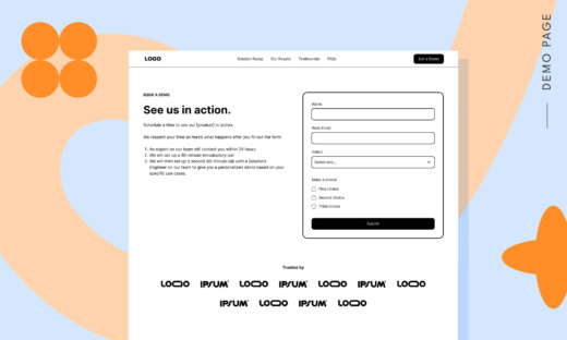
Lead generation pages
Lead generation pages are all about the give-and-take. Offer something irresistible, like an exclusive ebook, a tempting discount code, or insider access, in exchange for contact details. Think of it as a friendly handshake, opening the doors for future conversations and sales.
Promotional pages
These pages are tailored to highlight special sales events like Black Friday, Back to School, or that really big American football game with the incredibly expensive commercials (you know the one). They’re like the party planner of your Shopify store, showcasing the best deals, limited-time offers, and must-have products. They create a sense of urgency that’s as effective as a countdown timer on New Year’s Eve (but without that drunk person trying to give you unwanted smooches).
Sales landing pages
Every store has a top salesperson, that one ace who’s got the whole sales technique down pat. Sales landing pages are like that saleperson—they’re focused, direct, and all about converting visitors into buyers. Every element—from the headline to the images to the CTA—is designed to lead the customer to one thing: sealing the deal. It’s like having a personal shopper who helps you find exactly what you need, convinces you why you need it, and then guides you to the checkout.
Targeted campaign pages
Imagine a landing page that knows exactly what you want, like a barista who remembers your coffee order. That’s the targeted campaign page. Designed for specific audiences or marketing campaigns, these pages speak directly to a particular group’s needs and interests. Whether it’s for yoga enthusiasts, tech geeks, or fashionistas, these pages resonate with their audience, making them feel like the page was made just for them.
Why use landing pages for Shopify?
Tons of companies that sell on Shopify send traffic from their paid campaigns directly to product pages on their website. And, sure, that works well enough for some of ’em. After all, your site gives people a high-level overview of your product offering that landing pages usually don’t.
But the reality is that if you’re not using landing pages to prime visitors for purchase, you’re not converting to your potential.
Let’s say you’re running a seasonal campaign around Black Friday. You’ve got all your Facebook ads set up and ready to go. You hit the red launch button, and… oh no. Your relevance score is crying for help because you’re sending people who clicked a Black Friday ad to a generic product page.
Not only that, but you’re creating an awful experience for visitors. The place they wound up doesn’t match the ad that they clicked. They’re confused, maybe even frustrated. You can kiss that conversion goodbye.
1. You can get specific with your target audience
Pushing shoppers to a run-of-the-mill product page isn’t ideal since the page probably wasn’t designed to address their needs specifically. The best way to drive ecommerce sales is by pairing custom landing pages with highly targeted ads or emails to help you reach a specific audience at a specific time with a specific offer, encouraging them to take a specific action.
2. You can get higher conversion rates through testing and conversion optimization
Test, test, and test some more—by using A/B testing and conversion optimization (with tools like Smart Traffic) to tweak your messaging and design elements, you can squeeze even more conversions outta your campaigns.
3. You can deliver a customized brand experience
The product pages that come pre-packaged with themes on ecommerce platforms are meant to be modified to suit your brand, but most businesses just add their content and start sending traffic. That means lots of ecomm brands show up the same, with product pages that lack distinguishing features or meaningful detail.
With landing pages, you can provide a truly customized brand experience before visitors even hit your website—so once they do, they’ll be ready to buy.
4. You can build and launch with less time and money
We’ll be the first to admit there are plenty of head-turning product pages out there. The trouble is that most of these pages have been custom-built by specialized teams who speak Liquid code—and that’s reflected in their cost.
Then there’s the time commitment. Say you’ve decided not to run a Valentine’s Day campaign, but then you have a last-minute change of heart. Your dev won’t appreciate your call at 3 am, asking ’em to put together a product page. (And your designer, copywriter, and other team members won’t be throwing you a party, either.)
5. You can provide a smooth, seamless customer journey
If your visitor clicks on an ad announcing a discount on your most popular line of shoes but lands on a page where they don’t immediately see that offer, they’ll probably get frustrated and bounce.
You can provide a much better experience (and increase the odds of getting conversions) if you create landing pages that perfectly match the messaging that initially brought the customer to your ecommerce store.
6. You can keep visitors focused on making a purchase
Most product pages come with tons of distractions: site navigation, links out to reviews, multiple calls to action. There are plenty of ways for visitors to wander off in the midst of making a purchase.
On the other hand, your landing page is totally laser-focused on getting people to convert. Fewer distractions mean lower bounce rates, which means more sales.
Best practices for building your Shopify landing page
The best guidelines for building a landing page on Shopify are a lot like any other landing page best practices: message match, context of use, that sorta thing. Still, there are some specific things you can do on your Shopify pages that’ll give them that extra oomph.
Here are some tips to keep in mind while you’re building your Shopify landing page:
1. Define your goal
Start by asking, “What’s my endgame here?” Are you looking to skyrocket sales for a new product, grow your email list, or promote a seasonal sale? Your goal is the North Star guiding your entire landing page voyage.
2. Value proposition
This is your “why.” Why should visitors care about what you’re offering? It’s the heart of your landing page, and by keeping this top-of-mind you can ensure every element of the page is relevant and clear.
3. Know your audience
Dive into the minds of your target audience. What do they need? What keeps them up at night? The better you understand them, the more tailored your landing page can be.
4. Sell the benefits, not the features
Converting in ecomm is all about the benefits of the product. How does it improve your target customer’s life? Think through all of the potential benefits of your product (even the obscure, less tangible ones) and make sure you’re highlighting them on your landing page.
5. Craft a clear message
Your landing page copy should be as persuasive as a late-night infomercial host but way more authentic. Engage, inform, and entice. Every word should serve a purpose. If you’re not really into copywriting, no problem—our AI copywriting tool Smart Copy can generate all the high-converting copy you need with the click of a button.
6. Compelling CTAs
Your call-to-action should be clear, punchy, and impossible to ignore. Keep it specific and appealing so visitors will be more likely to click. (And it’s okay to use different wording across multiple CTAs on a single page, as long as they all point to the same destination.)
7. Attractive design and images
People are visual creatures. Use powerful images and an eye-catching design to keep them glued to your page. It’s like the visual equivalent of a page-turner. And wowing your audience with your design can be pretty easy if you’ve got lots of landing page templates to choose from.
8. Social proof
This is the cherry on top. Customer testimonials, reviews, endorsements—they’re the trusty sidekicks that give your landing page credibility and charm.
9. Employ psychological triggers
Familiarize yourself with concepts like social proof and scarcity. For example, you might wanna include messaging around time-based (“only for the next 24 hours”) or product-based (“only 10 left”) scarcity to drive landing page conversions.
10. Stay relevant by launching fast
The timing of your ecomm campaigns is huge. No one wants to hear about your New Year’s sale in February, so get crackin’ on those landing pages and launch your next campaign yesterday.
11. Optimize for mobile
In today’s world, not optimizing for mobile is like forgetting to put cheese on a pizza—a big no-no. Ensure your landing page looks as good on mobile as it does on desktop.
12. Test, tweak, repeat
Launching your landing page isn’t the end. It’s like planting a garden: It needs regular care. Use tools to analyze performance and don’t be afraid to tweak. Keep testing different elements—from headlines to images to CTAs. Remember, there’s always room for improvement.
13. SEO is your friend
Just because it’s a landing page doesn’t mean you ignore SEO. Include relevant keywords but don’t overstuff them like a Thanksgiving turkey. Make it natural.
14. Load time matters
If your page loads slower than a snail crossing a sidewalk, you’ll lose visitors. Optimize images and streamline elements for quicker load times.
How to choose a builder to create a Shopify landing page
Now that you know how and why Shopify landing pages can add some awesomeness to your ecommerce store, let’s get into the details of how to make it happen.
1. Shopify’s theme editor
Shopify provides their own in-house landing page templates, which makes it easy to create basic, generic landing pages. However, as we mentioned above, “basic and generic” isn’t great for grabbing attention and making an impact, so if you want to stand out from the crowd you’ll probably want to explore the other options below.
2. Coding with Liquid
Shopify has their own template language called Liquid, which allows you to create a landing page from scratch by playing with the code and crafting it however you like. But—and you could probably see that “but” coming—you either need to know how to code in Liquid, or have the budget to hire someone who does. And building pages like this is never a quick process, so you’ll need to add some extra time into your production schedule.
3. Use a builder
Custom landing page builders are, as the name implies, tools that are designed to help you create landing pages quickly and easily. Here at Unbounce we’re kinda fond of our two landing page builders:
Classic Builder
If you want pixel-perfect control over how your pages look, as well as the ability to customize code and scripts, this versatile and powerful tool is right up your alley.
With Classic Builder you can start with popular landing page templates, then use the drag-and-drop controls to customize every piece of the page to perfectly match your brand. Classic Builder plays nicely with almost any marketing automation or CRM tool, and you can also use Zapier to connect to over 1,000 tools.
Smart Builder
This AI landing page builder lets you put together beautiful, high-converting pages in just minutes.
Smart Builder is perfect for you if you’re more interested in pumping out eye-catching, conversion-optimized landing pages than digging deep into the guts of page design. The user-friendly interface makes it easy to put the page layout together, and Smart Copy can fill the page with well-written copy with just a few clicks.
Of course, we’re not the only game in town. Other popular and well-known page builders include Instapage and Leadpages, as well as Shopify-specific builders like PageFly, Shogun, GemPages, and Zipify Pages—have a look around and see which tool best fits your needs.
Shopify landing page examples
Here are four examples of Shopify landing pages that are gettin’ it done right.
1. Doctor + Daughter
Image courtesy of Doctor + Daughter
Doctor + Daughter is a cosmetics line made with organic ingredients. You wouldn’t know it by looking at their landing page, but the business behind the brand is actually The Lee Clinic.
One quick look at their website is all it takes to understand why this Shopify product landing page is vital to their marketing. The homepage does a lot of things—explains who the company is, where they’re located—but there’s no obvious way to find and purchase their products.
Let’s dig a little deeper and take a look at The Lee Clinic’s product list page.
Image courtesy of Doctor + Daughter
Sending traffic to this page presents obstacles, too. The copy doesn’t really tell us all that much about the benefits of the product. What’s driving me to learn more and buy?
Even the individual product pages bury lots of key information within collapsing bullet points, making it tough for visitors to find out what the products do or how to use them. And while these pages look pretty slick, most ecomm marketers could spot ’em as Shopify templates.
Image courtesy of Doctor + Daughter
Imagine you get a promotional email from The Lee Clinic advertising a site-wide discount. You click the link and find yourself on the page with their list of products, or even one of the specific product pages. What do you think would do a better job of getting you to buy—that, or this landing page?
Image courtesy of Doctor + Daughter
The Lee Clinic’s landing page (built by Webistry) does a fantastic job of summarizing the product benefits in a super attractive way. The design isn’t just gorgeous—it’s congruent. Clean. Simple. Professional and eye-catching. Really, it’s just a treat to look at.
2. Nanor Collection
Image courtesy of Nanor Collection
Nanor Collection sells long-lasting luxury candles, which is to say they burn real slow. If you’re planning a romantic evening (or several, consecutively), these candles are pour vous.
They’ve got an awesome product landing page (another from Webistry) that does a great job of showing off their product in an attractive way. It’s sexy. Slick. Simple. An alluring invitation, if I were so inclined.
Image courtesy of Nanor Collection
And look at how the product is showcased here.
Image courtesy of Nanor Collection
Yes, it’s gorgeous and jam-packed with persuasion elements, but that’s only half of it. It sustains the shopper’s experience. It lets them remain on the page, adding items to their cart without ever having to leave. Compare that with the online store on their site, where the user would need to click out and navigate through multiple pages to achieve the same objective.
It’s a great landing page, right? So it’ll come as no surprise to learn it’s converting at a healthy 5.6%.
Let’s compare it with another one of their pages specifically targeting Mother’s Day shoppers. But before I reveal the conversion rate of this one, take a closer look:
Image courtesy of Nanor Collection
Visually, there’s not a huge difference between the two pages. The real change is in the copy: the general landing page highlights a product feature (they’re “long-lasting”) while the Mother’s Day page speaks to the benefit customers can derive from that feature (making your partner feel special with an awesome gift).
The Mother’s Day page has some other things working in its favor. There’s a site-wide discount with an established deadline, plus messaging that indicates there might not be enough of these candles to go around (“while supplies last”). It does a good job of establishing scarcity.
So, which do you think did better?
The Mother’s Day page is converting at almost 15%, essentially turning 3X more visitors into customers than the general landing page. It just goes to show: benefits sell way better than features.
3. DIFF Eyewear
Image courtesy of DIFF Eyewear
DIFF Eyewear is an eyeglass ecomm that gives up a chunk of their revenue in support of charitable initiatives, helping provide glasses, eye exams, and surgeries to people in need.
The brand has a great-looking website, but like lots of storefronts, it has a ton of elements that distract visitors from making a purchase. There are all those menu items. Multiple calls to action. Different features and incentives like blue light lenses, buy-one-get-one, and philanthropy.
Compare the unfocused (because glasses—get it?) experience of their website with that of this mobile product landing page:
Image courtesy of DIFF Eyewear
Can you see the difference? Here, DIFF tilts its messaging on its head. The main site really focuses on their humanitarianism, and that’s great—it’s what their brand is all about. But here, the copy is all about the value to the customer. There’s no mention of charity. It’s all about making the sale based on the benefits of the product.
4. American Girl
Image courtesy of American Girl
If you or someone you know is into American Girl, there’s a very good chance that you or they are really into American Girl—as in, if a new doll is released or there’s a special sale on accessories the news must be delivered right away.
That’s why this simple, yet effective email sign up landing page is so important. There’s not a lot to it, but what is there serves a crucial function.
It all starts with a direct, attention-grabbing headline: “See what’s new before others do”. This headline and the copy just below it speaks to the love that American Girl fans have for the brand and their eagerness to stay on top of the latest developments. (Maybe so they can get the newest products and make their friends jealous? We’re not judging.)