
They say a picture is worth 1,000 words—but that assumes it’s a good image.
While a good image will strengthen your landing page’s overall message, a low-quality one can take away from it. In the worst-case scenario, it’ll give the wrong impression of your brand.
Fortunately, you can nail more of your image choices if you’re strategic. That’s why we’ve pulled together a few top tips to snag the best pictures for your landing page and knock your visitors’ socks off.
Five Tips for Picking the Right Landing Page Images
1. Make ’em the right size
Different landing page elements require different image sizes. For example, a 600×600-pixel image won’t work well as a hero image. It’s too small to work as a header on desktop screens, and its square aspect ratio won’t leave room for header text.
Before using an image, check its size in pixels and compare it to the best aspect ratio and size for its intended purpose. (To check an image’s size in Chrome, open it in a new tab and check the tab title for its pixel measurements.)
There are many recommended image sizes out in the wild, but you can start with the width of your page and go from there. Unbounce landing pages have a recommended width of 940 to 960 pixels.
Going back to the hero image example, you’d want to have it at least 960 pixels wide, so it covers the width of the landing page. For a full-screen hero image, you’ll want a 16:9 aspect ratio. Plug those numbers into an aspect ratio calculator, and you’ll find that you’ll need a picture at least 960 pixels wide and 540 pixels high.
You should also keep in mind that images can display at different ratios and sizes across platforms. Always double-check your pictures on desktop and mobile to make sure you have a mobile-friendly landing page. A mobile-responsive landing page builder will make the task easier.
Brutask’s landing page below shows a properly sized section image in action:
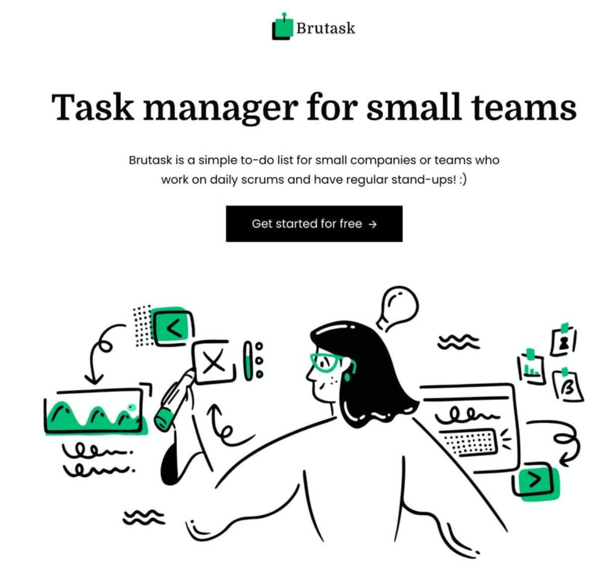
The art on this landing page fits perfectly across its middle column, lining up with the headline and subheader.
2. Use easy-to-digest visuals
Your visitors don’t want to play Where’s Waldo when they look at your images. Stick to pictures with one or two main focal points. Crowded visuals will distract your visitors from your landing page’s message instead of supporting it.
After all, your landing page and its images should follow the best practices for white space. When you leave plenty of space around an element, you demonstrate its importance. That rule goes for both the subjects of your image and the area around your images.
Uncluttered images also help you establish a solid visual hierarchy for your landing page. Our eyes naturally follow a Z or F pattern when we view a web page. It gets harder to follow a straightforward pattern when a page’s images don’t have clear focal points to track.
Notice how Trendy Butler uses a hero image with a single focal point to make a powerful impact:

Trendy Butler set a picture of a model wearing their clothes over a simple background to focus on their product. There’s also plenty of space between the model and the headline text, so the elements aren’t competing.
3. Switch things up
Use a variety of pictures with a good mix of subjects and angles to create a more dynamic landing page. Your landing page can come off flat when it shows the same subject or composition in all of its pictures. Don’t just stick to pictures of the same product or person.
A healthy variety of landing page images will keep your visitors’ attention as they explore your page. Plus, you’ll make each of your landing page sections feel more distinct.
As you pick your assortment of landing page pictures, try to throw in at least one image featuring a person. Multiple studies show that pictures of humans build trust with website visitors.
Check out how this landing page design for Made Moments keeps things interesting with various image subjects and layouts:
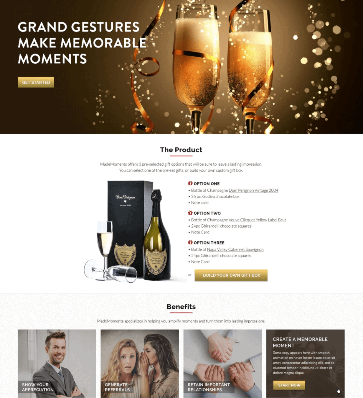
The first two images on the landing page introduce you to the brand’s products, then the benefits section uses pictures of people to emphasize the human element. All of the pictures have different focal points and compositions for a visually dynamic landing page.
If the images you have on hand don’t offer much of a mix, don’t be afraid to source some from a high-quality stock image website. You don’t have to break the bank to use stock images—sites like Unsplash offer theirs for free. Whatever you do, don’t use the example images from paid stock sites that have the transparent watermark imposed over them.
See how this free pic from Unsplash could spiff up a landing page in the food industry?
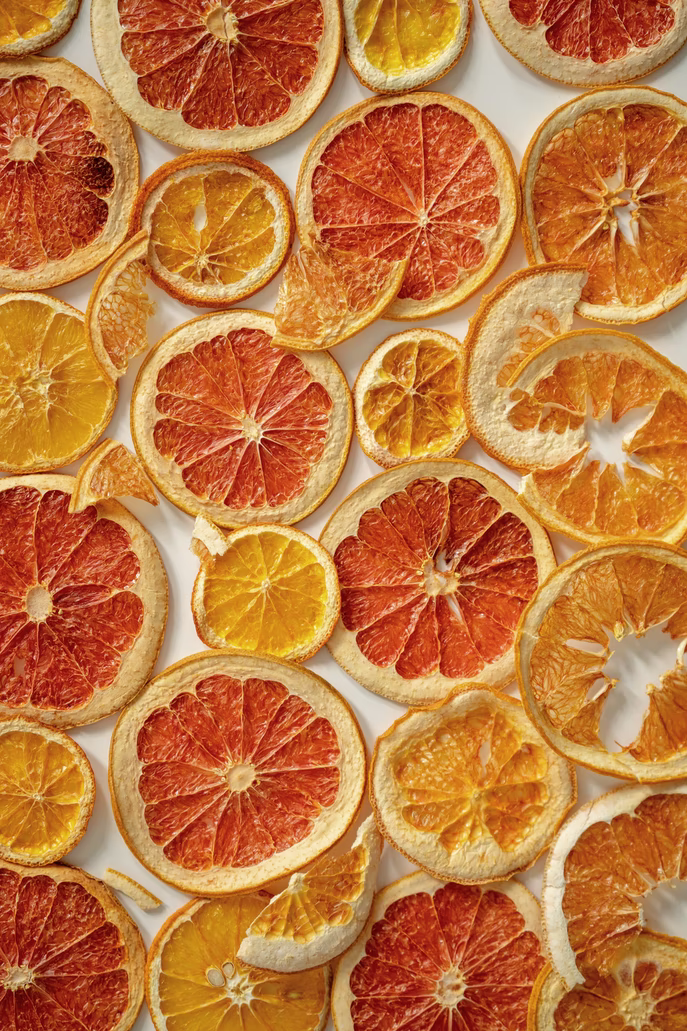
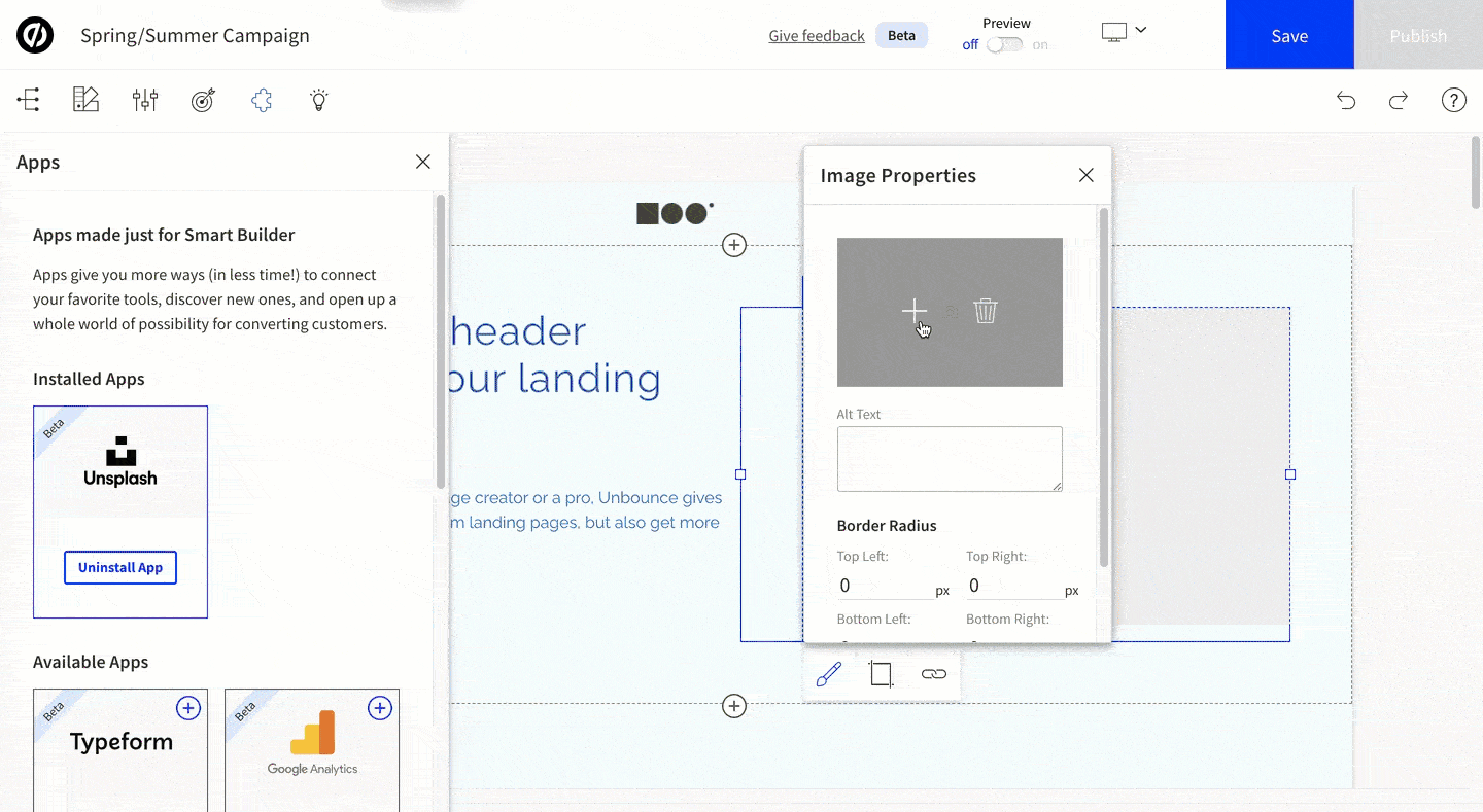
Unbounce users can add Unsplash images to their landing pages right through the builder.
Vector illustrations are also hot right now, especially in tech-related industries. Resources like DrawKit, IconScout, and Open Doodles have royalty-free illustrations for you to use.
4. Keep it real
The internet has plenty of stock images available for you to use for your landing page. But, not all of them will add value.
If you decide to use stock pictures, make sure to pick natural-looking ones. Some stock photos come off cold, fake, or forced—think the “woman laughing alone with salad” meme. You should use stock pictures with settings, emotions, and poses that feel genuine.
Unsplash’s “People” section has plenty of organic-feeling photos of people to add to your landing page. Even when they’re professionally posed and photographed, they don’t feel fake or cringe. Take a gander at these examples:


Another good bet for realistic imagery is pictures of your actual team members, products, spaces, and customers. If you have room in your budget, get a professional photographer to snap what matters to your brand. Depending on your phone quality and image complexity, you might be able to take a photo or two yourself.
Testimonials offer an excellent opportunity to include pictures of real people—your customers. Look how Squareshot includes images of their testimonial subjects on their landing page:
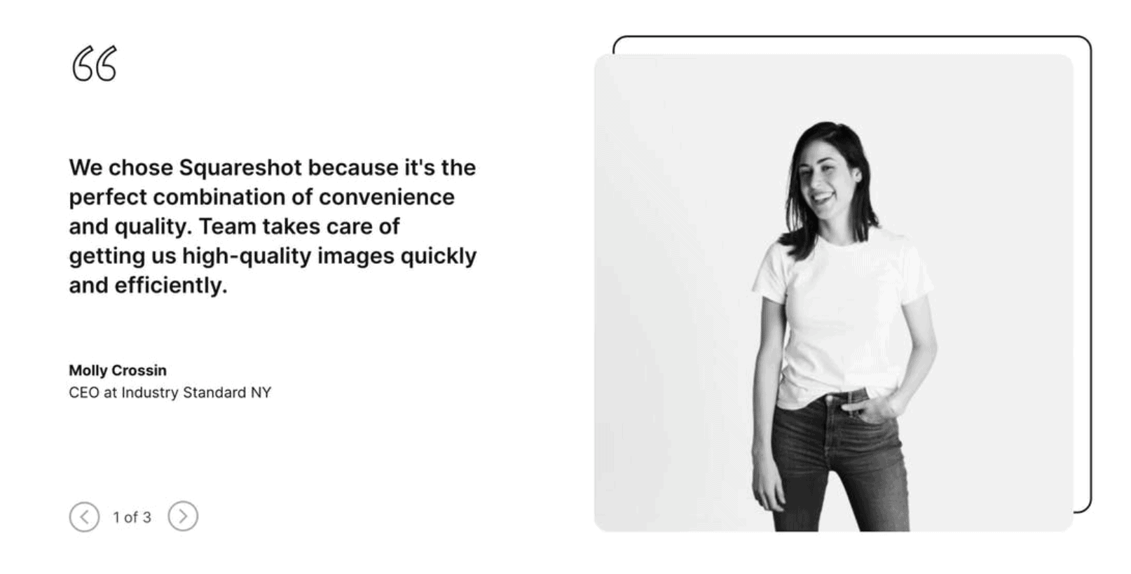
As a professional photography service, Squareshot has the resources to take its own pictures. If you don’t, you can always ask your reviewers and testimonial-givers to provide an image. It’ll make your social proof even more compelling.
5. Add your brand colors
This tip falls more under the “nice to have” category than “must-have,” but it can really zhuzh up your landing page. When you make a landing page that incorporates your brand colors, try adding pictures that have those colors, too. You’ll have a much more cohesive landing page.
How do you find images that match your brand colors? Click the “Tools” button on Google Image Search and pick an option under the “Color” dropdown. You could also try adding shapes or text to an image in Canva or manipulating a picture’s colors in Photoshop/Pixlr.
Plated added a subtle touch of brand color to this landing page’s hero image:
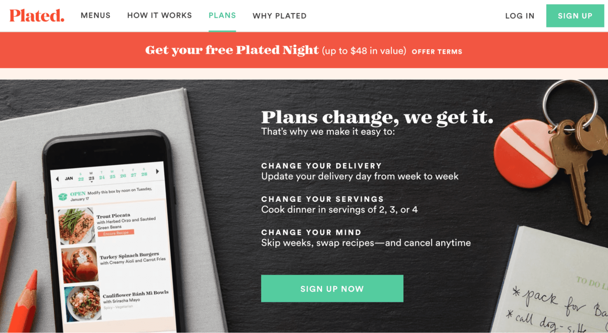
Look at those pencils on the left and the keychain on the right—their orange hues match the orange in Plated’s logo. The brand colors in your images don’t have to take up the whole picture to make an impact.
Better Images = More Conversions
Why should you be picky about your landing page images? Thanks to human psychology, images affect your conversion potential.
Research shows that images affect our choices. The visual cortex—the part of the brain that processes images—has decision-making power. Those decisions could include filling in an email, starting a trial, or making a purchase.
So, when you choose your images with care, you’re helping your visitors decide to convert. And who doesn’t want that for their landing page?
Want to make your decision-making process easier when adding landing page images? Unbounce’s AI-powered builder recommends the right template for your goals, audience, and industry to frame your images perfectly.

