Minimalist painter Jo Baer’s Primary Light Group: Red, Green, Blue features three white squares framed with black and colored bands. Thanks to human psychology, the squares look like they’re floating.

Primary Light Group: Red, Green, Blue shows you don’t have to cover your entire canvas to make an impression. The same rule applies to landing pages. In fact, you probably don’t want every inch of your landing page to have content.
Sometimes, less is more. White space offers tons of benefits to your landing page flow, structure, and impact.
Want to learn how to make a killer landing page that uses the power of white space? This blog will walk through what white space is, what it does to improve landing pages, and how you can tap into its potential.
What’s the Deal With White Space?
In landing page design, white space—sometimes called negative space—is the space between design elements.
Despite the name, white space doesn’t have to be white or empty. It can have colors or even a background image. Think of it as the areas between your points of focus.
A landing page has micro and macro white space, as Creatopy explains:
- Micro white space is the space between small elements—the space between icons or the spacing between lines of text.
- Macro white space is the space between big elements like graphics and columns of text.
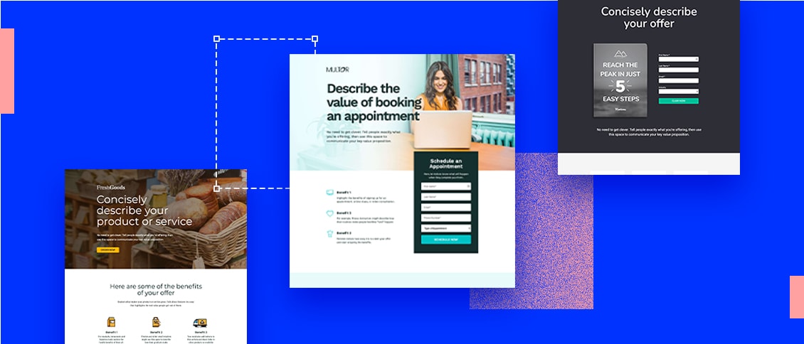
Let’s use one of our examples of high-converting lead generation pages to show macro and micro white space in action.

On the right side, you’ll see tons of macro white space, which helps direct the eye toward the copy and CTA on the left-hand side of the page, and then down to the app being displayed on the tablet.

On the left side of the header, you’ll find three zones of micro white space that break up the header, subheader, form field, and submission button.

So, as you can see, you can use micro and macro white space in your landing page design to separate and highlight different elements.
White space increases readability
While you might not notice how much white space helps with readability when it works, you can definitely tell when it’s missing.
Have you ever had to read through a document with the words printed aaaall the way to the margins of a page? What about a text from that friend who sends a gigantic text wall instead of separate lines? Not a fun time.
Readability becomes even more important online, where readers want answers to their questions fast. A study of thousands of internet users found that customers only read an average of 18% of a web page’s content. You’ll want to help them find that 18% quickly before they bounce.
White space classes up your pages
White space is also a hallmark of modern web design. Pages with more white space tend to look less cluttered, cleaner, and higher-quality. While it can feel like you’re “wasting” negative space, it’s just as important as other design elements.
Let’s look at examples of minimal and strategic white space usage.
If you’ve lived or visited New York City in the last decade or two, you might have seen ads for Dr. Jonathan Zizmor before he retired in 2016. Those ads were known for their “campy” quality, partially because they fit so many design elements onto one page. They didn’t have much micro or macro white space—almost every spot was filled with text or shapes.

The ads worked in Zizmor’s favor since they were a subway mainstay for 25 years. But this approach might not work so well for a business trying to come off as modern.
Contrast this with a more recent example, like this eBook landing page from Optimonk. It has a colorful design just like the subway ad above, but it uses much more white space:

The large swaths of open space—both macro and micro—follow today’s best practices for white space, and this landing page design feels much more modern.
How to Give Your Landing Pages Oomph With White Space
White space serves multiple purposes on landing pages. Once you understand all the different ways you can put it into action, you can better use white space to your advantage.
Direct user flow
Every landing page has a visual hierarchy that guides the viewer through its design elements. You can control that flow with strategic white space placement. When you give an element more white space around it, the viewer is more likely to look at that element first.
This practice goes back to one of Unbounce’s fundamental principles of conversion-centered landing page design: building structure. You can create an information hierarchy by giving the most important details more space than less important ones.
Check out how Simply Business creates a visual pathway using macro and micro white space.

The headline, subheader, and first call to action button have plenty of macro white space around them to draw your eye first. Then, once you head down the page, you’ll see the three-step process broken up with more micro white space. Your eye automatically goes to the page’s most important elements because of the room they have around them.
Break up your content
White space can also separate a landing page’s text and sections to group similar ideas together and improve readability. Spaces between lines of text, headlines, and paragraphs help you digest info in the intended order. When your landing page switches topics, macro white space smooths the transition.
Under the fifth principle of conversion-centered landing page design—drawing attention—your visuals should bring focus to the most important parts of your page. When you break up your content with white space, you help visitors give each section the attention it deserves.
Take a peek at Sundae’s easy-to-understand landing page to see this trick in action:

Sundae surrounds each major point in a section with white space to draw your focus to it. They also combine a subtle white/grey color contrast with plenty of negative space to separate the two sections shown above.
Create more impact
Touching on the conversion-centered landing page design principle of drawing attention, white space allows non-white space to make more impact. A major element surrounded by white space packs more of a punch without any nearby elements to distract from it.
This Amazon landing page mixes up its use of white space to draw attention to its CTA:

First, the page highlights features and testimonials with moderate amounts of white space. Then, it presents the CTA (“Get started”) surrounded by white space. Finally, it covers extra details in an FAQ section with minimal white space.
After you take an easy-breezy journey through the product’s benefits, Amazon invites you to get started, without distractions. Then, you can dig through the FAQ if you have any questions.
Boost user-friendliness
When you use white space on your landing page, you want your users to see it on every platform. Keep your white space consistent across all viewing formats, including web and mobile layouts. Additionally, make sure that your white space placement on desktop doesn’t push things out of the way—or create overlaps—on smaller devices.
It’s all about the seventh principle of conversion-centered landing page design: reducing friction. According to Statcounter, 41.97% of global web traffic came from desktop users in May 2021, with 55.31% coming from mobile. With more than half of your customers using mobile, you’ll want them to have a great landing page experience, too.
This mobile landing page from ClaimCompass balances white space with ease of use.

In the first section, this mobile landing page draws attention to the background between its header and subheader. Then, it spaces its benefits with checkmarks and micro white space to keep them readable. All of the elements feel like they’re in the right place, even with white space included in a mobile format.
Embrace the Space
Don’t underestimate the power of white space. When you give your design elements room to breathe, they’ll serve their intended purpose much more effectively. (Which gives you a better shot at earning conversions, too.) Check out the 7 Principles of Conversion-Centered Design for a crash course on building landing pages that convert.

