
Do you ever click the “checkout” button while looking to buy something and leave before you can finish?
There’s a bunch of little things that can get in the way of a successful checkout, and they often add up. If it becomes too much of a pain to finish the checkout process, you’re outta there.

The same thought process goes on with your customers. They need a friction-free experience with their checkout to cross the finish line.
Let’s learn more about the importance of a seamless checkout experience and five ways to keep yours smooooooth as butter.
The Importance of a Seamless Checkout Experience
No matter how much a customer wants one of your products, a lousy checkout process can sour the whole experience. With so many ecommerce stores out there, customers don’t have many reasons to stick around on one site.
But, if a lousy checkout experience can stop customers from buying, the opposite rule is true, too—a good checkout experience will improve conversions. In fact, the average ecommerce shop can boost conversions by 35.26% if they improve their checkout flow.
5 Ways to Improve Your Checkout Process
So, what can you do to boost your conversions through a smooth checkout? Here are five ideas.
1. Make checkout a no-commitment zone
While requiring customers to sign up for an account can help capture leads, it can also turn off some shoppers entirely. For these folks, it’s not worth adding another email and password to the long list of accounts they have to track.
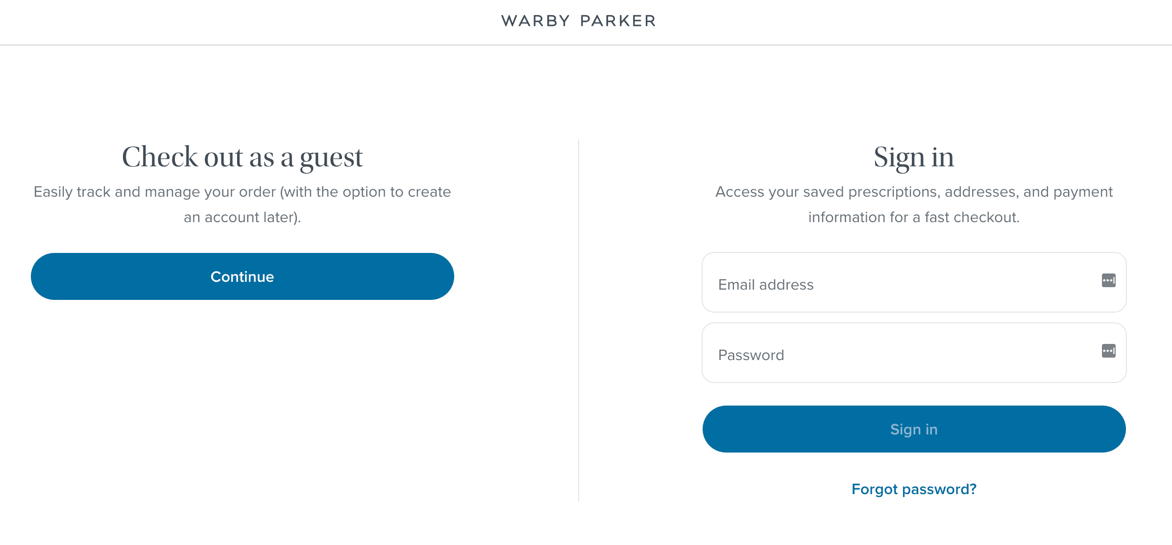
If your shop has customer accounts, always include a guest checkout option. Give it as much attention as your sign-in option, like the example below from Warby Parker:
Bonus tip: If you want more customers to opt into your account signup, include options to register using an existing Google or Facebook account. They’ll be able to sign up in a few clicks and have one less password to remember.
2. Keep fees transparent
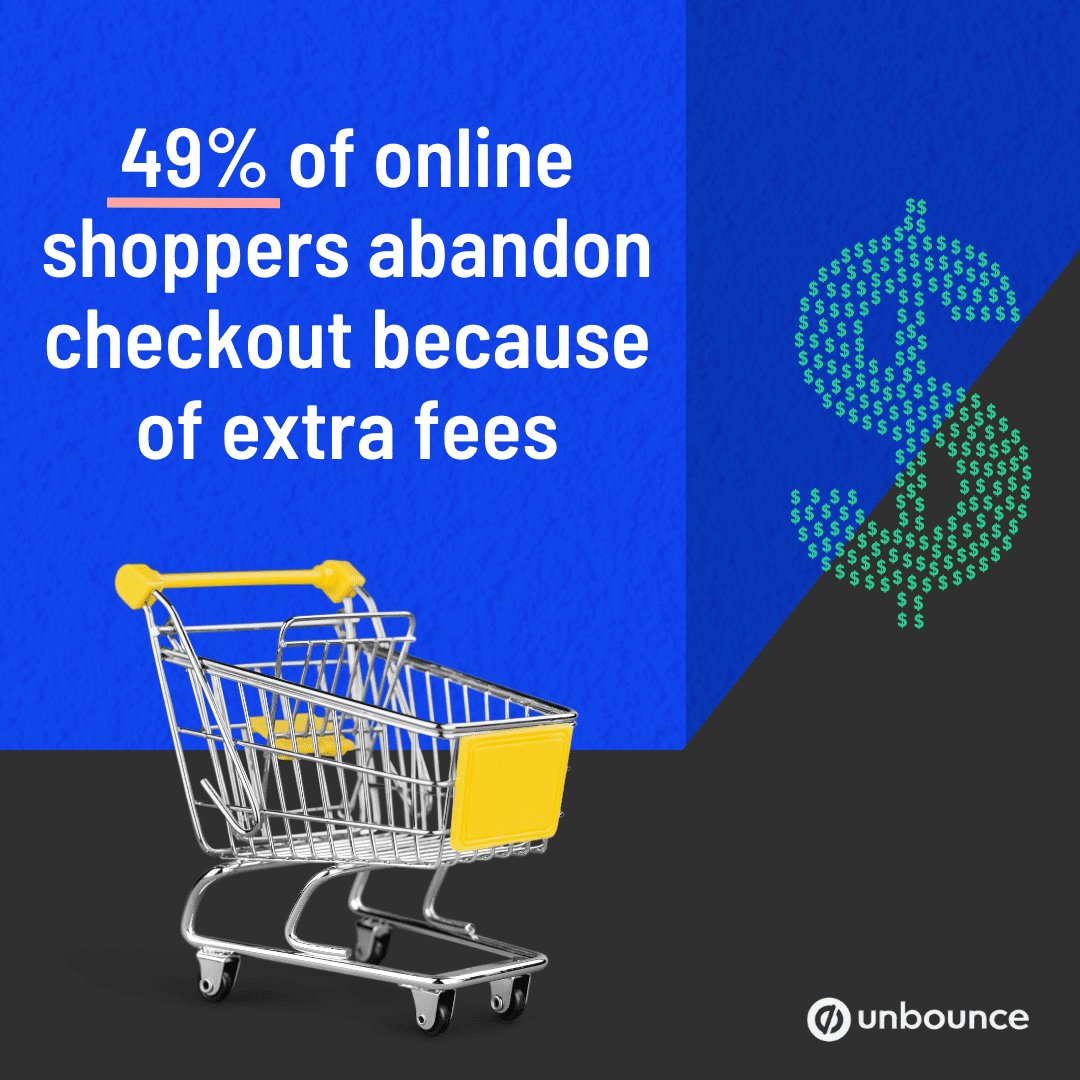
One of the biggest reasons customers drop their checkout carts is hidden fees that pop up after they start checking out. A staggering 49% of shoppers who abandon their carts do so because extra costs like taxes, shipping, and fees are too high. The shop didn’t warn them ahead of time, so they got slapped with sticker shock.
So, one of the best ways to keep people in your checkout happens before they even click that cart. Give your customer a heads-up about extra fees on your product pages and cart pages, so customers know what they’re in for.
We get that some fees, like shipping and taxes, depend on the shopper’s location. How do you stay clear about those? Easy-peasy—just remind customers that they’ll have to pay extra fees, like Singular Society:
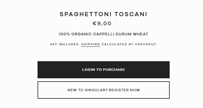
People shopping for pasta through Singular Society won’t know their shipping fees right away. But, they have a nifty link to shipping rates and a heads-up that they’ll get the number during checkout. Best of all, the pricing already includes VAT.
3. Make it easy
The more complicated checkout you have, the more obstacles you put between customer and purchase. Simplify the process wherever you can to keep shoppers moving towards a sale.
These kinds of features will make your checkout experience easier to boost the number of people who finish it:
- Address auto-fill: As a customer enters their address, the checkout offers validated addresses that could match.
- Card validation: The checkout interface validates the card in real-time, so the customer knows they entered their card info correctly the first time.
- Descriptive error messages: Error messages show the reason behind the error so the customer knows if it’s something they can fix (like a wrong card number) or something they can’t (like a server error).
Pro tip: Unbounce’s Stripe app includes frictionless features like these to help customers seal the deal. It comes with a user-friendly checkout out of the box.
4. Use a mobile-friendly design
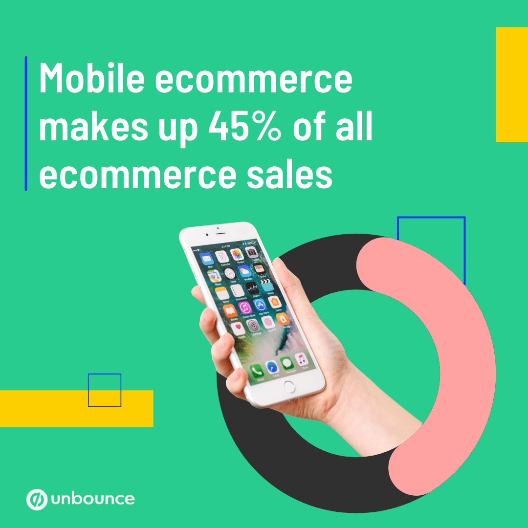
Mobile shopping is huge—it makes up 45% of all ecommerce sales. In other words, almost half of your customers will buy from you on mobile.
If your checkout only works on desktop, your mobile customers have to swipe and pinch all over the page to finish their checkout. Just like you should create a mobile-friendly landing page, you should have a responsive checkout, too. Otherwise, visitors might not consider all the zooming in and out worth it.
Let’s see what a mobile checkout looks like in action using Stripe’s customizable sample checkout:
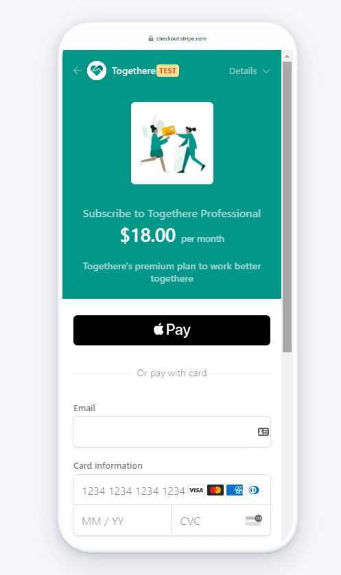
All the elements are large and easy to tap and scroll through. Everything has plenty of breathing room so the visitor doesn’t tap on something they don’t want to. Plus, it’s all in a single column so they only need to scroll down to fill out more info.
5. Keep it globally accessible
One of the neatest things about ecommerce is its global reach. Start an online store in the U.S., and you could get business from someone in Japan.
But if your checkout doesn’t offer Japanese as a language or yen as a currency, that customer might have to bounce. Online translators do fine for product descriptions, but you want to be 100% sure you know what you’re reading on a checkout page.
Open your checkout to as many folks as possible by offering multiple languages and currencies. Some checkout interfaces, like Stripe, go the extra mile by including popular international payment methods.
Compare these sample checkouts for a U.S. customer and a Chinese customer:
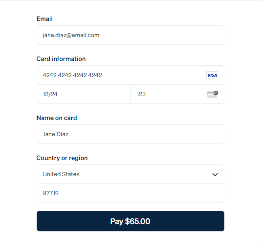
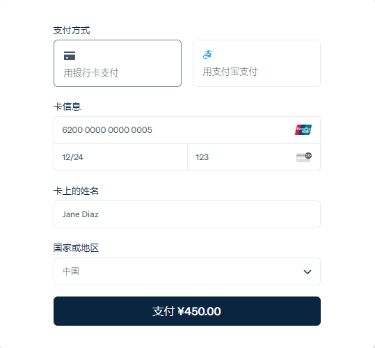
While the United States version focuses on card payments, the Chinese version includes an option for Alipay, one of the most popular payment platforms there. (You can see the Alipay logo in the box to the right of the box with the credit card symbol.) Chinese customers get to use their preferred language, currency, and platform, all in one checkout.
Don’t Let a Bad Checkout Process Stand in the Way of Sales
Don’t let your checkout stand in the way of sales. A good checkout process not only removes those obstacles but also does whatever it can to make things simple for the customer. Ask yourself: What can I do to help my visitors get from cart to checkout?
Unbounce’s Stripe app has a user-friendly interface that keeps checkout smooth for your landing page customers. With Unbounce’s platform taking visitors to conversion and Stripe guiding them through checkout, you won’t meet a better team.
And that’s just one way Unbounce Apps will take your customers to conversion.

